前端每日实战:93# 视频演示如何用纯 CSS 创作一根闪电连接线
2024-09-05 22:40:57
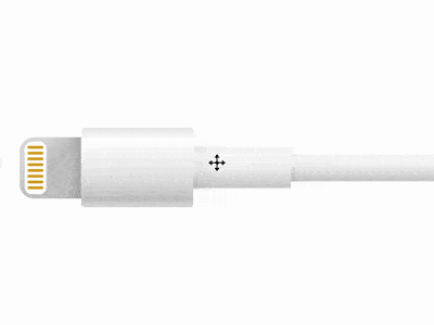
效果预览
按下右侧的“点击预览”按钮可以在当前页面预览,点击链接可以全屏预览。
https://codepen.io/comehope/pen/RBjdzZ
可交互视频
此视频是可以交互的,你可以随时暂停视频,编辑视频中的代码。
请用 chrome, safari, edge 打开观看。
https://scrimba.com/p/pEgDAM/cgkE6C6
源代码下载
每日前端实战系列的全部源代码请从 github 下载:
https://github.com/comehope/front-end-daily-challenges
代码解读
定义 dom,容器中包含 2 个元素,分别代表插头和线缆:
<div class="cable">

    <span class="head"></span>

    <span class="body"></span>

</div>
居中显示:
body {

    margin: 0;

    height: 100vh;

    display: flex;

    align-items: center;

}
定义容器尺寸:
.cable {

    display: flex;

    align-items: center;

    font-size: 10px;

    margin-left: 5em;

}
画出插头的轮廓:
.head {

    width: 8.5em;

    height: 8.5em;

    border-radius: 2em 0 0 2em;

}
画出插头上针脚的轮廓:
.head {

    position: relative;

}

.head::before {

    content: '';

    position: absolute;

    width: 3em;

    height: 7.3em;

    top: calc((8.5em - 7.3em) / 2);

    left: 0.7em;

    border-radius: 1em;

    box-sizing: border-box;

}
画出线缆中手持部位的轮廓:
.body {

    width: 15.5em;

    height: 11em;

    border-radius: 0.5em;

}
画出线缆中稍粗部位的轮廓:
.body {

    position: relative;

    display: flex;

    align-items: center;

}

.body::before {

    content: '';

    position: absolute;

    width: 13.5em;

    height: 6em;

    left: 15.5em;

}
画出线缆的延长线部分:
.body::after {

    content: '';

    position: absolute;

    width: 100vh;

    height: 3.9em;

    left: calc(15.5em + 13.5em);

}
隐藏画面外的部分:
body {

    overflow: hidden;

}
接下来绘制细节。
为延长线涂上渐变色:
.body::after {

    background:

        linear-gradient(

            white,

            hsl(0, 0%, 96%) 5%,

            hsl(0, 0%, 97%) 25%,

            hsl(0, 0%, 95%) 40%,

            hsl(0, 0%, 81%) 95%,

            white

        );

}
为线缆中稍粗部位涂上渐变色:
.body::before {

    background:

        linear-gradient(

            white,

            hsl(0, 0%, 96%) 5%,

            hsl(0, 0%, 98%) 20%,

            hsl(0, 0%, 95%) 50%,

            hsl(0, 0%, 81%) 95%,

            white

        );

}
为线缆中手持部位涂上渐变色:
.body {

    background:linear-gradient(

        hsl(0, 0%, 91%),

        white 15%,

        hsl(0, 0%, 93%) 50%,

        hsl(0, 0%, 87%) 70%,

        hsl(0, 0%, 79%) 90%,

        hsl(0, 0%, 84%),

        hsl(0, 0%, 86%)

    );

}
为插头涂上渐变色:
.head {

    background:

        linear-gradient(

            -45deg,

            hsl(0, 0%, 75%),

            hsl(0, 0%, 79%),

            hsl(0, 0%, 78%),

            hsl(0, 0%, 87%) 80%

        );

}
在插头上画出针脚:
.head::before {

    background-color: white;

}

.head::after {

    content: '';

    position: absolute;

    box-sizing: border-box;

    width: 2.2em;

    height: 0.4em;

    color: goldenrod;

    background-color: currentColor;

    border-radius: 0.5em;

    left: 1.1em;

    top: 1.2em;

    box-shadow:

        0 0.8em 0,

        0 1.6em 0,

        0 2.4em 0,

        0 3.2em 0,

        0 4em 0,

        0 4.8em 0,

        0 5.6em 0;

}
接下来添加阴影,使线缆更立体。
绘制插头上的阴影:
.head {

    background:

        linear-gradient(

            90deg,

            transparent 80%,

            rgba(0,0,0,12%)

        ),

        linear-gradient(

            -45deg,

            hsl(0, 0%, 75%),

            hsl(0, 0%, 79%),

            hsl(0, 0%, 78%),

            hsl(0, 0%, 87%) 80%

        );

}
绘制线缆手持部分的阴影:
.body::before {

    background:

        linear-gradient(

            45deg,

            rgba(0,0,0,4%) 10%,

            transparent 20%

        ),

        linear-gradient(

            90deg,

            rgba(0,0,0,4%),

            transparent 10%

        ),

        linear-gradient(

            white,

            hsl(0, 0%, 96%) 5%,

            hsl(0, 0%, 98%) 20%,

            hsl(0, 0%, 95%) 50%,

            hsl(0, 0%, 81%) 95%,

            white

        );

}
绘制线缆中稍粗部位的阴影:
.body::after {

    background:

        linear-gradient(

            45deg,

            rgba(0,0,0,4%),

            transparent 4%

        ),

        linear-gradient(

            90deg,

            rgba(0,0,0,4%),

            transparent 2%

        ),

        linear-gradient(

            white,

            hsl(0, 0%, 96%) 5%,

            hsl(0, 0%, 97%) 25%,

            hsl(0, 0%, 95%) 40%,

            hsl(0, 0%, 81%) 95%,

            white

        );

}
最后,为画面增加入场动画
.cable {

    animation: show 5s linear infinite;

}

@keyframes show {

    0% {

        transform: translateX(100vw);

    }

    20%, 100% {

        transform: translateX(0);

    }

}
大功告成!
最新文章
- Android--UI之Spinner
- PHPExcel对于Excel中日期和时间类型的处理
- 基于SQL Server 2008 Service Broker构建企业级消息系统
- yum:在Red Hat和Fedora中使用
- 360路由器c301最新固件支持万能中继
- C++ typedef详解
- UglifyJS--javascript代码压缩使用指南{转}
- BZOJ 1692: [Usaco2007 Dec]队列变换
- 网易DBA私享会分享会笔记2
- mybatis 总结(1)
- iOS客户端开发与Web前端开发
- 反馈法学习设计模式(一)——策略模式Strategy Pattern
- dede织梦后台页面及功能修改精简操作方法
- Webform(条件查询)
- Cocon90.Db调用方法
- Trailing Zeroes (III) (二分)题解
- Cannot load supported formats: Cannot run program "svn"
- GDAL读取影像并插值
- Scrum立会报告+燃尽图(十月十九日总第十次):
- django在windows设置定时任务,勉强能用
热门文章
- fedora18 Cannot retrieve metalink for repository: fedora. Please verify its path and try again 解决方法
- Microsoft windows terminal
- React-Native 之 GD (二)自定义共用导航栏样式
- Linux下查看分区内目录及文件占用空间容量
- centos6最小化安装默认没有 NetworkManager服务
- duliu题之狼抓兔子题解
- Ajax 实现导出文件-支持批量
- 操作Redis--hash/key-value
- 阿里云DNS api接口 shell 更改DNS解析
- 浅谈vue父子组件之间的传值