css3条纹进度条
2024-09-27 06:08:29
新建div,取名progress,如下
<div class="progress"></div>
在里面插入条纹进度条,以及进度显示文本进度:
<div class="progress-bar progress-bar-info progress-bar-striped active" style="width: 75%;">

        <div class="progress-value">75%</div>

 </div>
添加样式
.progress{

            height: 25px;

            background: #262626;

            padding: 5px;

            overflow: visible;

            border-radius: 20px;

            border-top: 1px solid #000;

            border-bottom: 1px solid #7992a8;

            margin-top: 50px;

}

.progress-bar {

            float: left;

            width: 0;

            height: 100%;

            font-size: 12px;

            line-height: 20px;

            color: #fff;

            text-align: center;

            background-color: #337ab7;

            -webkit-box-shadow: inset 0 -1px 0 rgba(0,0,0,.15);

            box-shadow: inset 0 -1px 0 rgba(0,0,0,.15);

            -webkit-transition: width .6s ease;

            -o-transition: width .6s ease;

            transition: width .6s ease;

 }

.progress .progress-bar{

          border-radius: 20px;

          position: relative;

          animation: animate-positive 2s;

 }

.progress .progress-value{

                      display: block;

                      padding: 3px 7px;

                      font-size: 13px;

                      color: #fff;

                      border-radius: 4px;

                      background: #191919;

                      border: 1px solid #000;

                      position: absolute;

                      top: -40px;

                      right: -10px;

}

.progress-bar-info {

            background-color: #5bc0de;

}

.progress .progress-value:after{

                      content: "";

                      border-top: 10px solid #191919;

                      border-left: 10px solid transparent;

                      border-right: 10px solid transparent;

                      position: absolute;

                      bottom: -6px;

                      left: 26%;

}

.progress-bar-striped {

            background-image: -webkit-linear-gradient(45deg,rgba(255,255,255,.15) 25%,transparent 25%,transparent 50%,rgba(255,255,255,.15) 50%,rgba(255,255,255,.15) 75%,transparent 75%,transparent);

            background-image: -o-linear-gradient(45deg,rgba(255,255,255,.15) 25%,transparent 25%,transparent 50%,rgba(255,255,255,.15) 50%,rgba(255,255,255,.15) 75%,transparent 75%,transparent);

            background-image: linear-gradient(45deg,rgba(255,255,255,.15) 25%,transparent 25%,transparent 50%,rgba(255,255,255,.15) 50%,rgba(255,255,255,.15) 75%,transparent 75%,transparent);

            -webkit-background-size: 20px 20px;

            background-size: 20px 20px;

}

@-webkit-keyframes animate-positive{

              0% { width: 0; }

}

@keyframes animate-positive{

              0% { width: 0; }

 }
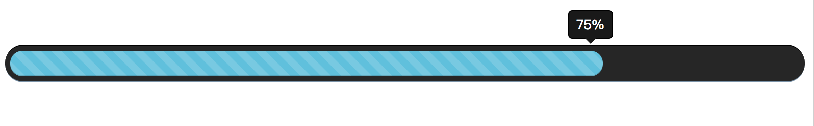
最后效果如下:
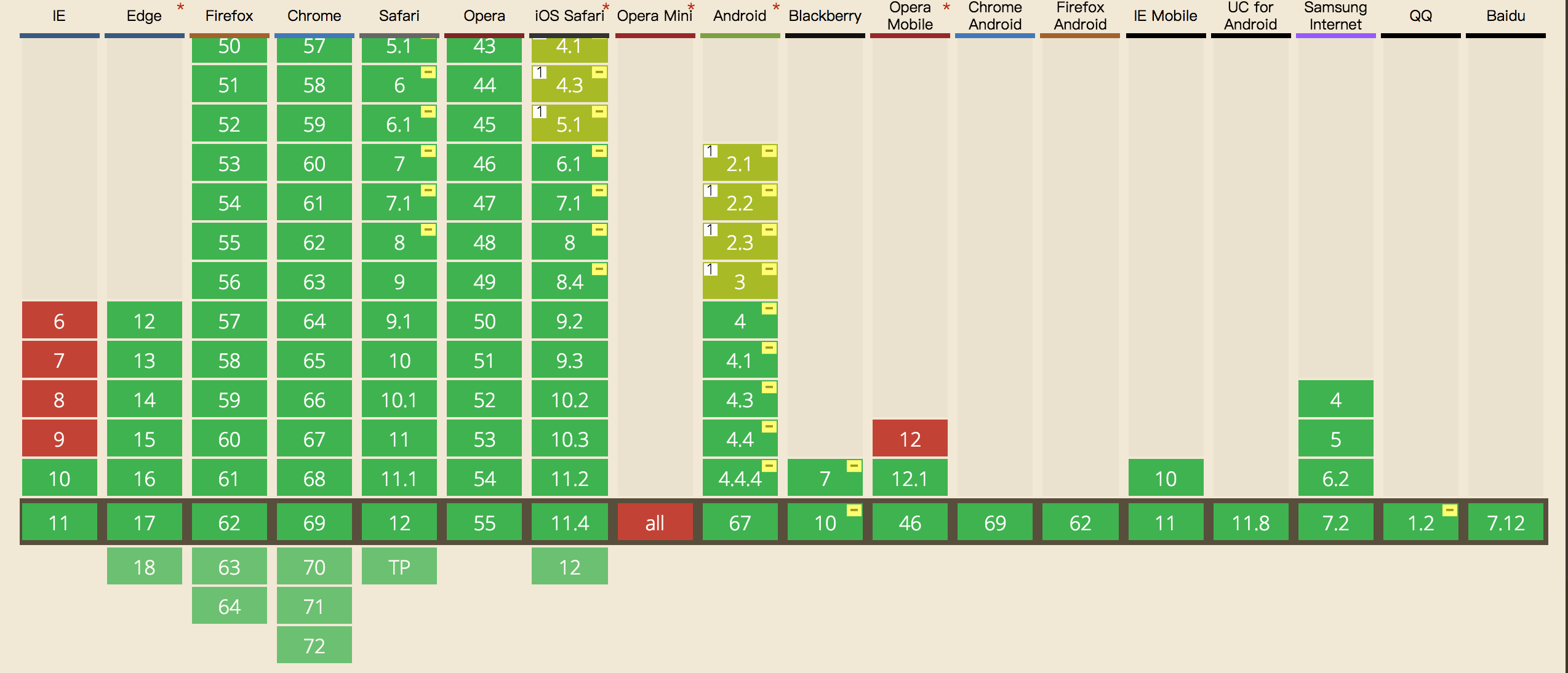
这里需要注意的是css3,keyframes的兼容性如下,ie9及以下就别用了:
最新文章
- Latex使用整理
- SQL—— 事务
- Linux 下配置多机实时同步
- c++cin.ignore()
- java对称加密报错:Input length must be multiple of 8 when decrypting with padded cipher
- 理解Windows中的路由表和默认网关
- Android Training精要(五)讀取Bitmap對象實際的尺寸和類型
- spring07 JDBC
- jquery 综合使用例子
- Python批量重命名
- 利用Fiddler修改请求信息通过Web API执行操作(Action)实例
- Stanford Word Segmenter使用
- C 一维数组 冒泡排序,查最大值
- cmd应用基础教程
- 洛谷P2894 [USACO08FEB]酒店Hotel [线段树]
- CSS实现跨浏览器兼容性的盒阴影效果
- jenkins webhook 配置
- Codeforces Round #371 (Div. 1) D - Animals and Puzzle 二维ST表 + 二分
- js 向上取整、向下取整、四舍五入
- django drf安装和doc生成
热门文章
- scala调用系统-scala.sys.process使用
- [轉]关于CR0.WP
- Clairewd's message /// 字符串hash
- Hibernate4教程一:入门介绍
- 学习笔记-es5新增的一些数组的API(不全)-字符串-字符串API(不全)
- 知识点整理01- 引用对象被子方法赋值后不改变;CheckBox 取消选择不可用问题
- CSS3新增(选择器{属性选择器,结构伪类选择器,伪元素选择器})
- Android Studio javadoc 生成注释文档
- 【mysql升级步骤】windows mysql版本升级 ,mysql 5.6 升级到5.7.27
- pygame征途:(一)图片移动反弹