《WPF》Expander控件简单美化
2024-08-28 07:22:08
示例图:
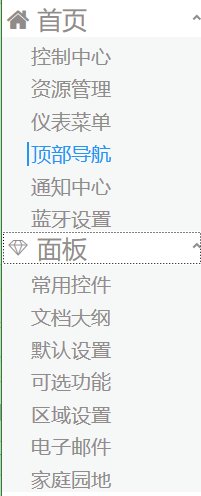
Expander控件功能很常见, 一般用于系统左侧的菜单收缩面板。
1.主要的组成
一个头部(header) 和 一个 内容(content) 组成。
<Expander ExpandDirection="Down" SnapsToDevicePixels="True" VerticalAlignment="Top" Style="{DynamicResource ExpanderStyle1}" >
<Expander.Header>
<StackPanel Orientation="Horizontal">
<TextBlock FontFamily="/WpfApplication1;component/Resources/#iconfont" Text=""
FontSize="" Foreground="#918C8C" VerticalAlignment="Center"></TextBlock>
<TextBlock FontSize="" Text="首页" Margin="8,0,-51,0" Foreground="#918C8C" ></TextBlock>
</StackPanel>
</Expander.Header>
<Expander.Content>
<StackPanel Background="#F6F8F8">
<RadioButton Style="{DynamicResource RadioButtonStyle}">控制中心</RadioButton>
<RadioButton Style="{DynamicResource RadioButtonStyle}">资源管理</RadioButton>
<RadioButton Style="{DynamicResource RadioButtonStyle}">仪表菜单</RadioButton>
<RadioButton Style="{DynamicResource RadioButtonStyle}">顶部导航</RadioButton>
<RadioButton Style="{DynamicResource RadioButtonStyle}">通知中心</RadioButton>
<RadioButton Style="{DynamicResource RadioButtonStyle}">蓝牙设置</RadioButton>
</StackPanel>
</Expander.Content>
</Expander>
为了修改掉原生的样式, 重新定义了一个Style / ExpanderStyle1
1.将原有的左侧圆形删除
2.把左侧的箭头移动至右侧 【主要修改红色加粗部分调整】
 <Style x:Key="ExpanderStyle1" TargetType="{x:Type Expander}">

            <Setter Property="Foreground" Value="{DynamicResource {x:Static SystemColors.ControlTextBrushKey}}"/>

            <Setter Property="Background" Value="Transparent"/>

            <Setter Property="BorderBrush" Value="#918C8C"/>

            <Setter Property="BorderThickness" Value="0 0 0 0"/>

            <Setter Property="Template">

                <Setter.Value>

                    <ControlTemplate TargetType="{x:Type Expander}">

                        <Border BorderBrush="{TemplateBinding BorderBrush}" BorderThickness="{TemplateBinding BorderThickness}" Background="{TemplateBinding Background}" CornerRadius="0" SnapsToDevicePixels="True">

                            <DockPanel>

                                <ToggleButton x:Name="HeaderSite" ContentTemplate="{TemplateBinding HeaderTemplate}"

                                              Content="{TemplateBinding Header}" DockPanel.Dock="Top" Foreground="{TemplateBinding Foreground}"

                                              FontWeight="{TemplateBinding FontWeight}" FontStyle="{TemplateBinding FontStyle}"

                                              FontStretch="{TemplateBinding FontStretch}" FontSize="{TemplateBinding FontSize}"

                                              FontFamily="{TemplateBinding FontFamily}" HorizontalContentAlignment="{TemplateBinding HorizontalContentAlignment}"

                                              IsChecked="{Binding IsExpanded, Mode=TwoWay, RelativeSource={RelativeSource TemplatedParent}}"

                                              Margin="1" MinWidth="0" MinHeight="0" Padding="{TemplateBinding Padding}" VerticalContentAlignment="{TemplateBinding

                                    VerticalContentAlignment}">

                                    <ToggleButton.FocusVisualStyle>

                                        <Style>

                                            <Setter Property="Control.Template">

                                                <Setter.Value>

                                                    <ControlTemplate>

                                                        <Border>

                                                            <Rectangle Margin="0" SnapsToDevicePixels="True" Stroke="Black" StrokeThickness="1" StrokeDashArray="1 2"/>

                                                        </Border>

                                                    </ControlTemplate>

                                                </Setter.Value>

                                            </Setter>

                                        </Style>

                                    </ToggleButton.FocusVisualStyle>

                                    <ToggleButton.Style>

                                        <Style TargetType="{x:Type ToggleButton}">

                                            <Setter Property="Template">

                                                <Setter.Value>

                                                    <ControlTemplate TargetType="{x:Type ToggleButton}">

                                                        <Border Padding="{TemplateBinding Padding}">

                                                            <Grid>

                                                                <Grid.ColumnDefinitions>

                                                                    <ColumnDefinition Width="19*"/>

                                                                </Grid.ColumnDefinitions>

                                                                <Path Grid.Column="0" x:Name="arrow" Data="M1,1.5L4.5,5 8,1.5" HorizontalAlignment="Right"  SnapsToDevicePixels="False" Stroke="#918C8C" StrokeThickness="2" VerticalAlignment="Center" Height="10" Margin="0,10" />

                                                                <ContentPresenter ContentTemplate="{TemplateBinding ContentTemplate}" Content="{TemplateBinding Content}" ContentStringFormat="{TemplateBinding ContentStringFormat}" HorizontalAlignment="Left" Margin="4,0,0,0" RecognizesAccessKey="True" SnapsToDevicePixels="True" VerticalAlignment="Center"  />

                                                            </Grid>

                                                        </Border>

                                                        <ControlTemplate.Triggers>

                                                            <Trigger Property="IsChecked" Value="True">

                                                                <Setter Property="Data" TargetName="arrow" Value="M1,4.5L4.5,1 8,4.5"/>

                                                            </Trigger>

                                                            <Trigger Property="IsMouseOver" Value="True">

                                                                <Setter Property="Stroke" TargetName="arrow" Value="Black"/>

                                                            </Trigger>

                                                            <Trigger Property="IsPressed" Value="True">

                                                                <Setter Property="Stroke" TargetName="arrow" Value="Black"/>

                                                            </Trigger>

                                                            <Trigger Property="IsEnabled" Value="False">

                                                                <Setter Property="Stroke" TargetName="arrow" Value="#FF707070"/>

                                                            </Trigger>

                                                        </ControlTemplate.Triggers>

                                                    </ControlTemplate>

                                                </Setter.Value>

                                            </Setter>

                                        </Style>

                                    </ToggleButton.Style>

                                </ToggleButton>

                                <ContentPresenter x:Name="ExpandSite" ContentTemplate="{TemplateBinding ContentTemplate}" Content="{TemplateBinding Content}" ContentStringFormat="{TemplateBinding ContentStringFormat}" DockPanel.Dock="Bottom" Focusable="False" HorizontalAlignment="{TemplateBinding HorizontalContentAlignment}" Margin="{TemplateBinding Padding}" Visibility="Collapsed" VerticalAlignment="{TemplateBinding VerticalContentAlignment}"/>

                            </DockPanel>

                        </Border>

                        <ControlTemplate.Triggers>

                            <Trigger Property="IsExpanded" Value="True">

                                <Setter Property="Visibility" TargetName="ExpandSite" Value="Visible"/>

                            </Trigger>

                            <Trigger Property="IsEnabled" Value="False">

                                <Setter Property="Foreground" Value="{DynamicResource {x:Static SystemColors.GrayTextBrushKey}}"/>

                            </Trigger>

                        </ControlTemplate.Triggers>

                    </ControlTemplate>

                </Setter.Value>

            </Setter>

        </Style>
3.在头部同时添加了一个字体图标, 用FontFamily绑定字体, 通过设置Text实现图标
<TextBlock FontFamily="/WpfApplication1;component/Resources/#iconfont" Text=""
FontSize="22" Foreground="#918C8C" VerticalAlignment="Center"></TextBlock>
4.在Content区域, 利用一个stackPanel面板 和多个 单选按钮组成子元素【同时修改原生的RadioButton样式】
<Expander.Content>

                    <StackPanel Background="#F6F8F8">

                        <RadioButton Style="{DynamicResource RadioButtonStyle}">控制中心</RadioButton>

                        <RadioButton Style="{DynamicResource RadioButtonStyle}">资源管理</RadioButton>

                        <RadioButton Style="{DynamicResource RadioButtonStyle}">仪表菜单</RadioButton>

                        <RadioButton Style="{DynamicResource RadioButtonStyle}">顶部导航</RadioButton>

                        <RadioButton Style="{DynamicResource RadioButtonStyle}">通知中心</RadioButton>

                        <RadioButton Style="{DynamicResource RadioButtonStyle}">蓝牙设置</RadioButton>

                    </StackPanel>

                </Expander.Content>
5.修改stackpanel面板背景色, 打到header与子元素背景产生一定的色差 【图上蓝色区域】
6.给RadioButton添加一个Style / RadioButtonStyle 【具体样式见代码注释】
 <Style x:Key="RadioButtonStyle" TargetType="{x:Type RadioButton}">

            <Setter Property="FocusVisualStyle">

                <Setter.Value>

                    <Style>

                        <Setter Property="Control.Template">

                            <Setter.Value>

                                <ControlTemplate>

                                    <Rectangle Margin="2" SnapsToDevicePixels="True" Stroke="{DynamicResource {x:Static SystemColors.ControlTextBrushKey}}" StrokeThickness="1" StrokeDashArray="1 2"/>

                                </ControlTemplate>

                            </Setter.Value>

                        </Setter>

                    </Style>

                </Setter.Value>

            </Setter>
             <!--Margin主要用于设置子元素距离左侧边距-->

            <Setter Property="Margin" Value="25 8 0 0"/>

            <Setter Property="FontSize" Value="20"/>

            <Setter Property="VerticalContentAlignment" Value="Center"/>

            <Setter Property="HorizontalContentAlignment" Value="Left"/>

            <Setter Property="BorderBrush" Value="Transparent"/>

            <Setter Property="Foreground" Value="#918C8C"/>

            <Setter Property="BorderThickness" Value="0"/>

            <Setter Property="Template">

                <Setter.Value>

                    <ControlTemplate TargetType="{x:Type RadioButton}">

                        <Grid x:Name="templateRoot" Background="Transparent" SnapsToDevicePixels="True">

                            <Border x:Name="border" BorderBrush="Red"

                                     BorderThickness="0"  Opacity="0.1"

                                Background="Transparent" SnapsToDevicePixels="True"/>
                  <!-- 用于设置选中的左侧树形边框-->

                            <Border x:Name="bd2" BorderBrush="#2196F3" />

                            <ContentPresenter x:Name="contentPresenter" ContentTemplate="{TemplateBinding ContentTemplate}" Content="{TemplateBinding Content}" Grid.Column="1" ContentStringFormat="{TemplateBinding ContentStringFormat}" Focusable="False" HorizontalAlignment="{TemplateBinding HorizontalContentAlignment}" Margin="{TemplateBinding Padding}" RecognizesAccessKey="True" SnapsToDevicePixels="{TemplateBinding SnapsToDevicePixels}" VerticalAlignment="{TemplateBinding VerticalContentAlignment}"/>

                        </Grid>

                        <ControlTemplate.Triggers>

                            <Trigger Property="HasContent" Value="True">

                                <Setter Property="FocusVisualStyle">

                                    <Setter.Value>

                                        <Style>

                                            <Setter Property="Control.Template">

                                                <Setter.Value>

                                                    <ControlTemplate>

                                                        <Rectangle Margin="14,0,0,0" SnapsToDevicePixels="True" Stroke="{DynamicResource {x:Static SystemColors.ControlTextBrushKey}}" StrokeThickness="1" StrokeDashArray="1 2"/>

                                                    </ControlTemplate>

                                                </Setter.Value>

                                            </Setter>

                                        </Style>

                                    </Setter.Value>

                                </Setter>

                                <Setter Property="Padding" Value="4,-1,0,0"/>

                            </Trigger>

                            <Trigger Property="IsMouseOver" Value="True">
                   <!--当选中的时候, 改变字体的颜色, 同时左侧加一条宽度为2 的 边框 -->

                                <Setter Property="Foreground"  Value="#2196F3"/>

                                <Setter Property="BorderThickness" Value="2 0 0 0" TargetName="bd2"/>

                            </Trigger>

                            <Trigger Property="IsChecked" Value="true">

                            </Trigger>

                            <Trigger Property="IsChecked" Value="{x:Null}"/>

                        </ControlTemplate.Triggers>

                    </ControlTemplate>

                </Setter.Value>

            </Setter>

            <Setter Property="MinHeight" Value="20"/>

            <Setter Property="HorizontalAlignment" Value="Stretch"/>

        </Style>
最新文章
- matlab小段代码学习
- AU3学习资源
- oracle_dblink配置
- 【转】驱动中的类class和节点
- Linux学习笔记总结--CentOS 设置静态IP
- 《SDN核心技术剖析和实战指南》第一章小结
- SqlBulkCopy使用心得 (大量数据导入)
- bootstrap注意事项(六)按钮
- spark install
- 一,IL访问静态属性和字段
- [学习笔记]修改关键跳无效且关键CALL又不存在的情况
- 椭圆曲线签名算法的v的定义
- Android studio 学习资料汇总
- Todolist组件
- bzoj1833: [ZJOI2010]count 数字计数 数位dp
- C中有关引用和指针的异同
- Ionic Js五:单选框操作
- vue-router(一)
- .net core i上 K8S(三)Yaml文件运行.netcore程序
- cdoj1338郭大侠与英雄学院