CSS动画实例:移动的眼珠子
适当地利用CSS的box-shadow可以构造图形,然后可以对构造的图形添加动画效果。下面我们通过移动的眼珠子、圆珠一二三、一分为四、四小圆旋转扩散等实例来体会box-shadow属性在动画制作中的使用方法。
box-shadow属性的基本格式为:
box-shadow: h-shadow v-shadow blur spread color inset;
其中,属性值h-shadow为必需,表示水平阴影的位置,它允许负值;v-shadow也为必需,表示垂直阴影的位置,也允许负值:blur可选,表示模糊距离;spread可选,给定阴影的尺寸;color可选,表示阴影的颜色;inset 可选,表示将外部阴影 (outset) 改为内部阴影。
1.移动的眼珠子
设页面中有<div class="shape"></div>,若为. shape设置样式规则如下:
.shape
{
width: 96px;
height: 64px;
border-radius: 50%;
background:#FFFAFA;
box-shadow: -105px 0 0 0px #FFFAFA;
position: relative;
margin-left:105px;
}
可在页面中显示如图1所示的图形,这两个椭圆中前面的一个是由box-shadow属性设置的。

图1 两个椭圆
再定义样式. Shape:after如下:
.shape:after
{
content: "";
width: 0;
height: 0;
border-radius: 50%;
left: 35%;
top: 30%;
position: absolute;
border:12px solid #000;
box-shadow: -102px 0 0 0 #000;
}
为表示眼珠的椭圆中加上两个黑点,可在页面中显示如图2所示的图形。

图2 两颗眼珠子
为眼珠子中的黑点定义关键帧,使得它移动起来。编写的HTML文件内容如下。


<!DOCTYPE html>

<html>

<head>

<title>移动的眼珠子</title>

<style>

  .container

  {

    margin: 0 auto;

    width: 300px;

    height:300px;

    position: relative;

    display:flex;

    justify-content:center;

    align-items:center;

    background:#d8d8d8;

    border: 4px solid rgba(255, 0, 0, 0.9);

    border-radius: 10%;

  }

  .shape

  {

    width: 96px;

    height: 64px;

    border-radius: 50%;

    background:#FFFAFA;

    box-shadow: -105px 0 0 0px #FFFAFA;

    position: relative;

    margin-left:105px;

  }

  .shape:after

  {

    content: "";

    width: 0;

    height: 0;

    border-radius: 50%;

    left: 35%;

    top: 30%;

    position: absolute;

    border:12px solid #000;

    box-shadow: -102px 0 0 0 #000;

    animation: move 0.8s linear infinite alternate;

  }

  @keyframes move

  {

    0%   { left: 0; }

    100% { left: 55px; }

  }

</style>

</head>

<body>

<div  class="container">

    <div class="shape"></div>

</div>

</body>

</html>
在浏览器中打开包含这段HTML代码的html文件,可以呈现出如图3所示的动画效果。
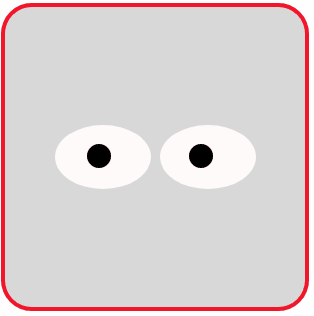
图3 移动的眼珠子(双眼)
为实现眼珠子移动动画效果,还可以编写如下的HTML文件。
<!DOCTYPE html>

<html>

<head>

<title>移动的眼珠子</title>

<style>

  .container

  {

    margin: 0 auto;

    width: 300px;

    height:300px;

    position: relative;

    display:flex;

    justify-content:center;

    align-items:center;

    background:#d8d8d8;

    border: 4px solid rgba(255, 0, 0, 0.9);

    border-radius: 10%;

  }

  .shape

  {

    position: relative;

    animation: 2s anim1 infinite;

  }

  .shape:before

  {

    content: '';

    display: block;

    overflow:hidden;

    width: 120px;

    height: 120px;

    border-radius: 80% 20%;

    background:#fff;

    border: 3px solid currentcolor;

    border-width: 3px 1.5px 1.5px 3px;

    transform: rotate(45deg);

  }

  .shape:after

  {

    content: '';

    display: block;

    width:30px;

    height: 30px;

    position: absolute;

    background: #000;

    top: 40px;

    left: 60%;

    border-radius: 50%;

    box-shadow: -4px 4px 0 10px #191970;

    animation: 2s anim2 linear infinite;

  }

  @keyframes anim1

  {

    0%, 30%, 100% { transform: scaleY(1); }

    10%     { transform: scaleY(0); }

  }

  @keyframes anim2

  {

    0%, 100% { left:60%; }

    30%      { left:10%; }

    50%      { left:80%;  }

  }

</style>

</head>

<body>

<div  class="container">

    <div class="shape"></div>

</div>

</body>

</html>
在浏览器中打开包含这段HTML代码的html文件,可以呈现出如图4所示的动画效果。
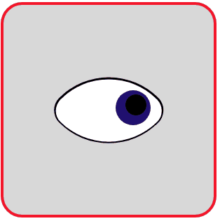
图4 移动的眼珠子(单眼)
2.圆珠一二三
实现这样一个动画效果:一个大圆环每翻动一次,里面增加一颗珠子,最多可增加到三颗。编写如下的HTML文件。
<!DOCTYPE html>

<html>

<head>

<title>圆珠一二三</title>

<style>

  .container

  {

    margin: 0 auto;

    width: 300px;

    height:300px;

    position: relative;

    display:flex;

    justify-content:center;

    align-items:center;

    background:#d8d8d8;

    border: 4px solid rgba(255, 0, 0, 0.9);

    border-radius: 10%;

  }

  .shape

  {

    position: relative;

    width: 160px;

    height: 160px;

    border: 8px solid #f0f;

    border-radius: 50%;

    animation: anim1 1.25s infinite -0.3s;

  }

  .shape:after

  {

    content: '';

    position: absolute;

    top:0;

    left:0;

    right:0;

    bottom:0;

    margin:auto;

    width: 0;

    height: 0;

    border: 20px solid #f00;

    border-radius: 50%;

    transform: translate(-40px);

    animation: anim2 5s infinite steps(1);

  }

  @keyframes anim1

  {

     0%   { transform: rotateX(0deg); }

     100% { transform: rotateX(180deg); }

  }

  @keyframes anim2

  {

     0%   { opacity: 0; }

     25%  { opacity: 1; }

     50%  { box-shadow: 40px 0 0 #0f0; }

     75%  { box-shadow: 40px 0 0 #0f0, 80px 0 0 #00f; }

  }

</style>

</head>

<body>

<div  class="container">

    <div class="shape"></div>

</div>

</body>

</html>
在浏览器中打开包含这段HTML代码的html文件,可以呈现出如图5所示的动画效果。
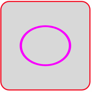
图5 圆珠一二三
3.一分为四
将一个圆球向上下左右四个方向生成四个同样的圆球,四个圆球采用box-shadow属性设置。编写如下的HTML文件。
<!DOCTYPE html>

<html>

<head>

<title>一分为四</title>

<style>

  .container

  {

    margin: 0 auto;

    width: 300px;

    height:300px;

    position: relative;

    display:flex;

    justify-content:center;

    align-items:center;

    background:#d8d8d8;

    border: 4px solid rgba(255, 0, 0, 0.9);

    border-radius: 10%;

  }

  .shape

  {

    position: relative;

    width: 30px;

    height: 30px;

    background: #f0f;

    border-radius: 50%;

    animation: anim 2s  linear infinite;

  }

  @keyframes anim

  {

     0%   { opacity: 0; }

     15%  { opacity: 1; }

     25%   { background:#d8d8d8; }

     100%

     {

          background:#d8d8d8;

           box-shadow: -80px 0 0 #f0f, 80px 0 0 #f0f,0 80px 0 0 #f0f,0 -80px 0 0 #f0f;

      }

  }

</style>

</head>

<body>

<div  class="container">

    <div class="shape"></div>

</div>

</body>

</html>
在浏览器中打开包含这段HTML代码的html文件,可以呈现出如图6所示的动画效果。

图6 圆球一分为四
若修改关键帧定义为:
@keyframes anim
{
0%,100% { box-shadow: 0 0 0 #f0f; }
25% { box-shadow: -80px 0 0 #f0f, 80px 0 0 #f0f; }
50% { box-shadow: 0 0 0 #f0f; }
75% { box-shadow: 0 80px 0 0 #f0f,0 -80px 0 0 #f0f; }
}
则呈现出如图7所示的动画效果。

图7 圆球一分为二
4.四个小圆旋转扩散
设页面中有<div class="shape"></div>,若为. shape设置样式规则如下:
.shape
{
position: relative;
width: 30px;
height: 30px;
border-radius: 50%;
box-shadow: -30px -30px 0 #f0f, 30px -30px 0 #f0f,
30px 30px 0 #f0f,-30px 30px 0 #f0f;
}
可在页面中显示如图8所示的图形,这4个小圆均是由box-shadow属性设置的。
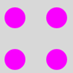
图8 四个小圆
若将图8的四个小圆作为初始帧,用
box-shadow: 60px -60px 0 #f0f,60px 60px 0 #f0f,-60px 60px 0 #f0f,-60px -60px 0 #f0f;
设置的另外4个圆作为终止帧,它和初始帧相比,四个小圆的大小不变,但位置发生了变化,这个变化产生的效果是小圆会旋转扩散。
编写的HTML文件内容如下。
<!DOCTYPE html>

<html>

<head>

<title>四小圆旋转扩散</title>

<style>

  .container

  {

    margin: 0 auto;

    width: 300px;

    height:300px;

    position: relative;

    display:flex;

    justify-content:center;

    align-items:center;

    background:#d8d8d8;

    border: 4px solid rgba(255, 0, 0, 0.9);

    border-radius: 10%;

  }

  .shape

  {

    position: relative;

    width: 30px;

    height: 30px;

    border-radius: 50%;

    animation: anim 1s  linear infinite;

  }

  @keyframes anim

  {

     0%   { box-shadow: -30px -30px 0 #f0f, 30px -30px 0 #f0f,30px 30px  0 #f0f,-30px 30px 0 #f0f;  }

     100%

     {

        box-shadow: 60px -60px 0 #f0f,60px 60px 0 #f0f,-60px 60px 0 #f0f,-60px -60px 0 #f0f;    }

  }

</style>

</head>

<body>

<div  class="container">

    <div class="shape"></div>

</div>

</body>

</html>
在浏览器中打开包含这段HTML代码的html文件,可以呈现出如图9所示的动画效果。

图9 四小圆旋转扩散
最新文章
- SQL(触发器)
- Python之路【第十四篇】前端补充回顾
- .NET 面试题整理
- Android 开源库和项目
- linux exec用法总结
- namenode启动参数
- xgboost中如何自定义metric(python中)
- AS 7 Internal Architecture Overview--reference
- (转)iOS 证书、密钥及信任服务
- 通过SSIS监控远程服务器磁盘空间并发送邮件报警
- bash shell中测试命令
- 测评:华为最新移动应用/APP测试工具MobileTest
- FFT \ NTT总结(多项式的构造方法)
- 【机器学习】K均值算法(II)
- 怎样理解JAVA的“构造方法”和“主方法”
- OTU rank curve(Rank Abundance 曲线)【基本概念】
- 编译的java工程压缩上传到linux服务器上后,中文的类名显示乱码
- Go Flow Control
- 数组去重复及记录重复个数(以及遍历map的四种方法)
- promise总结