IOS开关效果
2024-08-24 02:00:56
有IOS的开关模拟,当然也有MIUI的开关模拟
看到设置选项里面的开关样式,突发奇想地来试试
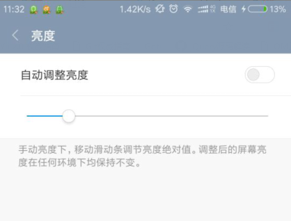

最终效果如图:

<!DOCTYPE html>

<html>

	<head>

		<meta charset="UTF-8">

		<title></title>

		<style>

			.switch-wrap {

				position: relative;

				margin: 50px auto;

				width: 120px;

				height: 40px;

				font: 14px/1.5 Arial, Sans-Serif;

			}

			.switch,

			.switch input,

			.switch input:before {

				width: 30px;

				height: 14px;

			}

			.switch input {

				position: absolute;

				right: 0;

			}

			.switch input:before {

				content: '';

				display: inline-block;

				position: relative;

				border-radius: 20px;

				border: 1px solid #ccccc6;

				box-shadow: 0 0 1px 1px #ececf3;

				background-color: #fff;

				cursor: pointer;

			}

			.switch input:after {

				content: '';

				position: absolute;

				width: 12px;

				height: 12px;

				top: 2px;

				left: 3px;

				border-radius: 50%;

				background-color: #ccccc6;

				transition: .2s left, .2s background-color;

			}

			.switch input:checked:after {

				left: 15px;

				background-color: #36a6fa;

				transition: .2s left, .2s background-color;

			}

		</style>

		<script src="jquery.js"></script>

		<script type="text/javascript">

			$('#switch').change(function() {

				$('.switch-action').text(this.checked ? '关闭' : '开启');

			});

		</script>

	</head>

	<body>

		<div class="switch-wrap">

			<span><span class="switch-action">开启</span>WLAN</span>

			<label class="switch">

            <input type="checkbox" name="switch" id="switch">

        </label>

		</div>

	</body>

</html>
实现过程
1. 选项框checkbox
模拟开关当然需要一个选项框,这里用到了复选框checkbox
2. 理解开关的过程
点击开关按钮,则开启或关闭。原生的checkbox无法做到图示的效果,所以就需要额外的元素来表示图中的开关
而我们又要使用到checkbox的点击效果以及点击后是否选中(checked)的效果,所以checkbox不能隐藏,但可以用覆盖的方式
为了减少多余标签的使用,可以使用伪元素:before、:after ,标签结构为
  <div class="switch-wrap">

        <span><span class="switch-action">开启</span>WLAN</span>

        <label class="switch">

            <input type="checkbox" name="switch" id="switch">

        </label>

    </div>
3. 开关的实现
用:before伪元素作为开关背景层,用:after伪元素作为开关项(即那个小圆圈)

        .switch input:before {

            content: '';

            display: inline-block;

            position: relative;

            border-radius: 20px;

            border: 1px solid #ccccc6;

            box-shadow: 0 0 1px 1px #ececf3;

            background-color: #fff;

            cursor: pointer;

        }
        .switch input:after {

            content: '';

            position: absolute;

            width: 12px;

            height: 12px;

            top: 2px;

            left: 3px;

            border-radius: 50%;

            background-color: #ccccc6;

            transition: .2s left, .2s background-color;

        }
初始小圆圈在左侧,当开关状态为开启时,右移,并更新开启状态的背景色
        .switch input:checked:after {

            left: 15px;

            background-color: #36a6fa;

            transition: .2s left, .2s background-color;

        }
以上就是关键的代码了,以下为完整的样式
 1 <style>

 2     .switch-wrap {

 3             position: relative;

 4             margin: 50px auto;

 5             width: 120px;

 6             height: 40px;

 7             font: 14px/1.5 Arial, Sans-Serif;

 8         }

 9

10         .switch,

11         .switch input,

12         .switch input:before {

13             width: 30px;

14             height: 14px;

15         }

16

17         .switch input {

18             position: absolute;

19             right: 0;

20         }

21

22         .switch input:before {

23             content: '';

24             display: inline-block;

25             position: relative;

26             border-radius: 20px;

27             border: 1px solid #ccccc6;

28             box-shadow: 0 0 1px 1px #ececf3;

29             background-color: #fff;

30             cursor: pointer;

31         }

32

33         .switch input:after {

34             content: '';

35             position: absolute;

36             width: 12px;

37             height: 12px;

38             top: 2px;

39             left: 3px;

40             border-radius: 50%;

41             background-color: #ccccc6;

42             transition: .2s left, .2s background-color;

43         }

44

45         .switch input:checked:after {

46             left: 15px;

47             background-color: #36a6fa;

48             transition: .2s left, .2s background-color;

49         }

50

51

52     </style>
4. 开关的测试
最后,可结合JS检测一下开关的状态变化
    <script src="jquery.js"></script>

    <script type="text/javascript">

        $('#switch').change(function() {

            $('.switch-action').text(this.checked ? '关闭' : '开启');

        });

    </script>
[-_-]眼睛累了吧,注意劳逸结合呀[-_-]
最新文章
- Kotlin的android扩展:对findViewById说再见(KAD 04)
- CSS:@font-face的使用方法
- [日常训练]FJ省夏令营day1
- 0506--Scrum项目1.0
- 银行卡号Luhm校验Java实现代码
- hdu5353 Average(模拟)
- Python求解数组重新组合求最小值(优酷)
- JDK中日期和时间的几个常用类浅析(三)
- UNIX域协议(命名套接字)
- linkin大话设计模式--常用模式总结
- Javascript的防抖和节流、VUE的防抖和节流
- jsonp 实现原理
- js计算base64文件流大小
- RQNOJ 3 Jam的计数法
- 使用共同函数,将PNotify弹出提示框公用
- [博客迁移]探索Windows Azure 监控和自动伸缩系列3 - 启用Azure监控扩展收集自定义监控数据
- Zend_Controller_Front 研究
- 闲话handle和handler
- day4 边缘检测Canny
- linux下MySQL停止和重启