【转载】无需图片,使用CSS3实现圆角按钮
2024-09-07 13:32:14
原文地址:http://www.open-open.com/home/space-37924-do-blog-id-5789.html
首先来看看效果:
事例HTML代码:
<a href="#" class="button green">button</a>

<a href="#" class="button blue">button</a>

<a href="#" class="button gray">button</a>
如果没有 CSS ,那么上面的 HTML 执行起来是这样的:

开始 CSS3 的编写:
.button {

    display: inline-block;

    position: relative;

    margin: 10px;

    padding: 0 20px;

    text-align: center;

    text-decoration: none;

    font: bold 12px/25px Arial, sans-serif;

}
一些不同颜色的按钮样式:
.green {

    color: #3e5706;

    background: #a5cd4e;

}

/* Blue Color */

.blue {

    color: #19667d;

    background: #70c9e3;

}

/* Gray Color */

.gray {

    color: #515151;

    background: #d3d3d3;

}
接下来开始用 CSS 处理圆角:
.button {

    display: inline-block;

    position: relative;

    margin: 10px;

    padding: 0 20px;

    text-align: center;

    text-decoration: none;

    font: bold 12px/25px Arial, sans-serif;

    text-shadow: 1px 1px 1px rgba(255,255,255, .22);

    -webkit-border-radius: 30px;

    -moz-border-radius: 30px;

    border-radius: 30px;

    -webkit-box-shadow: 1px 1px 1px rgba(0,0,0, .29), inset 1px 1px 1px rgba(255,255,255, .44);

    -moz-box-shadow: 1px 1px 1px rgba(0,0,0, .29), inset 1px 1px 1px rgba(255,255,255, .44);

    box-shadow: 1px 1px 1px rgba(0,0,0, .29), inset 1px 1px 1px rgba(255,255,255, .44);

    -webkit-transition: all 0.15s ease;

    -moz-transition: all 0.15s ease;

    -o-transition: all 0.15s ease;

    -ms-transition: all 0.15s ease;

    transition: all 0.15s ease;

}
现在的按钮圆润多了,看看:

还不够啊,没有立体效果,再完善完善:
/* Green Color */

.green {

    color: #3e5706;

    background: #a5cd4e; /* Old browsers */

    background: -moz-linear-gradient(top,  #a5cd4e 0%, #6b8f1a 100%); /* FF3.6+ */

    background: -webkit-gradient(linear, left top, left bottom, color-stop(0%,#a5cd4e), color-stop(100%,#6b8f1a)); /* Chrome,Safari4+ */

    background: -webkit-linear-gradient(top,  #a5cd4e 0%,#6b8f1a 100%); /* Chrome10+,Safari5.1+ */

    background: -o-linear-gradient(top,  #a5cd4e 0%,#6b8f1a 100%); /* Opera 11.10+ */

    background: -ms-linear-gradient(top,  #a5cd4e 0%,#6b8f1a 100%); /* IE10+ */

    background: linear-gradient(top,  #a5cd4e 0%,#6b8f1a 100%); /* W3C */

}

/* Blue Color */

.blue {

    color: #19667d;

    background: #70c9e3; /* Old browsers */

    background: -moz-linear-gradient(top,  #70c9e3 0%, #39a0be 100%); /* FF3.6+ */

    background: -webkit-gradient(linear, left top, left bottom, color-stop(0%,#70c9e3), color-stop(100%,#39a0be)); /* Chrome,Safari4+ */

    background: -webkit-linear-gradient(top,  #70c9e3 0%,#39a0be 100%); /* Chrome10+,Safari5.1+ */

    background: -o-linear-gradient(top,  #70c9e3 0%,#39a0be 100%); /* Opera 11.10+ */

    background: -ms-linear-gradient(top,  #70c9e3 0%,#39a0be 100%); /* IE10+ */

    background: linear-gradient(top,  #70c9e3 0%,#39a0be 100%); /* W3C */

}

/* Gray Color */

.gray {

    color: #515151;

    background: #d3d3d3; /* Old browsers */

    background: -moz-linear-gradient(top,  #d3d3d3 0%, #8a8a8a 100%); /* FF3.6+ */

    background: -webkit-gradient(linear, left top, left bottom, color-stop(0%,#d3d3d3), color-stop(100%,#8a8a8a)); /* Chrome,Safari4+ */

    background: -webkit-linear-gradient(top,  #d3d3d3 0%,#8a8a8a 100%); /* Chrome10+,Safari5.1+ */

    background: -o-linear-gradient(top,  #d3d3d3 0%,#8a8a8a 100%); /* Opera 11.10+ */

    background: -ms-linear-gradient(top,  #d3d3d3 0%,#8a8a8a 100%); /* IE10+ */

    background: linear-gradient(top,  #d3d3d3 0%,#8a8a8a 100%); /* W3C */

}
现在爽了,漂亮了,你喜欢这样的按钮吗?

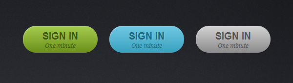
为了让按钮更大一点,我们增加了个 big 样式:
<a href="#" class="button big green">sign in <span>One minute</span></a>

<a href="#" class="button big blue">sign in <span>One minute</span></a>

<a href="#" class="button big gray">sign in <span>One minute</span></a>
/* Big Button Style */

.big {

    padding: 0 40px;

    padding-top: 10px;

    height: 45px;

    text-transform: uppercase;

    font: bold 20px/22px Arial, sans-serif;

}

.big span {

    display: block;

    text-transform: none;

    font: italic normal 12px/18px Georgia, sans-serif;

    text-shadow: 1px 1px 1px rgba(255,255,255, .12);

}
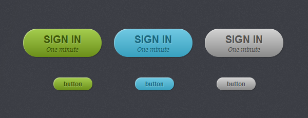
大按钮的效果:
我们还需要处理下当鼠标移到按钮上方时显示不同的效果:
.button:hover {

    -webkit-box-shadow: 1px 1px 1px rgba(0,0,0,.29), inset 0px 0px 2px rgba(0,0,0, .5);

    -moz-box-shadow: 1px 1px 1px rgba(0,0,0,.29), inset 0px 0px 2px rgba(0,0,0, .5);

    box-shadow: 1px 1px 1px rgba(0,0,0,.29), inset 0px 0px 2px rgba(0,0,0, .5);

}

.button:active {

    -webkit-box-shadow: inset 0px 0px 3px rgba(0,0,0, .8);

    -moz-box-shadow: inset 0px 0px 3px rgba(0,0,0, .8);

    box-shadow: inset 0px 0px 3px rgba(0,0,0, .8);

}
效果如下:

好了,完美的CSS3按钮解决方案。
最新文章
- Hello Bugs
- 【C#】分享一个弹出容器层,像右键菜单那样召即来挥则去
- jquery右键菜单
- PXE网络启动提示no default or ui configuration directive问题解决
- supersr--class_copyIvarList和class_copyPropertyList的区别
- css 中 list-style-image:
- Machine Schedule(poj 1274)
- 使用struts taglib导致java.lang.NullPointerException: Module 'null' not found.
- PetaPoco使用要点
- c# 集合ArrayList;特殊集合Stack、Queue
- leetcode Swap Nodes in Pairs python
- [置顶] c# datagridview‘s learn
- swift 定位 根据定位到的经纬度转换城市名
- [算法题] Search in Rotated Sorted Array ii
- java精确运算
- Memcache架构新思考
- synchronized和lock有什么区别?
- ICD
- 从Excel、CSV文件获取数据
- 在平衡树的海洋中畅游(三)——Splay
热门文章
- CodeForces 778D Parquet Re-laying 构造
- https refused 解决方法
- Android Studio自定义模板代码
- 《Cracking the Coding Interview》——第13章:C和C++——题目7
- 《Cracking the Coding Interview》——第6章:智力题——题目6
- Node应用进程管理器pm2的使用
- .netCore 反射 :Could not load file or assembly 系统找不到指定文件
- CodeForces-757B Bash's Big Day
- php连接数据库增删改查----多条件查询
- warning MSB3162: 所选的“Microsoft Report Viewer 2012 Runtime”项需要“Microsoft.SqlServer.SQLSysClrTypes.11.0”。在“系统必备”对话框中选择缺少的系统必备组件,或者为缺少的系统必备组件创建引导程序包。