关于css布局的记录(三) --布局实战
2024-10-18 10:36:21
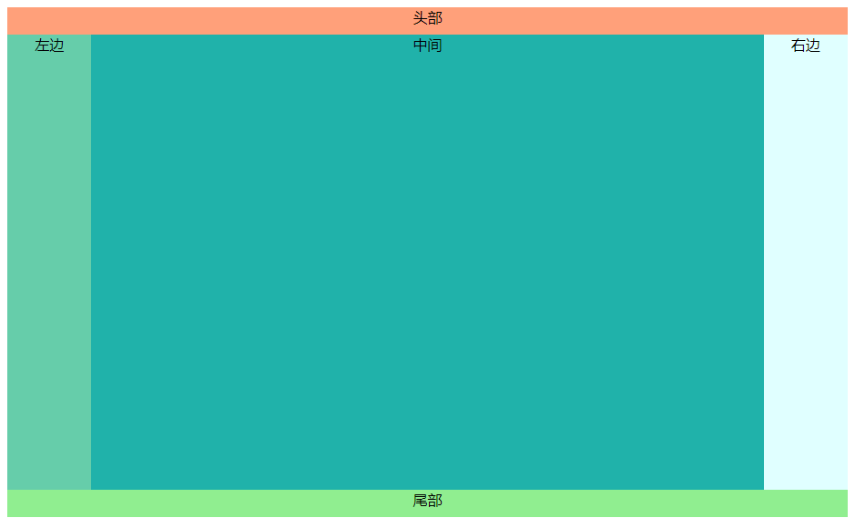
1、经典布局,上头下尾,两侧固定,中间自适应
效果图:
实现代码(普通):
<!DOCTYPE html>

<html lang="en">

<head>

    <meta charset="UTF-8">

    <title>test</title>

</head>

<style>

    .header{

        width:100%;

        height:30px;

        background-color:lightsalmon;

        text-align: center;

    }

    .footer{

        width:100%;

        height:30px;

        background-color:lightgreen;

        text-align: center;

    }

    .left{

        background-color:mediumaquamarine;

        margin-left:0%;

        width:10%;

    }

    .main{

        background-color:lightseagreen;

        width:80%;

    }

    .right{

        background-color:lightcyan;

        float:right;

        width:10%;

    }

    .left,.main,.right{

        height:100%;

        min-height:500px;

        display:inline-block;

        text-align: center;

    }

</style>

<body>

        <div class="header">头部</div>

            <div>

                <div class="left">左边

                </div><div class="main">中间

                </div><div class="right">右边</div>

            </div>

        <div class="footer">尾部</div>

</body>

</html>
2、用flex实现经典布局
应用默认的排序flex-direction:row及flex布局的默认效果代替了float,display:inline-block等效果
代码示例:
<!DOCTYPE html>

<html lang="en">

<head>

    <meta charset="UTF-8">

    <title>test</title>

</head>

<style>

    .body{

        display:flex;

        flex-wrap: wrap;

    }

    .header{

        width:100%;

        height:30px;

        background-color:lightsalmon;

        text-align: center;

    }

    .footer{

        width:100%;

        height:30px;

        background-color:lightgreen;

        text-align: center;

    }

    .left{

        background-color:mediumaquamarine;

        width:10%;

    }

    .main{

        background-color:lightseagreen;

        width:80%;

    }

    .right{

        background-color:lightcyan;

        width:10%;

    }

    .left,.main,.right{

        min-height:500px;

        text-align: center;

    }

</style>

<body>

    <div class="body">

        <div class="header">头部</div>

        <div class="left">左边</div>

        <div class="main">中间</div>

        <div class="right">右边</div>

        <div class="footer">尾部</div>

    </div>

</body>

</html>
3、用网格实现经典布局
用grid-template-columns定义每个的列宽
用grid-column定义每一列从哪个网线开始,哪个网线截止
代码示例:
<!DOCTYPE html>

<html lang="en">

<head>

    <meta charset="UTF-8">

    <title>test</title>

</head>

<style>

    .body{

        display:grid;

        grid-template-columns: 1fr 5fr 1fr;

    }

    .header{

        height:30px;

        background-color:lightsalmon;

        text-align: center;

        grid-column: 1/4;

    }

    .footer{

        width:100%;

        height:30px;

        background-color:lightgreen;

        text-align: center;

        grid-column: 1/4;

    }

    .left{

        background-color:mediumaquamarine;

        grid-column: 1/2;

    }

    .main{

        background-color:lightseagreen;

        grid-column: 2/3;

    }

    .right{

        background-color:lightcyan;

        grid-column: 3/4;

    }

    .left,.main,.right{

        min-height:500px;

        text-align: center;

    }

</style>

<body>

    <div class="body">

        <div class="header">头部</div>

        <div class="left">左边</div>

        <div class="main">中间</div>

        <div class="right">右边</div>

        <div class="footer">尾部</div>

    </div>

</body>

</html>
最新文章
- js创建与追加元素
- VMware中装Win2012并配置Hyper-v
- java学习第13天( java获取当前时间,有关大数据的运算及精确数字运算,Date类)
- 如果客户端禁用cookie,session还能使用吗?
- 【翻译】How To Tango With Django 1.5.4 第五章
- python——协程
- 【jQuery基础学习】12 jQuery学习感想
- sed命令用法详解
- TOAD Menu Shortcuts 快捷键
- 阻止长按复制页面中的内容;zepto中touch中的应用必须先加载event模块之后;
- day10、nfs+rsync全网备份及实时同步
- C++中explicit关键字
- 浅谈MySQL存储引擎-InnoDB&MyISAM
- 使用 Topshelf 创建 Windows 服务
- win7x64上配置 vs2015
- nginx-启动|关闭|重新加载配置文件的命令
- gitlab:开发+测试+发布的全流程图
- 帝国cms系统限制的登录次数不得超过5次请等60分钟过后方可重新登录
- API接口规范
- kafka-python的API简单介绍