FCC---Learn How Bezier Curves Work---定义坐标轴点的值,影响斜率,改变速度。具体调试换值既可以体会
The last challenge introduced the animation-timing-function property and a few keywords that change the speed of an animation over its duration.
CSS offers an option other than keywords that provides even finer control over how the animation plays out, through the use of Bezier curves.
In CSS animations, Bezier curves are used with the cubic-bezier function.
The shape of the curve represents how the animation plays out.
The curve lives on a 1 by 1 coordinate system.
The X-axis of this coordinate system is the duration of the animation (think of it as a time scale), and the Y-axis is the change in the animation.
The cubic-bezier function consists of four main points that sit on this 1 by 1 grid: p0, p1, p2, and p3. p0 and p3 are set for you - they are the beginning and end points which are always located respectively at the origin (0, 0) and (1, 1).
You set the x and y values for the other two points, and where you place them in the grid dictates the shape of the curve for the animation to follow.
This is done in CSS by declaring the x and y values of the p1 and p2 "anchor" points in the form: (x1, y1, x2, y2).
Pulling it all together, here's an example of a Bezier curve in CSS code:
animation-timing-function: cubic-bezier(0.25, 0.25, 0.75, 0.75);
In the example above, the x and y values are equivalent for each point (x1 = 0.25 = y1 and x2 = 0.75 = y2), which if you remember from geometry class, results in a line that extends from the origin to point (1, 1). This animation is a linear change of an element during the length of an animation, and is the same as using the linear keyword.
In other words, it changes at a constant speed.
练习题目:
For the element with the id of ball1, change the value of the animation-timing-function property from linear to its equivalent cubic-bezier function value.
Use the point values given in the example above.
练习代码:
 <style>

   .balls{

     border-radius: 50%;

     background: linear-gradient(

       35deg,

       #ccffff,

       #ffcccc

     );

     position: fixed;

     width: 50px;

     height: 50px;

     margin-top: 50px;

     animation-name: bounce;

     animation-duration: 2s;

     animation-iteration-count: infinite;

   }

   #ball1 {

     left: 27%;

     animation-timing-function: cubic-bezier(0.25, 0.25, 0.75, 0.75);

   }

   #ball2 {

     left: 56%;

     animation-timing-function: ease-out;

   }

   @keyframes bounce {

     0% {

       top: 0px;

     }

     100% {

       top: 249px;

     }

   }

 </style>

 <div class="balls" id="ball1"></div>

 <div class="balls" id="ball2"></div>
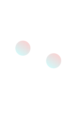
效果如下:
我的理解,也是2个球掉下,相同循环时间,你定义坐标轴2个点的值,再加上原点和(1,1),形成的曲线。
X轴是循环时间段,Y轴是变化值。例如,X是0.1,Y是0.9,意味在很少的时间内变化很大的值,速度会比较快。
具体也是调试数值,可以体会效果
最新文章
- [资源] Open source packages on SLAM
- [转]ionic tab view hide tab bar
- Python教程:[69]strip()函数详解
- ADT eclipse打开时出现Error: Error parsing C:\Users\admin*\.android\devices.xml
- hdu 4300(kmp)
- 使用PHP绘制统计图
- 两个iframe之间传值
- Java基础知识强化之IO流笔记08:异常的注意事项
- python高级编程之选择好名称:完2
- webstorm2016.2.4激活码
- C语言中,隐藏结构体的细节
- 原声js 五子棋 源码
- PHP通过URL获取文件大小
- Codeforces 626C
- php 定时任务
- spark面试总结4
- Apache rewrite地址重写
- 编程语言的分类及其优缺点,Python标准输入与输出
- P4491 [HAOI2018]染色
- jexus配置支持Owin