css3基础-动画案例(没啥实用性,纯粹好玩的)
2024-10-08 08:48:27
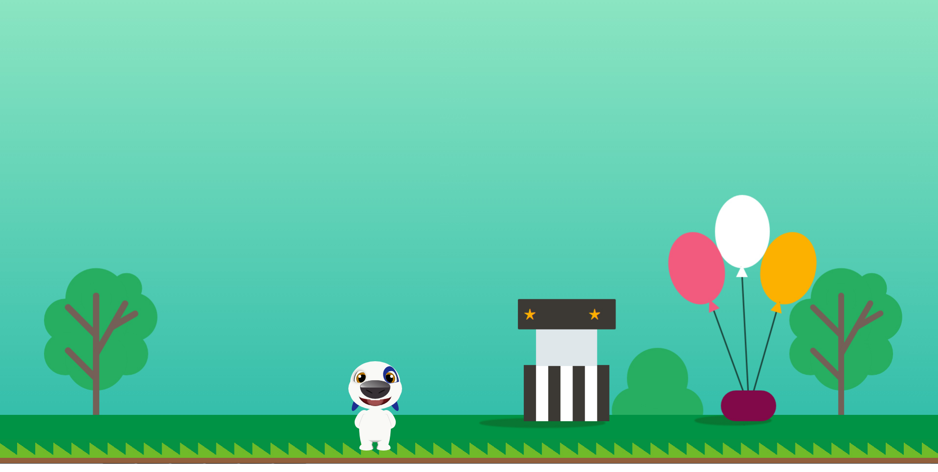
会动的汉克狗:
<!doctype html>

<html lang="en">

<head>

    <meta charset="UTF-8">

    <title>Cartoon Dog</title>

</head>

<body>

    <div class="dog">

        <div class="head">

            <div class="forehead"></div>

            <div class="face"></div>

            <div class="chin"></div>

            <div class="eye">

                <div class="pupil"></div>

            </div>

            <div class="eye right">

                <div class="pupil"></div>

            </div>

            <div class="birthmark"></div>

            <div class="ear"></div>

            <div class="ear right"></div>

            <div class="nose">

                <div class="nostril"></div>

                <div class="nostril right"></div>

            </div>

            <div class="mouth">

                <div class="teen no11"></div>

                <div class="teen no21"></div>

                <div class="tongue"></div>

            </div>

        </div>

        <div class="body">

            <div class="arm"></div>

            <div class="arm right"></div>

            <div class="leg">

                <div class="foot"></div>

            </div>

            <div class="leg right">

                <div class="foot"></div>

            </div>

            <div class="belly"></div>

        </div>

    </div>

    <style>

    :root {

        --bg: rgb(249, 249, 246);

        --hl: rgb(27, 47, 144);

        --t: 2s;

    }

    body {

        background: url(img/bg.jpg) no-repeat;

        background-size: 100%;

        overflow: hidden;

    }

    .dog {

        position: relative;

        top: 78vh;

        left: -10vw;

        /*transform: scale(1, 1);*/

    }

    .head {

        width: 275px;

        height: 275px;

        position: relative;

        margin: 0 auto;

    }

    .ear {

        animation: rotate var(--t) ease-out infinite;

        position: absolute;

        left: 50%;

        margin-left: -38px;

        top: 14px;

        z-index: 0;

        background-color: var(--hl);

        width: 16px;

        height: 70px;

        border-radius: 50%;

    }

    .ear.right {

        animation: rotate-right var(--t) ease-out infinite;

        transform: scale(-1, 1);

        margin-left: 22px;

    }

    .forehead {

        left: 50%;

        transform: translate(-50%, 0);

        top: -22px;

        border-radius: 51px / 43px 43px 5px 5px;

        width: 102px;

        height: 48px;

        background: var(--bg);

        position: absolute;

        z-index: 1

    }

    .face {

        left: 50%;

        transform: translate(-50%, 0);

        width: 110px;

        height: 68px;

        position: absolute;

        background: var(--bg);

        z-index: 1;

        border-radius: 40% / 50%;

    }

    .chin {

        left: 50%;

        transform: translate(-50%, 0);

        width: 104px;

        height: 36px;

        position: absolute;

        background: var(--bg);

        z-index: 1;

        border-radius: 50% / 0 0 36px 36px;

        top: 41px;

    }

    .eye {

        overflow: hidden;

        box-shadow: 2px 0px 0px -1px #000 inset, -1px -1px 7px 1px #bbb;

        left: 50%;

        transform: translate(-43.5px, 0);

        width: 24px;

        height: 24px;

        position: absolute;

        background: var(--bg);

        z-index: 2;

        border-radius: 50% / 20px 12px 12px 4px;

        top: -2px;

    }

    .eye.right {

        box-shadow: 2px 0px 0px -1px #000 inset;

        transform: scale(-1, 1) translate(-21.5px, 0);

    }

    .birthmark {

        left: 50%;

        transform: rotate(-10deg) translate(16.5px, 0);

        width: 30px;

        height: 36px;

        position: absolute;

        background: var(--hl);

        z-index: 2;

        border-radius: 50% / 18px 34px 2px 18px;

        top: -9px;

        z-index: 1

    }

    .birthmark:after {

        content: '';

        width: 100%;

        height: 2px;

        background: var(--bg);

        border-radius: 2px 2px 0 0;

        position: absolute;

        bottom: -1px;

        left: 1px

    }

    .nose {

        left: 50%;

        transform: translate(-50%, 0);

        width: 62px;

        height: 38px;

        position: absolute;

        background: #363035;

        z-index: 2;

        border-radius: 50% / 35% 35% 65% 65%;

        top: 17px

    }

    .nose:before {

        content: '';

        width: 98%;

        height: 40%;

        left: 50%;

        transform: translate(-50%, 0);

        position: absolute;

        background: linear-gradient(30deg, #fff 0%, #fff 5%, #aaa 20%, #363035 100%);

        border-radius: 50% / 90% 90% 10% 10%;

        opacity: 0.8

    }

    .mouth {

        animation: close var(--t) ease-out infinite;

        box-shadow: 0 0 6px 0 #000 inset;

        left: 50%;

        transform: translate(-50%, 0);

        width: 68px;

        height: 27px;

        position: absolute;

        background: #671316;

        z-index: 1;

        border-radius: 50% / 0 0 100% 100%;

        top: 45px

    }

    .mouth:before {

        content: '';

        z-index: 3;

        width: 100%;

        height: 50%;

        left: 50%;

        transform: translate(-50%, 0);

        position: absolute;

        background: var(--bg);

        border-radius: 50% / 0 0 70% 70%

    }

    .pupil {

        animation: tranlate var(--t) ease-out infinite;

        box-shadow: 0 0 6px 0 #000 inset;

        width: 26px;

        height: 26px;

        border-radius: 50%;

        background: #e79101;

        position: absolute;

        left: 3px;

        top: 3px

    }

    .pupil:before {

        border-radius: 50%;

        content: '';

        width: 18px;

        height: 18px;

        position: absolute;

        left: 50%;

        top: 50%;

        transform: translate(-50%, -50%);

        background: #000

    }

    .pupil:after {

        border-radius: 50%;

        content: '';

        width: 6px;

        height: 6px;

        position: absolute;

        left: 27%;

        top: 30%;

        transform: translate(-50%, -50%);

        background: #fff

    }

    .nostril {

        animation: resize var(--t) ease-out infinite;

        position: absolute;

        left: 50%;

        transform: translate(-20px, 0) rotate(28deg);

        top: 22px;

        z-index: 0;

        background: linear-gradient(0deg, #363035 0%, #000 100%);

        width: 15px;

        height: 4px;

        border-radius: 50%;

    }

    .nostril.right {

        transform: scale(-1, 1) translate(-6px, 0) rotate(28deg)

    }

    .teen {

        animation: follow var(--t) ease-out infinite;

        border-radius: 0 0 1px 2px;

        transform: translate(-50%, 0);

        width: 10px;

        height: 3px;

        background: var(--bg);

        position: absolute;

        top: 12px;

        left: 43%;

        z-index: 2

    }

    .teen.no21 {

        transform: scale(-1, 1) translate(-50%, 0)

    }

    .tongue {

        animation: extend var(--t) ease-out infinite;

        box-shadow: 0 0 6px 0 rgba(0, 0, 0, 0.5) inset;

        width: 34px;

        height: 18px;

        border-radius: 50% / 0 0 50% 50%;

        transform: translate(-50%, 0);

        position: absolute;

        left: 50%;

        z-index: 1;

        background: #a2504f

    }

    .body {

        width: 66px;

        height: 70px;

        position: absolute;

        left: 50%;

        transform: translate(-50%, 0);

        background: var(--bg);

        border-radius: 50%;

        top: 74px;

    }

    .arm {

        width: 26px;

        height: 40px;

        position: absolute;

        left: 50%;

        transform: translate(-40px, 0) rotate(22deg);

        background: var(--bg);

        border-radius: 50% / 25px 0 0 15px;

        top: 3px;

    }

    .arm.right {

        transform: scale(-1, 1) translate(-14px, 0) rotate(22deg);

    }

    .arm:before {

        content: '';

        width: 6px;

        height: 28px;

        box-shadow: -1px 0 0 0px #ddd;

        position: absolute;

        right: 8px;

        top: 8px;

        border-radius: 6px / 8px 0 0 20px

    }

    .leg {

        width: 29px;

        height: 50px;

        position: absolute;

        left: 50%;

        transform: translate(-33px, 0);

        background: linear-gradient(-80deg, #000 0%, var(--bg) 17%, var(--bg) 100%);

        border-radius: 50% / 0px 25px 25px 50px;

        top: 37px;

    }

    .leg.right {

        transform: scale(-1, 1) translate(-3px, 0)

    }

    .foot {

        width: 29px;

        height: 15px;

        position: absolute;

        left: 50%;

        transform: translate(-50%, 0);

        background: linear-gradient(-107deg, #000 0%, var(--bg) 17%, var(--bg) 100%);

        border-radius: 50% / 10px 10px 5px 5px;

        bottom: 0px;

    }

    .belly {

        width: 60px;

        height: 36px;

        position: absolute;

        left: 50%;

        transform: translate(-50%, 0);

        background: linear-gradient(0deg, #999 0%, var(--bg) 14%, var(--bg) 100%);

        border-radius: 50% / 0 0 36px 36px;

        bottom: 0px;

    }

    @keyframes rotate {

        0% {

            transform: rotate(0deg)

        }

        ,

        5% {

            transform: rotate(0deg)

        }

        55% {

            transform: rotate(30deg)

        }

        100% {

            transform: rotate(0deg)

        }

    }

    @keyframes rotate-right {

        0% {

            transform: rotate(0deg)

        }

        ,

        5% {

            transform: rotate(0deg)

        }

        55% {

            transform: rotate(-30deg)

        }

        100% {

            transform: rotate(0deg)

        }

    }

    @keyframes tranlate {

        0% {

            transform: translate(0px, 0)

        }

        ,

        5% {

            transform: translate(0px, 0)

        }

        55% {

            transform: translate(2px, 0)

        }

        100% {

            transform: translate(0px, 0)

        }

    }

    @keyframes resize {

        0% {

            height: 4px

        }

        ,

        5% {

            height: 4px

        }

        55% {

            height: 3px

        }

        100% {

            height: 4px

        }

    }

    @keyframes extend {

        0% {

            height: 18px

        }

        ,

        5% {

            height: 18px

        }

        55% {

            height: 25px

        }

        100% {

            height: 18px

        }

    }

    @keyframes close {

        0% {

            height: 27px

        }

        ,

        5% {

            height: 27px

        }

        55% {

            height: 24px

        }

        100% {

            height: 27px

        }

    }

    @keyframes follow {

        0% {

            top: 12px

        }

        ,

        5% {

            top: 12px

        }

        55% {

            top: 10px

        }

        100% {

            top: 12px

        }

    }

    </style>

</body>

</html>
小兔子动画:
<!DOCTYPE html>

<html lang="en">

<head>

    <meta charset="UTF-8">

    <title>index</title>

    <link rel="stylesheet" href="css/index.css">

</head>

<body>

    <!-- 天空 -->

    <div class="sky">

        <!-- 云 -->

        <div id="cloud1" class="cloud"></div>

        <div id="cloud2" class="cloud"></div>

        <div id="cloud3" class="cloud"></div>

        <div id="cloud4" class="cloud"></div>

        <div id="cloud5" class="cloud"></div>

    </div>

    <!-- 草地 -->

    <div class="grass">

        <img class="rabbit" src="img/rabbit.png" alt="rabbit">

    </div>

</body>

</html>
Index.css

*{margin:0;padding:0;}

html,body{width:100%;height:100%;overflow: hidden;}

.sky{

    width:100%;

    height:60%;

    position: relative;

    background: -webkit-linear-gradient(0deg, rgba(196, 228, 253,0), rgba(196, 228, 253,0.8));

    background:    -moz-linear-gradient(0deg, rgba(196, 228, 253,0), rgba(196, 228, 253,0.8));

    background:      -o-linear-gradient(0deg, rgba(196, 228, 253,0), rgba(196, 228, 253,0.8));

    background:         linear-gradient(0deg, rgba(196, 228, 253,0), rgba(196, 228, 253,0.8));

}

.grass{

    width:100%;

    height:40%;

    position: relative;

    background: -webkit-linear-gradient(0deg, rgba(148, 190, 89,0.8), rgba(148, 190, 89,0));

    background:    -moz-linear-gradient(0deg, rgba(148, 190, 89,0.8), rgba(148, 190, 89,0));

    background:      -o-linear-gradient(0deg, rgba(148, 190, 89,0.8), rgba(148, 190, 89,0));

    background:         linear-gradient(0deg, rgba(148, 190, 89,0.8), rgba(148, 190, 89,0));

}

/*云的统一样式*/

.cloud{

    position: absolute;

    background-color: #fff;

    border-radius: 50%;

    width: 100px;

    height: 103px;

    opacity: 0.5;

    z-index: 1;

}

.cloud:before{

    content: '';

    transform: translate(-50%, 0);

    position: absolute;

    left: -49%;

    top: 8px;

    border-radius: 43px;

    background-color: #fff;

    width: 65px;

    height: 103px;

    z-index: 4;

    transform: rotate(-30deg);

}

.cloud:after{

    content: '';

    transform: translate(-50%, 0);

    width: 221%;

    height: 62px;

    border-radius: 52px;

    background-color: #fff;

    position: absolute;

    top: 28px;

    left: 25px;

    z-index: 3;

}

/*每一朵云的单独样式*/

#cloud1{opacity: 0.5;left: 51%;top: 22px;z-index:10;

        animation: cloud_move 15s ease-out infinite;}

#cloud2{opacity: 0.7;left: 11%;top: 85px;z-index:30;

        animation: cloud_move 18s ease-out infinite;}

#cloud3{opacity: 0.8;left: 41%;top: 104px;z-index:50;

        animation: cloud_move 12s ease-out infinite;}

#cloud4{opacity: 0.6;left: 71%;top: 78px;z-index:20;

        animation: cloud_move 26s ease-out infinite;}

#cloud5{opacity: 0.9;left: 91%;top: 138px;z-index:40;

        animation: cloud_move 40s ease-out infinite;}

/*云朵动画*/

@keyframes cloud_move {

    0% {left: 110%;}

    100% {left: -10%;}

}

.rabbit{position: absolute;bottom:50px;right:200px;width:300px;}

自定义属性必须遵循CSS级联规则,使用:root 作用域来定义全局变量,由于自定义属性是全局的,为了避免冲突,最好按照统一的约定来命名变量,如果想让某个变量只在部分元素/组件下可见,只需要在特定的元素下定义该变量,并且自定义全局属性,为了避免冲突,可以简单的遵循BEM命名法来形成”命名空间”
body {

  --foo: #7F583F;

  --bar: #F7EFD2;

}

a {

  color: var(--foo);

  text-decoration-color: var(--bar);

}
最新文章
- tengine/nginx-tomcat动静分离遇到的问题
- word域1
- ssh 无密码登陆
- easyui datagrid使用参考
- Baxter机器人---测试准备(一)
- php部分--数组(包含指针思想遍历数组);
- Maven项目的目录结构
- Linux应用开发环境搭建
- Struts2 学习笔记19 类型转换 Part1
- [Swust OJ 794]--最近对问题(分治)
- vs2013内置IISExpress相关问题
- PAT (Advanced Level) 1106. Lowest Price in Supply Chain (25)
- 百度云bcc建站
- android 适配器 ArrayAdapter,SimpleAdapter的学习
- 【吐槽向】iOS 中的仿射变换
- 任务管理器中的PID找不到
- ES的基本用法
- Springboot的异常处理与自定义异常
- db2常用语句
- git 入门教程之实战 git