css文字颜色渐变的3种实现
2024-09-04 22:45:47
在web前端开发过程中,UI设计师经常会设计一些带渐变文字的设计图,在以前我们只能用png的图片来代替文字,今天可以实现使用纯CSS实现渐变文字了。下面就介绍3中实现方式供大家参考!
基础样式:
.gradient-text{text-align: left;text-indent:30px;line-height: 50px;font-size:40px;font-weight:bolder; position: relative; }第一种方法,使用 background-cli、 text-fill-color:
.gradient-text-one{

    background-image:-webkit-linear-gradient(bottom,red,#fd8403,yellow);

    -webkit-background-clip:text;

    -webkit-text-fill-color:transparent;

}
说明 :
background: -webkit-linear-gradient(...) 为文本元素提供渐变背景。
webkit-text-fill-color: transparent 使用透明颜色填充文本。
webkit-background-clip: text 用文本剪辑背景,用渐变背景作为颜色填充文本。
第二种方法,使用 mask-image:
.gradient-text-two{

   color:red;

}

.gradient-text-two[data-content]::after{

    content:attr(data-content);

    display: block;

    position:absolute;

    color:yellow;

    left:0;

    top:0;

    z-index:2;

    -webkit-mask-image:-webkit-gradient(linear, 0 0, 0 bottom, from(yellow), to(rgba(0, 0, 255, 0)));

}
说明:
mask-image 和 background-image 一样,不仅可以取值是 图片路径,也可以是渐变色。
第三种方法,使用 linearGradient、fill:
.gradient-text-three{

    fill:url(#SVGID_1_);

    font-size:40px;

    font-weight:bolder;

}
<svg viewBoxs="0 0 500 300" class="svgBox">
<defs>
<linearGradient id="SVGID_1_" gradientUnits="userSpaceOnUse" x1="0" y1="10" x2="0" y2="50">
<stop offset="0" style="stop-color:yellow"/>
<stop offset="0.5" style="stop-color:#fd8403"/>
<stop offset="1" style="stop-color:red"/>
</linearGradient>
</defs>
<text text-anchor="middle" class="gradient-text-three" x="110px" y="30%">花信年华</text>
</svg>说明:
在SVG中,有两种主要的渐变类型:
线性渐变(linearGradient)
放射性渐变(radialGradient)
SVG中的渐变不仅可以用于填充图形元素,还可以填充文本元素
dom示例:
<!DOCTYPE html>
<html>
<head>
<meta charset="utf-8">
<meta name="viewport" content="width=device-width, user-scalable=no, initial-scale=1.0, maximum-scale=1.0, minimum-scale=1.0">
<title>CSS3渐变字体</title>
<link rel="stylesheet" href="https://cdn.bootcss.com/bootstrap/3.3.7/css/bootstrap.min.css">
<script src="https://cdn.bootcss.com/jquery/2.1.1/jquery.min.js"></script>
<script src="https://cdn.bootcss.com/bootstrap/3.3.7/js/bootstrap.min.js"></script>
<style type="text/css">
*{margin:0;padding:0;}
body,html{width:100%;height:100%;}
.wrapper{width:80%;margin:0 auto;margin-top:30px;}
.gradient-text{text-align: left;text-indent:30px;line-height: 50px;font-size:40px;font-weight:bolder; position: relative; }
.gradient-text-one{
background-image:-webkit-linear-gradient(bottom,red,#fd8403,yellow);
-webkit-background-clip:text;
-webkit-text-fill-color:transparent;
}
.gradient-text-two{
color:red;
}
.gradient-text-two[data-content]::after{
content:attr(data-content);
display: block;
position:absolute;
color:yellow;
left:0;
top:0;
z-index:2;
-webkit-mask-image:-webkit-gradient(linear, 0 0, 0 bottom, from(yellow), to(rgba(0, 0, 255, 0)));
}
.gradient-text-three{
fill:url(#SVGID_1_);
font-size:40px;
font-weight:bolder;
}
</style>
</head>
<body>
<section class="wrapper">
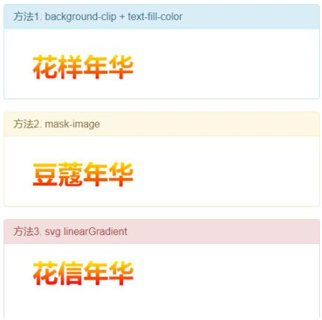
<div class="panel panel-info">
<div class="panel-heading">
<h3 class="panel-title">方法1. background-clip + text-fill-color</h3>
</div>
<div class="panel-body">
<h3 class="gradient-text gradient-text-one">花样年华</h3>
</div>
</div>
<div class="panel panel-warning">
<div class="panel-heading">
<h3 class="panel-title">方法2. mask-image</h3>
</div>
<div class="panel-body">
<h3 class="gradient-text gradient-text-two" data-content="豆蔻年华">豆蔻年华</h3>
</div>
</div>
<div class="panel panel-danger">
<div class="panel-heading">
<h3 class="panel-title">方法3. svg linearGradient</h3>
</div>
<div class="panel-body">
<svg viewBoxs="0 0 500 300" class="svgBox">

    <defs>

        <linearGradient id="SVGID_1_" gradientUnits="userSpaceOnUse" x1="0" y1="10" x2="0" y2="50">

            <stop  offset="0" style="stop-color:yellow"/>

            <stop  offset="0.5" style="stop-color:#fd8403"/>

            <stop  offset="1" style="stop-color:red"/>

        </linearGradient>

    </defs>

    <text text-anchor="middle" class="gradient-text-three" x="110px" y="30%">花信年华</text>

</svg>
</div>
</div>
</section>
</body>
</html>效果:
前端技术分享点击:加入
最新文章
- Scalaz(24)- 泛函数据结构: Tree-数据游览及维护
- bash的操作环境[转]
- sdibt 1244 烦人的幻灯片
- Java-Java中System.arraycopy() 和 Arrays.copyOf()两者之间的区别
- 【bzoj1047】理想的正方形
- 给宏基装WIN8.1系统之问题与解决方法(原创)
- JqueryMobile动态生成listView并实现刷新的两种方法
- spring(三)----大概是最简单的面向切面了
- jQuery在on绑定事件时,使用Function.prototype.bind上下文,只能用off(event)解绑函数,否则可能导致事件叠加
- Python局部变量和全局变量global
- win7设置虚拟wifi
- Oracle EBS-SQL (WIP-13):检查任务组件未选MRP净值.sql
- 看到关于socket非阻塞模式设置方式记录一下。
- Apache & WebDav 配置(一)
- VS2012编写C语言项目
- JS正则替换字符串
- jquery 分页控件1
- 再起航,我的学习笔记之JavaScript设计模式17(模板方法模式)
- linux查看空间情况----df与du命令
- bzoj 1283 序列 - 费用流
热门文章
- 洛谷 简单字符串 'P1055ISBN号码' 问题
- JZ-047-求 1+2+3+...+n
- Spring入门二:整合mybatis
- VirtualBox--修改虚拟硬盘大小
- docker学习笔记(1)- 架构概述
- Spring Cloud Alibaba 2021.0.1.0 发布:版本号再也不迷糊了
- linux 中 /dev/null和/dev/zero的作用以及区别
- PointNet: Deep Learning on Point Sets for 3D Classification and Segmentation
- 火狐firebug&firepath插件安装
- asp.net多语言网站的完整解决方案