布局神器:Flexbox
最近的工作内容大多是移动端网页的开发,百分比布局,Media Queries,Bootstrap等常规的响应式/自适应的开发技术皆一一试过,但觉以上都不够灵活,所以,一直再尝试寻求更加灵活的精确的移动端网页设计技术。
寻求的过程中知道了两个让我眼前一亮的解决方案:一个是Flexbox;另外一个是REM。
初次见到Flexbox的神奇用法,是在慕课网上看到《Flexbox,更优雅的布局》的视频教程:http://www.imooc.com/video/6048
让我眼前一亮的是如下的功能:
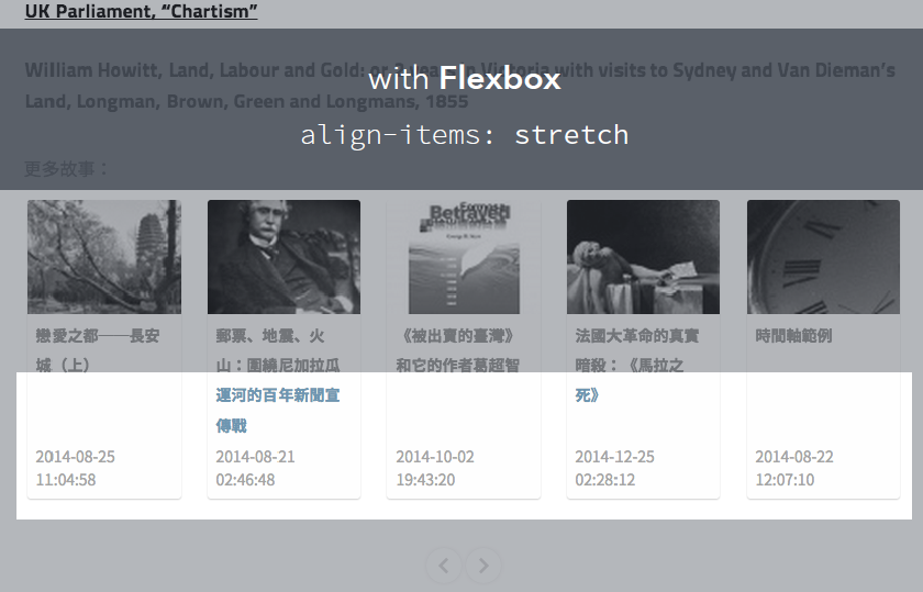
在线测试demo
http://ued.ctrip.com/blog/wp-content/webkitcss/demo/align-items.html
利用工作完成之余,在两天的时间内对Flexbox进行了一次全面的认识与实践,越发喜爱这个神器。
1# 让我们来认识下:什么是Flexbox?
能够按照设置好的规则来排列容器内的项目,而不必去计算每一个项目的宽度和边距。甚至是在容器的大小发生改变的时候,都可以重新计算,以至于更符合预期的排版。不仅解放了计算器,而且更加优美的服务于响应式设计.
flex的字面意思是,伸缩性的、弯曲的,引申含义为可自由配置的、灵活的意思。CSS3中的flex属性也是这么理解,具有flex属性的容器和容器内的项目都具有弹性计算的能力,以至于符合预定的规则
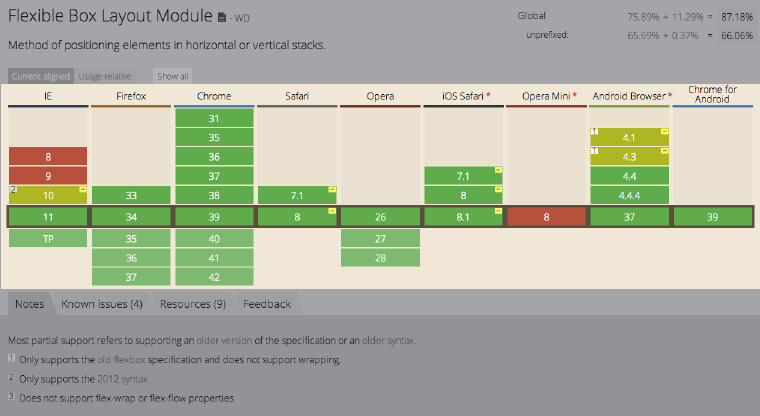
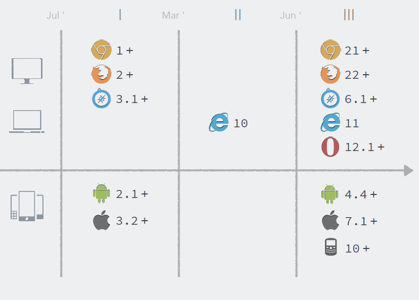
2# Flexbox对浏览器的兼容性
3#Flexbox原理
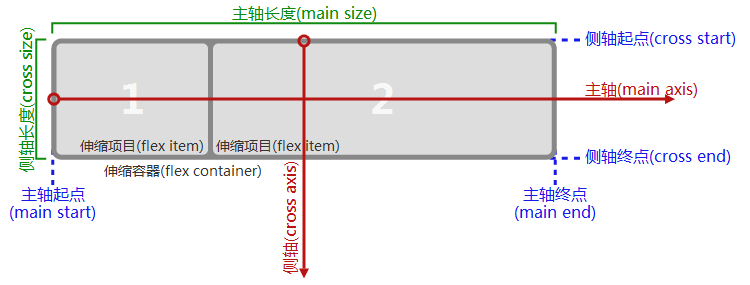
一个设有「display:flex」或「display:inline-flex」的元素是一个伸缩容器,伸缩容器的子元素被称为伸缩项目,这些子元素使用伸缩布局模型来排版。与布局计算偏向使用书写模式方向的块布局与行内布局不同,伸缩布局偏向使用伸缩流的方向。「flex-flow」的值决定了这些术语如何对应到物理方向(上/右/下/左)、物理轴(垂直/水平)、物理大小(宽度/高度)。
4、flex容器属性
4.1、display(应用于flex属性)
flex:相当于block
inline-flex:相当于inline-block
4.2、flex-direction(流动布局的主轴方向)
row(默认):行方向,在“ltr”(left-to-right)排版方式下从左向右排列;在“rtl”(right-to-left)排版方式下从右向左排列。
row-reverse:行反方向,与row排列方向相反。在“ltr”(left-to-right)排版方式下从右向左排列;在“rtl”(right-to-left)排版方式下从左向右排列。
column:列方向,与行方向垂直。在“ttb”(top-to-bottom)排版方式下从上向下排列;在“btt”(bottom-to-top)排版方式下从下向上排列。
column-reverse:类似于row-reverse,与column排列方向相反。在“ttb”(top-to-bottom)排版方式下从下向上排列;在“btt”(bottom-to-top)排版方式下从上向下排列。
4.3、flex-wrap(流动布局的侧轴方向)
nowrap(默认):无侧轴,即不换行。
wrap:侧轴垂直于主轴。在“ltr”、“rtl”排版方式下,侧轴方向向下;在“ttb”、“btt”排版方式下,侧轴方向向左。
wrap-inverse:与wrap属性相反。
4.4、flex-flow(“flex-direction”和“flex-wrap”属性的缩写)
row nowrap为其默认属性值,分别表示flex-direction和flex-wrap属性。
4.5、justify-content(主轴方向内容对齐方式)
flex-srart(默认):与主轴起始方向对齐。
flex-end:向主轴终点方向对齐。
center:向主轴中点方向对齐。
space-between:起始位置向主轴起始方向对齐,终点位置向主轴终点方向对齐,其余位置向主轴中点方向对齐。
space-around:与space-between类似,只是起始位置和终点位置保留一半空白。
以上描述,参考下图:

4.6、align-content(多个主轴沿侧轴方向的内容堆栈对齐方式)
flex-start:多个主轴沿侧轴起始方向对齐。
flex-end:多个主轴沿侧轴终点方向对齐。
center:多个主轴沿侧轴中点方向对齐。
space-between:第一个主轴沿主轴起始方向对齐,末尾主轴沿主轴终点方向对齐,其他主轴均匀分布对齐。
space-around:与space-between类似,只是侧轴起始位置和侧轴终点位置保留一半空白。
stretch(默认):伸缩多个主轴,保持侧轴方向统一距离。
以上描述,参考下图:

4.7、align-items(侧轴方向内容对齐方式)
与justify-content类似,只是这里的参考方向为侧轴。
stretch(默认):在侧轴方向拉伸每个项目,使每个项目保持相同的起始位置和终点位置。
flex-srart:与侧轴起始方向对齐。
flex-end:向侧轴终点方向对齐。
center:向侧轴中点方向对齐。
baseline:在侧轴上保持基线对齐,以第一个项目的基线为准。
以上描述,参考下图:

4.8、flex项目属性3.1、order(排序)
整数,默认为0,负无穷到正无穷。容器中的项目都是依order值从小到大排列,order值越大越就越在主轴方向的末尾。比如:
4.9、flex-grow(空白空间分配比例)
大于0的正数值。
4.10、flex-shrink(项目空间分配比例)
大于0的正数值。
4.11、flex-basis(项目的主轴方向长度)
如果项目制定了实际长度,则此长度为主。否则为自动计算长度。默认为auto。
4.12、flex(flex-grow、flex-shrink和flex-basis三个属性的简写)
格式为:flex: none | [ <'flex-grow'> <'flex-shrink'>? || <'flex-basis'> ]
4.13、align-self(项目在侧轴方向的对齐方式)
参考于容器的align-items(2.7)。
-------------------------------------------------
实例

html
<!DOCTYPE html>

<html lang="en">

<head>

	<meta charset="UTF-8">

	<title>demo:clearfix</title>

	<link rel="stylesheet" type="text/css" href="css/flex.css">

</head>

<body>

<!--flex:垂直/水平居中-->

<div class="wrap">

	<h3>flex:垂直/水平居中:<span class="code">{display:flex;justify-content:center;align-items:center}</span></h3>

<div class="demo">

	<img src="img/1.jpg">

</div>

<div class="demo">

	<img src="img/2.jpg">

</div>

<div class="demo">

<img src="img/3.jpg">

</div>

<div class="demo">

	<img src="img/1.jpg">

</div>

<div class="demo">

	<img src="img/2.jpg">

</div>

<div class="demo">

	<img src="img/4.jpg">

</div>

</div>

<!--水平响应式列表-->

<div class="wrap">

<h3>水平响应式列表:<span class="code">{display:flex;justify-content:space-between;}</span></h3>

	<div class="demo1">

		<div class="item item1">高120px</div>

		<div class="item item2">高50px</div>

		<div class="item item3">高140px</div>

		<div class="item item4">高100px</div>

	</div>

</div>

<!--水平响应式列表底端对齐-->

<div class="wrap">

<h3>水平响应式列表底端对齐:<span class="code">{display:flex;justify-content:space-around;align-items:flex-end;}</span></h3>

	<div class="demo2">

		<div class="item item1">高120px</div>

		<div class="item item2">高50px</div>

		<div class="item item3">高140px</div>

		<div class="item item4">高100px</div>

	</div>

</div>

<!--多行响应式布局-->

<div class="wrap">

<h3>多行响应式布局:<span class="code">{display:flex;justify-content:space-around;align-items:flex-end;flex-wrap:wrap;}</span></h3>

	<div class="demo3">

		<div class="item"></div>

		<div class="item"></div>

		<div class="item"></div>

		<div class="item"></div>

		<div class="item"></div>

		<div class="item"></div>

		<div class="item"></div>

		<div class="item"></div>

	</div>

</div>

<!--左固定右自适应等高布局-->

<div class="wrap">

<h3>左固定右自适应等高布局:<span class="code">{display:flex(父);flex-grow:0(子/固定);flex-grow:1(子/自适应);}</span></h3>

<div class="demo4">

	<div class="left">左边固定宽度为100px,这里设置了高度为auto</div>

	<div class="right">右边宽度自适应,并且左右两个区域是等高的,这里设置了高度为200px</div>

</div>

</div>

<!--左右固定中间自适应宽度底部对齐布局-->

<div class="wrap">

<h3>左右固定中间自适应宽度底部对齐布局:<span class="code">{display:flex(父);flex-grow:0(子/左/固定);flex-grow:1(子/中/自适应);flex-grow:0(子/右/固定);}</span></h3>

<div class="demo5">

	<div class="left">左边固定宽度为200px,这里设置了高度为auto</div>

	<div class="center">中间宽度自适应,并且左右两个区域是等高的,这里设置了高度为200px</div>

	<div class="right">右边固定宽度为200px,这里设置了高度为auto</div>

</div>

</div>

</body>

</html>
 /*

 *built by @kevin

 *2015/4/2

 *for learning flex

 *http://qianduanblog.com/post/css-learning-16-css3-flex-responsive-design.html

 *http://qianduanblog.com/post/css-learning-18-css3-flex-responsive-design-example.html

 *https://github.com/amfe/lib.flexible相关解决方案

  */

 *{

     margin:;

     padding:;

 }

 body{

     padding: 15px;

 }

 .wrap {

     font-family: "microsoft yahei";

     width: 100%;

     margin-bottom: 50px;

    display: inline-block;

 }

 h3{

     text-align: center;

     margin-bottom: 20px;

     color: #999;

 }

 .demo{

     width: 188px;

     height: 188px;

     background: #f5f5f5;

     margin:5px;

     float: left;

     margin-left: 20px;

     /*flex布局(作用于容器)*/

     display: flex;

     /*水平居中(作用于容器)*/

     justify-content: center;

     /*垂直居中(作用于容器)*/

     align-items: center;

 }

 .demo img{

     max-width: 150px;

     max-height: 150px;

     width: auto;

     height: auto;

 }

 /*水平响应列表*/

 .demo-wrap{

     border: 2px solid #ddd;

     background: #f7f7f7;

     height: 300px;

 }

 /*水平响应式列表*/

 .demo1{

     width: 100%;

     background-color: #333;

     /*flex布局(作用于容器)*/

     display: flex;

     /*两端对齐(作用于容器)*/

     justify-content: space-between;

 }

 /*水平响应式列表底端对齐*/

 .demo2{

     width: 100%;

     background-color: #f5f5f5;

     /*flex布局(作用于容器)*/

     display: flex;

     /*两端对齐(作用于容器)*/

     justify-content: space-around;

     align-items:flex-end;

 }

 /*多行响应式布局*/

 .demo3{

     width: 100%;

     /*flex布局(作用于容器)*/

     display: flex;

     /*两端对齐(作用于容器)*/

     justify-content: space-around;

     /*侧轴方向对齐方式(作用于容器)*/

     align-items: flex-end;

     /*换行(作用于容器)*/

     flex-wrap: wrap;

 }

 .demo3 .item{

     width: 300px;

     height: 50px;

     background: #444;

     margin-bottom: 20px;

 }

 /*左固定右自适应等高布局*/

 .demo4{

     display: flex;

     /*项目拉伸对齐,也就是所左边的高度为拉伸到和右边等高,默认是拉伸的*/

     /*align-items: stretch;*/

 }

 .demo4 .left{

     /*左边固定宽度,必须设置其最小宽度和最大宽度*/

     width: 200px;

     min-width: 200px;

     max-width: 200px;

     /*高度自由分配*/

     height:auto;

     background-color: #333;

     color:#fff;

     /*空白区域分配比例为0(作用于项目)*/

     flex-grow:;

 }

 .demo4 .right{

     margin-left: 10px;

     width:auto;

     height:200px;

     background-color: #333;

     color:#fff;

     /*空白区域分配比例为1(作用于项目)

     左右得到的空白比例为0:1,所以右边会分配到剩余的所有空白区域,

     左边成固定的宽度,右边为自适应宽度*/

     flex-grow:;

 }

 /*左右固定中间自适应宽度底部对齐布局*/

 .demo5{

     display: flex;

 }

 .demo5 .left,.demo5 .right{

     width: 200px;

     height: auto;

     max-width: 200px;

     min-width: 200px;

     background-color: #333;

     color:#fff;

     flex-grow:;

 }

 .demo5 .center{

     width: auto;

     height: 200px;

     background-color: #66cccc;

     color:#fff;

     flex-grow:;

 }

  .item{

     width: 100px;

     background: #66cccc;

     color: #C90000;

     font-size: 20px;

     text-align: center;

     line-height: 50px;

 }

  .item1{

     height: 120px;

 }

  .item2{

     height: 50px;

 }

  .item3{

     height: 140px;

 }

 .item4{

     height: 100px;

 }

 .demo6{

     width: 188px;

     background: #f5f5f5;

     margin:5px;

     float: left;

     margin-left: 20px;

 }

 .demo6 img{

     display: none;

 }

 .demo{

     width: 188px;

     height: 188px;

     background: #f5f5f5;

     margin:5px;

     float: left;

     margin-left: 20px;

     /*flex布局(作用于容器)*/

     display: flex;

     /*水平居中(作用于容器)*/

     justify-content: center;

     /*垂直居中(作用于容器)*/

     align-items: center;

 }

 .demo img{

     max-width: 150px;

     max-height: 150px;

     width: auto;

     height: auto;

 }
参考资料
http://qianduanblog.com/post/css-learning-16-css3-flex-responsive-design.html
http://qianduanblog.com/post/css-learning-18-css3-flex-responsive-design-example.html
http://www.imooc.com/video/6048
http://ued.ctrip.com/blog/wp-content/webkitcss/prop/align-items.html
最新文章
- Sql 2008 的常用函数
- django的cookie和session以及内置信号、缓存
- Javascript aop(面向切面编程)之around(环绕)
- Android学习笔记(九)——布局和控件的自定义
- 【BZOJ1060】[ZJOI2007]时态同步 树形DP
- android 读取sd卡中的图片
- HYSBZ 1415 - 聪聪和可可(概率DP)
- iOS设置导航栏样式(UINavigationController)
- cocos2dx中的用户数据的管理
- MySQL数据库备份和还原
- [改善Java代码]边界,边界,还是边界
- Tyvj P1463 智商问题 分块
- 服务端调用js:javax.script
- 在js中,window != top 的作用
- pwnable.kr bof之write up
- Ubuntu15.10 安装OpenCV3.1
- Jenkins持续集成项目搭建与实践——基于Python Selenium自动化测试(自由风格)
- WebApi-2 自定义路由与默认路由
- loadrunner测试https
- 从0开始的Python学习003序列