h5-钟表动画案例
2024-09-07 04:28:05
1.html代码
 <div class="clock">

         <div class="line line1">

             <div class="line-1"></div>

         </div>

         <div class="line line2">

             <div class="line-1"></div>

         </div>

         <div class="line line3">

             <div class="line-1"></div>

         </div>

         <div class="line line4">

             <div class="line-1"></div>

         </div>

         <div class="line line5">

             <div class="line-1"></div>

         </div>

         <div class="line line6">

             <div class="line-1"></div>

         </div>

         <div class="cover"></div>

         <div class="hour"></div>

         <div class="minute"></div>

         <div class="second"></div>

         <div class="center">

             <div class="center1"></div>

         </div>

 </div>
2.css代码
     <style>

         *{

             margin:;

             padding:;

         }

         /*钟表的外圈*/

         .clock{

             width: 300px;

             height: 300px;

             border: 10px solid #00ccbb;

             border-radius: 50%;

             margin: 100px auto;

             position: relative;

         }

         .cover,.hour,.minute,.second,.center,.center1{

             position: absolute;

             left: 50%;

             top: 50%;

         }

         .line,.line-1{

             position: absolute;

             left: 50%;

             top:;

             transform: translate(-50%,0%);

         }

         .cover,.center,.center1{

             border-radius: 50%;

             transform: translate(-50%,-50%);

         }

         .hour,.minute,.second{

             transform: translate(-50%,-100%);

             /*设置旋转中心*/

             transform-origin: center bottom;

         }

         /*钟表的刻度基本样式*/

         .line{

             width: 8px;

             height: 300px;

             background-color: #ccc;

         }

         /*钟表刻度  1和4需要加粗*/

         .line1,.line4{

             width: 12px;

         }

         /*钟表样式的一一定位*/

         .line2{

             transform: translate(-50%,0%) rotate(30deg);

         }

         .line3{

             transform: translate(-50%,0%) rotate(60deg);

         }

         .line4{

             transform: translate(-50%,0%) rotate(90deg);

         }

         .line5{

             transform: translate(-50%,0%) rotate(120deg);

         }

         .line6{

             transform: translate(-50%,0%) rotate(150deg);

         }

         /*钟表刻度的装饰*/

         .line-1{

             width: 2px;

             height: 300px;

             background-color: #00ccbb;

         }

         /*覆盖物*/

         .cover{

             width: 270px;

             height: 270px;

             background-color: #fff;

         }

         /*时针*/

         .hour{

             width: 6px;

             height: 80px;

             background-color: red;

             /*添加动画*/

             animation: clockAnimation  43200s linear infinite;

         }

         /*分针*/

         .minute{

             width: 4px;

             height: 100px;

             background-color: #2000ff;

             /*添加动画*/

             animation: clockAnimation  3600s linear infinite;

         }

         /*秒针*/

         .second{

             width: 2px;

             height: 120px;

             background-color: #22ff00;

             /*添加动画*/

             animation: clockAnimation  60s steps(60) infinite;

         }

         /*中心点*/

         .center{

             width: 20px;

             height: 20px;

             background-color: #c1cbcc;

         }

         .center1{

             width: 5px;

             height: 5px;

             background-color: #fff;

         }

         /*创建动画*/

         @keyframes clockAnimation {

             from{

                 transform: translate(-50%,-100%) rotate(0deg);

             }

             to{

                 transform: translate(-50%,-100%) rotate(360deg);

             }

         }

     </style>
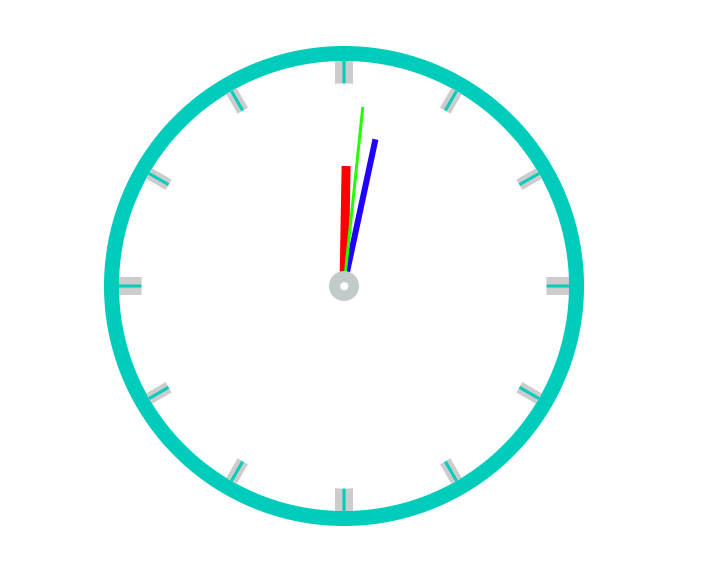
3.效果图
最新文章
- js正则表达式
- git/gitLab
- SpringMVC学习系列(5) 之 数据绑定-2
- StackBlur.js
- 【linux】man和--help
- Go Mobile 例子 basic 源码分析
- fuser 命令概述
- 原创C# 枚举 多状态 操作
- 警惕arm-linux-gcc编译器优化选项
- MYSQL Model报错:指定的存储区提供程序在配置中找不到 的解决
- grunt学习笔记1 理论知识
- angularJS--多个控制器之间的数据共享
- linux系统ubuntu18.04安装mysql(5.7)
- Android 键盘键名和键值列表
- 【Spark调优】聚合操作数据倾斜解决方案
- Recurrent Neural Network[survey]
- 跨域请求传递Cookie问题
- F - Rescue 优先队列bfs
- Dominator Tree & Lengauer-Tarjan Algorithm
- goldengate–使用filter+@GETENV在线重新初始化指定的table