周末愉快--css画大熊猫
2024-09-06 22:05:03
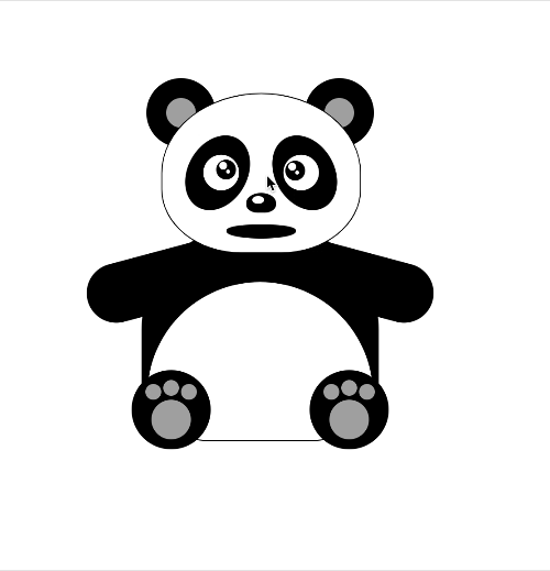
周末找了点轻松的话题,css画大熊猫。
先上效果图
欢迎竞猜大熊猫到底说了什么??

再上源码
<!DOCTYPE html>

<html lang="en">

<head>

  <meta charset="UTF-8">

  <meta name="viewport" content="width=device-width, initial-scale=1.0,

minimum-scale=1.0, maximum-scale=1.0, viewport-fit=cover, user-scalable=no">

  <title>纯css画大熊猫</title>

</head>

<body>

<div id="scene1" class="scene-1">

  <!--熊猫坐着-->

  <div class="head">

    <div class="ear ear-left"></div>

    <div class="ear ear-right"></div>

    <div class="face">

      <div class="eye-out eye-left">

        <div id="leftEyeOut" class="eye">

          <div id="leftEye" class="eyeball"></div>

        </div>

      </div>

      <div class="eye-out eye-right">

        <div class="eye">

          <div id="rightEye" class="eyeball"></div>

        </div>

      </div>

      <div class="nose"></div>

      <div id="mouth" class="mouth">

        <div id="tongue" class="tongue"></div>

      </div>

    </div>

  </div>

  <div id="pandaBody" class="body">

    <div id="leftArm" class="arm-left"></div>

    <div id="rightArm" class="arm-right"></div>

    <div class="foot foot-left">

      <div class="toe"></div>

    </div>

    <div class="foot foot-right">

      <div class="toe"></div>

    </div>

  </div>

</div>

<style>

  /*动画相关*/

  @keyframes mouth_animation {

    0%   {

      top: 132px;

      height: 14px;

    }

    25%  {

      top: 123px;

      height: 32px;

    }

    50%  {

      top: 125px;

      height: 26px;

    }

    75%  {

      top: 123px;

      height: 32px;

    }

    100% {

      top: 132px;

      height: 14px;

    }

  }

  .mouth-animation {

    /*animation: infinite;*/

    animation-name: mouth_animation;

    animation-duration: 3s;

  }

  .tongue-animation {

    /*animation: infinite;*/

    animation-name: tongue_animation;

    animation-duration: 3s;

  }

  @keyframes tongue_animation {

    10%   {

      bottom: 3px;

      height: 8px;

      opacity: 0;

    }

    15%  {

      bottom: 4px;

      height: 14px;

      opacity: 1;

    }

    50%  {

      bottom: 4px;

      height: 16px;

      opacity: 1;

    }

    85%  {

      bottom: 4px;

      height: 14px;

      opacity: 1;

    }

    90% {

      bottom: 3px;

      height: 8px;

      opacity: 0;

    }

  }

  .arm-left-animation {

    animation-name: arm_left_animation;

    animation-duration: 3s;

  }

  @keyframes arm_left_animation {

    0% {

      transform: rotate(75deg);

    }

    50%   {

      transform: rotate(125deg);

    }

    100% {

      transform: rotate(75deg);

    }

  }

  .arm-right-animation {

    animation-name: arm_right_animation;

    animation-duration: 3s;

  }

  @keyframes arm_right_animation {

    0% {

      transform: rotate(-75deg);

    }

    50%   {

      transform: rotate(-125deg);

    }

    100% {

      transform: rotate(-75deg);

    }

  }

</style>

<script>

  // 打招呼

  var hasAnimation = false

  function doAnimation(e, centerx) {

    let arm, ani;

    if (centerx > e.pageX) {

      arm = document.getElementById('leftArm');

      ani = 'arm-left-animation'

    } else {

      arm = document.getElementById('rightArm');

      ani = 'arm-right-animation'

    }

    var mouth = document.getElementById('mouth');

    mouth.classList.add("mouth-animation");

    var tongue = document.getElementById('tongue');

    tongue.classList.add("tongue-animation");

    arm.classList.add(ani);

    setTimeout(() => {

      hasAnimation = false

      mouth.classList.remove("mouth-animation");

      tongue.classList.remove("tongue-animation");

      arm.classList.remove(ani);

    }, 3000)

  }

  var pandaBody = document.getElementById('pandaBody');

  pandaBody.addEventListener("dblclick", function (e) {

    if (hasAnimation) {

      return ;

    }

    hasAnimation = true

    var x = pandaBody.getBoundingClientRect().x + pandaBody.getBoundingClientRect().width / 2.0;

    doAnimation(e, x)

  })

</script>

<script>

  // 眼睛跟随动

  var leftEyeCenter = {}, rightEyeCenter = {}

  setTimeout(() => {

    var eyel = document.getElementById('leftEye');

    var eyeCenterX = eyel.getBoundingClientRect().x + eyel.getBoundingClientRect().width / 2.0;

    var eyeCenterY = eyel.getBoundingClientRect().y + eyel.getBoundingClientRect().height / 2.0;

    leftEyeCenter = {x: eyeCenterX, y: eyeCenterY, dom: eyel}

    var eyer = document.getElementById('rightEye');

    eyeCenterX = eyer.getBoundingClientRect().x + eyer.getBoundingClientRect().width / 2.0;

    eyeCenterY = eyer.getBoundingClientRect().y + eyer.getBoundingClientRect().height / 2.0;

    rightEyeCenter = {x: eyeCenterX, y: eyeCenterY, dom: eyer}

  }, 100)

  var body = document.body;

  body.addEventListener("click", function (e) {

    eyePosition(leftEyeCenter, e);

    eyePosition(rightEyeCenter, e);

  })

  function eyePosition(eyeCenter, e) {

    var cx = e.pageX, cy = e.pageY;

    var eye = eyeCenter.dom;

    if ((cx < eyeCenter.x + 8 && cx > eyeCenter.x - 8) && cy < eyeCenter.y + 8 && cy > eyeCenter.y - 8) {

      eye.style = "";

    } else {

      var st = Math.atan2((cy - eyeCenter.y), (cx - eyeCenter.x));

      var x = 6 + 6 * Math.cos(st);

      var y = 6 + 6 * Math.sin(st);

      eye.style.left = x + 'px';

      eye.style.top = y + 'px';

    }

  }

  var timeOut = null;

  body.addEventListener("mousemove", function (e) {

    if (timeOut) {

      return ;

    }

    eyePosition(leftEyeCenter, e);

    eyePosition(rightEyeCenter, e);

    timeOut = setTimeout(() => {

      timeOut = null

    }, 50)

  })

</script>

<style>

  html, body {

    margin: 0;

    width: 100%;

    height: 100%;

    position: relative;

  }

  .scene-1 {

    position: absolute;

    left: 50%;

    top: 50%;

    transform: translate(-50%, -50%);

    width: 300px;

    height: 360px;

  }

</style>

<style>

  /*头*/

  .head {

    position: absolute;

    top: 0;

    left: 50%;

    transform: translateX(-50%);

    height: 160px;

    width: 200px;

    z-index: 10;

  }

  .head .face {

    position: relative;

    height: 160px;

    width: 200px;

    border-radius: 50% 50% 40% 40%;

    background: white;

    border: 1px solid black;

    z-index: 1;

  }

  .head .ear {

    position: absolute;

    top: -15px;

    height: 70px;

    width: 70px;

    border-radius: 50%;

    background: black;

  }

  .head .ear:after {

    content: ' ';

    position: absolute;

    left: 20px;

    top: 20px;

    height: 30px;

    width: 30px;

    border-radius: 50%;

    background-color: darkgrey;

  }

  .head .ear-left {

    left: -15px;

  }

  .head .ear-right {

    right: -15px;

  }

  .head .eye-out {

    position: absolute;

    top: 30px;

    height: 80px;

    width: 60px;

    border-radius: 50%;

    background: black;

  }

  .head .eye {

    position: absolute;

    top: 20px;

    height: 32px;

    width: 32px;

    border-radius: 50%;

    border: 2px solid white;

    background-color: white;

  }

  .head .eye-left {

    left: 50px;

    transform: rotate(30deg);

    transform-origin: 0% 0%;

  }

  .head .eye-left .eye {

    left: 15px;

    transform: rotate(-30deg);

    transform-origin: 50% 50%;

  }

  .head .eye-right {

    right: 50px;

    transform: rotate(-30deg);

    transform-origin: 100% 0%;

  }

  .head .eye-right .eye {

    right: 15px;

    transform: rotate(30deg);

    transform-origin: 50% 50%;

  }

  .head .eyeball {

    position: absolute;

    top: 6px;

    left: 6px;

    height: 20px;

    width: 20px;

    border-radius: 50%;

    background-color: black;

  }

  .head .eyeball:before {

    content: " ";

    position: absolute;

    left: 3px;

    top: 2px;

    width: 8px;

    height: 8px;

    border-radius: 50% / 50%;

    background-color: white;

  }

  .head .eyeball:after {

    content: " ";

    position: absolute;

    left: 10px;

    top: 10px;

    width: 4px;

    height: 4px;

    border-radius: 50% / 50%;

    background-color: white;

  }

  .head .nose {

    position: absolute;

    top: 100px;

    left: 50%;

    width: 30px;

    height: 20px;

    transform: translateX(-50%);

    border-radius: 50% 50% 40% 40%;

    background-color: black;

  }

  .head .nose:after {

    content: ' ';

    position: absolute;

    left: 6px;

    top: 3px;

    width: 12px;

    height: 8px;

    border-radius: 50% / 50%;

    background-color: white;

  }

  .head .mouth {

    position: absolute;

    top: 132px;

    left: 50%;

    width: 70px;

    height: 14px;

    transform: translateX(-50%);

    border-radius: 40% 40% 50% 50%;

    background-color: black;

  }

  .head .mouth .tongue {

    position: absolute;

    bottom: 3px;

    left: 50%;

    width: 40px;

    height: 8px;

    transform: translateX(-50%);

    border-radius: 50%;

    background-color: red;

    opacity: 0;

  }

</style>

<style>

  /*身子*/

  .body {

    position: absolute;

    top: 130px;

    left: 50%;

    transform: translateX(-50%);

    height: 220px;

    width: 240px;

    z-index: 5;

  }

  .body:before {

    content: '';

    position: absolute;

    top: 0px;

    left: 0;

    height: 220px;

    width: 240px;

    border-radius: 50% 50% 20% 20%;

    background-color: black;

    z-index: 2;

  }

  .body:after {

    content: '';

    position: absolute;

    left: 5px;

    top: 60px;

    width: 228px;

    height: 160px;

    overflow: hidden;

    border-radius: 160px 160px 40% 40%;

    background-color: white;

    border: 1px solid black;

    z-index: 3;

  }

  .body .arm-left {

    position: absolute;

    top: 40px;

    left: 20px;

    height: 120px;

    width: 60px;

    transform: rotate(75deg);

    transform-origin: 50% 10%;

    background-color: black;

    border-radius: 0 0 30px 30px;

  }

  .body .arm-right {

    position: absolute;

    top: 40px;

    right: 20px;

    height: 120px;

    width: 60px;

    transform: rotate(-75deg);

    transform-origin: 50% 10%;

    background-color: black;

    border-radius: 0 0 30px 30px;

  }

  .body .foot {

    position: absolute;

    top: 150px;

    height: 80px;

    width: 80px;

    background-color: black;

    border-radius: 40px;

    z-index: 5;

  }

  .body .foot:after {

    content: '';

    position: absolute;

    top: 30px;

    left: 20px;

    height: 40px;

    width: 40px;

    background-color: darkgrey;

    border-radius: 40px;

    z-index: 5;

  }

  .body .foot-left {

    left: -10px;

  }

  .body .foot-right {

    right: -10px;

  }

  .body .toe {

    position: absolute;

    top: 10px;

    left: 32px;

    height: 16px;

    width: 16px;

    background-color: darkgrey;

    border-radius: 40px;

  }

  .body .toe:before {

    content: " ";

    position: absolute;

    top: 4px;

    left: -18px;

    height: 16px;

    width: 16px;

    background-color: darkgrey;

    border-radius: 40px;

  }

  .body .toe:after {

    content: " ";

    position: absolute;

    top: 4px;

    left: 18px;

    height: 16px;

    width: 16px;

    background-color: darkgrey;

    border-radius: 40px;

  }

</style>

</body>

</html>
最新文章
- js中Json 对象,Json字符串转换
- windows 下安装 mysql
- 我的bootstrap使用的历程
- [物理学与PDEs]第2章 流体力学
- noip2008 火柴棒等式
- 转:关掉Archlinux中烦人的响铃
- jquery 中fadeIn,fadeOut动画
- Fun with dynamicobject dynamic and the settings table
- linux共享内存简析
- poj1656---数黑格子
- [小知识点]IE6下不支持:hover的解决方法
- 字符通向字节流的桥梁---- OutputStreamWriter
- ORDER BY RAND()
- SQL点滴7—使用SQL Server的attach功能出现错误及解决方法
- 一切app源于生活 用于生活 一个利于生活的app——利生活
- mysql事务使用 超简单
- git基本使用(搭建Git服务器)
- python 2.7 数据结构之列表list: 基础面试总结
- word交叉引用公式编号时和连公式一起引用
- go runtime.Gosched()的作用分析