CSS的Animation&Transition&gradients属性
2024-08-30 23:35:34
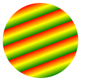
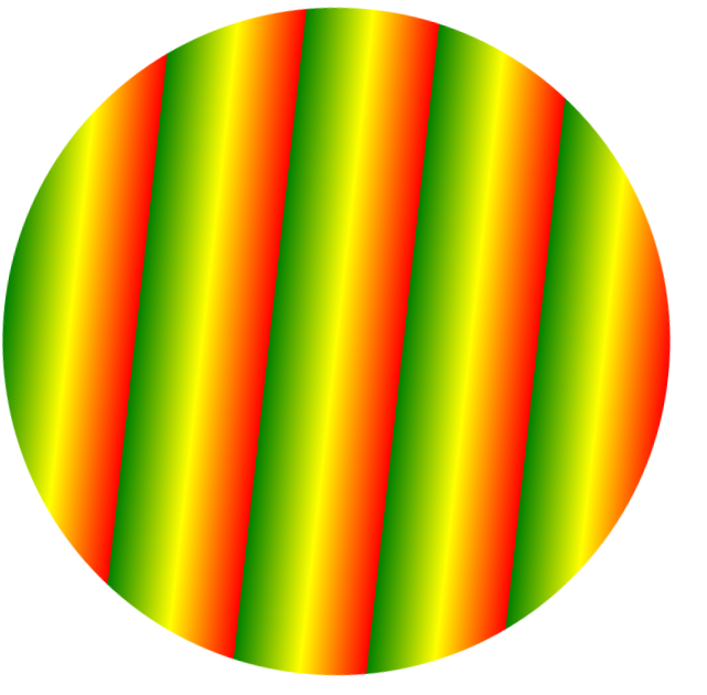
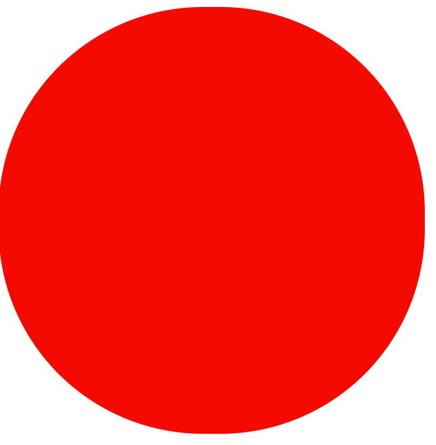
㈠Animation&Transition&gradients 代码示例
圆形,渐变颜色,旋转,当鼠标放在圆上,圆旋转变大
<!DOCTYPE html>

<html lang="en">

<head>

    <meta charset="UTF-8">

    <title>复合属性</title>

<style>

div{

     background-image:repeating-linear-gradient(red, yellow 10%, green 20%);

     width:200px;

     height:200px;

     border-radius:50%;

     animation:dh 6s linear infinite;

     transition:width 6s linear,height 6s linear

}

@keyframes dh{from{transform:rotate(0deg)}to{transform:rotate(360deg)}}

div:hover{

           width:600px;

           height:600px;

       }

</style>

</head>

<body>

    <div></div>

</body>

</html>
效果图:
初始状态:
鼠标悬浮后:
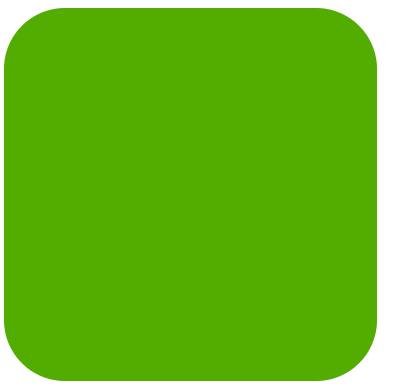
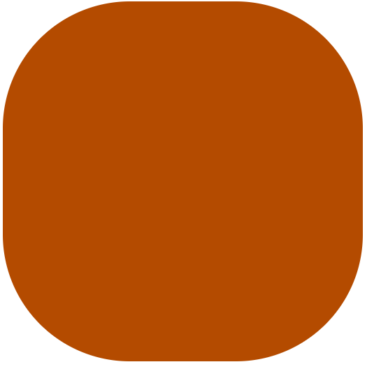
㈡transition定义多个属性
由绿色正方形逐渐变大为红色圆形
<!DOCTYPE html>

<html lang="en">

<head>

    <meta charset="UTF-8">

    <title>transition定义多个属性</title>

<style>

div{

    background-color:#0F0;

    width:200px;

    height:200px;

    transition:background-color 5s,width 5s,height 5s,border-radius 5s;

}

div:hover{

           background-color:#F00;

           width:500px;

           height:500px;

           border-radius:50%;

       }

</style>

</head>

<body>

    <div></div>

</body>

</html>
效果图:


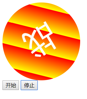
㈢js实现旋转和控制及交替旋转
<html>

<meta charset="utf-8">

<style>

div{

    background: repeating-linear-gradient(45deg,red,yellow 20%);

    width: 200px;

    height: 200px;

    border-radius: 50%;

    text-align: center;

    line-height: 200px;

    animation:animation1 6s infinite;

}

@keyframes animation1{

           from{font-size: 0px;color:black;}

           to{font-size: 80px;color:white;}

       }

</style>

<script>

    var x=0;

    var timerid;

    var fx;

    function start(){

        clearInterval(timerid)

        timerid=setInterval(function(){

        if(x==0)

          fx=true

        if(fx==true)

          x=x+1;

        if(x==360)

          fx=false

        if(fx==false)

           x=x-1

        document.getElementById("xz").style.transform='rotate(' + x + 'deg)';

    },10)

}

</script>

<body>

<div id="xz" onmouseover="clearInterval(timerid)" onmouseout="start()">战</div>

<button onclick="start()">开始</button>

<button onclick="clearInterval(timerid)">停止</button>

</body>

</html>
效果图:

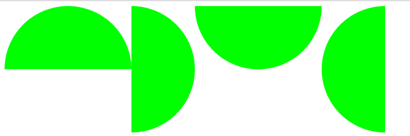
㈣semicirlcle(四个圆)
<!DOCTYPE html>

<html lang="en">

<head>

    <meta charset="UTF-8">

    <title>圆</title>

<style>

#sby{

     background-color:#0F0;

     width:200px;

     height:100px;

     border-radius:200px 200px 0 0;

     float:left;

    }

#yby{

     background-color:#0F0;

     width:100px;

     height:200px;

     border-radius:0 100px 100px 0;

     float:left;

}

#xby{

      background-color:#0F0;

      width:200px;

      height:100px;

      border-radius:0 0 200px 200px;

      float:left;

}

#zby{

     background-color:#0F0;

     width:100px;

     height:200px;

     border-radius:100px 0 0 100px;

     float:left;

}

</style>

</head>

<body>

<div id="sby"></div>

<div id="yby"></div>

<div id="xby"></div>

<div id="zby"></div>

</body>

</html>
效果图:
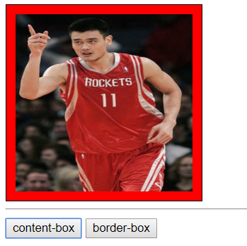
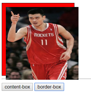
㈤JS测试box-sizing属性
<!DOCTYPE html>

<html lang="en">

<head>

    <meta charset="UTF-8">

    <title>Document</title>

<style>

div{

    background-color:red;

    width:200px;

    height:200px;

    border:solid 1px;

    padding:10px;

}

img{

     width:200px;

     height:200px;

    }

</style>

</head>

<body>

<div id="cs">

<img src="ym.jpg">

</div>

<hr>

<button onclick="document.getElementById('cs').style.boxSizing='content-box'">content-box</button>

<button onclick="document.getElementById('cs').style.boxSizing='border-box'">border-box</button>

</body>

</html>

<style>
效果图:
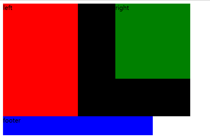
㈥clearfix代码示例
<style>

.container{

            width:500px;

            background-color:black;

        }

.container:after{

                  visibility: hidden;

                  display: block;

                  font-size: 0;

                  content: "";

                  clear: both;

                  height: 0;

              }

.left{

       width:200px;

       height:300px;

       background-color:red;

       float: left;

    }

.right{

        width: 200px;

        height: 200px;

        background-color: green;

        float: right;

    }

.footer{

         width: 400px;

         height: 50px;

         background-color: blue;

     }

</style>

<div class="container">

  <div class="left">left</div>

  <div class="right">right</div>

</div>

<div class="footer">footer</div>
效果图:
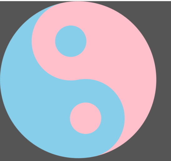
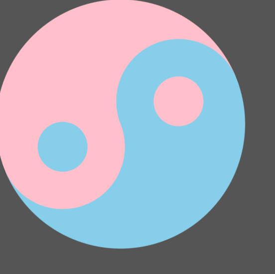
㈦taiji-aimation(太极图动画)
运用渐变和伪元素制作太极图,并转动起来
<!DOCTYPE html>

<html lang="en">

<head>

    <meta charset="UTF-8">

    <title>运用渐变和伪元素制作太极图</title>

    <style>

        *{

            padding: 0;

            margin: 0;

        }

        body{

            position:relative;

            background-color: #555;

        }

        div{

            width: 400px;

            height: 400px;

            background-image: linear-gradient(90deg,pink 50%,skyblue 50%);

            border-radius:50%;

            animation:zhuan 2s infinite linear;

        }

        div:before{

            content:"";

            width: 80px;

            height: 80px;

            background-color: pink;

            border:60px solid skyblue;

            position:absolute;

            left:100px;

            border-radius:50%;

            z-index:11;

        }

        div:after{

            content:"";

            width: 80px;

            height: 80px;

            background-color:skyblue;

            border:60px solid pink;

            position:absolute;

            left:100px;

            top:200px;

            border-radius:50%;

            z-index:12;

        }

        @keyframes zhuan{from{transform:rotate(0deg);}to{transform:rotate(360deg);}}

    </style>

</head>

<body>

    <div></div>

</body>

</html>
效果图:
㈧使用图片进行伪元素练习
<!DOCTYPE html>

<html lang="en">

<head>

    <meta charset="UTF-8">

    <title>使用图片进行伪元素练习</title>

    <style>

        *{

            padding: 0;

            margin: 0;

        }

        div{

            width: 550px;

            height: 700px;

            background:url(xz0.jpg);

            background-size: cover;

            position: absolute;left:500px;

        }

        div:before{

            content: " ";

            width: 550px;

            height: 700px;

            background:url(xz1.jpg);

            position: absolute;left: -500px;

        }

        div:after{

            content: " ";

            width: 550px;

            height: 700px;

            background:url(xz2.jpg);

            position: absolute;left: 500px;

        }

    </style>

</head>

<body>

    <div></div>

</body>

</html>
效果图:

由衷感谢:李国锋老师的代码示例
最新文章
- jQuery Validation Engine 表单验证
- instanceof
- sort函数用法
- 用thinkphp写的一个例子:抓取网站的内容并且保存到本地
- Ruby相关图书推荐
- linux系统目录详解
- C#当中的多线程_线程同步
- Oracle 卸载 不干净
- String源码
- Spring IOC三种注入方式(接口注入、setter注入、构造器注入)(摘抄)
- vbox centos安装增强工具
- HDU 2204 Eddy's 爱好 (容斥原理)
- 滚动锚定(Scroll Anchoring)- 让视口内容不再因视口上方 DOM 元素的高度变化而产生跳动
- 学号 2018-2019-20175212 童皓桢《Java程序设计》第5周学习总结
- C++ 是 编程界 的 背锅侠
- React Native桥接器初探
- SQLServer 查看耗时较多的SQL语句(转)
- javascript 异步解析
- 使用MyGeneration创建模板:介绍(翻译)
- 如何自定义微信小程序swiper轮播图面板指示点的样式