吴裕雄--天生自然 R语言数据可视化绘图(2)
par(ask=TRUE)

opar <- par(no.readonly=TRUE) # save original parameter settings

library(vcd)

counts <- table(Arthritis$Improved)

counts
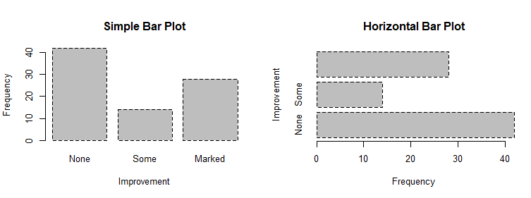
# Listing 6.1 - Simple bar plot
# vertical barplot
barplot(counts,
main="Simple Bar Plot",
xlab="Improvement", ylab="Frequency")
# horizontal bar plot
barplot(counts,
main="Horizontal Bar Plot",
xlab="Frequency", ylab="Improvement",
horiz=TRUE)

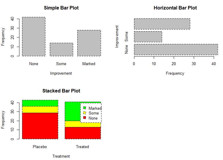
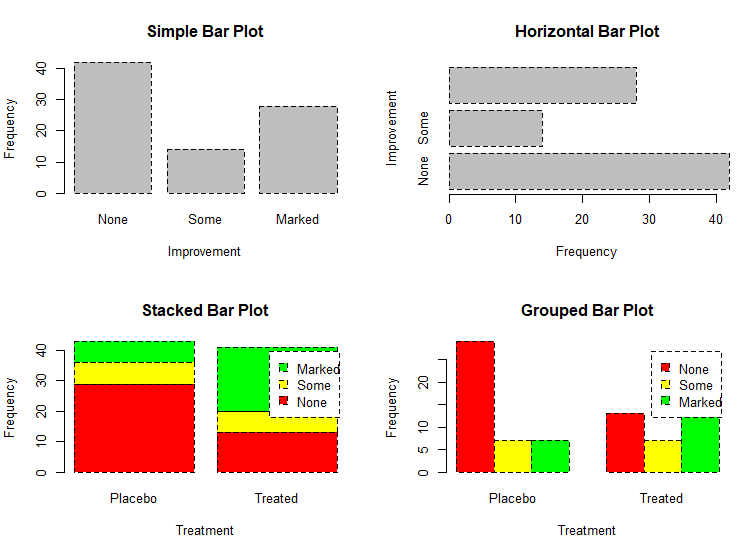
# obtain 2-way frequency table

library(vcd)

counts <- table(Arthritis$Improved, Arthritis$Treatment)

counts

# Listing 6.2 - Stacked and grouped bar plots

# stacked barplot

barplot(counts,

        main="Stacked Bar Plot",

        xlab="Treatment", ylab="Frequency",

        col=c("red", "yellow","green"),

        legend=rownames(counts))
# grouped barplot

barplot(counts,

        main="Grouped Bar Plot",

        xlab="Treatment", ylab="Frequency",

        col=c("red", "yellow", "green"),

        legend=rownames(counts), beside=TRUE)
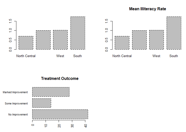
# Listing 6.3 - Bar plot for sorted mean values

states <- data.frame(state.region, state.x77)

means <- aggregate(states$Illiteracy, by=list(state.region), FUN=mean)

means

means <- means[order(means$x),]

means

barplot(means$x, names.arg=means$Group.1)

title("Mean Illiteracy Rate")

# Listing 6.3 - Bar plot for sorted mean values

states <- data.frame(state.region, state.x77)

means <- aggregate(states$Illiteracy, by=list(state.region), FUN=mean)

means

means <- means[order(means$x),]

means

barplot(means$x, names.arg=means$Group.1)

title("Mean Illiteracy Rate")

# Listing 6.4 - Fitting labels in bar plots

par(las=2)                # set label text perpendicular to the axis

par(mar=c(5,8,4,2))       # increase the y-axis margin

counts <- table(Arthritis$Improved) # get the data for the bars

# produce the graph

barplot(counts,

        main="Treatment Outcome", horiz=TRUE, cex.names=0.8,

        names.arg=c("No Improvement", "Some Improvement", "Marked Improvement")

)

par(opar)
# Spinograms

library(vcd)

attach(Arthritis)

counts <- table(Treatment,Improved)

spine(counts, main="Spinogram Example")

detach(Arthritis)

# Listing 6.5 - Pie charts
par(mfrow=c(2,2))
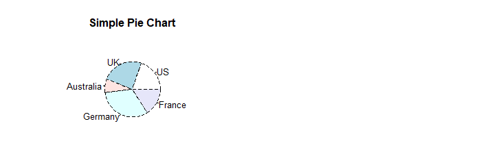
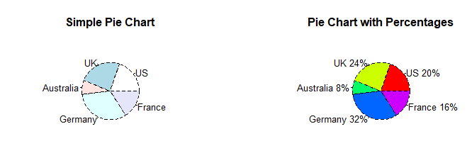
slices <- c(10, 12,4, 16, 8)
lbls <- c("US", "UK", "Australia", "Germany", "France") pie(slices, labels = lbls,
main="Simple Pie Chart")
pct <- round(slices/sum(slices)*100)

lbls <- paste(lbls, pct)

lbls <- paste(lbls,"%",sep="")

pie(slices,labels = lbls, col=rainbow(length(lbls)),

    main="Pie Chart with Percentages")
library(plotrix)

pie3D(slices, labels=lbls,explode=0.1,

      main="3D Pie Chart ")

mytable <- table(state.region)

lbls <- paste(names(mytable), "\n", mytable, sep="")

pie(mytable, labels = lbls,

    main="Pie Chart from a dataframe\n (with sample sizes)")

par(opar)
mytable <- table(state.region)

lbls <- paste(names(mytable), "\n", mytable, sep="")

pie(mytable, labels = lbls,

    main="Pie Chart from a dataframe\n (with sample sizes)")

par(opar)

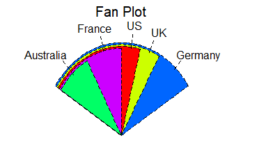
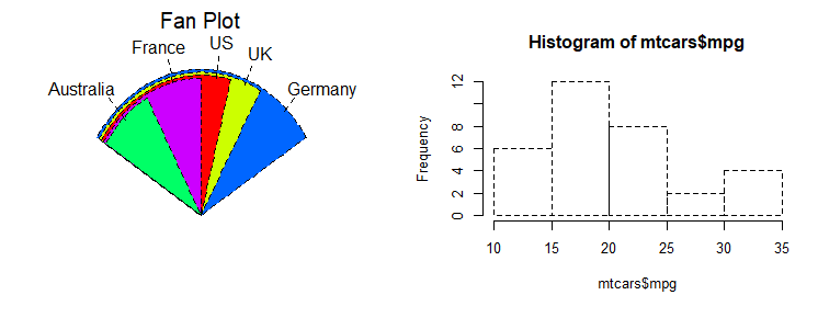
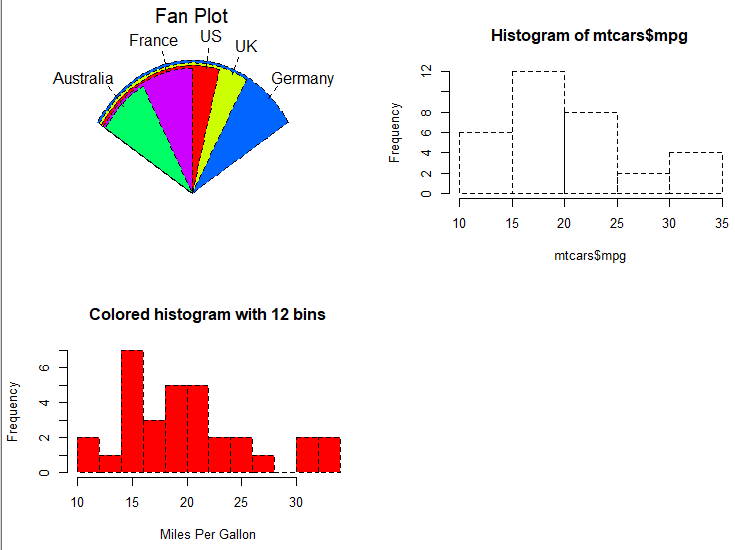
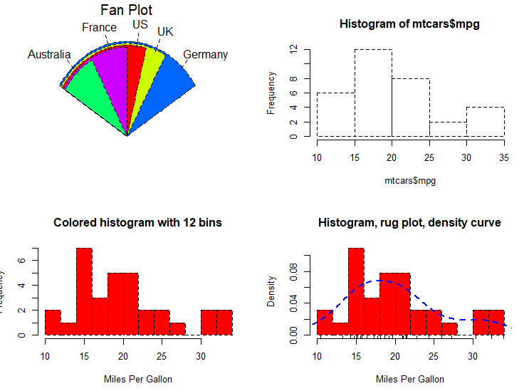
# Fan plots

library(plotrix)

slices <- c(10, 12,4, 16, 8)

lbls <- c("US", "UK", "Australia", "Germany", "France")

fan.plot(slices, labels = lbls, main="Fan Plot")
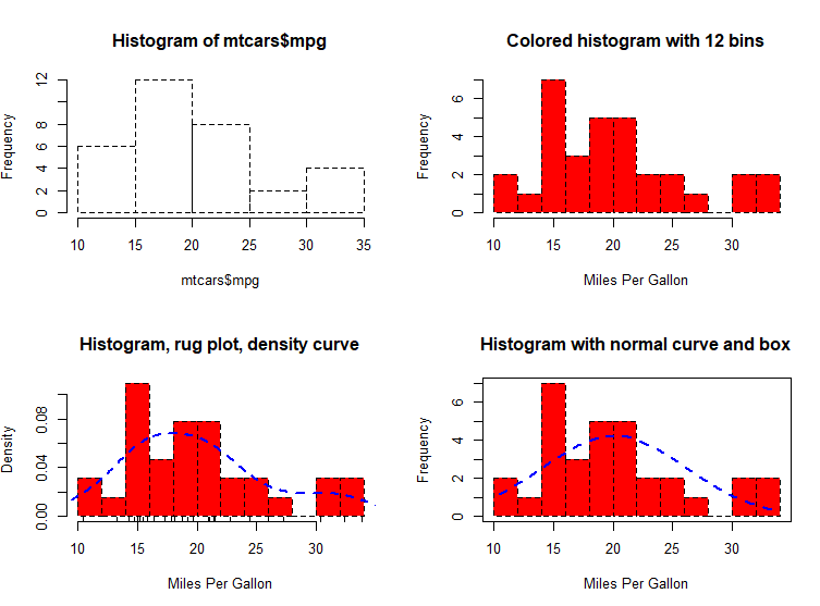
# Listing 6.6 - Histograms

# simple histogram                                                        1

hist(mtcars$mpg)
# colored histogram with specified number of bins

hist(mtcars$mpg,

     breaks=12,

     col="red",

     xlab="Miles Per Gallon",

     main="Colored histogram with 12 bins")
# colored histogram with rug plot, frame, and specified number of bins

hist(mtcars$mpg,

     freq=FALSE,

     breaks=12,

     col="red",

     xlab="Miles Per Gallon",

     main="Histogram, rug plot, density curve")

rug(jitter(mtcars$mpg))

lines(density(mtcars$mpg), col="blue", lwd=2)
# histogram with superimposed normal curve (Thanks to Peter Dalgaard)

x <- mtcars$mpg

h<-hist(x,

        breaks=12,

        col="red",

        xlab="Miles Per Gallon",

        main="Histogram with normal curve and box")

xfit<-seq(min(x),max(x),length=40)

yfit<-dnorm(xfit,mean=mean(x),sd=sd(x))

yfit <- yfit*diff(h$mids[1:2])*length(x)

lines(xfit, yfit, col="blue", lwd=2)

box()
# Listing 6.6 - Histograms

# simple histogram                                                        1

hist(mtcars$mpg)

# colored histogram with specified number of bins

hist(mtcars$mpg,

     breaks=12,

     col="red",

     xlab="Miles Per Gallon",

     main="Colored histogram with 12 bins")

# colored histogram with rug plot, frame, and specified number of bins

hist(mtcars$mpg,

     freq=FALSE,

     breaks=12,

     col="red",

     xlab="Miles Per Gallon",

     main="Histogram, rug plot, density curve")

rug(jitter(mtcars$mpg))

lines(density(mtcars$mpg), col="blue", lwd=2)

# histogram with superimposed normal curve (Thanks to Peter Dalgaard)

x <- mtcars$mpg

h<-hist(x,

        breaks=12,

        col="red",

        xlab="Miles Per Gallon",

        main="Histogram with normal curve and box")

xfit<-seq(min(x),max(x),length=40)

yfit<-dnorm(xfit,mean=mean(x),sd=sd(x))

yfit <- yfit*diff(h$mids[1:2])*length(x)

lines(xfit, yfit, col="blue", lwd=2)

box()
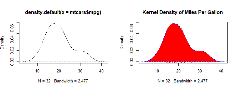
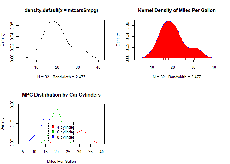
# Listing 6.7 - Kernel density plot

d <- density(mtcars$mpg) # returns the density data

plot(d) # plots the results

d <- density(mtcars$mpg)

plot(d, main="Kernel Density of Miles Per Gallon")

polygon(d, col="red", border="blue")

rug(mtcars$mpg, col="brown")
# Listing 6.8 - Comparing kernel density plots

par(lwd=2)

library(sm)

attach(mtcars)

# create value labels

cyl.f <- factor(cyl, levels= c(4, 6, 8),

                labels = c("4 cylinder", "6 cylinder", "8 cylinder"))

# plot densities

sm.density.compare(mpg, cyl, xlab="Miles Per Gallon")

title(main="MPG Distribution by Car Cylinders")

# add legend via mouse click

colfill<-c(2:(2+length(levels(cyl.f))))

cat("Use mouse to place legend...","\n\n")

legend(locator(1), levels(cyl.f), fill=colfill)

detach(mtcars)

par(lwd=1)
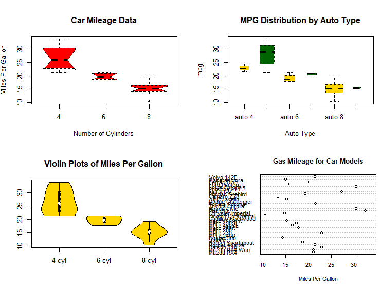
# parallel box plots

boxplot(mpg~cyl,data=mtcars,

        main="Car Milage Data",

        xlab="Number of Cylinders",

        ylab="Miles Per Gallon")
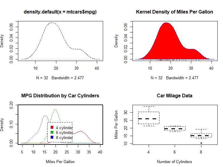
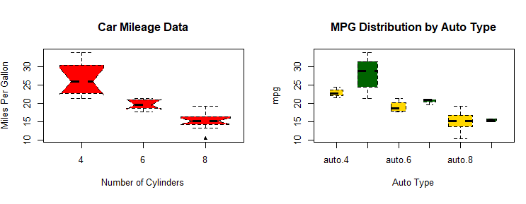
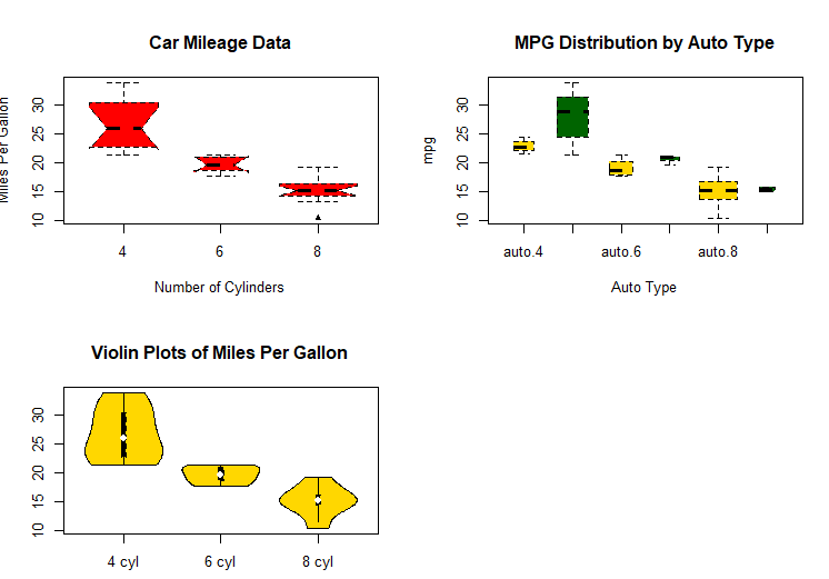
# notched box plots

boxplot(mpg~cyl,data=mtcars,

        notch=TRUE,

        varwidth=TRUE,

        col="red",

        main="Car Mileage Data",

        xlab="Number of Cylinders",

        ylab="Miles Per Gallon")

# Listing 6.9 - Box plots for two crossed factors
# create a factor for number of cylinders
mtcars$cyl.f <- factor(mtcars$cyl,
levels=c(4,6,8),
labels=c("4","6","8"))
# create a factor for transmission type
mtcars$am.f <- factor(mtcars$am,
levels=c(0,1),
labels=c("auto","standard"))
# generate boxplot
boxplot(mpg ~ am.f *cyl.f,
data=mtcars,
varwidth=TRUE,
col=c("gold", "darkgreen"),
main="MPG Distribution by Auto Type",
xlab="Auto Type")
# Listing 6.10 - Violin plots

library(vioplot)

x1 <- mtcars$mpg[mtcars$cyl==4]

x2 <- mtcars$mpg[mtcars$cyl==6]

x3 <- mtcars$mpg[mtcars$cyl==8]

vioplot(x1, x2, x3,

        names=c("4 cyl", "6 cyl", "8 cyl"),

        col="gold")

title("Violin Plots of Miles Per Gallon")
# dot chart

dotchart(mtcars$mpg,labels=row.names(mtcars),cex=.7,

         main="Gas Mileage for Car Models",

         xlab="Miles Per Gallon")
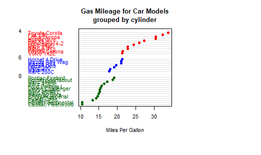
# Listing 6.11 - Dot plot grouped, sorted, and colored

x <- mtcars[order(mtcars$mpg),]

x$cyl <- factor(x$cyl)

x$color[x$cyl==4] <- "red"

x$color[x$cyl==6] <- "blue"

x$color[x$cyl==8] <- "darkgreen"

dotchart(x$mpg,

         labels = row.names(x),

         cex=.7,

         pch=19,

         groups = x$cyl,

         gcolor = "black",

         color = x$color,

         main = "Gas Mileage for Car Models\ngrouped by cylinder",

         xlab = "Miles Per Gallon")
最新文章
- eclipse软件创建servlet
- 设置Android studio黑色主题
- C# HttpWebRequest类
- 【czy系列赛】czy的后宫6 && bzoj1044 [HAOI2008]木棍分割
- rsyslog start with
- PHP 16: MySql的数据库访问
- PostgreSQL Replication之扩展与BDR
- React快速入门教程
- linux 常见操作指令
- 201621123031 《Java程序设计》第11周学习总结
- StandardContext
- MVC 微信开发获取用户OpenID
- AE插件:能量激光描边光效特效Saber Mac汉化版
- 查看当前的app运行的是哪个Activity
- python之attrgetter函数对对象排序
- 12th 本周工作量及进度统计
- BZOJ 2039 [2009国家集训队]employ人员雇佣 网络流
- 委托、Lambda表达式、事件系列04,委托链是怎样形成的, 多播委托, 调用委托链方法,委托链异常处理
- idea 上搭建 Mybatis 逆向工程
- git获取帮助
热门文章
- PyCharm安装和使用教程(Windows系统)
- 关于Windows Server 服务器 安装tomcat部署Java Web 项母
- CSS Module解决全局或本地使用@keyframes无效问题
- [Jinja2]本地加载html模板
- ARTS Week 7
- Codeforces 1248C Ivan the Fool and the Probability Theory(推公式)
- Linux系统之网络文件共享与数据实时同步实践
- Private Variable and Private Method - Python 私有变量 和 私有方法
- UNIX读书笔记----UNIX基础知识
- 【机器学习】算法原理详细推导与实现(六):k-means算法