Cys_Control(六) MTreeView
说明:由于Cefsharp浏览器项目需要各类控件,故之后的一些定义控件样式会参照Edge浏览器深色主题样式开发
一、查看TreeView原样式
1、通过Blend查看TreeView原有样式


<Style x:Key="TreeViewStyle1" TargetType="{x:Type TreeView}">

    <Setter Property="Background" Value="{DynamicResource {x:Static SystemColors.WindowBrushKey}}"/>

    <Setter Property="BorderBrush" Value="{StaticResource ListBorder}"/>

    <Setter Property="BorderThickness" Value="1"/>

    <Setter Property="Padding" Value="1"/>

    <Setter Property="Foreground" Value="{DynamicResource {x:Static SystemColors.ControlTextBrushKey}}"/>

    <Setter Property="ScrollViewer.HorizontalScrollBarVisibility" Value="Auto"/>

    <Setter Property="ScrollViewer.VerticalScrollBarVisibility" Value="Auto"/>

    <Setter Property="ScrollViewer.PanningMode" Value="Both"/>

    <Setter Property="Stylus.IsFlicksEnabled" Value="False"/>

    <Setter Property="VerticalContentAlignment" Value="Center"/>

    <Setter Property="Template">

        <Setter.Value>

            <ControlTemplate TargetType="{x:Type TreeView}">

                <Border x:Name="Bd" BorderThickness="{TemplateBinding BorderThickness}" BorderBrush="{TemplateBinding BorderBrush}" SnapsToDevicePixels="true">

                    <ScrollViewer x:Name="_tv_scrollviewer_" Background="{TemplateBinding Background}" CanContentScroll="false" Focusable="false" HorizontalScrollBarVisibility="{TemplateBinding ScrollViewer.HorizontalScrollBarVisibility}" Padding="{TemplateBinding Padding}" SnapsToDevicePixels="{TemplateBinding SnapsToDevicePixels}" VerticalScrollBarVisibility="{TemplateBinding ScrollViewer.VerticalScrollBarVisibility}">

                        <ItemsPresenter/>

                    </ScrollViewer>

                </Border>

                <ControlTemplate.Triggers>

                    <Trigger Property="IsEnabled" Value="false">

                        <Setter Property="Background" TargetName="Bd" Value="{DynamicResource {x:Static SystemColors.ControlBrushKey}}"/>

                    </Trigger>

                    <Trigger Property="VirtualizingPanel.IsVirtualizing" Value="true">

                        <Setter Property="CanContentScroll" TargetName="_tv_scrollviewer_" Value="true"/>

                    </Trigger>

                </ControlTemplate.Triggers>

            </ControlTemplate>

        </Setter.Value>

    </Setter>

    <Style.Triggers>

        <Trigger Property="VirtualizingPanel.IsVirtualizing" Value="true">

            <Setter Property="ItemsPanel">

                <Setter.Value>

                    <ItemsPanelTemplate>

                        <VirtualizingStackPanel/>

                    </ItemsPanelTemplate>

                </Setter.Value>

            </Setter>

        </Trigger>

    </Style.Triggers>

</Style>
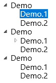
原始样式由外边框Border、内部可滚动容器ScrollViewer以及子集呈现部分ItemsPresenter组成
这三部分组成了TreeView的外部结构, 如下图中的树形结构样式由TreeViewItem决定
接着查看TreeViewItem的组成及样式
2、查看TreeViewItem原有样式
通过Blend编辑TreeViewItem模板副本生成如下三部分样式ExpandCollapseToggleStyle(小三角)、FocusVisualStyle(键盘焦点样式)、TreeViewItemStyle(自身样式)

ExpandCollapseToggleStyle
<Style x:Key="ExpandCollapseToggleStyle" TargetType="{x:Type ToggleButton}">

    <Setter Property="Focusable" Value="False"/>

    <Setter Property="Width" Value="16"/>

    <Setter Property="Height" Value="16"/>

    <Setter Property="Template">

        <Setter.Value>

            <ControlTemplate TargetType="{x:Type ToggleButton}">

                <Border Background="Transparent" Height="16" Padding="5,5,5,5" Width="16">

                    <Path x:Name="ExpandPath" Data="{StaticResource TreeArrow}" Fill="{StaticResource TreeViewItem.TreeArrow.Static.Fill}" Stroke="{StaticResource TreeViewItem.TreeArrow.Static.Stroke}">

                        <Path.RenderTransform>

                            <RotateTransform Angle="135" CenterY="3" CenterX="3"/>

                        </Path.RenderTransform>

                    </Path>

                </Border>

                <ControlTemplate.Triggers>

                    <Trigger Property="IsChecked" Value="True">

                        <Setter Property="RenderTransform" TargetName="ExpandPath">

                            <Setter.Value>

                                <RotateTransform Angle="180" CenterY="3" CenterX="3"/>

                            </Setter.Value>

                        </Setter>

                        <Setter Property="Fill" TargetName="ExpandPath" Value="{StaticResource TreeViewItem.TreeArrow.Static.Checked.Fill}"/>

                        <Setter Property="Stroke" TargetName="ExpandPath" Value="{StaticResource TreeViewItem.TreeArrow.Static.Checked.Stroke}"/>

                    </Trigger>

                    <Trigger Property="IsMouseOver" Value="True">

                        <Setter Property="Stroke" TargetName="ExpandPath" Value="{StaticResource TreeViewItem.TreeArrow.MouseOver.Stroke}"/>

                        <Setter Property="Fill" TargetName="ExpandPath" Value="{StaticResource TreeViewItem.TreeArrow.MouseOver.Fill}"/>

                    </Trigger>

                    <MultiTrigger>

                        <MultiTrigger.Conditions>

                            <Condition Property="IsMouseOver" Value="True"/>

                            <Condition Property="IsChecked" Value="True"/>

                        </MultiTrigger.Conditions>

                        <Setter Property="Stroke" TargetName="ExpandPath" Value="{StaticResource TreeViewItem.TreeArrow.MouseOver.Checked.Stroke}"/>

                        <Setter Property="Fill" TargetName="ExpandPath" Value="{StaticResource TreeViewItem.TreeArrow.MouseOver.Checked.Fill}"/>

                    </MultiTrigger>

                </ControlTemplate.Triggers>

            </ControlTemplate>

        </Setter.Value>

    </Setter>

</Style>
FocusVisualStyle
<Style x:Key="TreeViewItemFocusVisual">

    <Setter Property="Control.Template">

        <Setter.Value>

            <ControlTemplate>

                <Rectangle/>

            </ControlTemplate>

        </Setter.Value>

    </Setter>

</Style>
TreeViewItemStyle
<Style x:Key="TreeViewItemStyle1" TargetType="{x:Type TreeViewItem}">

    <Setter Property="Background" Value="Transparent"/>

    <Setter Property="HorizontalContentAlignment" Value="{Binding HorizontalContentAlignment, RelativeSource={RelativeSource AncestorType={x:Type ItemsControl}}}"/>

    <Setter Property="VerticalContentAlignment" Value="{Binding VerticalContentAlignment, RelativeSource={RelativeSource AncestorType={x:Type ItemsControl}}}"/>

    <Setter Property="Padding" Value="1,0,0,0"/>

    <Setter Property="Foreground" Value="{DynamicResource {x:Static SystemColors.ControlTextBrushKey}}"/>

    <Setter Property="FocusVisualStyle" Value="{StaticResource TreeViewItemFocusVisual}"/>

    <Setter Property="Template">

        <Setter.Value>

            <ControlTemplate TargetType="{x:Type TreeViewItem}">

                <Grid>

                    <Grid.ColumnDefinitions>

                        <ColumnDefinition MinWidth="19" Width="Auto"/>

                        <ColumnDefinition Width="Auto"/>

                        <ColumnDefinition Width="*"/>

                    </Grid.ColumnDefinitions>

                    <Grid.RowDefinitions>

                        <RowDefinition Height="Auto"/>

                        <RowDefinition/>

                    </Grid.RowDefinitions>

                    <ToggleButton x:Name="Expander" ClickMode="Press" IsChecked="{Binding IsExpanded, RelativeSource={RelativeSource TemplatedParent}}" Style="{StaticResource ExpandCollapseToggleStyle}"/>

                    <Border x:Name="Bd" Background="{TemplateBinding Background}" BorderThickness="{TemplateBinding BorderThickness}" BorderBrush="{TemplateBinding BorderBrush}" Grid.Column="1" Padding="{TemplateBinding Padding}" SnapsToDevicePixels="true">

                        <ContentPresenter x:Name="PART_Header" ContentSource="Header" HorizontalAlignment="{TemplateBinding HorizontalContentAlignment}" SnapsToDevicePixels="{TemplateBinding SnapsToDevicePixels}"/>

                    </Border>

                    <ItemsPresenter x:Name="ItemsHost" Grid.ColumnSpan="2" Grid.Column="1" Grid.Row="1"/>

                </Grid>

                <ControlTemplate.Triggers>

                    <Trigger Property="IsExpanded" Value="false">

                        <Setter Property="Visibility" TargetName="ItemsHost" Value="Collapsed"/>

                    </Trigger>

                    <Trigger Property="HasItems" Value="false">

                        <Setter Property="Visibility" TargetName="Expander" Value="Hidden"/>

                    </Trigger>

                    <Trigger Property="IsSelected" Value="true">

                        <Setter Property="Background" TargetName="Bd" Value="{DynamicResource {x:Static SystemColors.HighlightBrushKey}}"/>

                        <Setter Property="Foreground" Value="{DynamicResource {x:Static SystemColors.HighlightTextBrushKey}}"/>

                    </Trigger>

                    <MultiTrigger>

                        <MultiTrigger.Conditions>

                            <Condition Property="IsSelected" Value="true"/>

                            <Condition Property="IsSelectionActive" Value="false"/>

                        </MultiTrigger.Conditions>

                        <Setter Property="Background" TargetName="Bd" Value="{DynamicResource {x:Static SystemColors.InactiveSelectionHighlightBrushKey}}"/>

                        <Setter Property="Foreground" Value="{DynamicResource {x:Static SystemColors.InactiveSelectionHighlightTextBrushKey}}"/>

                    </MultiTrigger>

                    <Trigger Property="IsEnabled" Value="false">

                        <Setter Property="Foreground" Value="{DynamicResource {x:Static SystemColors.GrayTextBrushKey}}"/>

                    </Trigger>

                </ControlTemplate.Triggers>

            </ControlTemplate>

        </Setter.Value>

    </Setter>

    <Style.Triggers>

        <Trigger Property="VirtualizingPanel.IsVirtualizing" Value="true">

            <Setter Property="ItemsPanel">

                <Setter.Value>

                    <ItemsPanelTemplate>

                        <VirtualizingStackPanel/>

                    </ItemsPanelTemplate>

                </Setter.Value>

            </Setter>

        </Trigger>

    </Style.Triggers>

</Style>
这里我们着重看下TreeViewItemStyle的ControlTemplate部分
<ControlTemplate TargetType="{x:Type TreeViewItem}">

    <Grid>

        <Grid.ColumnDefinitions>

            <ColumnDefinition MinWidth="19" Width="Auto"/>

            <ColumnDefinition Width="Auto"/>

            <ColumnDefinition Width="*"/>

        </Grid.ColumnDefinitions>

        <Grid.RowDefinitions>

            <RowDefinition Height="Auto"/>

            <RowDefinition/>

        </Grid.RowDefinitions>

        <ToggleButton x:Name="Expander" ClickMode="Press" IsChecked="{Binding IsExpanded, RelativeSource={RelativeSource TemplatedParent}}" Style="{StaticResource ExpandCollapseToggleStyle}"/>

        <Border x:Name="Bd" Background="{TemplateBinding Background}" BorderThickness="{TemplateBinding BorderThickness}" BorderBrush="{TemplateBinding BorderBrush}" Grid.Column="1" Padding="{TemplateBinding Padding}" SnapsToDevicePixels="true">

            <ContentPresenter x:Name="PART_Header" ContentSource="Header" HorizontalAlignment="{TemplateBinding HorizontalContentAlignment}" SnapsToDevicePixels="{TemplateBinding SnapsToDevicePixels}"/>

        </Border>

        <ItemsPresenter x:Name="ItemsHost" Grid.ColumnSpan="2" Grid.Column="1" Grid.Row="1"/>

    </Grid>

</ControlTemplate>
如上代码可知控件由 ToggleButton (小三角) 、ContentPresenter (头部)、ItemsPresenter (子菜单)三部分组成。
下面改变ControlTemplate 样式
二、创建 CustomControl
这里我们模拟Edge收藏夹TreeView部分
1、新建CustomControl MTreeView
public class MTreeView : System.Windows.Controls.TreeView

{

    static MTreeView()

    {

        DefaultStyleKeyProperty.OverrideMetadata(typeof(MTreeView), new FrameworkPropertyMetadata(typeof(MTreeView)));

    }

}
MTreeView资源文件如下
<ResourceDictionary xmlns="http://schemas.microsoft.com/winfx/2006/xaml/presentation"

                    xmlns:x="http://schemas.microsoft.com/winfx/2006/xaml"

                    xmlns:local="clr-namespace:Cys_CustomControls.Controls">

    <Style  TargetType="{x:Type local:MTreeView}">

        <Setter Property="Background" Value="#4A4A4A"/>

        <Setter Property="BorderBrush" Value="#4A4A4A"/>

        <Setter Property="BorderThickness" Value="1"/>

        <Setter Property="Padding" Value="1"/>

        <Setter Property="Foreground" Value="{DynamicResource {x:Static SystemColors.ControlTextBrushKey}}"/>

        <Setter Property="ScrollViewer.HorizontalScrollBarVisibility" Value="Auto"/>

        <Setter Property="ScrollViewer.VerticalScrollBarVisibility" Value="Auto"/>

        <Setter Property="ScrollViewer.PanningMode" Value="Both"/>

        <Setter Property="Stylus.IsFlicksEnabled" Value="False"/>

        <Setter Property="VerticalContentAlignment" Value="Center"/>

        <Setter Property="Template">

            <Setter.Value>

                <ControlTemplate TargetType="{x:Type local:MTreeView}">

                    <Border x:Name="Bd" BorderThickness="{TemplateBinding BorderThickness}" BorderBrush="{TemplateBinding BorderBrush}" SnapsToDevicePixels="true">

                        <ScrollViewer x:Name="_tv_scrollviewer_" Background="{TemplateBinding Background}" CanContentScroll="false" Focusable="false" HorizontalScrollBarVisibility="{TemplateBinding ScrollViewer.HorizontalScrollBarVisibility}" Padding="{TemplateBinding Padding}" SnapsToDevicePixels="{TemplateBinding SnapsToDevicePixels}" VerticalScrollBarVisibility="{TemplateBinding ScrollViewer.VerticalScrollBarVisibility}">

                            <ItemsPresenter/>

                        </ScrollViewer>

                    </Border>

                    <ControlTemplate.Triggers>

                        <Trigger Property="IsEnabled" Value="false">

                            <Setter Property="Background" TargetName="Bd" Value="{DynamicResource {x:Static SystemColors.ControlBrushKey}}"/>

                        </Trigger>

                        <Trigger Property="VirtualizingPanel.IsVirtualizing" Value="true">

                            <Setter Property="CanContentScroll" TargetName="_tv_scrollviewer_" Value="true"/>

                        </Trigger>

                    </ControlTemplate.Triggers>

                </ControlTemplate>

            </Setter.Value>

        </Setter>

        <Style.Triggers>

            <Trigger Property="VirtualizingPanel.IsVirtualizing" Value="true">

                <Setter Property="ItemsPanel">

                    <Setter.Value>

                        <ItemsPanelTemplate>

                            <VirtualizingStackPanel/>

                        </ItemsPanelTemplate>

                    </Setter.Value>

                </Setter>

            </Trigger>

        </Style.Triggers>

    </Style>

</ResourceDictionary>
2、新建CustomControl MTreeViewItem
public class MTreeViewItem : TreeViewItem

{

    static MTreeViewItem()

    {

        DefaultStyleKeyProperty.OverrideMetadata(typeof(MTreeViewItem), new FrameworkPropertyMetadata(typeof(MTreeViewItem)));

    }

}
MTreeViewItem资源文件如下
    <Style x:Key="ExpandCollapseToggleStyle" TargetType="{x:Type ToggleButton}">

        <Setter Property="Focusable" Value="False"/>

        <Setter Property="Width" Value="16"/>

        <Setter Property="Height" Value="16"/>

        <Setter Property="Template">

            <Setter.Value>

                <ControlTemplate TargetType="{x:Type ToggleButton}">

                    <Border Background="Transparent" Height="16" Padding="3" Width="16">

                        <Path x:Name="ExpandPath" Data="M0,0 L0,8 L8,0 z" Fill="#FFFFFF">

                            <Path.RenderTransform>

                                <RotateTransform Angle="135" CenterY="4" CenterX="4"/>

                            </Path.RenderTransform>

                        </Path>

                    </Border>

                    <ControlTemplate.Triggers>

                        <Trigger Property="IsChecked" Value="True">

                            <Setter Property="RenderTransform" TargetName="ExpandPath">

                                <Setter.Value>

                                    <RotateTransform Angle="180" CenterY="4" CenterX="4"/>

                                </Setter.Value>

                            </Setter>

                        </Trigger>

                    </ControlTemplate.Triggers>

                </ControlTemplate>

            </Setter.Value>

        </Setter>

    </Style>

    <Style TargetType="{x:Type local:MTreeViewItem}">

        <Setter Property="Background" Value="Transparent"/>

        <Setter Property="HorizontalContentAlignment" Value="Stretch"/>

        <Setter Property="VerticalContentAlignment" Value="{Binding VerticalContentAlignment, RelativeSource={RelativeSource AncestorType={x:Type ItemsControl}}}"/>

        <Setter Property="Padding" Value="1,0,0,0"/>

        <Setter Property="Foreground" Value="#FFFFFF"/>

        <Setter Property="FocusVisualStyle" Value="{x:Null}"/>

        <Setter Property="Template">

            <Setter.Value>

                <ControlTemplate TargetType="{x:Type local:MTreeViewItem}">

                    <Grid>

                        <Grid.RowDefinitions>

                            <RowDefinition Height="Auto"/>

                            <RowDefinition/>

                        </Grid.RowDefinitions>

                        <Border x:Name="Bd" Background="{TemplateBinding Background}" HorizontalAlignment="Stretch" VerticalAlignment="Center" BorderThickness="{TemplateBinding BorderThickness}" BorderBrush="{TemplateBinding BorderBrush}"  Padding="{TemplateBinding Padding}" SnapsToDevicePixels="true">

                          <StackPanel Orientation="Horizontal">

                              <ToggleButton x:Name="Expander" ClickMode="Press" IsChecked="{Binding IsExpanded, RelativeSource={RelativeSource TemplatedParent}}" Style="{StaticResource ExpandCollapseToggleStyle}"/>

                              <Grid VerticalAlignment="Center" Height="35">

                                  <ContentPresenter VerticalAlignment="Center" x:Name="PART_Header" ContentSource="Header" HorizontalAlignment="{TemplateBinding HorizontalContentAlignment}" SnapsToDevicePixels="{TemplateBinding SnapsToDevicePixels}"/>

                              </Grid>

                            </StackPanel>

                        </Border>

                        <Grid Grid.Row="1">

                            <ItemsPresenter x:Name="ItemsHost" Margin="10,0,0,0"/>

                        </Grid>

                    </Grid>

                    <ControlTemplate.Triggers>

                        <Trigger Property="IsExpanded" Value="false">

                            <Setter Property="Visibility" TargetName="ItemsHost" Value="Collapsed"/>

                        </Trigger>

                        <Trigger Property="HasItems" Value="false">

                            <Setter Property="Visibility" TargetName="Expander" Value="Hidden"/>

                        </Trigger>

                        <Trigger Property="IsSelected" Value="true">

                            <Setter Property="Background" TargetName="Bd" Value="#575757"/>

                        </Trigger>

                        <MultiTrigger>

                            <MultiTrigger.Conditions>

                                <Condition Property="IsSelected" Value="true"/>

                                <Condition Property="IsSelectionActive" Value="false"/>

                            </MultiTrigger.Conditions>

                            <Setter Property="Foreground" Value="{DynamicResource {x:Static SystemColors.InactiveSelectionHighlightTextBrushKey}}"/>

                        </MultiTrigger>

                        <Trigger Property="IsEnabled" Value="false">

                            <Setter Property="Foreground" Value="{DynamicResource {x:Static SystemColors.GrayTextBrushKey}}"/>

                        </Trigger>

                    </ControlTemplate.Triggers>

                </ControlTemplate>

            </Setter.Value>

        </Setter>

        <Style.Triggers>

            <Trigger Property="VirtualizingPanel.IsVirtualizing" Value="true">

                <Setter Property="ItemsPanel">

                    <Setter.Value>

                        <ItemsPanelTemplate>

                            <VirtualizingStackPanel/>

                        </ItemsPanelTemplate>

                    </Setter.Value>

                </Setter>

            </Trigger>

        </Style.Triggers>

    </Style>
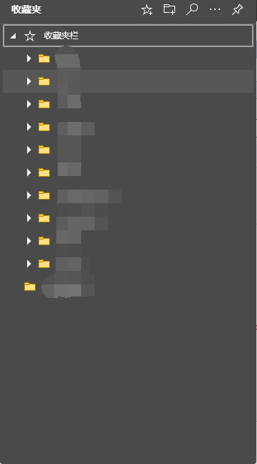
效果如下
与Edge菜单对比缺少图标
3、为MTreeViewItem增加 Icon
分别创建依赖属性Icon(未展开时图标)、IsExpandedIcon(展开后图标)、IconForeground(图标颜色)我们这里采用阿里字体图标
依赖属性如下:
/// <summary>

/// Icon

/// </summary>

public static readonly DependencyProperty IconProperty = DependencyProperty.Register("Icon", typeof(string), typeof(MTreeViewItem));

public string Icon

{

    get => (string)GetValue(IconProperty);

    set => SetValue(IconProperty, value);

}

/// <summary>

/// IsExpanded

/// </summary>

public static readonly DependencyProperty IsExpandedIconProperty = DependencyProperty.Register("IsExpandedIcon", typeof(string), typeof(MTreeViewItem));

public string IsExpandedIcon

{

    get => (string)GetValue(IsExpandedIconProperty);

    set => SetValue(IsExpandedIconProperty, value);

}

/// <summary>

/// IconForeground

/// </summary>

public static readonly DependencyProperty IconForegroundProperty = DependencyProperty.Register("IconForeground", typeof(Brush), typeof(MTreeViewItem));

public Brush IconForeground

{

    get => (Brush)GetValue(IconForegroundProperty);

    set => SetValue(IconForegroundProperty, value);

}
Xaml修改如下:
<Style TargetType="{x:Type local:MTreeViewItem}">
<Setter Property="Background" Value="Transparent"/>
<Setter Property="HorizontalContentAlignment" Value="Stretch"/>
<Setter Property="VerticalContentAlignment" Value="{Binding VerticalContentAlignment, RelativeSource={RelativeSource AncestorType={x:Type ItemsControl}}}"/>
<Setter Property="Padding" Value="1,0,0,0"/>
<Setter Property="Foreground" Value="#FFFFFF"/>
<Setter Property="FocusVisualStyle" Value="{x:Null}"/>
<Setter Property="Icon" Value=""/>
<Setter Property="IsExpandedIcon" Value=""/>
<Setter Property="IconForeground" Value="#FFCD2C"/>
<Setter Property="Template">
<Setter.Value>
<ControlTemplate TargetType="{x:Type local:MTreeViewItem}">
<Grid>
<Grid.RowDefinitions>
<RowDefinition Height="Auto"/>
<RowDefinition/>
</Grid.RowDefinitions>
<Border x:Name="Bd" Background="{TemplateBinding Background}" HorizontalAlignment="Stretch" VerticalAlignment="Center" BorderThickness="{TemplateBinding BorderThickness}" BorderBrush="{TemplateBinding BorderBrush}" Padding="{TemplateBinding Padding}" SnapsToDevicePixels="true">
<StackPanel Orientation="Horizontal">
<ToggleButton x:Name="Expander" ClickMode="Press" IsChecked="{Binding IsExpanded, RelativeSource={RelativeSource TemplatedParent}}" Style="{StaticResource ExpandCollapseToggleStyle}"/>
<TextBlock x:Name ="PART_Icon" Text="{TemplateBinding Icon}" Foreground="{TemplateBinding IconForeground}" VerticalAlignment="Center" Margin="5,0"/>
<Grid VerticalAlignment="Center" Height="35">
<ContentPresenter VerticalAlignment="Center" x:Name="PART_Header" ContentSource="Header" HorizontalAlignment="{TemplateBinding HorizontalContentAlignment}" SnapsToDevicePixels="{TemplateBinding SnapsToDevicePixels}"/>
</Grid>
</StackPanel>
</Border>
<Grid Grid.Row="1">
<ItemsPresenter x:Name="ItemsHost" Margin="10,0,0,0"/>
</Grid>
</Grid>
<ControlTemplate.Triggers>
<Trigger Property="IsExpanded" Value="false">
<Setter Property="Visibility" TargetName="ItemsHost" Value="Collapsed"/>
</Trigger>
<Trigger Property="IsExpanded" Value="True">
<Setter Property="Text" TargetName="PART_Icon" Value="{Binding RelativeSource={RelativeSource AncestorType=local:MTreeViewItem}, Path=IsExpandedIcon}"/>
</Trigger>
<Trigger Property="HasItems" Value="false">
<Setter Property="Visibility" TargetName="Expander" Value="Hidden"/>
</Trigger>
<Trigger Property="IsSelected" Value="true">
<Setter Property="Background" TargetName="Bd" Value="#575757"/>
</Trigger>
<MultiTrigger>
<MultiTrigger.Conditions>
<Condition Property="IsSelected" Value="true"/>
<Condition Property="IsSelectionActive" Value="false"/>
</MultiTrigger.Conditions>
<Setter Property="Foreground" Value="{DynamicResource {x:Static SystemColors.InactiveSelectionHighlightTextBrushKey}}"/>
</MultiTrigger>
<Trigger Property="IsEnabled" Value="false">
<Setter Property="Foreground" Value="{DynamicResource {x:Static SystemColors.GrayTextBrushKey}}"/>
</Trigger>
</ControlTemplate.Triggers>
</ControlTemplate>
</Setter.Value>
</Setter>
<Style.Triggers>
<Trigger Property="VirtualizingPanel.IsVirtualizing" Value="true">
<Setter Property="ItemsPanel">
<Setter.Value>
<ItemsPanelTemplate>
<VirtualizingStackPanel/>
</ItemsPanelTemplate>
</Setter.Value>
</Setter>
</Trigger>
</Style.Triggers>
</Style>
Xaml中增加了一个TextBlock用于显示字体图标
在控件中引用MTreeView如下:
<baseControl:MTreeView>
<baseControl:MTreeViewItem Header="收藏夹" Icon="" IsExpandedIcon="" IconForeground="#FFFFFF">
<baseControl:MTreeViewItem Header="文本" Icon="">
<baseControl:MTreeViewItem Header="文本1">
</baseControl:MTreeViewItem>
<baseControl:MTreeViewItem Header="文本2">
</baseControl:MTreeViewItem>
<baseControl:MTreeViewItem Header="文本3">
</baseControl:MTreeViewItem>
</baseControl:MTreeViewItem>
<baseControl:MTreeViewItem Header="图片">
<baseControl:MTreeViewItem Header="图片1">
</baseControl:MTreeViewItem>
<baseControl:MTreeViewItem Header="图片2">
</baseControl:MTreeViewItem>
<baseControl:MTreeViewItem Header="图片3">
</baseControl:MTreeViewItem>
</baseControl:MTreeViewItem>
<baseControl:MTreeViewItem Header="视频">
<baseControl:MTreeViewItem Header="视频1">
</baseControl:MTreeViewItem>
<baseControl:MTreeViewItem Header="视频2">
</baseControl:MTreeViewItem>
<baseControl:MTreeViewItem Header="视频3">
</baseControl:MTreeViewItem>
</baseControl:MTreeViewItem>
</baseControl:MTreeViewItem>
</baseControl:MTreeView>
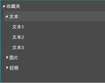
运行效果如下:

三、源码地址
gitee地址:https://gitee.com/sirius_machao/Cys_Controls/tree/dev/
最新文章
- Linux From Scratch(从零开始构建Linux系统,简称LFS)- Version 7.7(三)
- Cosh.1
- lphp输出控制output controll(header, ob_xxx)
- MagicalRecord 多表关联数据操作
- JavaScript 技巧总结
- 递归删除指定目录下的 .git 文件
- 【学习笔记】Xcode常见设置
- Can’t create handler inside thread that has not called Looper.prepare()
- haskell,lisp,erlang你们更喜欢哪个?
- 《玩转Bootstrap(基础)》笔记
- python自动化开发-[第二十二天]-bbs多级评论、点赞、上传文件
- 分布式理论——quorum原理
- 用Java实现adb命令的各种方式
- 博客主题皮肤探索-添加新功能和fiddler的css/js替换
- c3p0数据库连接池管理
- linux go with vscode
- quartz---定时器(配置注解方式&配置xml方式)
- c# 关闭socket的标准方法
- hadoop 分布式环境安装
- 细说linux IPC(四):posix 共享内存