css重要属性之辩
一、relative
1)与兄弟
relative对absolute
1、限制left/top/right/bottom定位
2、限制z-index层级;
3、限制在overflow下
relative对fixed
限制z-index层级;
2)本身特征
定位
1、相对自身
定位移动相对于自身
2、无侵入
relative定位不影响其他元素
margin影响其他元素布局
应用
拖拽效果
同时设置top/bottom left/right
绝对定位:拉伸
相对定位:斗争
top VS bottom top起作用
left VS bottom left起作用
3)层级
提高层级上下文
正常文档流模式下,后面的dom元素覆盖前面的,如果将前面的元素设置了relative将提升它自身的层级
新建层叠上下文与层级控制
z-index: auto : 没有限制内部absolute元素层叠的问题(except IE6,IE7 auto也会限制层级)
4)relative的最小化影响原则
——指尽量降低relative属性对其他元素或布局的潜在影响
1. 尽量避免使用relative
absolute+margin
2. relative最小化
将absolute父级独立为单独的容器,进行relative定位
二、absolute
1)与兄弟float
相同的特征表现
1. 包裹性
父元素对子元素的包裹
2. 破坏性
设置了子元素后,父元素高度塌陷
① absolute的破坏性是对图片的absolute化。图片设置absolute后,图片就从标准文档流中脱离出来,没有东西可以继续支撑容器的高度,容器自然就坍塌了。好像把房子的柱子挪到房子外边,房子果断就塌了
② absolute的包裹性是对容器的absolute化。容器设置absolute后,容器变为了 inline-block,容器本身没有设置宽度和高度的话,那么容器的宽高就等于内容的宽高,表现结果就是容器把内容包裹起来。
2)别把relative拴在一起(独立性的好处)
absolute 越独立,越强大
超越overflow
独立的absolute可以拜托overflow的限制,无论是滚动还是隐藏
clear 用来限制float
relative用来限制absolute
3)无依赖的absolute定位
脱离文档流
折翼的天使
1. 去浮动
2. 位置跟随
原来什么位置,绝对定位后还是什么位置
(ie7 永远的inline-block水平)
配合margin的精确定位
4)绝对定位实现相对效果
位置特别重要——充分利用跟随特性
图标图片相覆盖
img与vip中间使用注释<!-- -->实现完美贴合,避免出现空格
<!doctype html>
<html>
<head>
<meta charset="utf-8">
<title>图标定位二三事</title>
<style>
body { font: 14px/1.4 "Microsoft YaHei"; background-color: #EDEFF0; }
body, h3, h5 { margin: 0; }
img { border: 0 none; vertical-align: bottom; }
.l { float: left; }.r { float: right; }
.constr { width: 1200px; margin-left: auto; margin-right: auto; }
.header { background-color: #2A2C2E; }
.nav { height: 60px; }
.nav-list { float: left; font-size: 14px; font-weight: 400; }
.nav-a { display: inline-block; line-height: 20px; padding: 20px 35px; color: #B5BDC0; text-decoration: none; }
.nav-a:hover { color: #fff; } .course { padding-top: 10px; }
.course-list { float: left; width: 280px; height: 240px; margin: 5px 10px 15px; border-radius: 0 0 1px 1px; background-color: #F7FAF9; background-color: rgba(255,255,255,1); box-shadow: 0 1px 2px #c5c5c5; text-decoration: none; }
.course-list-img { background-color: #6396F1; }
.course-list-h { line-height: 50px; font-size: 14px; font-weight: 400; color: #363d40; text-align: center; }
.course-list-tips { margin: 0 14px; font-size: 12px; color: #b4bbbf; overflow: hidden; } .icon-hot { position: absolute; width: 28px; height: 11px; margin: -6px 0 0 2px; background: url(http://img.mukewang.com/545304730001307300280011.gif); }
.icon-recom { position: absolute; line-height: 20px; padding: 0 5px; background-color: #f60; color: #fff; font-size: 12px; }
.icon-vip { position: absolute; width: 36px; height: 36px; margin-left: -36px; background: url(http://img.mukewang.com/5453048000015d8800360036.gif); text-indent: -9em; overflow: hidden; }
</style>
</head> <body>
<div class="header">
<div class="constr">
<div class="nav">
<h3 class="nav-list">
<a href="http://www.imooc.com/course/list" class="nav-a">课程</a>
</h3>
<h3 class="nav-list">
<a href="http://www.imooc.com/wenda" class="nav-a">问答</a>
</h3>
<h3 class="nav-list">
<a href="http://www.imooc.com/seek/index" class="nav-a">
求课<i class="icon-hot"></i>
</a>
</h3>
</div>
</div>
</div> <div class="main">
<div class="constr">
<div class="course">
<a href="http://www.imooc.com/view/121" class="course-list">
<div class="course-list-img">
<span class="icon-recom">推荐</span>
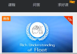
<img width="280" height="160" alt="分享:CSS深入理解之float浮动" src="http://img.mukewang.com/53d74f960001ae9d06000338-300-170.jpg"><!--
--><i class="icon-vip">vip</i>
</div>
<h5 class="course-list-h">分享:CSS深入理解之float浮动</h5>
<div class="course-list-tips">
<span class="l">已完结</span>
<span class="r">3514人学习</span>
</div>
</a>
</div>
</div>
</div>
</body>
</html>
下拉框
利用跟随特性
 <!doctype html>

 <html>

 <head>

 <meta charset="utf-8">

 <title>下拉框定位二三事</title>

 <style>

 body { margin: 0; font: 14px/1.4 "Microsoft YaHei"; background-color: #EDEFF0; }

 .constr { width: 1200px; max-width: 80%; margin-left: auto; margin-right: auto; padding-bottom: 300px; overflow: hidden; }

 .course-sidebar { width: 262px; float: left; }

 .course-sidebar > div { border: 1px solid #e6e8e9; box-shadow: 0px 1px 2px #d5d7d8; background-color: #fff; }

 .course-sidebar-type { height: 380px; }

 .course-sidebar-search { margin-top: 20px; overflow: hidden; }

 .course-search-input { width: 200px; line-height: 18px; padding: 10px; margin: 0; border: 0 none; font-size: 12px; font-family: inherit; float: left; }

 .course-sidebar-search.focus { border-color: #2ea7e0; }

 .course-search-input:focus { outline: 0 none; }

 .course-search-input::-ms-clear { display: none; }

 .course-search-btn { width: 38px; height: 38px; float: right; background: url(http://img.mukewang.com/545305ba0001f3f600380076.png); text-indent: -9em; overflow: hidden; }

 .focus .course-search-btn { background-position: 0 -38px; }

 .course-sidebar-result { display: none; position: absolute; width: 260px; margin: 39px 0 0 -1px; padding-left: 0; list-style-type: none; border: 1px solid #e6e8e9; background-color: #fff; box-shadow: 0px 1px 2px #d5d7d8; font-size: 12px; }

 .course-sidebar-result > li { line-height: 30px; padding-left: 12px; }

 .course-sidebar-result > li:hover { background-color: #f9f9f9; }

 .course-sidebar-result a { display: block; color: #5e5e5e; text-decoration: none; }

 .course-sidebar-result a:hover { color: #000; }

 </style>

 </head>

 <body>

 <div class="constr">

     <div class="course-sidebar">

         <div class="course-sidebar-type"></div>

         <div class="course-sidebar-search">

             <ul id="result" class="course-sidebar-result">

                 <li><a href="http://www.imooc.com/view/121">分享:CSS深入理解之float浮动</a></li>

                 <li><a href="http://www.imooc.com/view/118">案例:CSS圆角进化论</a></li>

                 <li><a href="http://www.imooc.com/view/93">案例:CSS Sprite雪碧图应用</a></li>

                 <li><a href="http://www.imooc.com/view/77">案例:CSS3 3D 特效</a></li>

                 <li><a href="http://www.imooc.com/view/57">案例:如何用CSS进行网页布局</a></li>

             </ul>

             <input class="course-search-input" placeholder="课程搜索">

             <a href="javascript:" class="course-search-btn">搜索</a>

         </div>

     </div>

 </div>

 <script>

 (function() {

     var input = document.getElementsByTagName("input")[0],

         result = document.getElementById("result");

     if (input && result) {

         input.onfocus = function() {

             this.parentNode.className = "course-sidebar-search focus";

             if (this.value != "") {

                 // show datalist

                 result.style.display = "block";

                 console.log('block');

             }

         };

         input.onblur = function() {

             if (this.value == "") {

                 this.parentNode.className = "course-sidebar-search";

             }

             // hide datalist

             result.style.display = "none";

             console.log('none')

         };

         // IE7 that wrap a DIV for avoid bad effect from float

         if (!document.querySelector) {

             var div = document.createElement("div");

             input.parentNode.insertBefore(div, input);

             div.appendChild(result);

         }

         // events of datalist

         if ("oninput" in input) {

             input.addEventListener("input", function() {

                 if (this.value.trim() != "") {

                     result.style.display = "block";

                 } else {

                     result.style.display = "none";

                 }

             });

         } else {

             // IE6-IE8

             input.onpropertychange = function(event) {

                 event = event || window.event;

                 if (event.propertyName == "value" && /focus/.test(this.parentNode.className)) {

                     if (this.value != "") {

                         result.style.display = "block";

                     } else {

                         result.style.display = "none";

                     }

                 }

             }

         }

     }

 })();

 </script>

 </body>

 </html>
居中
实现图片居中:
1. text-align+无依赖的绝对定位元素
2. display: block ; margin: auto;
3. position: absolute; margin-left:(width)/2
4. translate-x:-50%
第一种实现方式居中(同样的方式可用于右侧选择栏)
<div class="course-loading-x">
<img src="http://img.mukewang.com/5453077400015bba00010001.gif" class="course-loading" alt="加载中...">
</div> css:
.course-loading-x { height: 0; margin-top: 20px; text-align: center; letter-spacing: -.25em; overflow: hidden; }
.course-loading { position: absolute; margin-left: -26px; }
星号对齐(与空格)
星号绝对定位
小图标对齐
无依赖的绝对定位+margin
溢出
超越外部尺寸限制
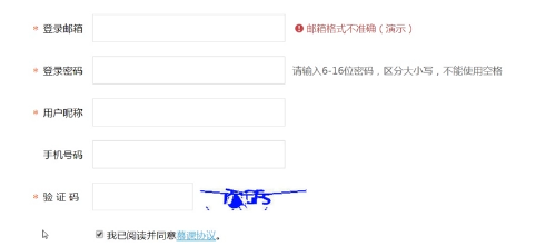
<label class="regist-label">

    <span class="regist-star">*</span>

    登录邮箱

</label>

.regist-label { width: 70px; padding-top: 10px; float: left; }

.regist-star { position: absolute; margin-left: -1em; font-family: simsun; color: #f30; }
<!doctype html>
<html>
<head>
<meta charset="utf-8">
<title>文本图标对齐与定位二三事</title>
<style>
body { margin: 0; font: 14px/1.4 "Microsoft YaHei"; background-color: #EDEFF0; }
a { color: #50B6E5; }
.constr { width: 1200px; margin-left: auto; margin-right: auto; }
.regist-head { height: 60px; line-height: 60px; padding-left: 30px; background-color: #be3948; color: #fff; font-size: 18px; }
.regist-body { min-height: 400px; padding: 100px 0; background-color: #fff; }
.regist-main { width: 600px; margin-left: auto; margin-right: auto; }
.regist-group { margin-top: 20px; overflow: hidden; }
.regist-label { width: 70px; padding-top: 10px; float: left; }
.regist-cell { display: table-cell; *display: inline-block; }
.regist-input { height: 18px; line-height: 18px; width: 260px; padding: 10px 5px; margin: 0 10px 0 0; border: 1px solid #d0d6d9; vertical-align: top; }
.regist-code-input { width: 130px; }
.regist-btn { display: inline-block; width: 160px; line-height: 40px; background-color: #39b94e; color: #fff; text-align: center; text-decoration: none; }
.regist-btn:hover { background-color: #33a646; }
.icon-warn { display: inline-block; width: 20px; height: 21px; background: url(http://img.mukewang.com/5453084a00016ae300120012.gif) no-repeat center; } .regist-star { position: absolute; margin-left: -1em; font-family: simsun; color: #f30; }
.regist-remark { position: absolute; line-height: 21px; padding-top: 9px; color: #666; }
.regist-warn { padding-left: 20px; color: #be3948; }
.regist-warn > .icon-warn { position: absolute; margin-left: -20px; }
</style>
</head> <body>
<div class="constr">
<div class="regist-head">注册</div>
<div class="regist-body">
<div class="regist-main">
<div class="regist-group">
<label class="regist-label"><span class="regist-star">*</span>登录邮箱</label>
<div class="regist-cell">
<input type="email" class="regist-input"><span class="regist-remark regist-warn">
<i class="icon-warn"></i>邮箱格式不准确(演示)
</span>
</div>
</div>
<div class="regist-group">
<label class="regist-label"><span class="regist-star">*</span>登录密码</label>
<div class="regist-cell">
<input type="password" class="regist-input"><span class="regist-remark">
请输入6-16位密码,区分大小写,不能使用空格
</span>
</div>
</div>
<div class="regist-group">
<label class="regist-label"><span class="regist-star">*</span>用户昵称</label>
<div class="regist-cell">
<input type="password" class="regist-input">
</div>
</div>
<div class="regist-group">
<label class="regist-label">手机号码</label>
<div class="regist-cell">
<input type="tel" class="regist-input">
</div>
</div>
<div class="regist-group">
<label class="regist-label"><span class="regist-star">*</span>验 证 码</label>
<div class="regist-cell">
<input class="regist-input regist-code-input"><img src="http://img.mukewang.com/545308540001678401500040.jpg">
</div>
</div>
<div class="regist-group">
<label class="regist-label"> </label>
<div class="regist-cell">
<input type="checkbox" checked><label>我已阅读并同意<a href="##">慕课协议</a>。</label>
<p>
<a href="javascript:" class="regist-btn">立即注册</a>
</p>
</div>
</div>
</div>
</div>
</div>
</body>
</html>
5)脱离文档流
垂直空间的层级
后来居上(准则)
z-index潜在误区
绝对定位元素都需要z-index控制层级,确定其显示的垂直位置
1.如果只有一个绝对定位元素,自然不需要z-index,自动覆盖普通元素;
2.如果两个绝对定位,控制DOM流的前后顺序达到需要的覆盖效果,依然无z-index;
3.如果多个绝对定位交错,非常非常少见,z-index:1控制;
4.如果非弹窗类的绝对定位元素z-index>2,必定z-index冗余,请优化!
备注:动画尽量作用在 绝对定位的元素上。
6)基本属性(天使的翅膀)
top/left/bottom/right
定位
一般组合使用:top+left/bottom+right
7)基本属性与width/height
相互替代性
绝对定位对立:left+right/top+bottom ————拉伸效果
positon:absolute;

left:0;

top:0;

width:50%;

=====等同于========

position:absolute;

left:0;

top:0;

width:50%;
差异——拉伸更强大
如:实现一个距离右侧200px全屏自适应容器层
---------------拉伸--------------

position: absolute;

left: 0;

right: 200px;

---------------width-------------

position: absolute;

left:0;

width:calc(100%-200);
相互支持性
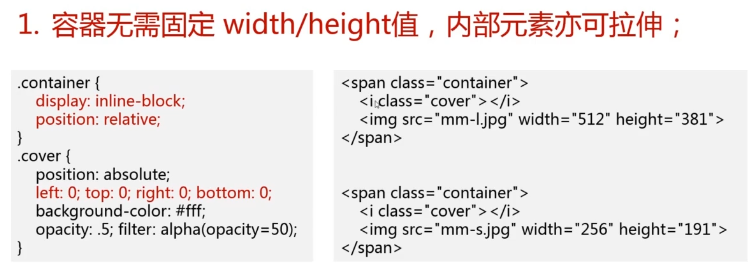
1. 容器无需固定width/height值,内部元素亦可拉伸
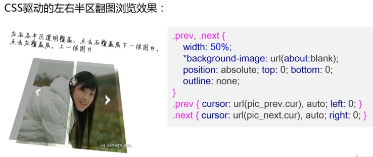
css驱动的左右半区翻图浏览效果
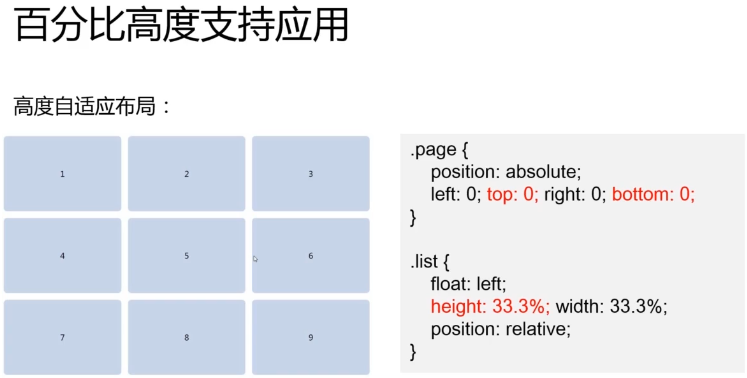
2. 容器拉伸,内部元素支持百分比width/height值
通常情况:
元素百分比height要起作用,需要父级容器的height值不是auto
绝对定位拉伸下:
即使父级容器的height值是auto,只要容器绝对定位拉伸形成,百分比高度值也是支持的
相互合作性
如果拉伸和width/height同时存在
则:width/height设置的尺寸 > left/top/right/bottom 拉伸的尺寸
当:尺寸限制,拉伸及margin:auto同时出现————绝对定位元素的绝对居中效果(IE8+)
8)absolute网页整体布局
摆脱狭隘的定位
1. body降级,子元素升级
//升级的子div设置为满屏

.page{ position: absolute; left:; top:;right:;bottom: 0 }

//绝对定位受限于父级,因此,page要想拉伸,则需要

html, body{ height: 100%; }
2. 各模块-头尾、侧边栏(pc端)各居其位
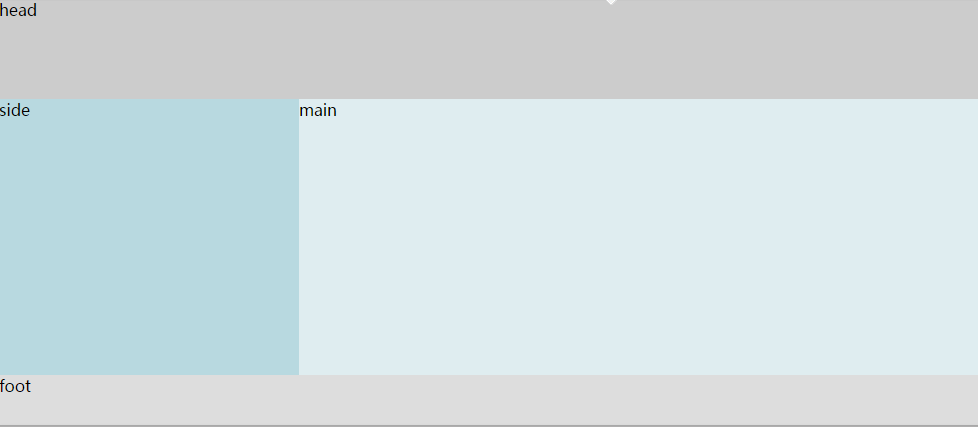
header,footer{ position: absolute; left:; right:; }

header {height: 50px; top:; }

footer {height: 50px; bottom:; }

side{ width: 250px; position: absolute; left:; top:50px; bottom:50px; }
3. 内容区域想象成body
.content{position: absolute; top: 50px; bottom:50px;left:250px; overflow:auto}
这时: 头尾及侧边栏都是fixed效果,不跟随滚动,避免了移动端position:fixed实现的诸多问题
4. 全屏覆盖与page平级
.overlay{

    position: absolute;

    top:;right:;bottom:;left:;

    z-index:;

}

<div class="page"></div>

<div class="overlay"></div>
完整实例
 <!doctype html>

 <html>

 <head>

 <meta charset="utf-8">

 <meta name="viewport" content="width=device-width,initial-scale=1.0,user-scalable=no">

 <title>慕课网-绝对定位整页布局演示</title>

 <link rel="stylesheet" href="css/absolute-layout.css">

 <style>

 body { font-family: 'microsoft yahei'; }

 </style>

 </head>

 <body>

 <div class="page">

     <div class="header">

         <h1>慕课网</h1>

         <a href="javascript:" class="icon-add">添加</a>

         <a href="javascript:" class="icon-search">搜索</a>

     </div>

     <div class="content">

         <div class="">

             <a href="http://www.imooc.com/learn/192" class="wechat-list">

                 <img src="http://img.mukewang.com/547d338d00010ced01200120.jpg">

                 <div class="cell">

                     <div class="wechat-h-time"><h5>张鑫旭</h5><time>早上09:51</time></div>

                     <p>CSS深入理解值绝对定位</p>

                 </div>

             </a>

             <a href="http://www.imooc.com/learn/192" class="wechat-list">

                 <img src="http://img.mukewang.com/547d338d00010ced01200120.jpg">

                 <div class="cell">

                     <div class="wechat-h-time"><h5>张鑫旭</h5><time>早上09:38</time></div>

                     <p>如果高度不够,可以手动缩小浏览器高度</p>

                 </div>

             </a>

             <a href="http://www.imooc.com/learn/192" class="wechat-list">

                 <img src="http://img.mukewang.com/547d338d00010ced01200120.jpg">

                 <div class="cell">

                     <div class="wechat-h-time"><h5>张鑫旭</h5><time>早上08:47</time></div>

                     <p>此demo是本系列最后一个demo</p>

                 </div>

             </a>

             <a href="http://www.imooc.com/learn/192" class="wechat-list">

                 <img src="http://img.mukewang.com/547d338d00010ced01200120.jpg">

                 <div class="cell">

                     <div class="wechat-h-time"><h5>张鑫旭</h5><time>早上08:36</time></div>

                     <p>此demo需要在高级浏览器中查看</p>

                 </div>

             </a>

             <a href="http://www.imooc.com/learn/192" class="wechat-list">

                 <img src="http://img.mukewang.com/547d338d00010ced01200120.jpg">

                 <div class="cell">

                     <div class="wechat-h-time"><h5>张鑫旭</h5><time>昨天</time></div>

                     <p>重在原理展示,结构可多变。例如,header放在page外面~~</p>

                 </div>

             </a>

             <a href="https://github.com/zhangxinxu/mobilebone" class="wechat-list">

                 <img src="http://img.mukewang.com/547d338d00010ced01200120.jpg">

                 <div class="cell">

                     <div class="wechat-h-time"><h5>张鑫旭</h5><time>昨天</time></div>

                     <p>最近鄙人整了个名叫Mobilebone的开源项目</p>

                 </div>

             </a>

             <a href="https://github.com/zhangxinxu/mobilebone" class="wechat-list">

                 <img src="http://img.mukewang.com/547d338d00010ced01200120.jpg">

                 <div class="cell">

                     <div class="wechat-h-time"><h5>张鑫旭</h5><time>星期三</time></div>

                     <p>就是依赖绝对定位整体布局,大家可以前去围观</p>

                 </div>

             </a>

             <a href="http://www.imooc.com/learn/192" class="wechat-list">

                 <img src="http://img.mukewang.com/547d338d00010ced01200120.jpg">

                 <div class="cell">

                     <div class="wechat-h-time"><h5 class="business">慕课网</h5><time>星期三</time></div>

                     <p><img src="http://img.mukewang.com/547d33a00001299b00320033.jpg" width="16" height="16"></p>

                 </div>

             </a>

             <a href="http://www.imooc.com/learn/121" class="wechat-list">

                 <img src="http://img.mukewang.com/547d338d00010ced01200120.jpg">

                 <div class="cell">

                     <div class="wechat-h-time"><h5>张鑫旭</h5><time>星期三</time></div>

                     <p>CSS深入理解之浮动</p>

                 </div>

             </a>

             <a href="http://www.imooc.com/learn/121" class="wechat-list">

                 <img src="http://img.mukewang.com/547d338d00010ced01200120.jpg">

                 <div class="cell">

                     <div class="wechat-h-time"><h5>张鑫旭</h5><time>上周</time></div>

                     <p>同样精彩,欢迎支持~</p>

                 </div>

             </a>

         </div>

     </div>

     <div class="footer">

         <a href="http://www.imooc.com/course/list">

             <i class="icon-wechat"></i>课程

         </a>

         <a href="http://www.imooc.com/wenda">

             <i class="icon-contacts"></i>问答

         </a>

         <a href="http://www.imooc.com/seek/index">

             <i class="icon-finds"></i>求课

         </a>

         <a href="http://www.imooc.com/space/course" class="active">

             <i class="icon-mes"></i>我的课程

         </a>

     </div>

 </div>

 </body>

 </html>
 /* wechat.css */

 body {

     margin:;

     -webkit-user-select: none;

     user-select: none;

     -ms-touch-action: none;

 }

 /* construction */

 html, body, .page {

     height: 100%; width: 100%;

     overflow: hidden;

 }

 .page {

     position: absolute; left:; top:;

 }

 body { background-color: #ebebeb; font-family: "Helvetica Neue", Helvetica, STHeiTi, sans-serif; }

 a { text-decoration: none; -webkit-tap-highlight-color: rgba(0,0,0,0); }

 h1,h2,h3,h4,h5,h6{ margin:; font-weight:; }

 ul,ol{ margin:; list-style-type: none; }

 .header, .footer, .content { position: absolute; left:; right:; }

 .header { height: 48px; padding: 0 5px; background-color: #21292B; color: #fff; top:; z-index:; }

 .header > h1 { line-height: 48px; margin: 0 0 0 10px; font-size: 18px; float: left; }

 .header > a { display: inline-block; width: 48px; height: 48px; background-size: 48px 144px; text-indent: -9em; overflow: hidden; }

 .header > .icon-search, .header > .icon-add { float: right; }

 .footer { height: 52px; border-top: 1px solid #dfdfdf; background-color: #fcfcfc; bottom:; z-index:; }

 .footer > a { width: 25%; text-align: center; color: #999; float: left; font-size: 14px; }

 .footer > a > i { display: block; height: 35px; margin-bottom: -3px; background-size: 35px 280px; }

 .footer > .active { color: #45c018; }

 .content { top: 48px; bottom: 53px; overflow: auto; }

 .icon-search, .icon-back, .icon-add { background: url(http://img.mukewang.com/547d339b000188bb00960288.png) no-repeat; }

 .icon-back { background-position: 0 -96px; }

 .icon-add { background-position: 0 -48px; }

 .icon-wechat, .icon-contacts, .icon-finds, .icon-mes { background: url(http://img.mukewang.com/547d33970001444d00700560.png) no-repeat center top; }

 .active .icon-wechat { background-position: center -35px; }

 .icon-contacts { background-position: center -70px; }

 .active .icon-contacts { background-position: center -105px; }

 .icon-finds  { background-position: center -140px; }

 .active .icon-finds { background-position: center -175px; }

 .icon-mes  { background-position: center -210px; }

 .active .icon-mes { background-position: center -245px; }

 .icon-find { background: url(icon-find.png) no-repeat; background-size: 28px 210px; }

 .icon-find-2 { background-position: 0 -30px; }

 .icon-find-3 { background-position: 0 -60px; }

 .icon-find-4 { background-position: 0 -90px; }

 .icon-find-5 { background-position: 0 -120px; }

 .icon-find-6 { background-position: 0 -150px; }

 .icon-find-7 { background-position: 0 -180px; }

 .icon-me { background: url(icon-me.png) no-repeat; background-size: 28px 120px; }

 .icon-me-2 { background-position: 0 -30px; }

 .icon-me-3 { background-position: 0 -60px; }

 .icon-me-4 { background-position: 0 -90px; }

 .wechat-list { display: block; height: 64px; padding: 8px 12px; box-sizing: border-box; border-bottom: 1px solid #d7d7d7; background-color: #fff; }

 .wechat-list:last-child { border-bottom:; }

 .wechat-list > img { width: 48px; height: 48px; float: left; }

 .wechat-list > .cell { padding-left: 58px; line-height: 24px; color: #333; }

 .wechat-h-time { overflow: hidden; }

 .wechat-h-time > h5 { font-size: 100%; float: left; }

 .wechat-h-time > time { font-size: 12px; color: #b9b9b9; float: right; }

 .wechat-h-time .business { color: #54688D; }

 .wechat-h-time + p { margin: 0 20px 0 0; font-size: 14px; color: #a8a8a8; white-space: nowrap; text-overflow: ellipsis; overflow: hidden; }

 .wechat-detail { position: relative; z-index:; }
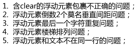
三、float
1)float的设计初衷仅仅是: 文字环绕效果
包裹与破坏
使父元素塌陷
- clear
- BFC/haslayout
.clearfix:after{content:'';display:table;clear:both;}

.clearfix{*zoom:;}
clearfix只需要用在包含浮动子元素的父级元素上
两种方式:
 <!doctype html>

 <html>

 <head>

 <meta charset="utf-8">

 <title>clear与margin重叠</title>

 </head>

 <body>

 1.

 <div style="background-color: #f5f5f5;">

     <img src="http://img.mukewang.com/53d60af3000171a002560191.jpg" style="float:left;">

     <div style="clear:both; margin-bottom:100px;">clear:both;</div>

 </div>

 <div style="margin-top: 100px;">本文字离图片的距离是?</div>

 <br><br><br><br>2.

 <div style="background-color: #f5f5f5; overflow: hidden;">

     <img src="http://img.mukewang.com/53d60af3000171a002560191.jpg" style="float:left; margin-bottom: 100px;">

 </div>

 <div style="margin-top: 100px;">本文字离图片的距离是?</div>

 </body>

 </html>
清除浮动有两种方法:
1、用clear清除浮动:浮动元素底部加入 <div> + clear:both 样式; 会发生margin重叠显现。
原因:外部元素会对内部元素产生影响,图片的bottom是针对下一个div的上部为标准,所以上移100px,而发生重叠。
2、用BFC清除浮动:浮动元素的父元素 + overflow:hidden 样式; 父元素会将整个元素包裹起来,从而不会出现塌陷和重叠显现。
原因:内部元素被包裹起来不会受到干扰,图片的bottom就是父元素的bottom,所以上移100px;
2)浮动的滥用
砌砖布局
1. 容错性比较糟糕,容易出问题
2. 这种布局需要元素固定尺寸,很难重复使用
3. 低版本ie下有很多问题
3)浮动与流动布局
1. 单侧固定
width+ float
padding-left/margin-left
2. 智能自适应
float
display: table-cell ie8+
display: inline-block ie7
4) 兼容
ie7
最新文章
- Android与H5交互
- chmod() has been disabled for security reasons
- Eclipse中安装使用SVN
- Ajax时代 SQL注入依然是隐患
- hdoj 1071 The area
- Django的请求流程(url)
- Linux企业级项目实践之网络爬虫(17)——存储页面
- 你被adblock坑过吗?
- JSP基本语法--Page指令 <%@page 属性=”内容“%>
- 【MyBatis源码解析】MyBatis一二级缓存
- JavaScript一个whenReady函数,监听及注册事件
- lisp : set 与setq 函数
- Centos7.2中安装pip
- confd template src格式和 templates 语法
- 如何控制TextBox的最打输入字符的长度
- tcp客户端封装
- Spring3自定义环境配置 <beans profile="">
- putty xming gnome-session
- html5 app开发
- awk 截取某段时间的日志
热门文章
- 如何在鼠标hover时改变标注的样式
- JAVA finally字句的异常丢失和返回值覆盖解析
- [C#]为微软ASP.NET官方教学视频增加字幕
- Kafka 0.10 KafkaConsumer流程简述
- Professional C# 6 and .NET Core 1.0 - 37 ADO.NET
- Java IO流学习总结三:缓冲流-BufferedInputStream、BufferedOutputStream
- 1activiti认识和数据库和插件配置
- DB2函数大全
- 微信jsSDK公众号开发时网页提示 invalid signature错误的解决方法
- button快速点击造成多次相应的解决办法