第 2 章 前端基础之CSS
一、CSS语法
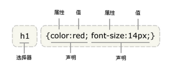
CSS规则由两个主要的部分构成:选择器,以及一条或多条声明。
 '''

     selector {

           property: value;

           property: value;

       ... property: value

     }

 '''
例如:
h1 {color:red; font-size:14px;}
二、CSS的四种引入方式
1、行内式
行内式是在标记的style属性中设定CSS样式,这种方式没有体现CSS的优势,不推荐使用。
<p style="background-color: rebeccapurple">hello yuan</p>
2、嵌入式
嵌入式是将CSS样式集中写在网页的<head></head>标签对的<style></style>标签对中。格式如下:
<head>

    <meta charset="UTF-8">

    <title>Title</title>

    <style>

        p{

            background-color: #2b99ff;

        }

    </style>

</head>
3、链接式
将一个.css文件引入到HTML文件中。
<link href="mystyle.css" rel="stylesheet" type="text/css"/>
4、 导入式
将一个独立的.css文件引入HTML文件中,导入式使用CSS规则引入外部CSS文件,<style>标记也是写在<head>中,使用的语法如下:
<style type="text/css">

          @import"mystyle.css"; 此处要注意.css文件的路径

</style>
注意:
导入式会在整个网页装载完成后再装载CSS文件,因此这就导致了一个问题,如果网页比较大则会出现显示无样式的页面,闪烁一下之后,再出现网页的样式。这是导入式固有的一个缺陷。使用链接式时与导入式不同的是它会以网页文件主体装载前装载CSS文件,因此显示出来的网页从一开始就是带样式的效果的,它不会象导入式那样先显示无样式的网页,然后再显示有样式的网页,这是链接式的优点。
三、选择器
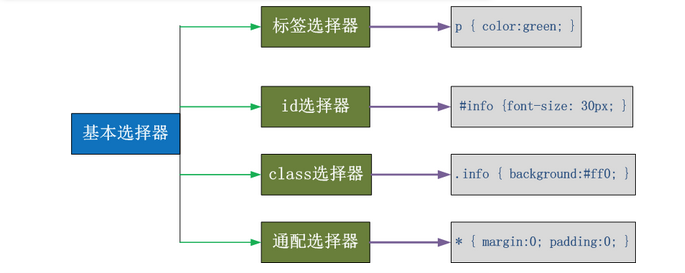
1、基本选择器
<!DOCTYPE html>

<html lang="en">

<head>

    <meta charset="UTF-8">

    <title>Title</title>

    <style>

        1  按标签名选择

        p{

            color: red;

        }

        div{

            background-color: green;

        }

        2 按id属性选择

        #c1{

            font-size: 40px;

        }

        3 按class属性选择

        .c2{

            background-color: rebeccapurple;

        }

        4 *

        *{

            color: red;

        }

    </style>

</head>

<body>

<p class="c2">hello1</p>

<p id="c1">hello2</p>

<p class="c2">hello3</p>

<div>DIV</div>

<!--<p style="color: red">hello3</p>-->

</body>

</html>
基本选择器
2、组合选择器
 E,F   多元素选择器,同时匹配所有E元素或F元素,E和F之间用逗号分隔      :div,p { color:#f00; }

 E F   后代元素选择器,匹配所有属于E元素后代的F元素,E和F之间用空格分隔 :li a { font-weight:bold;}

 E > F   子元素选择器,匹配所有E元素的子元素F            :div > p { color:#f00; }

 E + F   毗邻元素选择器,匹配所有紧随E元素之后的同级元素F  :div + p { color:#f00; }

 E ~ F   普通兄弟选择器(以破折号分隔)                 :.div1 ~ p{font-size: 30px; }
注意,关于标签嵌套:
一般,块级元素可以包含内联元素或某些块级元素,但是内联元素不能包含块级元素,它只能包含其它内联元素。需要注意的是,p标签不能包含块级标签。
<!DOCTYPE html>

<html lang="en">

<head>

    <meta charset="UTF-8">

    <title>Title</title>

    <style>

    /*后代选择器*/

         .outer p{

             color: red;

         }

    /*子代选择器*/

        .outer>p{

             color: red;

         }

        .outer .c2 p{

        }

    /*多元素选择器*/

        .outer>p,.c3{

            color: red;

        }

         .outer >p{

            color: rebeccapurple;

        }

         /*毗邻选择器*/

        .outer+p{

            color: red;

        }

        /*普通兄弟选择器(以破折号分割)*/

         .outer~p{

            color: red;

        }

    </style>

</head>

<body>

<div class="outer">

    <p>P</p>

    <div class="c2">

        <p>PP</p>

    </div>

</div>

<div class="c3">P</div>

<p>P3</p>

<div class="outer">

    <div class="inner">

        <p>P3</p>

    </div>

    <p>PPP</p>

</div>

<span>1111</span>

<p>P2</p>

<p egon="namealex" alex="sb">P4</p>

<p egon="ooo">P4</p>

<div egon="ooo">P4</div>

</body>

</html>
组合选择器
3、属性选择器
E[att]             匹配所有具有att属性的E元素,不考虑它的值。(注意:E在此处可以省略。)

E[att=val]         匹配所有att属性等于"val"的E元素  div[class="eroor"] {color :#f00;}

E[att~=val]        匹配所有att属性具有多个空格分隔的值、其中一个值等于"val"的E元素。

                   td[class="name"]  {color:#f00;}

E[attr^=val]       匹配属性值以指定值开头的每个元素 div[class^="test"] {background:#ffff00;}

E[attr$=val]       匹配属性值以指定值结尾的每个元素 div[class$="test"] {background:#ffff00;}

E[attr*=val]       匹配属性值以包含指定值的每个元素 div[class*="test"] {background:#ffff00;}
<!DOCTYPE html>

<html lang="en">

<head>

    <meta charset="UTF-8">

    <title>Title</title>

    <style>

        /*属性选择器*/

        div[egon="ooo"]{

            color: red;

        }

        [egon^="nameale"]{

            color: red;

        }

         [egon*="o"]{

            color: red;

        }

    </style>

</head>

<body>

<p>P3</p>

<div class="outer">

    <div class="inner">

        <p>P3</p>

    </div>

    <p>PPP</p>

</div>

<span>1111</span>

<p>P2</p>

<p egon="namealex" alex="sb">P4</p>

<p egon="ooo">P4</p>

<div egon="ooo">P4</div>

</body>

</html>
属性选择器
4、伪类
1)、anchor伪类:专用于控制链接的显示效果
'''

   a:link(没有接触过的链接),用于定义了链接的常规状态。

   a:hover(鼠标放在链接上的状态),用于产生视觉效果。

   a:visited(访问过的链接),用于阅读文章,能清楚的判断已经访问过的链接。

   a:active(在链接上按下鼠标时的状态)用于表现鼠标按下时的链接状态。

   伪类选择器:伪类指的是标签的不同状态:

              a ==> 点过状态 没有点过的状态  鼠标悬浮状态  激活状态

   a:link {color:#FF0000} 未访问的链接

   a:visited {color: #00FF00} 已访问的链接

   a:hover {color: #FF00FF} 鼠标移动到链接上

   a:active {color : #0000FF}  选定的链接  格式:标签:伪类名称{css代码;}

'''
<!DOCTYPE html>

<html lang="en">

<head>

    <meta charset="UTF-8">

    <title>Title</title>

    <style>

       .top{

           background-color: rebeccapurple;

           width: 100px;

           height: 100px;

       }

        .bottom{

            background-color: green;

            width: 100px;

            height: 100px;

        }

        .outer:hover .bottom{

            background-color: yellow;

        }

        注意:一定是outer:hover  控制outer里某一个标签,否则无效

        .top:hover .bottom{

            background-color: yellow;

        }

    </style>

</head>

<body>

<div class="outer">

    <div class="top">top</div>

    <div class="bottom">bottom</div>

</div>

</body>

</html>
5、before after 伪类
:before     p:before     在每个<p>元素之前插入内容

:after      p:after      在每个<p>元素之后插入内容

例:p:before {content:"hello";color:red;display:block;}
<!DOCTYPE html>

<html lang="en">

<head>

    <meta charset="UTF-8">

    <title>Title</title>

    <style>

        /*a:link{*/

            /*color: goldenrod;*/

        /*}*/

        /*a:hover{*/

            /*color: green;*/

        /*}*/

        /*a:active{*/

            /*color: red;*/

        /*}*/

        /*a:visited{*/

            /*color: darkgrey;*/

        /*}*/

        /*.c1{*/

            /*width: 100px;*/

            /*height: 100px;*/

            /*background-color: green;*/

        /*}*/

        /*.c1:hover{*/

            /*background-color: red;*/

        /*}*/

        /*.c2{*/

            /*width: 100px;*/

            /*height: 100px;*/

            /*background-color: goldenrod;*/

        /*}*/

        /*.c3{*/

            /*width: 100px;*/

            /*height: 100px;*/

            /*background-color: darkmagenta;*/

        /*}*/

        /*.box{*/

            /*border: 1px solid red;*/

        /*}*/

        /*.c3:hover .c2{*/

            /*background-color: green;*/

        /*}*/

        /*before after*/

        .outer:after{

            content: "world";

            color: red;

        }

    </style>

</head>

<body>

<!--<a href="">helloYuan</a>-->

<!--<div class="c1"></div>-->

<div class="box">

    <div class="c2"></div>

    <div class="c3"></div>

</div>

<div class="outer">

    <p>hello</p>

</div>

</body>

</html>
6、选择器的优先级
1)、CSS的继承
继承是CSS的一个主要特征,它是依赖与祖先-后代的关系的,继承是一种机制,它允许样式不仅可以应用于某个特定的元素,还可以应用与它的后代。例如一个BODY定义了的颜色也会应用到段落的文本中。
body{color:red;} <p>helloyuan</p>
这段文字都继承了由body {color:red;}样式定义的颜色,然而CSS继承性的权重是非常低的,是比普通元素的权重还要低的0.
p{color:green}
发现只要给加个颜色值就能覆盖掉它继承的样式颜色。由此可见:任何显示申明的规则都可以覆盖其继承样式。
此外,继承是CSS重要的一部分,我们甚至不用去考虑它为什么能够这样,但CSS继承也是有限制的,有一些属性不能被继承,如:border,margin,padding,background等。
div{

  border:1px solid #222

}

<div>hello <p>yuan</p> </div>
2)、CSS的优先级
所谓CSS优先级,即是指CSS样式在浏览器中被解析的先后顺序。
样式表中的特殊性描述了不同规则的相对权重,它的基本规则是:
1 内联样式表的权值最高 style="" -----------------------1000;
2 统计选择符中的ID属性个数 #id ------------------------------100;
3 统计选择符中的class属性个数 .class ----------------------------10;
4 统计选择符中的html标签名个数 p ---------------------------------1;
按这些规则将数字符串逐位相加,就得到最终的权重,然后在比较取舍时按照从左到右的顺序逐位比较。
1、文内的样式优先级为1,0,0,0,所以始终高于外部定义。

2、有!important 声明的规则高于一切。

3、如果!important 声明冲突,则比较优先权。

4、如果优先权一样,则按照在源码中出现的顺序决定,后来者居上。

5、由继承而得到的样式没有specificity的计算,它低于一切其它规则(比如全局选择符*定义的规则)。
四、CSS属性操作
1、CSS text
1)、文本颜色:color
颜色属性被用来设置文字的颜色。
颜色是通过CSS最经常的指定:
- 十六进制值 - 如:#FF0000
- 一个RGB值 - 如:RGB(255,0,0)
- 颜色的名称 - 如 :red
p { color: rebeccapurple; }
2)、水平对齐方式
text-align 属性规定元素中的文本的水平对齐方式。
- left 把文本排列到左边。默认值:由浏览器决定。
- right 把文本排列到右边。
- center 把文本排列到中间。
- justify 实现两端对齐文本效果。
<!DOCTYPE html>
<html lang="en">
<head>
<meta charset="UTF-8">
<title>CSS</title>
<style>
h1 {text-align:center;}
p.publish_time {text-align:right;}
p.content {text-align:justify;}
</style>
</head>
<body>
<h1>CSS text-align 水平居中</h1>
<p class="publish_time">2017 年 5 月 17 号</p>
<p class="content">
有个落拓不得志的中年人每隔三两天就到教堂祈祷,而且他的祷告词几乎每次都相同。第一次他到教堂时,
跪在圣坛前,虔诚地低语:“上帝啊,请念在我多年来敬畏您的份上。让我中一次彩票吧!阿门。”
几天后,他又垂头丧气回到教堂,同样跪着祈祷:“上帝啊,为何不让我中彩票?我愿意更谦卑地来
服侍你,求您让我中一次彩票吧!阿门。”又过了几天,他再次出现在教堂,同样重复他的祈祷。如此周而
复始,不间断地祈求着。到了最后一次,他跪着:“我的上帝,为何您不垂听我的祈求?让我中一次彩票吧!
只要一次,让我解决所有困难,我愿终身奉献,专心侍奉您……”就在这时,圣坛上发出一阵宏伟庄严的声
音:“我一直垂听你的祷告。可是最起码?你也该先去买一张彩票吧!”</p>
<p><b>注意:</b> 重置浏览器窗口大小查看 "justify" 是如何工作的。</p> </body>
</html>
3)、文本其它属性
'''

font-size:10px;

line-height:200px; 文本行高,通俗的讲,文字高度加上文字上下的空白区域的高度50%:基于字体大小的百分比

vertical-align:-4px 设置元素内容的垂直对齐方式,只对行内元素有效,对块级元素无效。

text-decoration:none  text-decoration 属性用来设置或删除文本的装饰,主要是用来删除链接的下划线

font-family:'Lucaida Bright'

font-weight:lighter/bold/border/

font-style:oblique

text-indent:150px;   首行缩进150px

letter-spacing:10px;  字母间距

word-spacing:20px;  单词间距

text-transform:capitalize/uppercase/lowercase; 文本转换,用于所有字句变成大写或小写字母,或每个单词的首字母大写

'''
2、背景属性
1)、属性介绍
- background-color
- background-image
- background-repeat
- background-position
 background-color: cornflowerblue

 background-image: url('1.jpg');

 background-repeat: no-repeat;(repeat:平铺满)

 background-position: right top(20px 20px);
简写
background:#ffffff url('1.png') no-repeat right top;
<!DOCTYPE html>

<html lang="en">

<head>

    <meta charset="UTF-8">

    <title>Title</title>

    <style>

     body

    {

        /*background-image:url('http://image.baidu.com/search/detail?ct=503316480&z=undefined&tn=baiduimagedetail&ipn=d&word=%E8%83%8C%E6%99%AF&step_word=&ie=utf-8&in=&cl=2&lm=-1&st=undefined&cs=3055598097,3360735557&os=2323812307,3137545118&simid=3410384594,366902202&pn=1&rn=1&di=10438789350&ln=1970&fr=&fmq=1505886753580_R&fm=&ic=undefined&s=undefined&se=&sme=&tab=0&width=undefined&height=undefined&face=undefined&is=0,0&istype=0&ist=&jit=&bdtype=0&spn=0&pi=0&gsm=0&objurl=http%3A%2F%2Fimg06.tooopen.com%2Fimages%2F20160711%2Ftooopen_sy_169964521661.jpg&rpstart=0&rpnum=0&adpicid=0');*/

        background-color:#cccccc;

    }

</style>

</head>

<body>

         <h1>Hello World!</h1>

</body>

</html>
3、边框属性
1)、属性介绍
- border-width (简写属性为元素的所有边框设置宽度,或者单独地为各边边框设置宽度,只有当边框样式不是none时才起作用,如果边框样式是none,边框宽度实际会重置为0,不允许指定负长度值。)
- border-style(required) (属性用于设置元素所有边框的样式,或者单独地为各边设置边框样式,只有当这个值不是none时边框才可能出现。)
- border-color
 border-style: solid;

 border-color: chartreuse;

 border-width: 20px;
简写
简写:border: 30px rebeccapurple solid;
2)、边框-单独设置各边
fdffs
border-top-style:dotted;

border-right-style:solid;

border-bottom-style:dotted;

border-left-style:none;
<!DOCTYPE html>

<html lang="en">

<head>

    <meta charset="UTF-8">

    <title>Title</title>

    <style>

        .c1{

            width: 200px;

            height: 200px;

            /*border-style: solid;*/

            /*border-width: 10px;*/

            /*border-color: red;*/

            border: solid red 2px;

            border-radius: 20%;

        }

    </style>

</head>

<body>

<div class="c1">sadfsda</div>
border-style的值:

4、列表属性
list-style-type            设置列表项标志的类型。

list-style-image           将图像设置为列表项标志。

list-style-position        设置列表中列表标志的位置。

list-style                 简写属性,用于把所有用于列表的属性设置于一个声明中。
list-style-type 属性指定列表项标记的类型:
ul {list-style-type: square;}
使用图像来替换列表项的标记:
ul {

      list-style-image: url(' ');

              }
<!DOCTYPE html>

<html lang="en">

<head>

    <meta charset="UTF-8">

    <title>Title</title>

</head>

<body>

     <table border="1px" cellpadding="2px" cellspacing="5px">

         <tr>

             <td>111</td>

             <td>111</td>

             <td>111</td>

             <td>111</td>

         </tr>

         <tr>

             <td colspan="2">111</td>

             <td>111</td>

             <td>111</td>

         </tr>

         <tr>

             <td>111</td>

             <td>111</td>

             <td>111</td>

             <td rowspan="2">111</td>

         </tr>

         <tr>

             <td>111</td>

             <td>111</td>

             <td>111</td>

         </tr>

     </table>

</body>

</html>
table 列表标签
5、dispaly属性
- none
- block
- inline
- inline-block
1)、none(隐藏某标签)
p{display:none;}
注意与visibility:hidden的区别:
visibility:hidden可以隐藏某个元素,但隐藏的元素仍需要占用与未隐藏之前一样的空间。也就是说,该元素虽然被隐藏了,但仍然会影响布局。
display:none可以隐藏某个元素,且隐藏的元素不会占用任何空间。也就是说,该元素不但被隐藏了,而且该元素原本占用的空间也会从页面布局中消失。
2)、block(内联标签设置为块级标签)
span {display :block;}
注意:一个内联元素设置为display:block是不允许有它内部的嵌套块元素。
3)、inline(块级标签设置为内联标签)
li {display:inline;}
4)、inline-block
display:inline-block可做列表布局,其中的类似与图片间的间隙小bug可以通过如下设置解决:
#outer{

            border: 3px dashed;

            word-spacing: -5px;

        }
<!DOCTYPE html>

<html lang="en">

<head>

    <meta charset="UTF-8">

    <title>Title</title>

    <style>

        /*.c1{*/

            /*display: inline;*/

            /*width: 200px;*/

            /*height: 200px;*/

            /*background-color: green;*/

        /*}*/

        /*span{*/

            /*width: 200px;*/

            /*height: 200px;*/

            /*background-color: wheat;*/

            /*display: block;*/

        /*}*/

           .c1{

             width: 200px;

            height: 200px;

            background-color: wheat;

            display: inline-block;

           }

        .c2{

             width: 200px;

            height: 200px;

            background-color: goldenrod;

            display: inline-block;

           }

        .c3{

             width: 200px;

            height: 200px;

            background-color: green;

            display: inline-block;

           }

        span{

            margin-left: -4px;

        }

        .Myhide{

            display: none;

        }

     /*===========================*/

        .box{

            border:1px solid red;

        }

        .ico,.egon{

            display: inline-block;

        }

        .box:hover img{

            display: block;

        }

    </style>

</head>

<body>

<!--<div class="c1">DIV</div>-->

<!--<span>SPAN</span>-->

<span class="c1 Myhide">111</span>

<span class="c2">222</span>

<span class="c3">333</span>

<div class="box">

    <div class="text">hkjfdashfkas</div>

    <div class="text">

        <div class="ico">???????????????</div>

        <div class="egon"><img class="Myhide" src="egon.jpg" alt="" width="30px" height="30px"></div>

    </div>

</div>

</body>

</html>
dispaly属性例子
6、外边距(margine)和内边距(padding)
1)、盒子模型
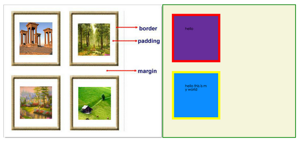
- margin:用于控制元素与元素之间的距离;margin的最基本用途就是控制元素周围空间的间隔,从视觉角度上达到相互隔开的目的。
- padding:用于控制内容与边框之间的距离。
- Border(边框):围绕在内边距和内容外的边框。
- Content(内容):盒子的内容,显示文本和图像。
2)、margine(外边距)
单外边距属性:
 margin-top:100px;

 margin-bottom:100px;

 margin-right:50px;

 margin-left:50px;
简写属性
margin:10px 20px 20px 10px;

        上边距为10px

        右边距为20px

        下边距为20px

        左边距为10px

margin:10px 20px 10px;

        上边距为10px

        左右边距为20px

        下边距为10px

margin:10px 20px;

        上下边距为10px

        左右边距为20px

margin:25px;

        所有的4个边距都是25px
居中应用
margin: 0 auto;
3)padding(内边距)
单独使用填充属性可以改变上下左右的填充,缩写填写属性也可以使用,一旦改变一切都改变。
设置同margine;
页码实例:
<!DOCTYPE html>

<html lang="en">

<head>

    <meta charset="UTF-8">

    <title>Title</title>

    <style>

        .outer{

            margin: 0 auto;

            width: 80%;

        }

        .content{

            background-color: darkgrey;

            height: 500px;

        }

        a{

            text-decoration: none;

        }

        .page-area{

            text-align: center;

            padding-top: 30px;

            padding-bottom: 30px;

            background-color: #f0ad4e;

        }

        .page-area ul li{

            display: inline-block;

        }

       .page-area ul li a ,.page-area ul li span{

            display: inline-block;

            color: #369;

            height: 25px;

            width: 25px;

            text-align: center;

            line-height: 25px;

            padding: 8px;

            margin-left: 8px;

            border: 1px solid #e1e1e1;

            border-radius: 15%;

        }

       .page-area ul li .page-next{

           width: 70px;

           border-radius:0

       }

       .page-area ul li span.current_page{

           border: none;

           color: black;

           font-weight:900;

       }

       .page-area ul li a:hover{

           color: #fff;

           background-color: #2459a2;

       }

    </style>

</head>

<body>

<div class="outer">

<div class="content"></div>

<div class="page-area">

             <ul>

                 <li><span class="current_page">1</span></li>

                 <li><a href="#" class="page-a">2</a></li>

                 <li><a href="#" class="page-a">3</a></li>

                 <li><a href="#" class="page-a">4</a></li>

                 <li><a href="#" class="page-a">5</a></li>

                 <li><a href="#" class="page-a">6</a></li>

                 <li><a href="#" class="page-a">7</a></li>

                 <li><a href="#" class="page-a">8</a></li>

                 <li><a href="#" class="page-a">9</a></li>

                 <li><a href="#" class="page-a">10</a></li>

                 <li><a href="#" class="page-a page-next">下一页</a></li>

             </ul>

</div>

</div>

</body>

</html>
思考1:body的外边距
边框在默认情况下会定会于浏览器窗口的左上角,但是并没有紧贴着浏览器的窗口的边框,这是因为body本身也是一个盒子(外层还有html),在默认情况下,body距离html会有若干像素的margin,具体数值因各个浏览器不尽相同,所以body中的盒子不会紧贴浏览器窗口的边框了,为了验证这一点,加上:
body{

    border: 1px solid;

    background-color: cadetblue;

}
解决方法:
body{

    margin: 0;

}
思考2:margin collapse(边界塌陷或者边界重叠)
1、兄弟div:
上面div的margin-bottom和下面div的margin-top会塌陷,也就是回取上下两者margin里最大值作为显示值
2、父子div:
if 父级div中没有border,padding,inline content,子级div的margin会一直向上找,直到找到某个标签包括border,padding,inline content中的其中一个,然后按此div进行margin;
<!DOCTYPE html>

<html lang="en" style="padding: 0px">

<head>

    <meta charset="UTF-8">

    <title>Title</title>

    <style>

        body{

            margin: 0px;

        }

        .div1{

            background-color: rebeccapurple;

            width: 300px;

            height: 300px;

            overflow: hidden;

        }

        .div2{

            background-color: green;

            width: 100px;

            height: 100px;

            margin-bottom: 40px;

            margin-top: 20px;

        }

        .div3{

            background-color:teal;

            width: 100px;

            height: 100px;

            margin-top: 20px;

        }

    </style>

</head>

<body>

<div style="background-color: bisque;width: 300px;height: 300px"></div>

<div class="div1">

   <div class="div2"></div>

   <div class="div3"></div>

</div>

</body>

</html>
解决方法:
overflow: hidden;
<!DOCTYPE html>

<html lang="en">

<head>

    <meta charset="UTF-8">

    <title>Title</title>

    <style>

        .c1,.c2{

            width: 300px;

            height: 300px;

            padding: 50px;

            /*padding: 50px 20px 20px;*/

            /*padding-top: 50px;*/

            border: dashed 2px red;

        }

        .c1{

             background-color: wheat;

             margin-bottom: 20px;

        }

        .c2{

             background-color: dodgerblue;

             margin-top: 50px;

        }

        .s1,.s2{

            color: white;

            padding: 10px;

        }

        .s1{

            background-color: rebeccapurple;

        }

        .s2{

            background-color: darkmagenta;

            margin-left: 100px;

        }

        .outer{

            width: 100%;

            height: 600px;

            background-color: wheat;

            overflow: hidden;

        }

        .inner{

            width: 80%;

            height: 300px;

            background-color: gray;

            margin: 100px auto;

        }

    </style>

</head>

<body>

    <div class="c1">Yuan</div>

    <div class="c2">Yuan2</div>

    <span class="s1">111</span>

    <span class="s2">222</span>

    <div class="outer">

        <div class="inner"></div>

    </div>

</body>

</html>
外边距与内边距
7、float属性
1)、基本浮动规则
先来了解一下block元素和inline元素在文档流中的排列方式。
block元素通常被现实为独立的一块,独占一行,多个block元素会各自新起一行,默认block元素宽度自动填满其父元素宽度。block元素可以设置width,height,margin,padding属性;
inline元素不会独占一行,多个相邻的行内元素会排列在同一行里,直到一行排列不下,才会新换一行,其宽度随元素的内容而变化。inline元素设置width,height属性无效。
- 常见的块级元素有div、form、table、p、pre、h1~h5、dl、ol、ul等。
- 常见的内联元素有span、a、strong、em、label、input、select、textarea、img、br等。
所谓的文档流,指的是元素排版布局过程中,元素会自动从左往右,从上往下的流式排列。
脱离文档流,也就是将元素从普通的布局排版中拿走,其他盒子在定位的时候,会当做脱离文档流的元素不存在而进行定位。
假如某个div元素A是浮动的,如果A元素上一个元素也是浮动的,那么A元素会跟随在上一个元素的后边(如果一行放不下这两个元素,那么A元素会被挤到下一行);如果A元素上一个元素是标准流中的元素,那么A的相对垂直位置不会改变,也就是说A的顶部总是和上一个元素的底部对齐。此外,浮动的框之后的block元素会认为这个框不存在,但其中的文本依然会为这个元素让出位置。浮动的框之后inline元素,会为这个框空出位置,然后按顺序排列。
示例代码:
<!DOCTYPE html>

<html lang="en">

<head>

    <meta charset="UTF-8">

    <title>Title</title>

    <style>

        *{

            margin: 0;

        }

        .r1{

            width: 300px;

            height: 100px;

            background-color: #7A77C8;

            float: left;

        }

        .r2{

            width: 200px;

            height: 200px;

            background-color: wheat;

            /*float: left;*/

        }

        .r3{

            width: 100px;

            height: 200px;

            background-color: darkgreen;

            float: left;

        }

    </style>

</head>

<body>

<div class="r1"></div>

<div class="r2"></div>

<div class="r3"></div>

</body>

</html>
2)、非完全脱离文档流
左右结构div盒子重叠现象,一般是由于相邻两个div一个使用浮动一个没有使用浮动,一个使用浮动一个没有导致div不是在同个“平面”上,但内容不会造成覆盖现象,只有div形成覆盖现象。
<!DOCTYPE html>

<html lang="en">

<head>

    <meta charset="UTF-8">

    <title>Title</title>

    <style>

        *{

            margin: 0;

        }

        .r1{

            width: 100px;

            height: 100px;

            background-color: #7A77C8;

            float: left;

        }

        .r2{

            width: 200px;

            height: 200px;

            background-color: wheat;

        }

    </style>

</head>

<body>

<div class="r1"></div>

<div class="r2">region2</div>

</body>

</html>
解决方法:要么都不使用浮动,要么都使用float浮动,要么对没有使用float浮动的div设置margin样式。
3)、父级塌陷现象
<!DOCTYPE html>

<html lang="en">

<head>

    <meta charset="UTF-8">

    <title>Title</title>

<style type="text/css">

         * {

             margin:0;padding:0;

         }

        .container{

            border:1px solid red;width:300px;

        }

        #box1{

            background-color:green;float:left;width:100px;height:100px;

        }

        #box2{

            background-color:deeppink; float:right;width:100px;height:100px;

        }

         #box3{

             background-color:pink;height:40px;

         }

</style>

</head>

<body>

        <div class="container">

                <div id="box1">box1 向左浮动</div>

                <div id="box2">box2 向右浮动</div>

        </div>

        <div id="box3">box3</div>

</body>

</body>

</html>
例子如上:.container和box3的布局是上下结构,上图发现box3跑到了上面,与.container产生了重叠,但文本内容没有发生覆盖,只有div发生覆盖现象,这个原因是因为第一个大盒子里的子元素使用了浮动,脱离了文档流,导致.container没有被撑开。box3认为.container没有高度(未被撑开),因此跑上去了。
解决方法:
a、固定高度
给.container设置固定高度,一般情况下文字内容不确定多少就不能设置固定高度,所以一般不能设置".container"高度(当然能确定内容多高,这种情况下“.container”是可以设置一个高度即可解决覆盖问题。或者给.container加一个固定高度的子div):
<div class="container">

                <div id="box1">box1 向左浮动</div>

                <div id="box2">box2 向右浮动</div>

                <div id="empty" style="height: 100px"></div>

</div>

<div id="box3">box3</div>
但是这样限定固定高度会使页面操作不灵活,不推荐!
b、清除浮动(推荐)
clear语法:
clear:none | left | right | both
取值:
none:默认值。允许两边都可以有浮动对象。
left:不允许左边有浮动对象。
right:不允许右边有浮动对象。
both:不允许有浮动对象。
但是需要注意的是:clear属性只会对自身起作用,而不会影响其他元素。
<!DOCTYPE html>

<html lang="en">

<head>

    <meta charset="UTF-8">

    <title>Title</title>

    <style>

        *{

            margin: 0;

        }

        .r1{

            width: 300px;

            height: 100px;

            background-color: #7A77C8;

            float: left;

        }

        .r2{

            width: 200px;

            height: 200px;

            background-color: wheat;

            float: left;

            clear: left;

        }

        .r3{

            width: 100px;

            height: 200px;

            background-color: darkgreen;

            float: left;

        }

    </style>

</head>

<body>

<div class="r1"></div>

<div class="r2"></div>

<div class="r3"></div>

</body>

</html>
把我住两点:
- 元素是从上到下、从左到右依次加载的。
- clear:left;对自身起作用,一旦左边有浮动元素,即切换到下一行来保证左边元素不是浮动的,依据这一点解决父级塌陷问题。
思考:
<!DOCTYPE html>

<html lang="en">

<head>

    <meta charset="UTF-8">

    <title>Title</title>

    <style>

        *{

            margin: 0;

        }

        .r1{

            width: 300px;

            height: 100px;

            background-color: #7A77C8;

            float: left;

        }

        .r2{

            width: 200px;

            height: 200px;

            background-color: wheat;

            float: left;

            clear: both;

        }

        .r3{

            width: 100px;

            height: 200px;

            background-color: darkgreen;

            float: left;

        }

    </style>

</head>

<body>

<div class="r1"></div>

<div class="r2"></div>

<div class="r3"></div>

</body>

</html>
解决父级塌陷
'''

   .clearfix:after{        <----在类名为"clearfix"的元素内最后面加入内容;

   content:".";           <----内容为"."就是一个英文的句号而已,也可以不写。

   display:block;         <----加入的这个元素转换为块级元素。

   clear:both;            <----清除左右两边浮动。

   visibility:hidden;     <----可见度设为隐藏。注意它和display:none;是有区别的。

                                visibility:hidden;仍然占据空间,只是看不到而已;

   line-height:0;         <----行高为0;

   height:0;              <----高度为0;

   font-size:0;           <----字体大小为0;

   }

   .clearfix  { *zoom:1;}  <----这是针对于IE6的,因为IE6不支持:after伪类,这个

                                神奇的zoom:1让IE6的元素可以清除浮动来包裹内部元素。

   整段代码就相当于在浮动元素后面跟了个宽度为0的空div,然后设定它clear:both来达到清除浮动

   的效果,之所以用它,是因为,不必在html文件中写入大量无意义的空标签,又能清除浮动。

   <div  class="head  clearfix" ></div>

'''
c、overflow:hidden
overflow:hidden的含义是超出的部分要裁切隐藏,float的元素虽然不在普通流中,但是他是浮动在普通流之上的,可以把普通流元素+浮动元素想象成一个立方体,如果没有明确设定包含容器高度的情况下,它要计算内容的全部高度才能确定在什么位置hidden,这样浮动元素的高度被计算进去,这样包含容器就会被撑开,清除浮动。
8、position定位
1)、static
static默认值,无定位,不能当作绝对定位的参照物,并且设置标签对象的left、top等值是不起作用的。
2)position :relative/absolute
relative :相对定位。
相对定位是相对于该元素在文档流中的原始位置,即以自己原始位置为参照物,有趣的是,即使设定了元素的相对定位以及偏移值,元素还占有着原来的位置,即占据文档流空间,对象遵循正常文档流,但将依据top,right,bottom。left等属性在正常文档流中偏移位置,而其层叠通过z-index属性定义。
注意:position:relative的一个主要用法:方便绝对定位元素找到参照物。
absolute:绝对定位。
定义:设置为绝对的元素框从文档流完全删除,并相对于最近的已定位祖元素定位,如果元素没有已定位的祖元素,那么它的位置相对于最初的包含块(即body元素),元素原先在正常文档流中所占的空间会关闭,就好像该元素原来不存在一样,元素定位后生产一个块级框,而不论原来它在正常流中生成何种类型的框。
重点:如果父级设置了position属性,例如position:relative;那么子元素就会以父级的左上角为原始点进行定位,这样能很好的解决自适应网站的标签偏离问题,即父级为自适应的,那我子元素就设置position:absolute;父元素设置position:relative;然后top,right。left用百分比宽度表示。
另外,对象脱离正常文档流,使用top,right,bottom,left等属性进行绝对定位,而其层叠通过z-index属性定义。
示例代码:
<!DOCTYPE html>

<html lang="en">

<head>

    <meta charset="UTF-8">

    <title>Title</title>

    <style>

        *{

            margin: 0;

        }

        .outet{

            /*position: relative;*/

        }

        .item{

            width: 200px;

            height:200px ;

        }

        .r1{

            background-color: #7A77C8;

        }

        .r2{

            background-color: wheat;

            /*position: relative;*/

            position: absolute;

            top: 200px;

            left: 200px;

        }

        .r3{

            background-color: darkgreen;

        }

    </style>

</head>

<body>

<div class="item r1"></div>

<div class="outet">

    <div class="item r2"></div>

    <div class="item r3"></div>

</div>

</body>

</html>
总结:参照物用相对定位,子元素用绝对定位,并且保证相对定位参照物不会偏移即可。
3)、position:fixed
fixed:对象脱离正常文档流,使用top,right,bottom,left等属性以窗口为参考点进行定位,当出现滚动条时,对象不会随着滚动。而其层叠通过z-index属性定义。注意点:一个元素若设置了position:absolute|fixed;则该元素就不能设置float,这是一个常识性的知识点,因为这是两个不同的流,一个是浮动流,另一个是定位流,但是relative却可以。因为它原本所占的空间仍然占据文档流。
在理论上,被设置为fixed的元素会被定位与浏览器窗口的一个指定坐标,不论窗口是否滚动,它都会固定在这个位置。
示例代码:
<!DOCTYPE html>

<html lang="en">

<head>

    <meta charset="UTF-8">

    <title>Title</title>

    <style>

        *{

            margin: 0;

        }

        .back{

            background-color: wheat;

            width: 100%;

            height: 1200px;

        }

        span{

            display: inline-block;

            width: 80px;

            height: 50px;

            position: fixed;

            bottom: 20px;

            right: 20px;

            background-color: rebeccapurple;

            color: white;

            text-align: center;

            line-height: 50px;

        }

    </style>

</head>

<body>

<div class="back">

    <span>返回顶部</span>

</div>

</body>

</html>
五、注意
1、默认的高度和宽度问题
1)、父子都是块级元素
<!DOCTYPE html>

<html>

<head>

    <title>fortest</title>

    <style>

        div.parent{

            width: 500px;

            height: 300px;

            background: #ccc;

        }

        div.son{

            width: 100%;

            height: 200px;

            background: green;

        }

    </style>

</head>

<body>

    <div class="parent">

        <div class="son"></div>

    </div>

</body>

</html>
这时,子元素设置为了父元素width的100%,那么子元素的宽度也是500px;但是如果我们把子元素的width去掉之后,就会发现子元素还是等于父元素的width。也就是说,对于块级元素,子元素的宽度默认为父元素的100%。
当我们给子元素添加padding和margin时,可以发现宽度width是父元素的宽度减去子元素的margin值和padding值。
如果去掉子元素的height,就会发现子元素的高度为0,故height是不会为100%的,一般我们都是通过添加内容(子元素)将父元素撑起来。
2)、父:块级元素 子:内联元素
如果内联元素是不可替换元素(除img,input以外的一般元素),元素是没有办法设置宽度的,也就谈不上100%的问题了,即内联元素必须依靠其内部的内容才能撑开。
如果内联元素是可替换元素(img,input,本身可以设置长和宽),不管怎么设置父元素的宽度和高度,而不设置img的宽和高时,img总是表现为其原始的宽和高。
<!DOCTYPE html>

<html>

<head>

    <title>...</title>

    <style>

        div.parent{

            width: 500px;

            height: 300px;

            background: #ccc;

        }

        img{

            height: 100px;

            background: green;

        }

    </style>

</head>

<body>

    <div class="parent">

        <img class="son" src="s1.jpg"></img>

    </div>

</body>

</html>
由此我们可以发现,虽然没有设置宽度,但是表现在浏览器上为160px,它并没有继承父元素的100%得到500px,而是根据既定的高度来等比例缩小宽度。同样,如果只设置width,那么height也会等比例改变。如果我们把img的width设置为100%,就可以发现其宽度这时就和父元素的宽度一致了,而我们一般的做法时,首先确定img的父元素的宽度和高度,然后再将img的宽度和高度设置位100%,这样,图片就能铺满父元素了。
六、后台管理布局
<!DOCTYPE html>

<html lang="en">

<head>

    <meta charset="UTF-8">

    <title>Title</title>

    <style>

        .pg-header{

           height: 48px;

           width: 100%;

           background-color: #2459a2;

           position: fixed;

           top:0;

           left: 0;

        }

        .left{

            position:absolute;

            left:0;

            top:48px;

            bottom:0;

            width:200px;

            background-color: #ededed;

        }

        .right{

            position:absolute;

            right:0;

            left:200px;

            top:48px;

            bottom:0;

            overflow:auto;

        }

        .content{

            height: 2000px;

            width: 100%;

        }

    </style>

</head>

<body>

<div class="pg-header"></div>

<div>

    <div class="left">

    </div>

    <div class="right">

      <div class="content"></div>

    </div>

</div>

</body>

</html>
七、CSS响应式布局
<!DOCTYPE html>

<html lang="en">

<head>

    <meta charset="UTF-8">

    <title>Title</title>

    <style>

        /*======================================初始化=====================*/

            *{

             margin: 0;

             padding: 0;

                  }

            body{

                font-size: 12px;

            }

            a{

              text-decoration: none;

            }

        /*======================================header区域设置=====================*/

        .header{

               height: 44px;

               width: 100%;

               background-color: #2459a2;

               position: fixed;

               top:0;

               left: 0;

        }

        .header_content{

            width: 80%;

            height: 44px;

            background-color: #2459a2;

            margin: 0 auto;

            line-height: 44px;

            position: relative;

        }

/*======header区part1:logo ===========*/

               .logo{

                    float: left;

                    width: 121px;

                    height: 23px;

                    margin-top: 9px;

                }

/*======header区part2:action-menu =====*/

               .action-menu{

                    float: left;

                    margin-left: 30px;

                }

                .action-menu a.tb{

                            color: #c0cddf;

                            padding: 0 10px;

                            text-align: center;

                            margin-left: -3px;

                            display: inline-block;

                        }

                .action-menu a.tb:hover {

                    color: #fff;

                    background-color: lightslategrey;

                }

                 .action-menu a.active, .action-menu a.active:hover {

                                color: #fff;

                                background-color:#204982;;

                            }

/*======header区part3:key-search =====*/

                 .key-search{

                         margin-top: 5px;

                         float: right;

                    }

                 .key-search a.search-icon-box, .search-txt {

                        float: left;

                    }

                .search-txt {

                    color: #333;

                    line-height: 25px;

                    padding: 2px 2px 2px 5px;

                    height: 25px;

                    width: 91px;

                }

                .key-search a.search-icon-box {

                    border: 1px solid #e0e0e0;

                    background-color: #f4f4f4;

                    width: 30px;

                    height: 31px;

                    border-left: 0;

                }

                .key-search a.search-icon-box span.search-icon{

                    background: url("images/icon.png") no-repeat 0 -197px;

                    float: left;

                    height: 12px;

                    width: 11px;

                    margin-left: 10px;

                    margin-top: 9px;

                }

/*======header区part4:action-nav =====*/

                .action-nav {

                       float: right;

                       margin-right: 10px;

                    }

                 .action-nav a {

                        color: white;

                        padding: 14px 18px;

                    }

                .action-nav a:hover{

                    background-color: lightslategrey;

                    color: white;

                }

 /*======================================content区域设置=====================*/

             .content-box {

                    background-color: #ededed;

                    padding-top: 44px;

                    height: 100%;

                }

             .content {

                    width: 960px;

                    margin: 0 auto;

                    height: auto!important;

                    overflow: hidden;

                    min-height: 713px;

                    padding: 6px 28px;

                    background-color: #fff;

                    /*overflow: hidden;取消后看看效果*/

                }

        /*===============================响应式布局=====================*/

         @media(max-width:1050px) {

          .action-menu a.item{

              display: none;

              background-color: gold;

              border: dashed 1px rebeccapurple;

              color: black;

          }

             .action-menu a.active{

                 padding: 0 25px;

             }

             .action-nav{

                 float: left;

                 margin-left: 80px;

             }

             .key-search{

                 float: right;

                 margin-right: 100px;

             }

          .action-menu:hover a.item{

              display: block;

          }

         }

        @media(max-width:810px) {

             .key-search{

                 display: none;

             }

            .action-nav{

                display: none;

            }

        }

    </style>

</head>

<body>

    <!--header结构-->

    <div class="header">

         <div class="header_content">

               <div class="logo">

                   <a href="/"><img src="data:images/logo.png" alt=""></a>

               </div>

               <div class="action-menu">

                        <a href="#" class="tb active">全部</a>

                        <a href="#" class="tb item">42区</a>

                        <a href="#" class="tb item">段子</a>

                        <a href="#" class="tb item">图片</a>

                        <a href="#" class="tb item">挨踢1024</a>

                        <a href="#" class="tb item">你问我答</a>

               </div>

               <div class="key-search">

                    <form action="/" method="post">

                        <input type="text" class="search-txt">

                        <a href="#" class="search-icon-box" >

                            <span class="search-icon"></span>

                        </a>

                    </form>

               </div>

               <div class="action-nav">

                    <a href="#" class="register-btn">注册</a>

                    <a href="#" class="login-btn">登录</a>

               </div>

         </div>

    </div>

    <!--content结构-->

    <div class="content-box">

        <div class="content">

        </div>

    </div>

</body>

</html>
最新文章
- Java程序员开发参考资源
- kettle插入/更新
- BF-KMP 算法
- HTML5 移动应用开发环境搭建及原理分析
- itext poi 学习之旅 (1)创建pdf
- UVA_Cubic Eight-Puzzle UVA 1604
- SQL数据库文件修复/用友/金蝶/管家婆/速达/思讯数据库恢复 硬盘恢复
- 開始:触摸MySQL
- linux根据端口号查询来源程序
- BZOJ 4108: [Wf2015]Catering [上下界费用流]
- Java .classpath文件Classpath entry org.maven.eclipse.MAVEN2_CLASSPATH_CONTAINER will not be exported or published异常解决办法
- vue通过id从列表页跳转到对应的详情页
- css 颜色表示法
- Intel发6款全新9代i9/i7/i5 CPU:巅峰8核
- Qt5.7 无法输入中文问题
- Centos维护命令
- Tornado 模板(StaticFileHandler/static_path/template_path等) 笔记
- asp.net core中使用log4net
- Spring学习笔记之各个包的作用
- JAVA多线程基础学习二:synchronized