CSS之小知识
1、居中
a、文字水平居中
text-align:center;
b、文字垂直居中
/* 如果有n行文字,那么将行高设为容器高度的n分之一 */

height: 35px; line-height: 35px;
c、容器水平居中
width:300px;

margin:0 auto;
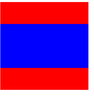
d、容器垂直居中
方法1:绝对定位
  <style>

    .big {

      background: red;

      height: 200px;

      width: 200px;

    }

    .small {

      background: blue;

      height: 100px;

      width: 200px;

    }

    .big {

      position: relative;

    }

    .small {

      position: absolute;

      top: calc(50% - 50px);

    }

  </style>

  <div class="big">

    <div class="small"></div>

  </div>
方法2:flex弹性布局
  <style>

    .big {

      background: red;

      height: 200px;

      width: 200px;

    }

    .small {

      background: blue;

      height: 100px;

      width: 200px;

    }

    .big {

      display: flex;

      align-items: center;

    }

  </style>

  <div class="big">

    <div class="small"></div>

  </div>
效果:
2、box-shadow使用
box-shadow: h-shadow v-shadow blur spread color inset;
h-shadow 必需。水平阴影的位置。允许负值。
v-shadow 必需。垂直阴影的位置。允许负值。
blur 可选。模糊距离。
spread 可选。阴影的尺寸。
color 可选。阴影的颜色。请参阅 CSS 颜色值。
inset 可选。将外部阴影 (outset) 改为内部阴影,默认外部。
注:可以设置多个值,多个阴影覆盖。boder若设置圆角,阴影相应自动为圆角。
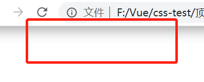
案例1:页面顶部阴影
给body添加阴影
  <style>

    body:before {

      content: "";

      position: fixed;

      top: -10px;

      left: 0;

      width: 100%;

      height: 10px;

      box-shadow: 0px 0px 20px rgba(66,66,66);

      z-index: 100;

      }

  </style>
效果:
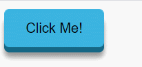
案例2:3D按钮
box-shadow给一个垂直5px的阴影,在给一个10px,5px的模糊阴影。点击后移动按钮,同时减小阴影的尺寸即可。
  <style>

    button {

      padding: 10px 20px;

      background: #3bb3e0;

      border: 1px solid #3bb3e0;

      border-radius: 5px;

      cursor: pointer;

      box-shadow: 0px 5px 0px #156785, 0px 10px 5px #999;

    }

    button:active {

      transform: translateY(3px);

      box-shadow: 0px 2px 0px #156785, 0px 5px 5px #999;

    }

  </style>

  <button type="button">Click Me!</button>
效果:
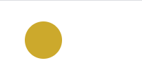
案例3:光环
    .pulse {

      margin: 20px;

      width: 36px;

      height: 36px;

      border-radius: 50%;

      background: #cca92c;

      cursor: pointer;

      box-shadow: 0 0 0 rgba(204,169,44, 0.4);

      animation: pulse 3s infinite;

    }

    @keyframes pulse {

      0% { box-shadow: 0 0 0 0 rgba(204,169,44, 0.4); }

      70% { box-shadow: 0 0 0 18px rgba(204,169,44, 0); }

      100% { box-shadow: 0 0 0 0 rgba(204,169,44, 0); }

    }

  </style>

  <div class="pulse"></div>
效果:
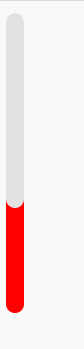
案例4:温度计效果
  <style>

    .thermometer {

      height: 200px;

      width: 12px;

      border-radius: 10px;

      background-color: #e3e1e1;

      cursor: pointer;

      box-shadow: inset 0 -100px 0 red;

      animation: thermometer 3s infinite;

    }

    @keyframes thermometer {

      0% { box-shadow: inset 0 -50px 0 red; }

      100% { box-shadow: inset 0 -150px 0 red; }

    }

  </style>

  <div class="thermometer"></div>
效果:
案例5:滚动条样式
  <style>

    ::-webkit-scrollbar-track {

      box-shadow: inset 0 0 6px rgba(0,0,0,0.3);

      border-radius: 10px;

      background-color: #F5F5F5;

    }

    ::-webkit-scrollbar {

      width: 12px;

      background-color: #F5F5F5;

    }

    ::-webkit-scrollbar-thumb {

      border-radius: 10px;

      box-shadow: inset 0 0 6px rgba(0,0,0,.3);

      background-color: #555;

    }

    .scrollbar {

      height: 200px;

      width: 65px;

      background: #F5F5F5;

      overflow-y: scroll;

    }

    .force-overflow {

      min-height: 450px;

    }

  </style>

  <div class="scrollbar">

    <div class="force-overflow"></div>

  </div>
效果:
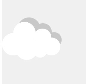
案例6:复制图形
多个值叠加形成
  <style>

    .box {

      width: 200px;

      height: 200px;

      background: #f0f0f0;

      position: relative;

    }

    .cloud {

      position: absolute;

      top: calc(50% - 25px);

      width: 50px;

      height: 50px;

      background: #fff;

      border-radius: 50%;

      box-shadow: 65px -15px 0 -5px #fff, 25px -25px #fff, 30px 10px #fff, 60px 15px 0 -10px #fff, 85px 5px 0 -5px #fff, 35px -35px #c8c8c8, 66px -27px 0 -5px #c8c8c8, 91px -10px 0 -8px #c8c8c8; }

  </style>

  <div class="box">

    <div class="cloud"></div>

  </div>
效果:
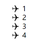
3、图片做列表标志
  <style>

    ul {

      list-style: none;

    }

    ul li {

      background: url('li.png') 30px 30px no-repeat;

      background-position: 0 -8px;

    }

    span {

      margin: 30px;

    }

  </style>

  <ul>

    <li><span>1</span></li>

    <li><span>2</span></li>

    <li><span>3</span></li>

    <li><span>4</span></li>

  </ul>
效果:
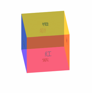
4、3D效果
  <style>

    .box{

      margin: 60px;

      width: 100px;

      height: 100px;

      /* perspective: 800px; */

    }

    .container{

      position: relative;

      transform-style: preserve-3d;

      animation: rY 5s infinite linear;

    }

    .item{

      position: absolute;

      width: 100px;

      height: 100px;

      opacity:0.5;

      text-align: center;

      line-height: 100px;

    }

    .it1{

      background: red;

      transform: translateZ(50px);

    }

    .it2{

      background: yellow;

      transform: translateX(50px) rotateY(90deg);

    }

    .it3{

      background: green;

      transform: translateZ(-50px) rotateY(180deg);

    }

    .it4{

      background: blue;

      transform: translateX(-50px) rotateY(270deg);

    }

    .it5{

      background: orange;

      transform: translateY(-50px) rotateX(90deg);

    }

    .it6{

      background: violet;

      transform: translateY(50px) rotateX(90deg);

    }

    @keyframes rY {

      from {transform: rotateX(-33.5deg) rotateY(0deg)}

      to {transform: rotateX(-33.5deg) rotateY(360deg)}

    }

  </style>

  <div class="box">

    <div class="container">

      <div class="item it1">红</div>

      <div class="item it2">黄</div>

      <div class="item it3">绿</div>

      <div class="item it4">蓝</div>

      <div class="item it5">橙</div>

      <div class="item it6">紫</div>

    </div>

  </div>
效果:
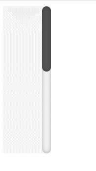
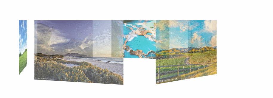
案例2:照片墙
  <style>

    .box{

      margin: 150px;

      perspective: 800px;

    }

    .container{

      position: relative;

      transform-style: preserve-3d;

      animation: rY 20s infinite linear;

      /* transform: rotateX(-30deg) rotateY(0deg); */

    }

    .item{

      position: absolute;

      width: 160px;

      height: 100px;

      opacity:0.7;

    }

    .it1{

      background: url('1.jpg') no-repeat;

      background-size: 100% 100%;

      transform: translateX(80px) translateZ(200px);

    }

    .it2{

      background: url('2.jpg') no-repeat;

      background-size: 100% 100%;

      transform: translateX(240px) translateZ(100px) rotateY(60deg);

    }

    .it3{

      background: url('3.jpg') no-repeat;

      background-size: 100% 100%;

      transform: translateX(240px) translateZ(-100px) rotateY(120deg);

    }

    .it4{

      background: url('4.jpg') no-repeat;

      background-size: 100% 100%;

      transform: translateX(80px) translateZ(-200px) rotateY(180deg);

    }

    .it5{

      background: url('5.jpg') no-repeat;

      background-size: 100% 100%;

      transform: translateX(-80px) translateZ(-100px) rotateY(240deg);

    }

    .it6{

      background: url('6.jpg') no-repeat;

      background-size: 100% 100%;

      transform: translateX(-80px) translateZ(100px) rotateY(300deg);

    }

    @keyframes rY {

      from {transform: rotateY(0deg)}

      to {transform: rotateY(360deg)}

    }

  </style>

  <div class="box">

    <div class="container">

      <div class="item it1"></div>

      <div class="item it2"></div>

      <div class="item it3"></div>

      <div class="item it4"></div>

      <div class="item it5"></div>

      <div class="item it6"></div>

    </div>

  </div>
效果:
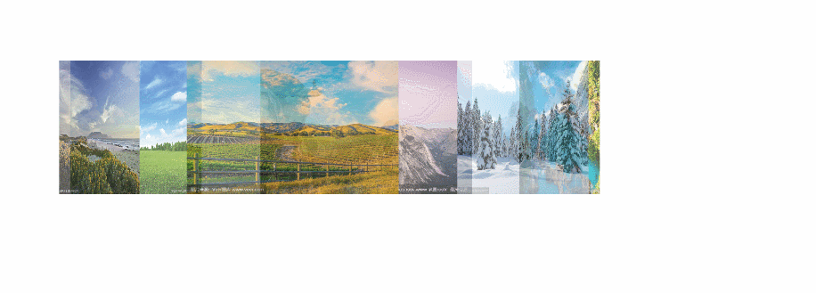
若不加perspective:
5、黑白图片
设置该段代码,图片会变成黑白图片
img.desaturate {

    filter: grayscale(100%);

    -webkit-filter: grayscale(100%);

    -moz-filter: grayscale(100%);

    -ms-filter: grayscale(100%);

    -o-filter: grayscale(100%);

}
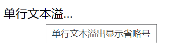
6、单行文本溢出显示省略号
  <style>

    .text{

      width: 100px;

      overflow: hidden;

      /* 文本溢出显示省略号 */

      text-overflow:ellipsis;

      /* 文本不会换行 */

      white-space: nowrap;

    }

  </style>

  <div class="text" title="单行文本溢出显示省略号">单行文本溢出显示省略号</div>
效果:
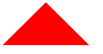
7、三角形
  <style>

    .triangle {

      border-color: transparent transparent red transparent;

      border-style: solid;

      border-width: 0px 100px 100px 100px;

      height: 0px;

      width: 0px;

    }

  </style>

  <div class="triangle"></div>
效果:
8、选择器
a、:not()选择器
选中不在此范围内的元素,例如:div:not(:last-child),选中除最后一个div的所有div元素
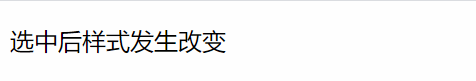
b、::selection选择器
选择器匹配元素中被用户选中或处于高亮状态的部分,可以应用于少数的CSS属性:color, background, cursor,和outline
  <style>

    p::selection{

      color: #fff;

      background:red;

    }

  </style>

  <p>选中后字体颜色和背景颜色改变</p>
效果:
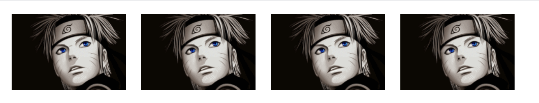
9、文字模糊处理
text-shadow: 0 0 2px rgb(236 51 51);
效果:

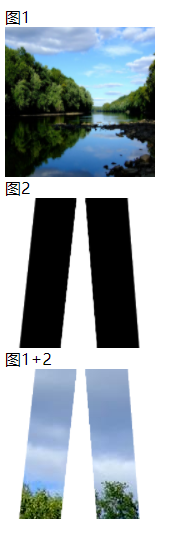
10、misk-image
设置元素上遮罩层的图像,和background差不多,同样拥有size、repeat、position等属性
mask-image的图片需要满足两个条件:1、png图片;2、背景是透明色的图,或者有透明色。
案例1:两张图片结合
  <style>

    .pic1{

      width: 150px;

      height: 150px;

      background-image: url('pic1.jpg');

      background-repeat: no-repeat;

      background-size: 150px 150px;

    }

    .pic2{

      width: 150px;

      height: 150px;

      background-image: url('pic2.png');

      background-repeat: no-repeat;

      background-size: 150px 150px;

    }

    .mask{

      width: 150px;

      height: 150px;

      background-image: url('pic1.jpg');

      -webkit-mask-image: url('pic2.png');

      -webkit-mask-size: 150px 150px;

      -webkit-mask-repeat: no-repeat;

      -webkit-mask-position: 50% 50%;

    }

  </style>

  <span>图1</span>

  <div class="pic1"></div>

  <span>图2</span>

  <div class="pic2"></div>

  <span>图1+2</span>

  <div class="mask"></div>
效果:
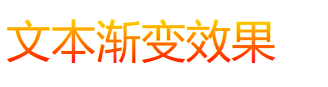
案例2:文本渐变
-webkit-gradient是background的一个属性值
第一组参数type(类型)为 linear
第二组参数是,x1 y1, x2 y2,当成颜色渐变体的两个点的坐标就是。x1,x2,y1,y2的取值范围为0%-100%,当x1,x2,y1,y2取值为极值的时候,x1和x2可以取值left(或0%)或right(或100%),,y1和y2可以取值top(或0%)或bottom(或100%)
from(开始颜色值),to(结束颜色值)是两个渐变颜色值
  <style>

    .text {

      color: red;

      position: relative;

      font-size: 30px;

    }

    .text[data-content]::after {

      content: attr(data-content);

      z-index: 10;

      color: yellow;

      position: absolute;

      top: 0;

      left: 0;

      -webkit-mask-image:-webkit-gradient(linear, 0 0, 0 bottom, from(yellow), to(rgba(0,0,255,0)));

    }

  </style>

  <div class="text" data-content="文本渐变效果">文本渐变效果</div>
效果:
11、background-blend-mode
用于单个标签间内背景图与渐变背景间的混合模式,类似ps将多个图层混合得到一个新的效果。
属性值:
normal默认值。设置正常的混合模式
multiply正片叠底模式,用混合颜色来增重基色,产生一种更深的颜色。用黑色正片叠底的结果是黑色,用白色正片叠底的结果是图片没有任何变化。
screen滤色模式,两个像素色的逆向正片叠底。滤色和正片叠底正好相反,使用白色进行虑色会产生白色,使用黑色虑色的结果是图像没有变化。
overlay叠加模式,颜色变深的程度依赖于基色:浅色变的更浅,深色变得更深。
darken变暗模式,选择两个重叠的像素中颜色更深的那个。
lighten变亮模式,选择两个叠加的像素中颜色较轻的那个。
color-dodge颜色减淡模式,颜色减淡减小对比度使基色变亮以反映混合色。
saturation 饱和度模式,当“基色”颜色与“混合色”颜色的饱和度值不同时,才能使用描绘颜色进行着色处理
color 颜色模式,该模式能够使灰色图像的阴影或轮廓透过着色的颜色显示出来,产生某种色彩化的效果。
luminosity 亮度模式,能够使用“混合色”颜色的亮度值进行着色,而保持“基色”颜色的饱和度和色相数值不变。其实就是用“基色”中的“色相”和“饱和度”以及“混合色”的亮度创建“结果色”。此模式创建的效果是与“颜色”模式创建的效果相反
Hard light 强光模式,产生一种强光照射的效果。如果“混合色”颜色“基色”颜色的像素更亮一些,那么“结果色”颜色将更亮;如果“混合色”颜色比“基色”颜色的像素更暗一些,那么“结果色”将更暗。
Difference 差值模式,将从图像中“基色”颜色的亮度值减去“混合色”颜色的亮度值,如果结果为负,则取正值,产生反相效果。由于黑色的亮度值为0,白色的亮度值为255,因此用黑色着色不会产生任何影响,用白色着色则产生被着色的原始像素颜色的反相。
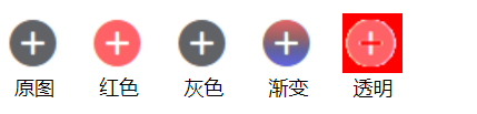
案例1:图标变色
假设我们有这样一张图片,JPG、PNG、GIF 都可以,但是有一个前提要求,就是主色黑色纯色,底色白色(底色如果是透明色,将会填充为对应颜色)
lighten变亮模式与变暗模式产生的效果相反:黑色比任何颜色都要暗,所以黑色会被任何色替换掉。反之,如果素材的底色是黑色,主色是白色。那就应该用变暗(darken)的混合模式
  <style>

    .pic {

      display: inline-block;

      width: 36px;

      height: 36px;

      background-image: url('icon.png');

      background-size: cover;

      line-height: 90px;

      text-align: center;

      margin-right: 10px;

      font-size: 12px;

    }

    .pic1 {

      background-image: url('icon.png'), linear-gradient(#f00, #f00);

      background-blend-mode: lighten;

      background-size: cover;

    }

    .pic2 {

      background-image: url('icon.png'), linear-gradient(#333, #333);

      background-blend-mode: lighten;

      background-size: cover;

    }

    .pic3 {

      background-image: url('icon.png'), linear-gradient(#f00, #00f);

      background-blend-mode: lighten;

      background-size: cover;

    }

    .pic4 {

      display: inline-block;

      width: 36px;

      height: 36px;

      background-image: url('icon1.png');

      background-size: cover;

      line-height: 90px;

      text-align: center;

      margin-right: 10px;

      font-size: 12px;

    }

    .pic41 {

      background-image: url('icon1.png'), linear-gradient(#f00, #f00);

      background-blend-mode: lighten;

      background-size: cover;

    }

  </style>

  <div class="pic">原图</div>

  <div class="pic pic1">红色</div>

  <div class="pic pic2">灰色</div>

  <div class="pic pic3">渐变</div>

  <div class="pic4 pic41">透明</div>
效果:
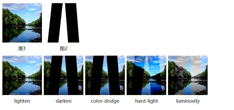
案例2:多个图片叠加
将两个或者多个图片利用混合模式叠加在一起
  <style>

    .pic1{

      display: inline-block;

      width: 100px;

      height: 100px;

      background-image: url('pic1.jpg');

      background-repeat: no-repeat;

      background-size: 100px 100px;

      line-height: 230px;

      text-align: center;

      font-size: 12px;

    }

    .pic2{

      display: inline-block;

      width: 100px;

      height: 100px;

      background-image: url('pic2.png');

      background-repeat: no-repeat;

      background-size: 100px 100px;

      line-height: 230px;

      text-align: center;

      font-size: 12px;

    }

    .pic{

      display: inline-block;

      width: 100px;

      height: 100px;

      background: url('pic1.jpg'), url('pic2.png');

      background-size: 100px 100px;

      line-height: 230px;

      margin-top: 10px;

      text-align: center;

      font-size: 12px;

    }

    .mask1{

      background-blend-mode: lighten;

    }

    .mask2{

      background-blend-mode: darken;

    }

    .mask3{

      background-blend-mode: color-dodge;

    }

    .mask4{

      background-blend-mode: hard-light;

    }

    .mask5{

      background-blend-mode: luminosity;

    }

  </style>

  <div class="pic1">图1</div>

  <div class="pic2">图2</div>

  <div></div>

  <div class="pic mask1">lighten</div>

  <div class="pic mask2">darken</div>

  <div class="pic mask3">color-dodge</div>

  <div class="pic mask4">hard-light</div>

  <div class="pic mask5">luminosity</div>
效果:
案例3:利用叠加制作hover效果
  <style>

    .pic {

      width: 150px;

      height: 100px;

      margin: 10px;

      float: left;

      background: url('blend.png'),linear-gradient(#f00, #00f);

      background-size: cover, 100% 100%;

      background-position: 0 0, -150px 0;

      background-blend-mode: luminosity;

      background-repeat: no-repeat;

      transition: .5s background-position linear;

    }

    .pic1 {

      background-image: url('blend.png'),linear-gradient(90deg, #ff5722, #03a9f4);

    }

    .pic2 {

      background-image: url('blend.png'),linear-gradient(-180deg, #00bcd4, #fa1a09);

    }

    .pic3 {

      background-image: url('blend.png'),linear-gradient(45deg, #ffc107, #3f51b5, #4caf50, #ff0057, #fae105, #5c00ff);

    }

    .pic:hover {

      background-position: 0 0, 0 0;

    }

  </style>

  <div class="pic"></div>

  <div class="pic pic1"></div>

  <div class="pic pic2"></div>

  <div class="pic pic3"></div>
效果:
最新文章
- linux 字符设备驱动写法
- 【Javascript】解决Ajax轮询造成的线程阻塞问题(过渡方案)
- char *p = "abcdefg"; p[0] = p[1]出错
- Salt官方将RHEL5/CentOS5 源
- VB6-表格控件MSHFlexGrid 实用代码
- 『在线工具』 基于 xsser.me 源码 + BootStrap 前端 的 XSS 平台
- C语言刷新缓冲区(转载)
- 网站服务管理系统wdcp简介及功能特性
- hdu 4944 FSF’s game(数论)
- Javascript闭包的一些研究
- C# 常用接口学习 IEnumerable<T>
- Ironic中pxe driver和agent driver的区别
- Java采用RSA加密及解密技术的有关Maven项目的配置流程:
- VScode快捷键、Chrome快捷键知识小总结和状态码
- centos7如何添加开机启动服务/脚本
- 安全之路 —— 无DLL文件实现远程线程注入
- <数据结构与算法分析>读书笔记--模型
- Linux shell中处理
- js 判断整数
- sql点滴43—mysql允许用户远程登陆