css3动画(animation)效果3-正方体合成
2024-10-19 08:53:53
<!DOCTYPE html>
<html lang="en">
<head>
<meta charset="UTF-8">
<title>旋转的星球</title>
<style type="text/css">
ul{
margin: 0;
padding: 0;
list-style: none;
}
.box{
height: 100px;
width: 100px;
perspective: 500px;
margin: 50px 0 0 50px;
}
.list{
position: relative;
height: 100px;
width: 100px;
background-color: blue;
transform-style: preserve-3d;
transform-origin: 0 0 0;
animation: rotate 1s 10s 3 both linear;
}
.in{
position: absolute;
height: 100px;
width: 100px;
}
.list .in:nth-child(6){
background-color: pink;
transform-origin: top;
animation: in6 2s both;
}
.list .in:nth-child(5){
background-color: lightgreen;
transform-origin: right;
animation: in5 2s 2s both;
}
.list .in:nth-child(4){
background-color: lightblue;
transform-origin: bottom;
animation: in4 2s 4s both;
}
.list .in:nth-child(3){
background-color: lightcoral;
transform-origin: left;
animation: in3 2s 6s both;
}
.list .in:nth-child(2){
background-color: lightcyan;
animation: in2 2s 8s both;
}
.list .in:nth-child(1){background-color: lightsalmon;}
.box:hover .list{animation-play-state: paused;}
.box:hover .in{animation-play-state: paused;}
@keyframes in6{100%{transform: rotateX(90deg);}}
@keyframes in5{100%{transform: rotateY(90deg);}}
@keyframes in4{100%{transform: rotateX(-90deg);}}
@keyframes in3{100%{transform: rotateY(-90deg);}}
@keyframes in2{100%{transform: translateZ(100px);}}
@keyframes rotate{100%{transform: rotate3d(1,1,1,360deg);}}
</style>
</head>
<body>
<div class="box">
<ul class="list" id="list">
<li class="in"></li>
<li class="in"></li>
<li class="in"></li>
<li class="in"></li>
<li class="in"></li>
<li class="in"></li>
</ul>
</div>
<script type="text/javascript">
list.addEventListener('animationend',function(e){
e = e || event;
var target = e.target || e.srcElement;
if(target.nodeName == 'UL'){
list.style.animationName = 'none';
var children = list.getElementsByTagName('li');
for(var i = 0; i < children.length;i++){
children[i].style.animationName = 'none';
}
setTimeout(function(){
list.style.animationName = 'rotate';
var children = list.getElementsByTagName('li');
for(var i = 0; i < children.length;i++){
children[i].style.animationName = 'in' + (i+1);
}
},100);
}
},false);
</script>
<strong>【简要介绍】</strong>
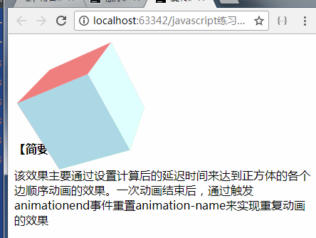
<p>该效果主要通过设置计算后的延迟时间来达到正方体的各个边顺序动画的效果。一次动画结束后,通过触发animationend事件重置animation-name来实现重复动画的效果</p>
</body>
</html>
效果图:
原链接:https://www.cnblogs.com/xiaohuochai/p/5419236.html
最新文章
- app上线具体流程
- 稳定灵活的 HTML 列式布局
- Atitit.iso格式蓝光 BDMV 结构说明
- Uva442 hdu 1082 Matrix Chain Multiplication
- IntelliJ IDEA13.1.3+Scala2.11.1环境搭建
- 百度编辑器 无法获取post过去的值
- Android布局居中的几种做法
- [iOS微博项目 - 2.4] - 重新安排app启动步骤
- 严重: The web application [] registered the JDBC driver 错误
- Async callback to awaitable Task<> z
- View not attached to window manager
- php fpm start.sh
- C# WinForm多线程(二)ThreadPool 与 Timer
- 真机调试方法- IOS/Android移动设备
- USACO奶牛博览会(DP)
- Cloud Native 云化架构阅读笔记
- C# 虹软离线SDK引擎 人脸识别
- 从零开始学 Web 之 BOM(三)offset,scroll,变速动画函数
- currentTarget
- Linux基础命令-cd