如何用纯 CSS 创作一盘传统蚊香
2024-08-30 04:32:04
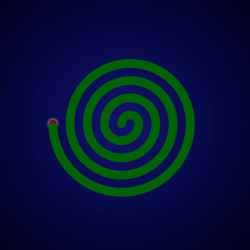
效果预览
按下右侧的“点击预览”按钮可以在当前页面预览,点击链接可以全屏预览。
https://codepen.io/comehope/pen/BVpvMz
可交互视频教程
此视频是可以交互的,你可以随时暂停视频,编辑视频中的代码。
请用 chrome, safari, edge 打开观看。
https://scrimba.com/p/pEgDAM/cZ8Ebf7
源代码下载
每日前端实战系列的全部源代码请从 github 下载:
https://github.com/comehope/front-end-daily-challenges
代码解读
定义 dom,容器中包含 8 个子元素:
<div class="coil">

    <span></span>

    <span></span>

    <span></span>

    <span></span>

    <span></span>

    <span></span>

    <span></span>

    <span></span>

</div>
居中显示:
body {

    margin: 0;

    height: 100vh;

    display: flex;

    align-items: center;

    justify-content: center;

    background: radial-gradient(circle at center, midnightblue, black);

}
画出纹香盘要用的框线:
.coil {

    position: relative;

    display: flex;

    justify-content: center;

}

.coil span {

    position: absolute;

    width: calc((var(--n) * 2 - 1) * 1em);

    height: calc((var(--n) - 0.5) * 1em);

    border: 1em solid darkgreen;

}

.coil span:nth-child(1) {

    --n: 1;

}

.coil span:nth-child(2) {

    --n: 2;

}

.coil span:nth-child(3) {

    --n: 3;

}

.coil span:nth-child(4) {

    --n: 4;

}

.coil span:nth-child(5) {

    --n: 5;

}

.coil span:nth-child(6) {

    --n: 6;

}

.coil span:nth-child(7) {

    --n: 7;

}

.coil span:nth-child(8) {

    --n: 8;

}
把一半框线放置到上方:
.coil span:nth-child(odd) {

    align-self: flex-end;

}
删除掉上方框线的下边框,和下方框线的上边框:
.coil span:nth-child(odd) {

    border-bottom: none;

}

.coil span:nth-child(even) {

    border-top: none;

}
对齐上下边框:
.coil span:nth-child(even) {

    transform: translateX(-1em);

}
把边框改为曲线:
.coil span:nth-child(odd) {

    border-radius: 50% 50% 0 0 / 100% 100% 0 0;

}

.coil span:nth-child(even) {

    border-radius: 0 0 50% 50% / 0 0 100% 100%;

}
用伪元素画出蚊香最中间的部分:
.coil::before {

    content: '';

    position: absolute;

    width: 1em;

    height: 1em;

    background-color: darkgreen;

    border-radius: 50%;

    left: -1.5em;

    top: -0.5em;

}
用伪元素画出蚊香的燃点:
.coil::after {

    content: '';

    position: absolute;

    width: 1em;

    height: 1em;

    border-radius: 50%;

    top: -0.5em;

    background-color: darkred;

    left: -9.5em;

    z-index: -1;

    transform: scale(0.9);

    box-shadow: 0 0 1em white;

}
最后,为燃点增加闪动的效果:
.coil::after {

    animation: blink 1s linear infinite alternate;

}

@keyframes blink {

    to {

        box-shadow: 0 0 0 white;

    }

}
大功告成!
原文地址:https://segmentfault.com/a/1190000015246974
最新文章
- HDU4010 (动态树)
- UIButton中setTitleEdgeInsets和setImageEdgeInsets的使用
- Codeforces Round #243 (Div. 2) B(思维模拟题)
- 视图缩放、移动、旋转--ios
- linq 和 , 并 , 差 ,交
- res里面的drawable(ldpi、mdpi、hdpi、xhdpi、xxhdpi)
- unity, sprite atlas
- 发送邮件(遵循smtp协议即简单的邮件发送协议)
- OracleParameter 的使用(参数名要以:开头,不允许包含@等特殊字符)[转]
- python下载文件(图片)源码,包含爬网内容(爬url),可保存cookie
- 消除警告"property access result unused - getters should not be used for side effects"
- sspanel 添加远程节点问题汇总
- 【Linux】 CentOS7 虚拟机配置
- OkHTTPClient
- Building QGIS from source - step by step(随笔2)
- 洛谷P4065 [JXOI2017]颜色(线段树)
- MySQL 存储过程中分页
- Hive记录-Sqoop常用命令
- bzoj4445 小凸想跑步
- XAMPP/PHPnow/phpStudy安装使用对比