CSS高级特效(下)
3.混合模式与合成
在图形编辑软件(比如Photoshop)中,设计师很早就可以选择两个设计元素叠加时的颜色如何混合了。
CSS Compositing and Blending标准使我们可以在CSS中使用图形编辑软件的混合模式。
最简单的混合模式是“正片叠加”(multiply),计算方法是源像素每个颜色通道的值乘以目标像素对应颜色通道的值,混合后的图片会变暗。可以借助灰阶来理解这种混合模式,在灰阶中0代表黑色,1代表白色。假设源值为0.8,目标值为0.5,那最终相乘后值就是\(0.8\times0.5=0.4\),偏暗了。
<article id="milky-way" class="section-milkyway section stacked inverted">

    <div class="wrapper">

        <h2 class="section-title">The Milky Way</h2>

        <div class="section-text">

            <p>...</p>

        </div>

    </div>

</article>
.section-milkyway {

    background-image: url(img/milkyway.jpg);

    background-color: #202D53; /* 给背景图片上色 */

    background-blend-mode: luminosity; /* 设置混合模式为明度(luminosity) */

}
混合元素:混合元素与它们的背景。
<article id="planets" class="section-planets section stacked inverted">

    <div class="wrapper">

        <h2 class="section-title">The Planets</h2>

        <img class="fig fig-planet" src="img/saturn.png" alt="The planet Saturn and its ring system">

        <div class="section-text">

            <p>...</p>

        </div>

    </div>

</article>
.fig-planet {

    mix-blend-mode: screen; /* 使用滤色(screen)混合模式让图片与页面的背景色相融合。 */

}
文字镂空:
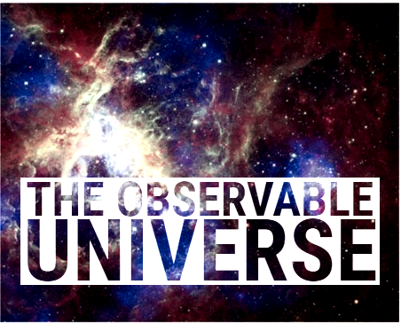
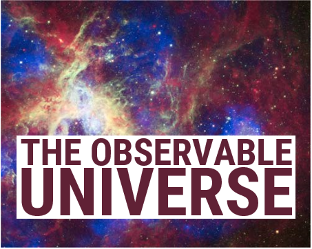
<h2 class="universe-title">

    <svg viewBox="0 0 400 120" role="presentation">

        <text>

            <tspan class="universe-span-1" x="6" dy="0.8em">The Observable</tspan>

            <tspan class="universe-span-2" x="3" dy="0.75em">Universe</tspan>

        </text>

    </svg>

</h2>
.universe-title text {

    fill: #602135; /* SVG中的文本颜色通过fill属性控制 */

    text-transform: uppercase;

}

.universe-span-1 {

    font-size: 53.2px;

}

.universe-span-2 {

    font-size: 96.2px;

}

@supports (mix-blend-mode: screen) {

    .universe-title {

        mix-blend-mode: screen;

    }

    .universe-title text {

        fill: #000; /* 使用混合模式的同时,也将文本的填充颜色改为黑色,让它完全透明。 */

    }

}
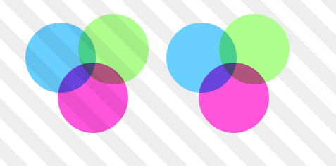
**隔离**就是创建元素分组,把混合控制在分组内部。
```html
```
```css
body {
background-image: repeating-linear-gradient(45deg, #fff, #fff 20px, #eee 0, #eee 40px);
background-size: cover;
}
.group {
position: relative;
margin: 2em;
}
.group-b {
left: 200px;
opacity: 0.999;
/*isolation: isolate;*/
}
.item {
width: 100px;
height: 100px;
position: absolute;
background-color: #ccc;
mix-blend-mode: multiply;
clip-path: circle();
}
/* 省略 */
```
## 4.CSS中的图像处理:滤镜
**滤镜**会应用给元素及其子元素。通过滤镜可以给元素(按序)应用一种或多种特效。
```css
.universe-header {
/* 将颜色去掉50%,将对比度提示为正常值的1.5倍。 */
filter: grayscale(50%) contrast(1.5);
}
```
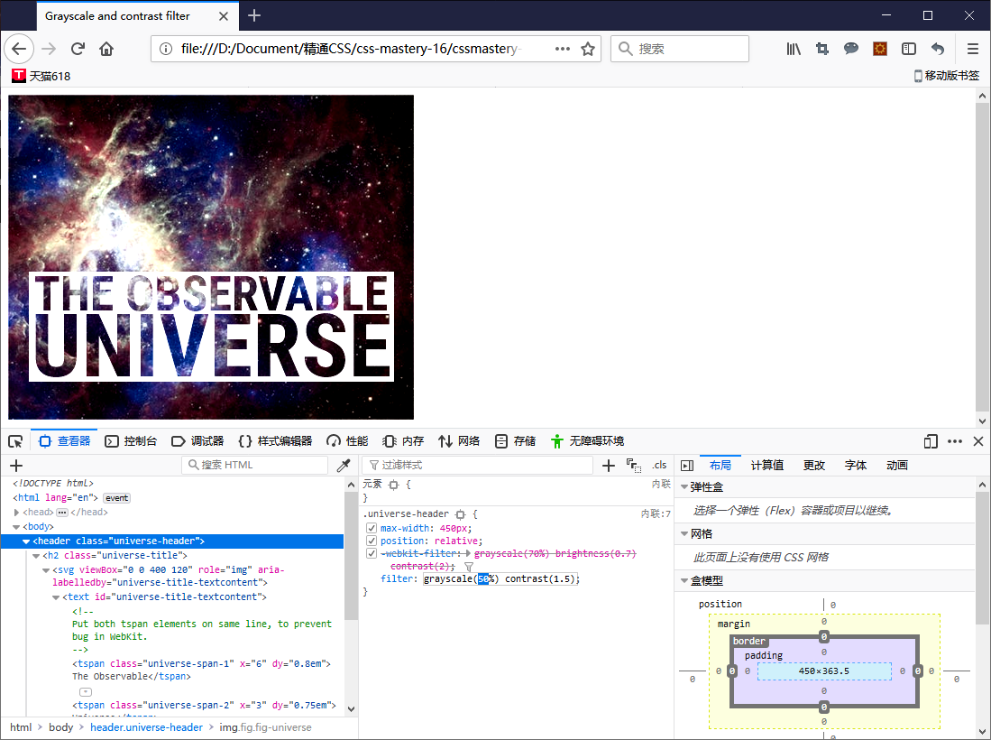
通过浏览器的开发者工具来调整样式,可以看到不同值的效果。
多数滤镜既可以接受百分比值,又可以接受数值。任何大于上限值的值都会被截取为最大值。
opacity()滤镜与opacity属性的区别在于,前者的实际效果取决于它在滤镜链条中的位置。相对而言,opacity属性则总是在所有滤镜应用完之后才起作用。
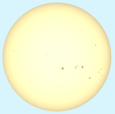
色相旋转:
.fig-sun {

    filter: contrast(0.34) brightness(1.6) sepia(1) hue-rotate(10deg);

    mask: url(#circlemask); /* 使用SVG蒙版技术将黑色背景遮住。 */

}
先使用sepia()滤镜给图片上色,再用hue-rotate()滤镜旋转图片的整体色相,以标准色轮为参照。
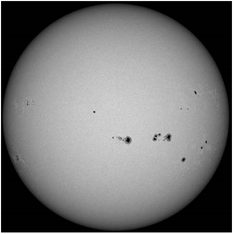
太阳及其黑子的图片(原图):
给图片添加滤镜之后(旋转色相):
box-shadow会应用到元素矩形的边框盒子,而drop-shadow()滤镜应用到元素透明的轮廓。
.nav-section li {

    filter: drop-shadow(0 0 .5em rgba(0,0,0,0.3));

}
blur()滤镜给元素应用高斯模糊。
.fig-planet {

    filter: blur(10px);

}
使用backdrop-filter属性可以实现类似“毛玻璃”的效果。
.section-milkyway .section-text {

    backdrop-filter: blur(5px);

    background-color: rgba(0,0,0,0.5);

}
目前这个属性连Firefox浏览器都不支持哦~
通过CSS加载的图片也可以使用滤镜(同样地,Firefox浏览器还是不支持)。
.figure-filtered {

    background-image: filter(url(img/saturn.png), grayscale(1) opacity(0.4));

}
高级滤镜:
CSS滤镜最强大的地方在于,我们可以使用SVG创建自定义滤镜。
<img class="filter-1977" src="img/cat.jpg" alt="Charles the Cat">

<svg height="0" viewBox="0 0 100 100">

	<filter id="filter-1977"

			primitiveUnits="objectBoundingBox" color-interpolation-filters="sRGB">

	  <feComponentTransfer result="contrastout">

		  <feFuncR type="linear" slope="1.1" intercept="-0.05"/>

		  <feFuncG type="linear" slope="1.1" intercept="-0.05"/>

		  <feFuncB type="linear" slope="1.1" intercept="-0.05"/>

	  </feComponentTransfer>

	  <feComponentTransfer in="contrastout" result="brightnessout">

		  <feFuncR type="linear" slope="1.1"/>

		  <feFuncG type="linear" slope="1.1"/>

		  <feFuncB type="linear" slope="1.1"/>

	  </feComponentTransfer>

	  <feColorMatrix in="brightnessout"

					 type="saturate" values="1.3" result="img" />

	  <feFlood flood-color="#f36abc" flood-opacity="0.3"

			   x="0" y="0" width="1" height="1"

			   result="overlay" />

	  <feBlend in="overlay" in2="img" mode="screen" />s

	</filter>

</svg>
.filter-1977 {

    filter: url(#filter-1977);

}
浏览器还没有对SVG效果实现硬件加速,因此自定义滤镜要尽量少用。
5.应用特效的次序
所有剪切、蒙版、混合和滤镜都会在其他属性之后应用,包括color、width、height、border、背景属性等设置元素基本外观的属性。
首先,按声明次序应用滤镜。接着剪切元素,然后应用蒙版。最后应用混合模式(opacity属性也是一种混合模式)。
参考资料:
- 《精通CSS》— [英] 安迪·巴德、[瑞典] 埃米尔·比约克隆德
最新文章
- 代理模式(Proxy Pattern)
- 【转载】利用shell脚本获取一个文件的绝对路径readlink
- 我写的一个ExcelHelper通用类,可用于读取或生成数据
- Silverlight实例教程 - 自定义扩展Validation类,验证框架的总结和建议(转载)
- 【POJ】2234 Matches Game(博弈论)
- POJ 3468 线段树裸题
- Java 集合深入理解(14):Map 概述
- NeHe OpenGL教程 第十六课:雾
- js中DOM集合的动态特性
- HTML5_画布_太阳系
- 1048 图的宽度优先遍历序列 c语言
- Apache Maven 入门
- Android开发之异步消息处理机制AsyncTask
- 使用log4cxx在GUI 程序中将信息输出到Console
- Homebrew安装和使用
- Struts2学习笔记(三)——Action详解
- git bash here右键菜单
- 【论文笔记】Progressive Neural Networks 渐进式神经网络
- Dubbo与Zookeeper、Spring整合使用
- 屏幕亮度(XE10.1+WIN8.164)