轻轻松松学CSS:媒体查询
轻轻松松学CSS:利用媒体查询创建响应式布局
媒体查询,针对不同的媒体类型定制不同的样式规则。在网站开发中,可以创建响应式布局。
一、初步认识媒体查询在响应式布局中的应用
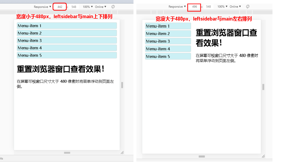
下面实例在屏幕可视窗口尺寸大于 480 像素时将菜单浮动到页面左侧


 <!DOCTYPE html>

 <html>

 <head>

 <meta name="viewport" content="width=device-width, initial-scale=1.0">

 <meta charset="utf-8">

 <title>test</title>

 <style>

 .wrapper {overflow:auto;}

 #main {margin-left: 4px;}

 #leftsidebar {float: none;width: auto;}

 #menulist {margin:;padding:;}

 .menuitem {

     background:#CDF0F6;

     border:1px solid #d4d4d4;

     border-radius:4px;

     list-style-type:none;

     margin:4px;

     padding:2px;

 }

 @media screen and (min-width: 480px) {

     #leftsidebar {width:200px;float:left;}

     #main {margin-left:216px;}

 }

 </style>

 </head>

 <body>

 <div class="wrapper">

   <div id="leftsidebar">

     <ul id="menulist">

       <li class="menuitem">Menu-item </li>

       <li class="menuitem">Menu-item </li>

       <li class="menuitem">Menu-item </li>

       <li class="menuitem">Menu-item </li>

       <li class="menuitem">Menu-item </li>

    </ul>

   </div>

   <div id="main">

     <h1>重置浏览器窗口查看效果!</h1>

     <p>在屏幕可视窗口尺寸大于  像素时将菜单浮动到页面左侧。</p>

   </div>

 </div>

 </body>

 </html>
关键代码:
 @media screen and (min-width: 480px) {

     #leftsidebar {width: 200px; float: left;}

     #main {margin-left:216px;}

 }
screen,是最常见的媒体类型的一种,用于电脑屏幕,平板电脑,智能手机等
and,操作符,表示同时具备的条件,敲代码时两边一定有空格
min-width:定义输出设备中的页面最小可见区域宽度
以上代码的意思就是在可见区域宽度大于等于480px时,leftsidebar与main左右排列(小于480px时,leftsidebar和main都是块元素,当然是上下排列)
二、媒体查询与bootstrap的姻缘
很多网页都是基于网格设计的,响应式网格视图通常是12列,宽度为100%,在浏览器窗口大小调整时会自动伸缩(和bootstrap的栅格系统是不是相似?)
 <!DOCTYPE html>

 <html>

 <head>

 <meta name="viewport" content="width=device-width, initial-scale=1.0">

 <meta charset="utf-8">

 <title>test</title>

 <style>

 * {

     box-sizing: border-box;

 }

 .row:after {

     content: "";

     clear: both;

     display: block;

 }

 [class*="col-"] {

     float: left;

     padding: 15px;

 }

 html {

     font-family: "Lucida Sans", sans-serif;

 }

 .header {

     background-color: #9933cc;

     color: #ffffff;

     padding: 15px;

 }

 .menu ul {

     list-style-type: none;

     margin: 0;

     padding: 0;

 }

 .menu li {

     padding: 8px;

     margin-bottom: 7px;

     background-color :#33b5e5;

     color: #ffffff;

     box-shadow: 0 1px 3px rgba(0,0,0,0.12), 0 1px 2px rgba(0,0,0,0.24);

 }

 .menu li:hover {

     background-color: #0099cc;

 }

 .aside {

     background-color: #33b5e5;

     padding: 15px;

     color: #ffffff;

     text-align: center;

     font-size: 14px;

     box-shadow: 0 1px 3px rgba(0,0,0,0.12), 0 1px 2px rgba(0,0,0,0.24);

 }

 .footer {

     background-color: #0099cc;

     color: #ffffff;

     text-align: center;

     font-size: 12px;

     padding: 15px;

 }

 /* For mobile phones: */

 [class*="col-"] {

     width: 100%;

 }

 @media only screen and (min-width: 600px) {

     /* For tablets: */

     .col-m-1 {width: 8.33%;}

     .col-m-2 {width: 16.66%;}

     .col-m-3 {width: 25%;}

     .col-m-4 {width: 33.33%;}

     .col-m-5 {width: 41.66%;}

     .col-m-6 {width: 50%;}

     .col-m-7 {width: 58.33%;}

     .col-m-8 {width: 66.66%;}

     .col-m-9 {width: 75%;}

     .col-m-10 {width: 83.33%;}

     .col-m-11 {width: 91.66%;}

     .col-m-12 {width: 100%;}

 }

 @media only screen and (min-width: 768px) {

     /* For desktop: */

     .col-1 {width: 8.33%;}

     .col-2 {width: 16.66%;}

     .col-3 {width: 25%;}

     .col-4 {width: 33.33%;}

     .col-5 {width: 41.66%;}

     .col-6 {width: 50%;}

     .col-7 {width: 58.33%;}

     .col-8 {width: 66.66%;}

     .col-9 {width: 75%;}

     .col-10 {width: 83.33%;}

     .col-11 {width: 91.66%;}

     .col-12 {width: 100%;}

 }

 </style>

 </head>

 <body>

 <div class="header">

 <h1>header</h1>

 </div>

 <div class="row">

 <div class="col-3 col-m-3 menu">

 <ul>

 <li>The Flight</li>

 <li>The City</li>

 <li>The Island</li>

 <li>The Food</li>

 </ul>

 </div>

 <div class="col-6 col-m-9">

 <h1>The City</h1>

 <p>Chania is the capital of the Chania region on the island of Crete. The city can be divided in two parts, the old town and the modern city.</p>

 </div>

 <div class="col-3 col-m-12">

 <div class="aside">

 <h2>What?</h2>

 <p>Chania is a city on the island of Crete.</p>

 <h2>Where?</h2>

 <p>Crete is a Greek island in the Mediterranean Sea.</p>

 <h2>How?</h2>

 <p>You can reach Chania airport from all over Europe.</p>

 </div>

 </div>

 </div>

 <div class="footer">

 <p>Resize the browser window to see how the content respond to the resizing.</p>

 </div>

 </body>

 </html>
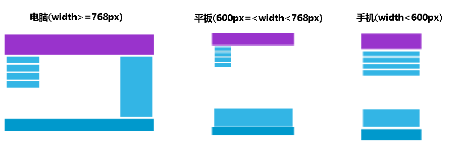
针对桌面设备(电脑):
第一和第三部分跨越 3 列。中间部分跨域 6 列
针对平板设备:
第一部分跨域 3列,第二部分跨越 9 列,第三部分跨域 12 列
<div class="row">

    <div class="col-3 col-m-3">...</div>

    <div class="col-6 col-m-9">...</div>

    <div class="col-3 col-m-12">...</div>

</div>
针对手机设备:上下排列
[class*="col-"] {

    width: 100%;

}
提示:上边的代码中关键的部分还有:
 [class*="col-"]{

     float:left;

 }

 *{

     box-sizing:border-box;

 }
具体原因不再解释,读者有兴趣可以看我的博客里关于浮动和盒子模型部分
上边这个例子和bootstrap更接近了一步
我们再来说说什么是bootstrap?Bootstrap是非常受欢迎的响应式前端框架,它是基于HTML、JavaScript、CSS的,它简洁灵活,使Web开发更加快捷
下面举一个简单例子
 <!DOCTYPE html>

 <html lang="en">

 <head>

   <title>Bootstrap Example</title>

   <meta charset="utf-8">

   <meta name="viewport" content="width=device-width, initial-scale=1">

   <link rel="stylesheet" href="https://apps.bdimg.com/libs/bootstrap/3.3.4/css/bootstrap.min.css">

   <script src="https://apps.bdimg.com/libs/jquery/2.1.4/jquery.min.js"></script>

   <script src="https://apps.bdimg.com/libs/bootstrap/3.3.4/js/bootstrap.min.js"></script>

 </head>

 <body>

 <div class="container">

   <div class="jumbotron">

     <h1>My First Bootstrap Page</h1>

     <p>Resize this responsive page to see the effect!</p>

   </div>

   <div class="row">

     <div class="col-sm-4">

       <h3>Column 1</h3>

       <p>Lorem ipsum dolor sit amet, consectetur adipisicing elit...</p>

       <p>Ut enim ad minim veniam, quis nostrud exercitation ullamco laboris...</p>

     </div>

     <div class="col-sm-4">

       <h3>Column 2</h3>

       <p>Lorem ipsum dolor sit amet, consectetur adipisicing elit...</p>

       <p>Ut enim ad minim veniam, quis nostrud exercitation ullamco laboris...</p>

     </div>

     <div class="col-sm-4">

       <h3>Column 3</h3>

       <p>Lorem ipsum dolor sit amet, consectetur adipisicing elit...</p>

       <p>Ut enim ad minim veniam, quis nostrud exercitation ullamco laboris...</p>

     </div>

   </div>

 </div>

 </body>

 </html>
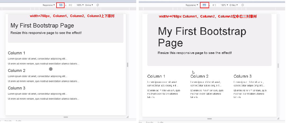
bootstrap栅栏系统css中的col-sm-*的意义:
.col-sm- 小屏幕 平板 (≥768px)
当width>=768px时,Column1、Column2、Column3左中右三列(一行内)
当width<768px时,Column1、Column2、Column3上中下三行排列
由此可见,Bootstrap就是利用了CSS的媒体查询才实现的响应式布局(当然更复杂的功能还得用到JavaScript)!
最新文章
- jQuery animate动画 stop()方法详解~
- HDU 4003 [树][贪心][背包]
- stm32中断服务函数
- dede:arclist 如何调用文章正文?
- mysql mysqldump只导出表结构或只导出数据的实现方法
- JQuery中的动画
- bzoj 1004 1004: [HNOI2008]Cards burnside定理
- POJ 1065 Wooden Sticks#贪心+qsort用法
- [Swift]LeetCode804. 唯一摩尔斯密码词 | Unique Morse Code Words
- HBase源码实战:CreateRandomStoreFile
- ubuntu16.04降级内核版本至3.13.0-85
- LineRenderer实现一个画线组件
- [TensorFlow]Tensor维度理解
- Git - 忽略Xcode工程中UserInterfaceState.xcuserstate文件的问题
- python 自带的range是不能实现对小数的操作的,如果要对小数操作可以使用numpy
- Linux内核(16) - 高效学习Linux内核
- JDBC增加、更新、删除数据
- Flask与pyaudio实现音频数据流的传输(电话会议语音交互式应用)
- ASP.NET 4.5 MVC 4 无法运行在Windows2008的IIS7.0上显示404的解决方案
- 【Numpy】python机器学习包Numpy基础知识学习