css实现一个冰墩墩
2024-09-18 20:19:39
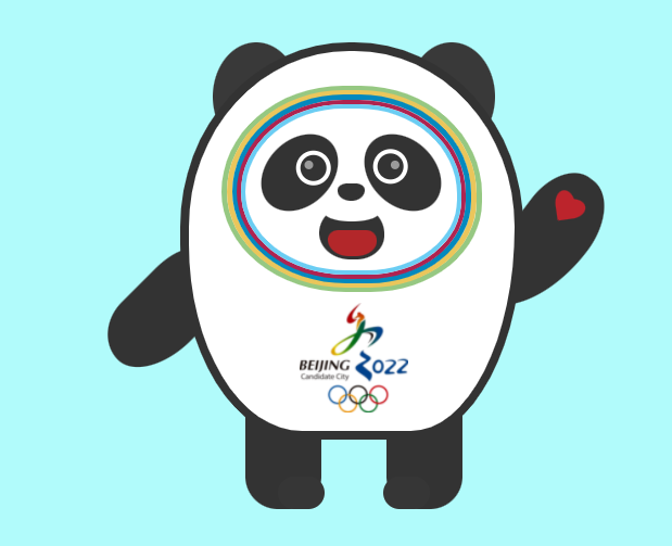
一墩难求,花了一两个小时自己画了一个,HTML结构很简单,CSS上主要就是将各个位置定位,肚子上的logo就只有发挥啦
以下是HTML代码
<div class="container">

    <div class="m_body"></div>

    <div class="ear_l"></div>

    <div class="ear_r"></div>

    <div class="arm_l"></div>

    <div class="arm_r"></div>

    <div class="face f_green"></div>

    <div class="face f_yelow"></div>

    <div class="face f_blue"></div>

    <div class="face f_purple"></div>

    <div class="face f_shy_blue"></div>

    <div class="eye_l"></div>

    <div class="eye_r"></div>

    <div class="nose"></div>

    <div class="mouth"></div>

    <div class="logo">

        <img src="./img/logo_d.png" alt="">

    </div>

    <div class="leg_l"></div>

    <div class="leg_r"></div>

</div>
以下是CSS样式
    body {background: rgb(177, 251, 251);}

    .container {margin: auto;width: 500px;height: 500px;position: relative;text-align: center;}

    .m_body {width: 300px;height: 350px;border: #333 8px solid;margin: 50px auto;

        border-radius: 90% 90% 60% 65% / 85% 85% 98% 90%;background: #fff;position: absolute;z-index: 2;}

    .ear_l,.ear_r {background: #393939;width: 80px;height: 100px;border-radius: 50%;

        position: absolute;z-index: 1;}

    .ear_l {left: 30px;top: 50px; }

    .ear_r {left: 210px;top: 50px;}

    .arm_l,.arm_r {background: #333;position: absolute;z-index: 1;}

    .arm_l {width: 70px;height: 120px;left: -50px;top: 240px;transform: rotate(45deg);border-radius: 35% 60% 90% 90%/ 55% 85% 90% 60%;}

    .arm_r {width: 70px;height: 150px;left: 300px;top: 162px;transform: rotate(37deg);

        border-radius: 56% 62% 98% 6%/ 40% 46% 80% 58%;}

    .arm_r:before,.arm_r:after {content: "";width: 18px;height: 26px;background: #bc242c;

        position: absolute;border-top-left-radius: 50%;border-top-right-radius: 50%;}

    .arm_r:before {transform: rotate(45deg);left: 26px;top: 20px;}

    .arm_r:after {transform: rotate(-45deg);left: 19px;top: 20px;}

    .face {position: absolute;border-radius: 48% 48% 44% 49%/ 53% 54% 45% 50%;position: absolute;z-index: 3;}

    .f_green {border: #96c882 5px solid;width: 230px;height: 180px;left: 38px;top: 90px;}

    .f_yelow {border: #EAC65B 5px solid;width: 220px;height: 172px;left: 43px;top: 94px;}

    .f_blue {border: #0489be 5px solid;width: 210px;height: 164px;left: 48px;top: 98px;}

    .f_purple {border: #AF2350 4px solid;width: 203px;height: 157px;left: 52px;

        top: 103px;}

    .f_shy_blue {border: #6BCDF3 4px solid;width: 195px;height: 149px;left: 56px;top: 107px;}

    .eye_l,.eye_r {background: #333;width: 60px;height: 80px;border-radius: 50%;position: absolute;z-index: 4;}

    .eye_l:before,.eye_r:before {position: absolute;content: '';

        width: 24px;height: 24px; border-radius: 50%;border: 4px solid #fff;z-index: 5;

    }

    .eye_l:after,.eye_r:after {position: absolute;content: '';

        width: 8px;height: 8px;background: #9B9B9B;border-radius: 50%;z-index: 6;

    }

    .eye_l:after {right: 25px;top: 25px;}

    .eye_r:after {left: 26px; top: 26px;}

    .eye_l:before {left: 20px;top: 12px; }

    .eye_r:before {left: 10px;top: 12px; }

    .eye_l { left: 80px; top: 130px; transform: rotate(45deg); }

    .eye_r {left: 175px;top: 130px;transform: rotate(-45deg);}

    .nose {background: #333;position: absolute;left: 145px;top: 180px;z-index: 6;}

    .nose, .nose:before,.nose:after {width: 25px;height: 16px;

    border-radius: 45px 42px 60px 61px/ 30px 30px 50px 46px; }

    .mouth { width: 60px;height: 50px;border-radius: 48% 48% 44% 49%/ 53% 54% 45% 50%;

        background: #333;left: 128px;top: 200px;position: absolute;z-index: 7;}

    .mouth::before {content: '';width: 50px;height: 16px;left: 5px;top: -1px;

    position: absolute;background: #fff;z-index: 8;border-radius: 50%; }

    .mouth:after { content: '';width: 45px;height: 24px;

    border-radius: 30% 30% 60% 60%/ 50% 54% 80% 90%; background: #B3272A;

    position: absolute;z-index: 9;top: 23px;left: 8px;}

    .logo {position: absolute; z-index: 10;top: 290px;left: 110px;}

    .logo img {width: 100px; }

    .leg_l,.leg_r {background: #333;position: absolute;width: 70px;

        height: 90px;border-radius: 0 0 30px 30px;z-index: 1;}

    .leg_l {left: 60px;top: 390px;}

    .leg_r {left: 190px;top: 390px;}

    .leg_l:after,

    .leg_r:after { content: "";width: 43px; height: 30px;

        position: absolute;background: #363636;border-radius: 30px;

    }

    .leg_l:after {bottom: 0;right: -3px;}

    .leg_r:after {bottom: 0;left: -3px;}
效果展示
最新文章
- SAP CRM 用户界面对象类型和设计对象
- css实现容器垂直水平居中的七中方法
- java多线程之 基本概念
- es6+移动轮播插件
- 利用最新版的RubyMine2016.2开发Ruby On Rails 程序
- Xcode中常用的快捷键
- 【C#设计模式——创建型模式】工场方法模式
- 雕爷牛腩这样判断零售未来-搜狐IT
- Android开源项目分享
- JSP入门 taglib
- 简单理解OpenGL模型视图变换
- robotframework之滚动条
- Delphi ClientDataSet复制记录
- WPF数据爬取小工具-某宝推广位批量生成,及订单爬取 记:接单最痛一次的感悟
- js 显示刚刚上传的图片 (onchange事件)
- [Unity插件]Lua行为树(六):打印树结构
- 第5月第21天 bugly ios证书位置
- 关于ASP.NET中Request.QueryString的乱码问题(转)
- 20145317 网络对抗技术 逆向与Bof基础
- chrome 扩展插件提示