CSS3画五角星和六角星
2024-08-29 03:32:05
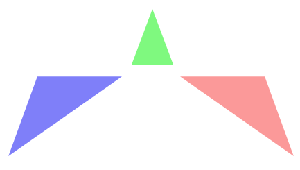
最终想要实现的效果


一、五角星
在画五角星之前首先分析这个五角星是如何实现,由哪几个部分构成的,示意图如下:
三个顶角向上的三角形,通过设置旋转和定位相互重叠和拼接实现最终的五角星效果。
为了语义化和代码更加简便,所以使用伪类来添加内容。
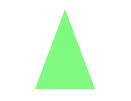
1、设置一个等腰三角形,并使用transform将其旋转到合适的角度 transform: rotate(35deg);
.star{

        width:0px;height:0px;

        border-bottom:70px solid rgba(244,0,0,0.4);

        border-left:100px solid transparent;

        border-right:100px solid transparent;

        margin:100px auto;

        /*到这一步为止,得到的是一个向上的等腰三角形*/

        -webkit-transform: rotate(35deg);

        -ms-transform: rotate(35deg);

        -o-transform: rotate(35deg);

        transform: rotate(35deg);

        /*顺时针旋转35deg*/

        position:relative;

    }

2、使用:before伪元素在div元素前面添加内容。
伪类所添加的内容继承 div的样式也发生了顺时针旋转,所以如果消除顺时针旋转的影响,可以 transform: rotate(-35deg);
设置定位,将内容调整到合适的位置 top:-45px; left:-65px;
.star:before{

        content:"";

        width:0px;

        height:0px;

        border-bottom:80px solid rgba(0,244,0,0.5);

        border-left:30px solid transparent;

        border-right:30px solid transparent;

        /*伪类所添加的内容继承原来的样式也发生了顺时针旋转*/

        -webkit-transform: rotate(-35deg);

        -ms-transform: rotate(-35deg);

        -o-transform: rotate(-35deg);

        transform: rotate(-35deg);

        /*设置负值,就会逆时针旋转*/

        position:absolute;

        top:-45px;left:-65px;

        /*定位调整位置*/

    }
3、使用 :after 伪类在div 元素后面添加内容
将内容旋转到合适的角度 transform: rotate(-35deg);
设置定位,放置在适当的位置 top:3px;left:105px;
.star:after{

        content:"";

        width:0px;

        height:0px;

        position:absolute;

        border-bottom:70px solid rgba(0,0,244,0.5);

        border-left:100px solid transparent;

        border-right:100px solid transparent;

        -webkit-transform: rotate(-70deg);

        -ms-transform: rotate(-70deg);

        -o-transform: rotate(-70deg);

        transform: rotate(-70deg);

        top:3px;left:-105px;

    }

实现效果和代码:
<!DOCTYPE html>

<html lang="en">

<head>

    <meta charset="UTF-8">

    <title>transform</title>

    <style>

    .star{

        width:0px;height:0px;

        border-bottom:70px solid red;

        /*rgba(244,0,0,0.4);*/

        border-left:100px solid transparent;

        border-right:100px solid transparent;

        margin:100px auto;

        /*到这一步为止,得到的是一个向上的等腰三角形*/

        -webkit-transform: rotate(35deg);

        -ms-transform: rotate(35deg);

        -o-transform: rotate(35deg);

        transform: rotate(35deg);

        /*顺时针旋转35deg*/

        position:relative;

    }

    .star:before{

        content:"";

        width:0px;

        height:0px;

        border-bottom:80px solid red;

        /*rgba(0,244,0,0.5);*/

        border-left:30px solid transparent;

        border-right:30px solid transparent;

        /*伪类所添加的内容继承原来的样式也发生了顺时针旋转*/

        -webkit-transform: rotate(-35deg);

        -ms-transform: rotate(-35deg);

        -o-transform: rotate(-35deg);

        transform: rotate(-35deg);

        /*设置负值,就会逆时针旋转*/

        position:absolute;

        top:-45px;

        left:-65px;

        /*定位调整位置*/

    }

    .star:after{

        content:"";

        width:0px;

        height:0px;

        position:absolute;

        border-bottom:70px solid red;

        /*rgba(0,0,244,0.5);*/

        border-left:100px solid transparent;

        border-right:100px solid transparent;

        -webkit-transform: rotate(-70deg);

        -ms-transform: rotate(-70deg);

        -o-transform: rotate(-70deg);

        transform: rotate(-70deg);

        top:3px;left:-105px;

    }

    </style>

</head>

<body>

    <div class="star"></div>

</body>

</html>


二、六角星
相比于五角星,六角星就简单的多了,来是先来分析它是如何构成的:
两个三角形交叠实现
注意两个三角形之间的位置关系,设置正确的定位。

代码:
<!DOCTYPE html>

<html lang="en">

<head>

    <meta charset="UTF-8">

    <title></title>

    <style>

    #star{

        width:0px;height:0px;

        border-bottom:100px solid red;

        /*rgba(244,244,0,0.4);*/

        border-left:50px solid transparent;

        border-right:50px solid transparent;

        margin:50px auto;

        position:relative;

    }

    #star:after{

        content:" ";

        width:0px;height:0px;

        border-top:100px solid red;

        /*rgba(0,244,250,0.6);*/

        border-left:50px solid transparent;

        border-right:50px solid transparent;

        position:absolute;

        top:50px;left:-50px;

    }

    </style>

</head>

<body>

    <div id="star"></div>

</body>

</html>


最新文章
- ZooKeepr日志清理【转】
- Hibernate和Mybatis的对比
- 带卡扣的网卡接口使用小Tips,大家注意插拔网线的手法啊!
- Creating a SharePoint BCS .NET Connectivity Assembly to Crawl RSS Data in Visual Studio 2010
- Web项目构建
- js中arguments的应用
- 重新理解一遍UpdatePanel
- Lua Behavior Tree For Unity3D(Lua描述行为树For Unity3D)
- Json 查看Json的插件
- RMAN基础恢复测试
- 点开GitHub之后,瑟瑟发抖...的我
- MQTT初步使用
- 英语笔记3(git)
- [NOI2010]超级钢琴(RMQ+堆)
- 第三次Sprint
- pyspider使用
- spring boot 2.0(二)动态banner的支持
- 使用c# 实现冒泡排序
- IIS7.5全站301跳转,内页+带参数url,这才是真正的全站跳转
- smtpclient 邮件发送测试
热门文章
- dcef3 指出一个坑
- Web UI自动化测试基础——元素定位(二)
- Visdom可视化
- Sql注入校验
- Linux-SSH远程管理服务实战
- JS 数组的常用方法详解归纳之改变原数组方法
- (3.5)常用知识-NULL与零长度、字符串尾部填充空格
- CM使用MySQL数据库预处理scm_prepare_database.sh执行报错:java.sql.SQLException: Access denied for user 'scm'@'hadoop101.com' (using password: YES)
- 洛谷P2507 [SCOI2008]配对 题解(dp+贪心)
- linux安装mysql8(完整图文笔记)