The Shapes of CSS
2024-10-19 00:24:54

#square {

    width: 100px;

    height: 100px;

    background: red;

}

#rectangle {

    width: 200px;

    height: 100px;

    background: red;

}

#circle {

    width: 100px;

    height: 100px;

    background: red;

    -moz-border-radius: 50px;

    -webkit-border-radius: 50px;

    border-radius: 50px;

}

#oval {

    width: 200px;

    height: 100px;

    background: red;

    -moz-border-radius: 100px / 50px;

    -webkit-border-radius: 100px / 50px;

    border-radius: 100px / 50px;

}

#triangle-up {

    width: 0;

    height: 0;

    border-left: 50px solid transparent;

    border-right: 50px solid transparent;

    border-bottom: 100px solid red;

}

#triangle-down {

    width: 0;

    height: 0;

    border-left: 50px solid transparent;

    border-right: 50px solid transparent;

    border-top: 100px solid red;

}

#triangle-left {

    width: 0;

    height: 0;

    border-top: 50px solid transparent;

    border-right: 100px solid red;

    border-bottom: 50px solid transparent;

}

#triangle-right {

    width: 0;

    height: 0;

    border-top: 50px solid transparent;

    border-left: 100px solid red;

    border-bottom: 50px solid transparent;

}

#triangle-topleft {

    width: 0;

    height: 0;

    border-top: 100px solid red;

    border-right: 100px solid transparent;

}

#triangle-topright {

    width: 0;

    height: 0;

    border-top: 100px solid red;

    border-left: 100px solid transparent;

}

#triangle-bottomleft {

    width: 0;

    height: 0;

    border-bottom: 100px solid red;

    border-right: 100px solid transparent;

}

#triangle-bottomright {

    width: 0;

    height: 0;

    border-bottom: 100px solid red;

    border-left: 100px solid transparent;

}

#curvedarrow {

  position: relative;

  width: 0;

  height: 0;

  border-top: 9px solid transparent;

  border-right: 9px solid red;

  -webkit-transform: rotate(10deg);

  -moz-transform: rotate(10deg);

  -ms-transform: rotate(10deg);

  -o-transform: rotate(10deg);

}

#curvedarrow:after {

  content: "";

  position: absolute;

  border: 0 solid transparent;

  border-top: 3px solid red;

  border-radius: 20px 0 0 0;

  top: -12px;

  left: -9px;

  width: 12px;

  height: 12px;

  -webkit-transform: rotate(45deg);

  -moz-transform: rotate(45deg);

  -ms-transform: rotate(45deg);

  -o-transform: rotate(45deg);

}
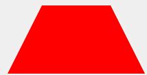
#trapezoid {

    border-bottom: 100px solid red;

    border-left: 50px solid transparent;

    border-right: 50px solid transparent;

    height: 0;

    width: 100px;

}

#parallelogram {

    width: 150px;

    height: 100px;

    -webkit-transform: skew(20deg);

       -moz-transform: skew(20deg);

         -o-transform: skew(20deg);

    background: red;

}

#star-six {

    width: 0;

    height: 0;

    border-left: 50px solid transparent;

    border-right: 50px solid transparent;

    border-bottom: 100px solid red;

    position: relative;

}

#star-six:after {

    width: 0;

    height: 0;

    border-left: 50px solid transparent;

    border-right: 50px solid transparent;

    border-top: 100px solid red;

    position: absolute;

    content: "";

    top: 30px;

    left: -50px;

}

#star-five {

   margin: 50px 0;

   position: relative;

   display: block;

   color: red;

   width: 0px;

   height: 0px;

   border-right:  100px solid transparent;

   border-bottom: 70px  solid red;

   border-left:   100px solid transparent;

   -moz-transform:    rotate(35deg);

   -webkit-transform: rotate(35deg);

   -ms-transform:     rotate(35deg);

   -o-transform:      rotate(35deg);

}

#star-five:before {

   border-bottom: 80px solid red;

   border-left: 30px solid transparent;

   border-right: 30px solid transparent;

   position: absolute;

   height: 0;

   width: 0;

   top: -45px;

   left: -65px;

   display: block;

   content: '';

   -webkit-transform: rotate(-35deg);

   -moz-transform:    rotate(-35deg);

   -ms-transform:     rotate(-35deg);

   -o-transform:      rotate(-35deg);

}

#star-five:after {

   position: absolute;

   display: block;

   color: red;

   top: 3px;

   left: -105px;

   width: 0px;

   height: 0px;

   border-right: 100px solid transparent;

   border-bottom: 70px solid red;

   border-left: 100px solid transparent;

   -webkit-transform: rotate(-70deg);

   -moz-transform:    rotate(-70deg);

   -ms-transform:     rotate(-70deg);

   -o-transform:      rotate(-70deg);

   content: '';

}

pentagon {

    position: relative;

    width: 54px;

    border-width: 50px 18px 0;

    border-style: solid;

    border-color: red transparent;

}

#pentagon:before {

    content: "";

    position: absolute;

    height: 0;

    width: 0;

    top: -85px;

    left: -18px;

    border-width: 0 45px 35px;

    border-style: solid;

    border-color: transparent transparent red;

}

#hexagon {

    width: 100px;

    height: 55px;

    background: red;

    position: relative;

}

#hexagon:before {

    content: "";

    position: absolute;

    top: -25px;

    left: 0;

    width: 0;

    height: 0;

    border-left: 50px solid transparent;

    border-right: 50px solid transparent;

    border-bottom: 25px solid red;

}

#hexagon:after {

    content: "";

    position: absolute;

    bottom: -25px;

    left: 0;

    width: 0;

    height: 0;

    border-left: 50px solid transparent;

    border-right: 50px solid transparent;

    border-top: 25px solid red;

}

#octagon {

    width: 100px;

    height: 100px;

    background: red;

    position: relative;

}

#octagon:before {

    content: "";

    position: absolute;

    top: 0;

    left: 0;

    border-bottom: 29px solid red;

    border-left: 29px solid #eee;

    border-right: 29px solid #eee;

    width: 42px;

    height: 0;

}

#octagon:after {

    content: "";

    position: absolute;

    bottom: 0;

    left: 0;

    border-top: 29px solid red;

    border-left: 29px solid #eee;

    border-right: 29px solid #eee;

    width: 42px;

    height: 0;

}

#heart {

    position: relative;

    width: 100px;

    height: 90px;

}

#heart:before,

#heart:after {

    position: absolute;

    content: "";

    left: 50px;

    top: 0;

    width: 50px;

    height: 80px;

    background: red;

    -moz-border-radius: 50px 50px 0 0;

    border-radius: 50px 50px 0 0;

    -webkit-transform: rotate(-45deg);

       -moz-transform: rotate(-45deg);

        -ms-transform: rotate(-45deg);

         -o-transform: rotate(-45deg);

            transform: rotate(-45deg);

    -webkit-transform-origin: 0 100%;

       -moz-transform-origin: 0 100%;

        -ms-transform-origin: 0 100%;

         -o-transform-origin: 0 100%;

            transform-origin: 0 100%;

}

#heart:after {

    left: 0;

    -webkit-transform: rotate(45deg);

       -moz-transform: rotate(45deg);

        -ms-transform: rotate(45deg);

         -o-transform: rotate(45deg);

            transform: rotate(45deg);

    -webkit-transform-origin: 100% 100%;

       -moz-transform-origin: 100% 100%;

        -ms-transform-origin: 100% 100%;

         -o-transform-origin: 100% 100%;

            transform-origin :100% 100%;

}

#infinity {

    position: relative;

    width: 212px;

    height: 100px;

}

#infinity:before,

#infinity:after {

    content: "";

    position: absolute;

    top: 0;

    left: 0;

    width: 60px;

    height: 60px;

    border: 20px solid red;

    -moz-border-radius: 50px 50px 0 50px;

         border-radius: 50px 50px 0 50px;

    -webkit-transform: rotate(-45deg);

       -moz-transform: rotate(-45deg);

        -ms-transform: rotate(-45deg);

         -o-transform: rotate(-45deg);

            transform: rotate(-45deg);

}

#infinity:after {

    left: auto;

    right: 0;

    -moz-border-radius: 50px 50px 50px 0;

         border-radius: 50px 50px 50px 0;

    -webkit-transform: rotate(45deg);

       -moz-transform: rotate(45deg);

        -ms-transform: rotate(45deg);

         -o-transform: rotate(45deg);

            transform: rotate(45deg);

}

#diamond {

    width: 0;

    height: 0;

    border: 50px solid transparent;

    border-bottom-color: red;

    position: relative;

    top: -50px;

}

#diamond:after {

    content: '';

    position: absolute;

    left: -50px;

    top: 50px;

    width: 0;

    height: 0;

    border: 50px solid transparent;

    border-top-color: red;

}

#diamond-shield {

    width: 0;

    height: 0;

    border: 50px solid transparent;

    border-bottom: 20px solid red;

    position: relative;

    top: -50px;

}

#diamond-shield:after {

    content: '';

    position: absolute;

    left: -50px; top: 20px;

    width: 0;

    height: 0;

    border: 50px solid transparent;

    border-top: 70px solid red;

}

#diamond-narrow {

    width: 0;

    height: 0;

    border: 50px solid transparent;

    border-bottom: 70px solid red;

    position: relative;

    top: -50px;

}

#diamond-narrow:after {

    content: '';

    position: absolute;

    left: -50px; top: 70px;

    width: 0;

    height: 0;

    border: 50px solid transparent;

    border-top: 70px solid red;

}

#cut-diamond {

    border-style: solid;

    border-color: transparent transparent red transparent;

    border-width: 0 25px 25px 25px;

    height: 0;

    width: 50px;

    position: relative;

    margin: 20px 0 50px 0;

}

#cut-diamond:after {

    content: "";

    position: absolute;

    top: 25px;

    left: -25px;

    width: 0;

    height: 0;

    border-style: solid;

    border-color: red transparent transparent transparent;

    border-width: 70px 50px 0 50px;

}

#egg {

   display:block;

   width: 126px;

   height: 180px;

   background-color: red;

   -webkit-border-radius: 63px 63px 63px 63px / 108px 108px 72px 72px;

   border-radius:         50%  50%  50%  50%  / 60%   60%   40%  40%;

}

#pacman {

  width: 0px;

  height: 0px;

  border-right: 60px solid transparent;

  border-top: 60px solid red;

  border-left: 60px solid red;

  border-bottom: 60px solid red;

  border-top-left-radius: 60px;

  border-top-right-radius: 60px;

  border-bottom-left-radius: 60px;

  border-bottom-right-radius: 60px;

}

#talkbubble {

   width: 120px;

   height: 80px;

   background: red;

   position: relative;

   -moz-border-radius:    10px;

   -webkit-border-radius: 10px;

   border-radius:         10px;

}

#talkbubble:before {

   content:"";

   position: absolute;

   right: 100%;

   top: 26px;

   width: 0;

   height: 0;

   border-top: 13px solid transparent;

   border-right: 26px solid red;

   border-bottom: 13px solid transparent;

}

#burst-12 {

    background: red;

    width: 80px;

    height: 80px;

    position: relative;

    text-align: center;

}

#burst-12:before, #burst-12:after {

    content: "";

    position: absolute;

    top: 0;

    left: 0;

    height: 80px;

    width: 80px;

    background: red;

}

#burst-12:before {

    -webkit-transform: rotate(30deg);

       -moz-transform: rotate(30deg);

        -ms-transform: rotate(30deg);

         -o-transform: rotate(30deg);

}

#burst-12:after {

    -webkit-transform: rotate(60deg);

       -moz-transform: rotate(60deg);

        -ms-transform: rotate(60deg);

         -o-transform: rotate(60deg);

}

#burst-8 {

    background: red;

    width: 80px;

    height: 80px;

    position: relative;

    text-align: center;

    -webkit-transform: rotate(20deg);

       -moz-transform: rotate(20deg);

        -ms-transform: rotate(20deg);

         -o-transform: rotate(20eg);

}

#burst-8:before {

    content: "";

    position: absolute;

    top: 0;

    left: 0;

    height: 80px;

    width: 80px;

    background: red;

    -webkit-transform: rotate(135deg);

       -moz-transform: rotate(135deg);

        -ms-transform: rotate(135deg);

         -o-transform: rotate(135deg);

}

#yin-yang {

    width: 96px;

    height: 48px;

    background: #eee;

    border-color: red;

    border-style: solid;

    border-width: 2px 2px 50px 2px;

    border-radius: 100%;

    position: relative;

}

#yin-yang:before {

    content: "";

    position: absolute;

    top: 50%;

    left: 0;

    background: #eee;

    border: 18px solid red;

    border-radius: 100%;

    width: 12px;

    height: 12px;

}

#yin-yang:after {

    content: "";

    position: absolute;

    top: 50%;

    left: 50%;

    background: red;

    border: 18px solid #eee;

    border-radius:100%;

    width: 12px;

    height: 12px;

}

#badge-ribbon {

 position: relative;

 background: red;

 height: 100px;

 width: 100px;

 -moz-border-radius:    50px;

 -webkit-border-radius: 50px;

 border-radius:         50px;

}

#badge-ribbon:before,

#badge-ribbon:after {

  content: '';

  position: absolute;

  border-bottom: 70px solid red;

  border-left: 40px solid transparent;

  border-right: 40px solid transparent;

  top: 70px;

  left: -10px;

  -webkit-transform: rotate(-140deg);

  -moz-transform:    rotate(-140deg);

  -ms-transform:     rotate(-140deg);

  -o-transform:      rotate(-140deg);

}

#badge-ribbon:after {

  left: auto;

  right: -10px;

  -webkit-transform: rotate(140deg);

  -moz-transform:    rotate(140deg);

  -ms-transform:     rotate(140deg);

  -o-transform:      rotate(140deg);

}

#space-invader{

  box-shadow:

    0 0 0 1em red,

    0 1em 0 1em red,

    -2.5em 1.5em 0 .5em red,

    2.5em 1.5em 0 .5em red,

    -3em -3em 0 0 red,

    3em -3em 0 0 red,

    -2em -2em 0 0 red,

    2em -2em 0 0 red,

    -3em -1em 0 0 red,

    -2em -1em 0 0 red,

    2em -1em 0 0 red,

    3em -1em 0 0 red,

    -4em 0 0 0 red,

    -3em 0 0 0 red,

    3em 0 0 0 red,

    4em 0 0 0 red,

    -5em 1em 0 0 red,

    -4em 1em 0 0 red,

    4em 1em 0 0 red,

    5em 1em 0 0 red,

    -5em 2em 0 0 red,

    5em 2em 0 0 red,

    -5em 3em 0 0 red,

    -3em 3em 0 0 red,

    3em 3em 0 0 red,

    5em 3em 0 0 red,

    -2em 4em 0 0 red,

    -1em 4em 0 0 red,

    1em 4em 0 0 red,

    2em 4em 0 0 red;

    background: red;

    width: 1em;

    height: 1em;

    overflow: hidden;

    margin: 50px 0 70px 65px;

  }

#tv {

  position: relative;

  width: 200px;

  height: 150px;

  margin: 20px 0;

  background: red;

  border-radius: 50% / 10%;

  color: white;

  text-align: center;

  text-indent: .1em;

}

#tv:before {

  content: '';

  position: absolute;

  top: 10%;

  bottom: 10%;

  right: -5%;

  left: -5%;

  background: inherit;

  border-radius: 5% / 50%;

}

#chevron {
position: relative;
text-align: center;
padding: 12px;
margin-bottom: 6px;
height: 60px;
width: 200px;
}
#chevron:before {
content: '';
position: absolute;
top: 0;
left: 0;
height: 100%;
width: 51%;
background: red;
-webkit-transform: skew(0deg, 6deg);
-moz-transform: skew(0deg, 6deg);
-ms-transform: skew(0deg, 6deg);
-o-transform: skew(0deg, 6deg);
transform: skew(0deg, 6deg);
}
#chevron:after {
content: '';
position: absolute;
top: 0;
right: 0;
height: 100%;
width: 50%;
background: red;
-webkit-transform: skew(0deg, -6deg);
-moz-transform: skew(0deg, -6deg);
-ms-transform: skew(0deg, -6deg);
-o-transform: skew(0deg, -6deg);
transform: skew(0deg, -6deg);
}

#magnifying-glass

{

 font-size: 10em; /* This controls the size. */

 display: inline-block;

 width: 0.4em;

 height: 0.4em;

 border: 0.1em solid red;

 position: relative;

 border-radius: 0.35em;

}

#magnifying-glass::before

{

 content: "";

 display: inline-block;

 position: absolute;

 right: -0.25em;

 bottom: -0.1em;

 border-width: 0;

 background: red;

 width: 0.35em;

 height: 0.08em;

 -webkit-transform: rotate(45deg);

    -moz-transform: rotate(45deg);

     -ms-transform: rotate(45deg);

      -o-transform: rotate(45deg);

}

#facebook-icon {

  background: red;

  text-indent: -999em;

  width: 100px;

  height: 110px;

  border-radius: 5px;

  position: relative;

  overflow: hidden;

  border: 15px solid red;

  border-bottom: 0;

}

#facebook-icon::before {

  content: "/20";

  position: absolute;

  background: red;

  width: 40px;

  height: 90px;

  bottom: -30px;

  right: -37px;

  border: 20px solid #eee;

  border-radius: 25px;

}

#facebook-icon::after {

  content: "/20";

  position: absolute;

  width: 55px;

  top: 50px;

  height: 20px;

  background: #eee;

  right: 5px;

}

#moon {

  width: 80px;

  height: 80px;

  border-radius: 50%;

  box-shadow: 15px 15px 0 0 red;

}

#flag {

  width: 110px;

  height: 56px;

  padding-top: 15px;

  position: relative;

  background: red;

  color: white;

  font-size: 11px;

  letter-spacing: 0.2em;

  text-align: center;

  text-transform: uppercase;

}

#flag:after {

  content: "";

  position: absolute;

  left: 0;

  bottom: 0;

  width: 0;

  height: 0;

  border-bottom: 13px solid #eee;

  border-left: 55px solid transparent;

  border-right: 55px solid transparent;

}

#cone {

  width: 0;

  height: 0;

  border-left: 70px solid transparent;

  border-right: 70px solid transparent;

  border-top: 100px solid red;

  -moz-border-radius: 50%;

  -webkit-border-radius: 50%;

  border-radius: 50%;

}

#cross {

  background: red;

  height: 100px;

  position: relative;

  width: 20px;

}

#cross:after {

  background: red;

  content: "";

  height: 20px;

  left: -40px;

  position: absolute;

  top: 40px;

  width: 100px;

}

#base {

  background: red;

  display: inline-block;

  height: 55px;

  margin-left: 20px;

  margin-top: 55px;

    position: relative;

    width: 100px;

}

#base:before {

  border-bottom: 35px solid red;

  border-left: 50px solid transparent;

  border-right: 50px solid transparent;

  content: "";

  height: 0;

  left: 0;

  position: absolute;

  top: -35px;

  width: 0;

}
注:整理自网络
最新文章
- tnt_esri.dat Arcgis8.1安装license
- POJ1386Play on Words[有向图欧拉路]
- maven eclipse 安装
- unity, scene视图查看场景时应调成正交模式
- ASP.NET操作WMI
- python学习笔记二--列表的使用
- linux查看接口连接状态
- 【转】Acm之java速成
- hibernate简单的增删改查
- 将两个列不同的DataTable合并成一个新的DataTable
- vue组件(将页面公用的头部组件化)
- 开始python成长之路
- Mycat 分片规则详解--单月小时分片
- 【区块链】【一】Hash 算法【转】
- 如何使用ABBYY FineReader 12将JPEG文件转换成Word文档
- Delphi XE5 Android 运行黑屏卡死的解决方法
- R-table和tapply函数
- 吴恩达 Deep learning 第二周 神经网络基础
- php中对MYSQL操作之预处理技术(1)数据库dml操作语句
- Vue 2.0学习(四)计算属性