CSS3_边框 border 详解_一个 div 的阴阳图
2024-08-31 13:48:07
(面试题)
怎么样通过 CSS 画一个三角形:
1. 元素的 width 和 height 设置为 0
2. 边框 足够大
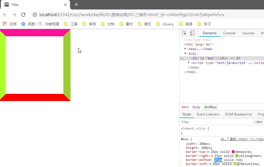
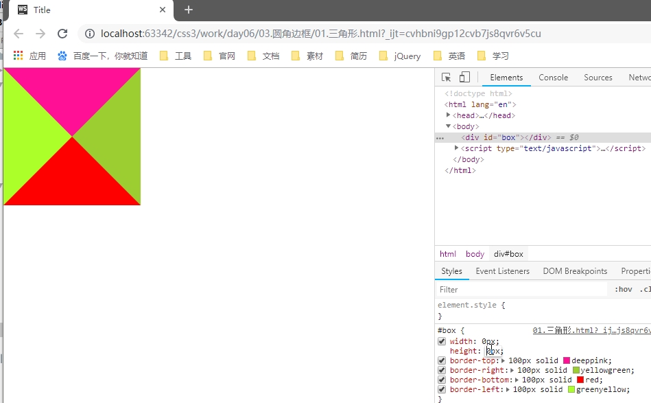
3. 需要的三角形的部分, border-top-color 设置为 有色
4. 不需要的部分 border-right-color,border-bottom-color,border-left-color,设置为 透明色
color: rgba(0,0,0,0);

// 或者

color: #0000;

// 或者

color: transparent;
圆角边框(支持所有元素,无论块元素,还是行内元素)
- 尽管,border-radius 将 元素 变成了圆形,但是里面的文本子元素,仍旧沿着矩形盒子进行排列。
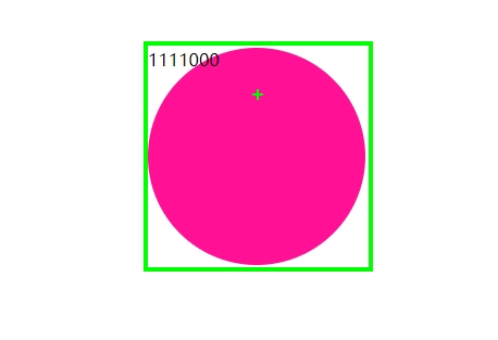
- CSS3 提供的特性: 尽管盒子的外形和位置发生了变换,但是元素在文档流中的位置是不变的
- border-radius: 50%; // 百分比参照盒子自身。
- 当 width = height 时,会画一个圆形。
- 当 width 不等于 height 时,会画一个椭圆形。
- 椭圆形
#box {

    width: 300px;

    height: 200px;

    border-radius: 150px/100px;    // x 轴半径 / y 轴半径

}
- 椭圆形
- 语法:
#box {

    border-radius: 30px 10px 50px 0;    // 左上 右上 右下 左下

    border-radius: 30px 10px 50px;

    border-radius: 30px 10px;

    border-radius: 30px;

}
- 用 CSS 画一个半圆
#box {

    width: 100px;

    hright: 200px;

    border-radius: 0  100% 100% 0;

    // border-radius: 100% 0 0 100%;

}

#box {

    width: 200px;

    hright: 100px;

    border-radius: 100% 100% 0 0 ;

    // border-radius: 0 0 100% 100%;

}
- 用 CSS 画一个扇形
#box {

    width: 100px;

    hright: 100px;

    border-radius: 100% 0 0 0;

    // border-radius: 0 100% 0 0 0;

    // border-radius: 0 0 100% 0;

    // border-radius: 0 0 0 100%;

}
- 用 CSS 画一个太极图
<!DOCTYPE html>

<html>

    <head>

        <meta charset="UTF-8" />

        <title>太极图</title>

        <style type="text/css">

            #test_box {

                width: 200px;

                height: 200px;

                border-radius: 50%;

                margin: 30px auto;

                background-color: red;

                position: relative;

            }

            #test_box #left_box,

            #test_box #right_box {

                width: 100px;

                height: 200px;

                float: left;

            }

            #test_box #left_box {

                background-color: #000;

                border-radius: 100px 0 0 100px;

            }

            #test_box #right_box {

                background-color: #fff;

                border-radius:  0 100px 100px 0;

            }

            #test_box #top_box,

            #test_box #bottom_box {

                width: 100px;

                height: 100px;

                border-radius: 50%;

                position: absolute;

                left: 50%;

                margin-left: -50px;

            }

            #test_box #top_box {

                top: 0;

                background-color: #000;

            }

            #test_box #bottom_box {

                bottom: 0;

                background-color: #fff;

            }

            #test_box #top_box #white_dot,

            #test_box #bottom_box #black_dot {

                width: 20px;

                height: 20px;

                border-radius: 50%;

                position: absolute;

                top: 0;

                left: 0;

                bottom: 0;

                right: 0;

                margin: auto;

            }

            #test_box #top_box #white_dot {

                background-color: #fff;

            }

            #test_box #bottom_box #black_dot {

                background-color: #000;

            }

        </style>

    </head>

    <body>

        <div id="test_box">

            <div id="left_box">

            </div>

            <div id="right_box">

            </div>

            <div id="top_box">

                <div id="white_dot"></div>

            </div>

            <div id="bottom_box">

                <div id="black_dot"></div>

            </div>

        </div>

    </body>

</html>
只用一个 <div> 画太极阴阳图
<!DOCTYPE html>

<html>

    <head>

        <meta charset="UTF-8" />

        <title>神分阴阳</title>

        <style type="text/css">

            body {

                width: 100%;

                color: #000;

                background: #96b377;

                font: 14px Helvetica, Arial, sans-serif;

            }

            #test_box {

                width: 100px;

                height: 200px;

                border-right: 100px solid #fff;

                border-radius: 50%;

                margin: 30px auto;

                background-color: #000;

                position: relative;

                top: 0px;

                left: 0px;

            }

            #test_box:before {

                content: "";

                width: 20px;

                height: 20px;

                border: 40px solid #000;

                border-radius: 50%;

                background-color: #fff;

                position: absolute;

                top: 0px;

                left: 100%;

                margin-left: -50px;

                        /* 左右 上下 模糊 颜色 */

                box-shadow: 4px 0px 4px #a66fe2;

            }

            #test_box:after {

                content: "";

                width: 20px;

                height: 20px;

                border: 40px solid #fff;

                border-radius: 50%;

                background-color: #000;

                        /* 左右 上下 模糊 颜色 */

                box-shadow: -5px 0px 4px #c4d0a7;

                position: absolute;

                bottom: 0px;

                left: 100%;

                margin-left: -50px;

            }

        </style>

    </head>

    <body>

        <div id="test_box">

        </div>

    </body>

</html>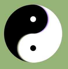
- 弧形凹陷 评论框
<!DOCTYPE html>

<html>

    <head>

        <meta charset="UTF-8" />

        <title>弧形凹陷 评论框</title>

        <style type="text/css">

            body {
               background-color: #96b377;
           }
            #test_box {

                width: 800px;

                height: 300px;

                margin: 300px auto 0px;

                border: 1px solid red;

                background-color: skyblue;

                position: relative;

                top: 0px;

                left: 0px;

            }

            #test_box #arc {

                width: 100px;

                height: 100px;

                border-radius: 50%;

                background-color: #96b377;

                border: 1px solid red;

                position: absolute;

                top: -70px;

                left: 70px;

            }

            #test_box #arc #mask {

                width: 102px;

                height: 100px;

                background-color: #96b377;

                position: absolute;

                top: -32px;

                left: -1px;

            }

            #test_box #arc #circle_login {

                width: 70px;

                height: 70px;

                border-radius: 50%;

                background-color: #ccc;

                text-align: center;

                line-height: 70px;

                font-size: 24px;

                position: absolute;

                z-index: 2;

                top: 0;

                left: 0;

                bottom: 0;

                right: 0;

                margin: auto;

            }

        </style>

    </head>

    <body>

        <div id="test_box">

            <div id="arc">

                <div id="mask"></div>

                <div id="circle_login">

                    登录

                </div>

            </div>

        </div>

    </body>

</html>
- 四叶草 旋转 初探 CSS3 动画
<!DOCTYPE html>

<html>

    <head>

        <meta charset="UTF-8" />

        <title>四叶草旋转 初探 CSS 动画</title>

        <style type="text/css">

            body {

                width: 100%;

                color: #000;

                background: #96b377;

                font: 14px Helvetica, Arial, sans-serif;

            }

            #test_box {

                width: 624px;

                height: 624px;

                margin: 60px auto;

                list-style: none;

animation: turnAround 1s linear infinite;

            }

@keyframes turnAround {

    from {transform: rotate(0deg)}

    to {transform: rotate(360deg)}

}

            #test_box li {

                float: left;

                width: 300px;

                height: 300px;

                margin: 5px;

                border: 1px solid red;

                background-color: #eee;

            }

            #test_box li:nth-child(1),

            #test_box li:nth-child(4) {

                border-radius: 0 230px 0 230px;

            }

            #test_box li:nth-child(2),

            #test_box li:nth-child(3) {

                border-radius: 230px 0 230px 0;

            }

        </style>

    </head>

    <body>

        <ul id="test_box">

            <li></li>

            <li></li>

            <li></li>

            <li></li>

        </ul>

    </body>

</html>
最新文章
- Yii源码阅读笔记(三十)
- Java项目——模拟电话薄联系人增删改查
- java.util.ConcurrentModificationException
- Openstack安全规则说明
- Shell重定向文件描述符
- SVN与TortoiseSVN实战:补丁详解
- [转] Web前端优化之 图片篇
- Android中让多个线程顺序执行探究
- 学习Qt,Getting started
- SSL / TSL 传输加密算法 初解读
- Mysql优化批量插入数据
- Tableau可视化绘图教程
- pycharm无法使用ctrl+c/v复制粘贴的问题
- Record && Limit
- 010 pandas的DataFrame
- 洛谷P3195 玩具装箱TOY
- 硬盘读取不了-->>完美解决
- SIT/UAT测试
- 【转】如何用Maven创建web项目(具体步骤)
- web开发 那些年基于Redis的Provider库