可以用 Python 编程语言做哪些神奇好玩的事情?
作者:造数科技
链接:https://www.zhihu.com/question/21395276/answer/219747752
使用Python绘图
我们先来看看,能画出哪样的图
<img src="https://pic2.zhimg.com/v2-a8031dd3c7b213eba1f5b2530d3d79f5_b.png" data-rawwidth="550" data-rawheight="450" class="origin_image zh-lightbox-thumb" width="550" data-original="https://pic2.zhimg.com/v2-a8031dd3c7b213eba1f5b2530d3d79f5_r.png">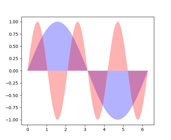
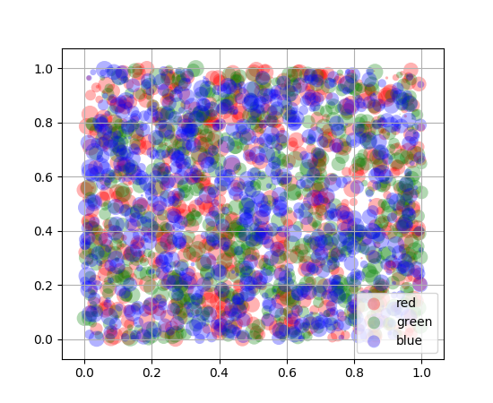
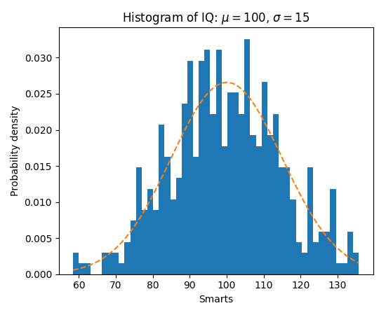
更强大的是,每张图片下都有提供源代码,可以直接拿来用,修改参数即可。

"""

===============

Basic pie chart

===============

Demo of a basic pie chart plus a few additional features.

In addition to the basic pie chart, this demo shows a few optional features:

    * slice labels

    * auto-labeling the percentage

    * offsetting a slice with "explode"

    * drop-shadow

    * custom start angle

Note about the custom start angle:

The default ``startangle`` is 0, which would start the "Frogs" slice on the

positive x-axis. This example sets ``startangle = 90`` such that everything is

rotated counter-clockwise by 90 degrees, and the frog slice starts on the

positive y-axis.

"""

import matplotlib.pyplot as plt

# Pie chart, where the slices will be ordered and plotted counter-clockwise:

labels = 'Frogs', 'Hogs', 'Dogs', 'Logs'

sizes = [15, 30, 45, 10]

explode = (0, 0.1, 0, 0)  # only "explode" the 2nd slice (i.e. 'Hogs')

fig1, ax1 = plt.subplots()

ax1.pie(sizes, explode=explode, labels=labels, autopct='%1.1f%%',

        shadow=True, startangle=90)

ax1.axis('equal')  # Equal aspect ratio ensures that pie is drawn as a circle.

plt.show()
<img src="https://pic3.zhimg.com/v2-f85e431df208c510be1c4a1ef579aaea_b.png" data-rawwidth="800" data-rawheight="900" class="origin_image zh-lightbox-thumb" width="800" data-original="https://pic3.zhimg.com/v2-f85e431df208c510be1c4a1ef579aaea_r.png">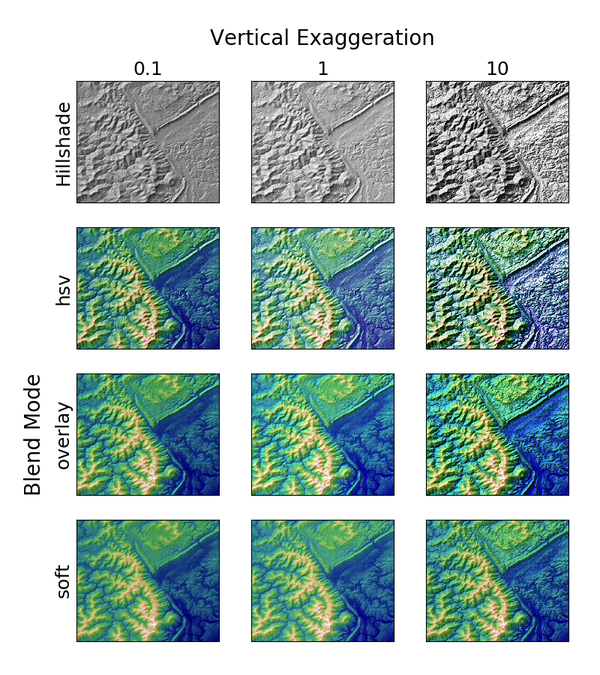
"""

Demonstrates the visual effect of varying blend mode and vertical exaggeration

on "hillshaded" plots.

Note that the "overlay" and "soft" blend modes work well for complex surfaces

such as this example, while the default "hsv" blend mode works best for smooth

surfaces such as many mathematical functions.

In most cases, hillshading is used purely for visual purposes, and *dx*/*dy*

can be safely ignored. In that case, you can tweak *vert_exag* (vertical

exaggeration) by trial and error to give the desired visual effect. However,

this example demonstrates how to use the *dx* and *dy* kwargs to ensure that

the *vert_exag* parameter is the true vertical exaggeration.

"""

import numpy as np

import matplotlib.pyplot as plt

from matplotlib.cbook import get_sample_data

from matplotlib.colors import LightSource

dem = np.load(get_sample_data('jacksboro_fault_dem.npz'))

z = dem['elevation']

#-- Optional dx and dy for accurate vertical exaggeration --------------------

# If you need topographically accurate vertical exaggeration, or you don't want

# to guess at what *vert_exag* should be, you'll need to specify the cellsize

# of the grid (i.e. the *dx* and *dy* parameters).  Otherwise, any *vert_exag*

# value you specify will be relative to the grid spacing of your input data

# (in other words, *dx* and *dy* default to 1.0, and *vert_exag* is calculated

# relative to those parameters).  Similarly, *dx* and *dy* are assumed to be in

# the same units as your input z-values.  Therefore, we'll need to convert the

# given dx and dy from decimal degrees to meters.

dx, dy = dem['dx'], dem['dy']

dy = 111200 * dy

dx = 111200 * dx * np.cos(np.radians(dem['ymin']))

#-----------------------------------------------------------------------------

# Shade from the northwest, with the sun 45 degrees from horizontal

ls = LightSource(azdeg=315, altdeg=45)

cmap = plt.cm.gist_earth

fig, axes = plt.subplots(nrows=4, ncols=3, figsize=(8, 9))

plt.setp(axes.flat, xticks=[], yticks=[])

# Vary vertical exaggeration and blend mode and plot all combinations

for col, ve in zip(axes.T, [0.1, 1, 10]):

    # Show the hillshade intensity image in the first row

    col[0].imshow(ls.hillshade(z, vert_exag=ve, dx=dx, dy=dy), cmap='gray')

    # Place hillshaded plots with different blend modes in the rest of the rows

    for ax, mode in zip(col[1:], ['hsv', 'overlay', 'soft']):

        rgb = ls.shade(z, cmap=cmap, blend_mode=mode,

                       vert_exag=ve, dx=dx, dy=dy)

        ax.imshow(rgb)

# Label rows and columns

for ax, ve in zip(axes[0], [0.1, 1, 10]):

    ax.set_title('{0}'.format(ve), size=18)

for ax, mode in zip(axes[:, 0], ['Hillshade', 'hsv', 'overlay', 'soft']):

    ax.set_ylabel(mode, size=18)

# Group labels...

axes[0, 1].annotate('Vertical Exaggeration', (0.5, 1), xytext=(0, 30),

                    textcoords='offset points', xycoords='axes fraction',

                    ha='center', va='bottom', size=20)

axes[2, 0].annotate('Blend Mode', (0, 0.5), xytext=(-30, 0),

                    textcoords='offset points', xycoords='axes fraction',

                    ha='right', va='center', size=20, rotation=90)

fig.subplots_adjust(bottom=0.05, right=0.95)

plt.show()
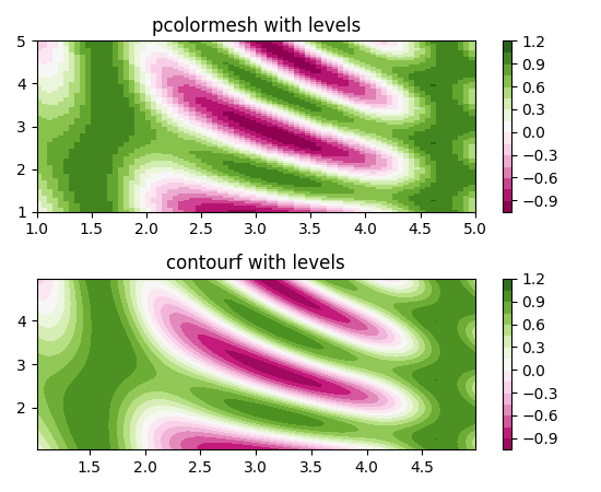
图片来自Matplotlib官网 Thumbnail gallery
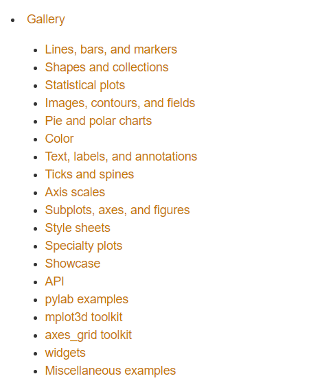
这是图片的索引,可以看看有没有自己需要的
<img src="https://pic1.zhimg.com/v2-1be30f4fb48a08d508a8c354d540dea0_b.png" data-rawwidth="485" data-rawheight="561" class="origin_image zh-lightbox-thumb" width="485" data-original="https://pic1.zhimg.com/v2-1be30f4fb48a08d508a8c354d540dea0_r.png">
Stop plotting your data - annotate your data and let it visualize itself.
http://holoviews.org/getting_started/Gridded_Datasets.html
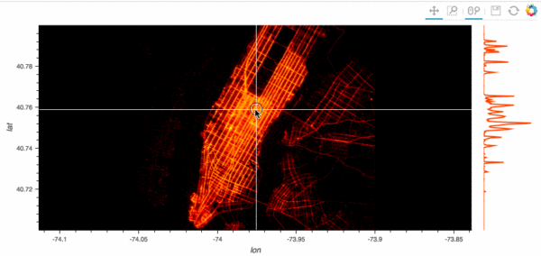
http://holoviews.org/gallery/demos/bokeh/scatter_economic.html
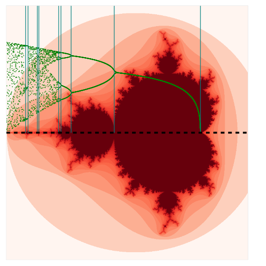
http://holoviews.org/gallery/demos/bokeh/verhulst_mandelbrot.html
<img src="https://pic4.zhimg.com/v2-d305a75b64dcd09e4c889b84d333ca37_b.png" data-rawwidth="500" data-rawheight="500" class="origin_image zh-lightbox-thumb" width="500" data-original="https://pic4.zhimg.com/v2-d305a75b64dcd09e4c889b84d333ca37_r.png">
最新文章
- Atitit.技术管理者要不要自己做开发??
- Android开发自学笔记(Android Studio1.3.1)—3.Android应用结构解析
- HTML-DIV布局
- python中range和xrange的区别
- 未能加载文件或程序集“Newtonsoft.Json, Version=6.0.0.0, Culture=neutral, PublicKeyToken=30ad4fe6b2a6aeed”或它的某一个依赖项。找到的程序集清单定义与程序集引用不匹配。
- iOS iOS7越狱
- ACM - ICPC World Finals 2013 B Hey, Better Bettor
- C 队列顺序存储
- Android 国际化图片资源文件
- Linux 继续进阶
- 用PHP迭代器来实现一个斐波纳契数列(转)
- C++:string类的使用
- 前端面试题整理(html篇)
- Vivado简单调试技能
- centos7安装docker并安装jdk和tomcat(常用命令)
- 生成器函数_yield_yield from_send
- [JavaScript]catch(ex)语句中的ex
- Elastic 开发篇(3)
- HGOI20181031 模拟题解
- C# 生成 DataMatrix 格式的二维码