CSS布局大全
前几天面试,问我某布局感觉回答不是很OK所以研究了一下各种布局。
一、单列布局
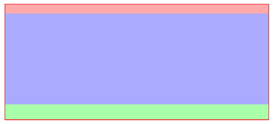
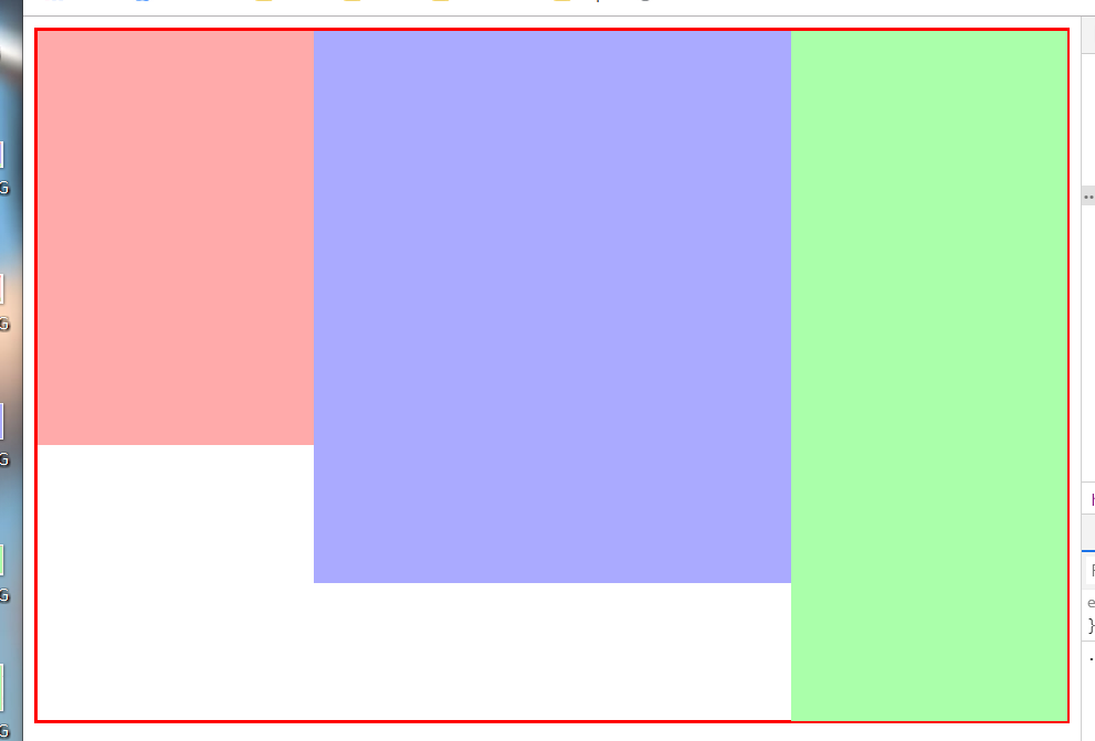
1.普通布局(头部、内容、底部)
    <div class="container">

        <header></header>

        <div class="content"></div>

        <footer></footer>

    </div>
.container {

            width: 80%;

            margin: 30px auto;

            border:2px solid red;

            box-sizing: border-box;

        }

        .container header {

            width: 100%;

            height: 30px;

            background: #faa;

        }

        .container .content {

            width: 100%;

            height: 300px;

            background: #aaf;

        }

        .container footer {

            height: 50px;

            background: #afa;

        }
2.内容居中(内容区域为80%宽度,采用margin:0 auto;实现水平居中)

<!DOCTYPE html>

<html lang="en">

<head>

    <meta charset="UTF-8">

    <title>Document</title>

    <style type="text/css">

        .container {

            width: 80%;

            margin: 30px auto;

            border:2px solid red;

            box-sizing: border-box;

        }

        .container header {

            width: 100%;

            height: 30px;

            background: #faa;

        }

        .container .content {

            width: 80%;

            height: 300px;

            margin: 0 auto;

            background: #aaf;

        }

        .container footer {

            height: 50px;

            background: #afa;

        }

    </style>

</head>

<body>

    <div class="container">

        <header></header>

        <div class="content"></div>

        <footer></footer>

    </div>

</body>

</html>
二、两栏布局
1.采用float 左边固定大小,右边自适应
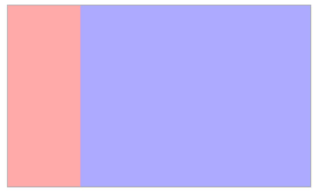
左侧采用float:left往左浮动,右侧margin-left:200px,留出左侧内容的空间。
<!DOCTYPE html>

<html lang="en">

<head>

    <meta charset="UTF-8">

    <title>Document</title>

    <style type="text/css">

        .wrapper {

            /* width:80%;和margin 是为了方便我截图*/

            width: 80%;

            margin: 50px auto;

            border:2px solid #aaa;

            box-sizing: border-box;

            /*采用bfc清除浮动*/

            overflow: hidden;

        }

        .nav {

            float: left;

            width: 200px;

            background: #faa;

            height: 500px;

        }

        .content {

            margin-left: 200px;

            height: 500px;

            background-color: #aaf;

        }

    </style>

</head>

<body>

    <div class="wrapper">

        <div class="nav"></div>

        <div class="content"></div>

    </div>

</body>

</html>
2.采用display: inline-block; 和 calc() 实现
由于inline-会把空格和回车算进去,所以我们在wrappper中设置font-size:0来清除影响。当然,打包出来的压缩格式可以忽略。
<!DOCTYPE html>

<html lang="en">

<head>

    <meta charset="UTF-8">

    <title>Document</title>

    <style type="text/css">

        .wrapper {

            /* width:80%;和margin 是为了方便我截图*/

            width: 80%;

            margin: 50px auto;

            border:2px solid red;

            box-sizing: border-box;

            font-size: 0;

        }

        .nav {

            display: inline-block;

            width: 200px;

            background: #faa;

            height: 500px;

        }

        .content {

            width: calc(100% - 200px);

            display: inline-block;

            height: 500px;

            background-color: #aaf;

        }

    </style>

</head>

<body>

    <div class="wrapper">

        <div class="nav"></div>

        <div class="content"></div>

    </div>

</body>

</html>
3.采用flex实现,左侧固定大小,右侧设置flex:1,即可实现自适应
HTML不变,css如下:
.wrapper {

            /* width:80%;和margin 是为了方便我截图*/

            width: 80%;

            margin: 50px auto;

            border:2px solid red;

            box-sizing: border-box;

                        /*flex布局*/

            display: flex;

        }

        .nav {

            width: 200px;

            background: #faa;

            height: 500px;

        }

        .content {

            flex:;

            height: 500px;

            background-color: #aaf;

        }
三、三栏布局
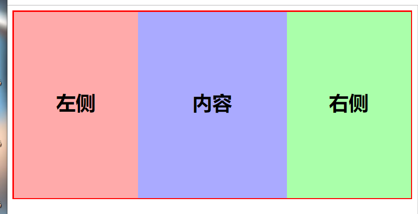
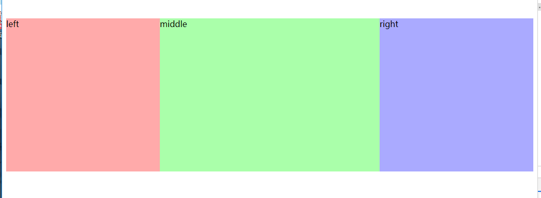
1.采用float浮动,左右大小固定,中间自适应
<!DOCTYPE html>

<html lang="en">

<head>

    <meta charset="UTF-8">

    <title>Document</title>

    <style type="text/css">

        .wrapper {

            width: 100%;

            margin-bottom: 30px;

            border:2px solid red;

            box-sizing: border-box;

        }

        .wrapper .left {

            width: 200px;

            height: 300px;

            background: #faa;

            float: left;

        }

        .wrapper .right {

            width: 200px;

            height: 300px;

            background: #afa;

            float: right;

        }

        .wrapper .content {

            height: 300px;

            background-color: #aaf;

            margin:0 200px;

        }

    </style>

</head>

<body>

    <!-- 三栏-浮动布局 -->

    <div class="wrapper">

        <div class="left"></div>

        <div class="right"></div>

        <div class="content"></div>

    </div>

</body>

</html>
采用inline-block 与两栏布局类似
.wrapper {

            width: 100%;

            margin-bottom: 30px;

            border:2px solid red;

            box-sizing: border-box;

            font-size:;

        }

        .wrapper .left {

            display: inline-block;

            width: 200px;

            height: 300px;

            background: #faa;

        }

        .wrapper .right {

            display: inline-block;

            width: 200px;

            height: 500px;

            background: #afa;

        }

        .wrapper .content {

            width: calc(100% - 400px);

            display: inline-block;

            height: 400px;

            background-color: #aaf;

        }
这里我们给每个容器的高度不同,结果:
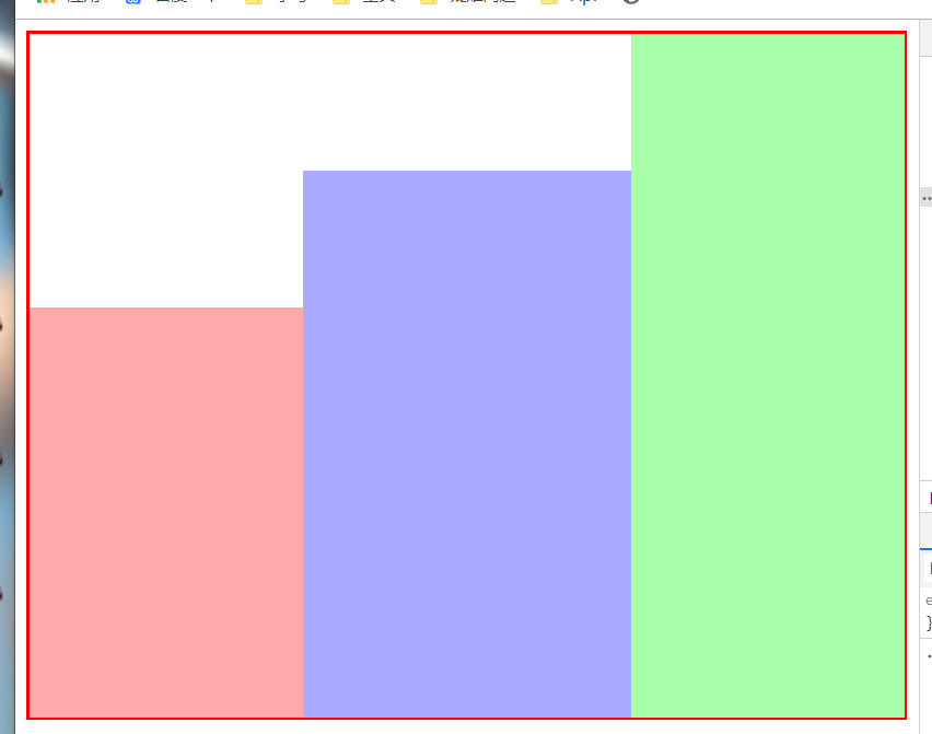
我们可以发现他是底部对齐的,只需改变他的对其方式即可。vertical-align: top;
.wrapper .left {

            display: inline-block;

            width: 200px;

            height: 300px;

            background: #faa;

            vertical-align: top;/*添加*/

        }

        .wrapper .right {

            display: inline-block;

            width: 200px;

            height: 500px;

            background: #afa;

            vertical-align: top;

        }

        .wrapper .content {

            width: calc(100% - 400px);

            display: inline-block;

            height: 400px;

            background-color: #aaf;

            vertical-align: top;

        }
结果:
3.采用flex布局
.wrapper {

            width: 100%;

            margin-bottom: 30px;

            border:2px solid red;

            box-sizing: border-box;

            display: flex;

        }

        .wrapper .left {

            width: 200px;

            height: 300px;

            background: #faa;

        }

        .wrapper .right {

            width: 200px;

            height: 500px;

            background: #afa;

        }

        .wrapper .content {

            flex:;

            height: 400px;

            background-color: #aaf;

        }
接下来就是大名鼎鼎的 圣杯布局 和 双飞翼布局了。
这两个布局非常重要,性能什么的都要比上面好很多,主要是为了让content内容区域优先加载。
1.圣杯布局
<!-- 圣杯布局 -->

    <div class="container">

        <div class="middle"></div>

        <div class="left"></div>

        <div class="right"></div>

    </div>
上面是html,发现了吧,middle写在最前面,这样网页在载入时,就会优先加载。
具体实现思路,通过给 container 左右固定的padding来预留出left和right的空间
看一下css部分:
.container {

            position: relative;;

            height: 300px;

            background: #ddd;

            padding: 0 300px 0;

        }

        .container .middle{

            float: left;

            width: 100%;

            height: 300px;

        }

        .container .left{

            float: left;

            position: relative;

            height: 300px;

            width: 300px;

            margin-left: -100%;

            left: -300px;

        }

        .container .right {

            float: left;

            position: relative;

            width: 300px;

            height: 300px;

            margin-left: -300px;

            left: 300px;

        }
所以内部元素都是左浮动的,主要区域宽度100%;
左侧区域通过margin-left:100%;使它浮动到左方,然后更具自身定位 left:-300px;将之移动到父容器的padding中
右侧同理,只不过只需要margin自己本身的宽度。
结果:左右固定宽度300px,中间自适应
2.双飞翼布局
双飞翼布局和圣杯差不多,主要是将padding换成了margin而且只需要包裹middle即可,
    <div class="container">

        <div class="middle"></div>

    </div>

    <div class="left"></div>

    <div class="right"></div>
css:
       .container{

            float: left;

            width: 100%;

            height: 300px;

            background: #ddd;

        }

        .container .middle{

            height: 300px;

            margin: 0 300px;

        }

        .left{

            float: left;

            position: relative;

            width: 300px;

            height: 300px;

            margin-left: -100%;

        }

        .right{

            float: left;

            position: relative;

            width: 300px;

            height: 300px;

            margin-left: -300px;

        }
差距不大,看代码就完事了。
最后,我们就可以自嗨了!
<!DOCTYPE html>
<html lang="en">
<head>
<meta charset="UTF-8">
<title>Document</title>
<style type="text/css">
* {
margin:0;
padding: 0;
}
.wrapper {
width: 100%;
display: flex;
}
.wrapper .left {
width: 200px;
height: 90vh;
background: #faa;
}
.wrapper .left .left-box {
width: 90%;
height: 120px;
margin: 30px auto;
background: #ff4;
}
.wrapper .left .left-box2 {
height: 50%;
}
.wrapper .right {
width: 200px;
height: 90vh;
background: #afa;
}
.wrapper .right .card {
width: 80%;
margin: 20px auto;
background-color: #f42
}
.wrapper .content {
flex: 1;
min-height: 90vh;
background: #aaf;
column-count: 3;
column-gap: 10px;
}
.wrapper .card {
width: 100%;
height: 100px;
background: #c44;
font-size: 18px;
text-align: center;
line-height: 100px;
margin:5px 0;
break-inside: avoid;
}
header,footer {
height: 5vh;
background: #424242;
}
h2 {
text-align: center;
color: #f8f8f8;
} @media screen and (max-width: 800px) {
.wrapper .content {
column-count: 2;
}
}
</style> </head>
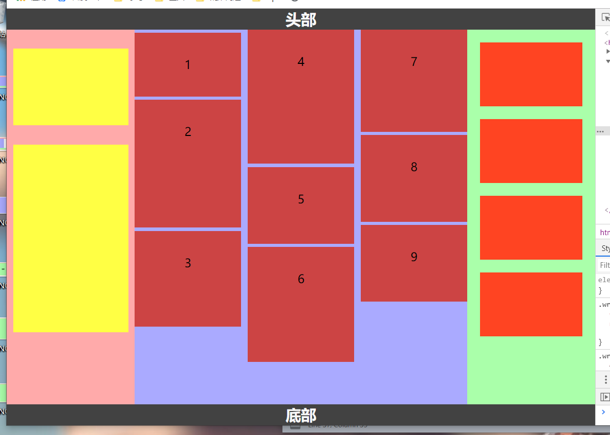
<body>
<!-- 头部 -->
<header><h2>头部</h2></header>
<div class="wrapper">
<div class="left">
<div class="left-box"></div>
<div class="left-box left-box2"></div>
</div>
<div class="content">
<div class="card" style="height: 100px">1</div>
<div class="card" style="height: 200px">2</div>
<div class="card" style="height: 150px">3</div>
<div class="card" style="height: 210px">4</div>
<div class="card" style="height: 120px">5</div>
<div class="card" style="height: 180px">6</div>
<div class="card" style="height: 160px">7</div>
<div class="card" style="height: 136px">8</div>
<div class="card" style="height: 120px">9</div>
</div>
<div class="right">
<div class="card"></div>
<div class="card"></div>
<div class="card"></div>
<div class="card"></div>
</div>
</div>
<footer><h2>底部</h2></footer>
</body>
</html>
最新文章
- 备忘DES带向量的加密和解密与DES简单加密与解密
- question2answer论坛框架分析及web开发思考
- VMWARE虚拟机CentOS6.4系统使用主机无线网卡上网的三种方法介绍
- 使用U盘代替光盘来刻录ISO镜像文件的方法
- 【C语言】04-函数
- python基础篇-day1
- JZs3c2440裸板程序GPIO操作总结
- windows8.1 plsql连接oracle
- jQuery Dialog弹出层对话框插件
- UVA 1329 - Corporative Network
- C++:抽象基类和纯虚函数的理解
- 我们的java基础到底有多差 一个视频引发的感想
- C#进阶のMEF注入
- SpringMvc @PathVariable 工作原理
- hibernate中复合主键的使用
- PWA需要的技术
- notecase的下载与安装(全网最详细)(图文详解)
- 第十周PSP&进度条
- Django之ContentType详解
- 〖Linux〗zigbee实验之cc2430移植tinyos2.x的步骤(Ubuntu13.10)