数据挖掘---Matplotib的学习
什么是matplotlib
mat - matrix 矩阵
二维数据 - 二维图表
plot - 画图
lib - library 库
matlab 矩阵实验室
mat - matrix
lab 实验室
利用pip安装matplotlib
pip3 install matplotlib
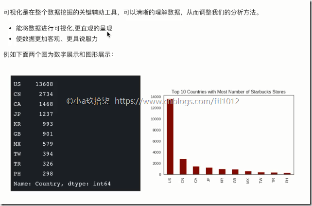
为什么学习Matplotlib
更多JS可视化库:
国内:https://echarts.baidu.com/examples/ (百度)
奥卡姆剃刀原理 - 如无必要勿增实体
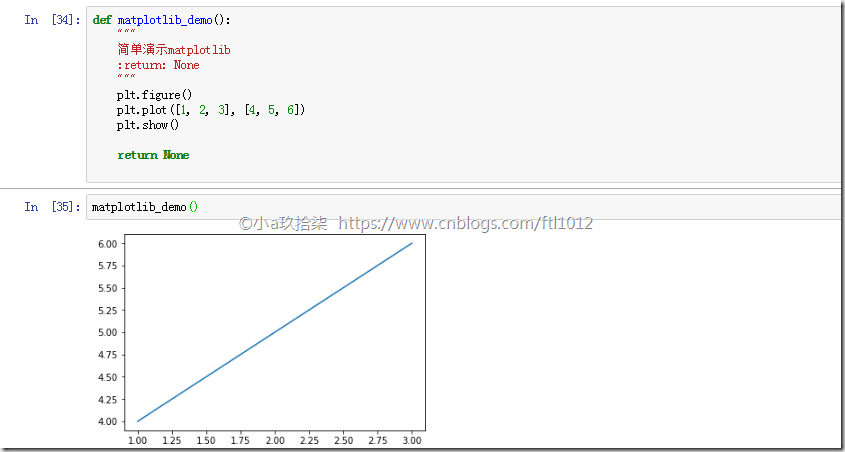
实现一个简单的Matplotlib
import matplotlib.pyplot as plt

def matplotlib_demo():

    """

    简单演示matplotlib

    :return: None

    """

    plt.figure()   # 创建了一个画布,设置了

    plt.plot([1, 2, 3], [4, 5, 6]) # 指定了横坐标、纵坐标参数

    plt.show()  # 点连线进行呈现

    return None

matplotlib_demo()
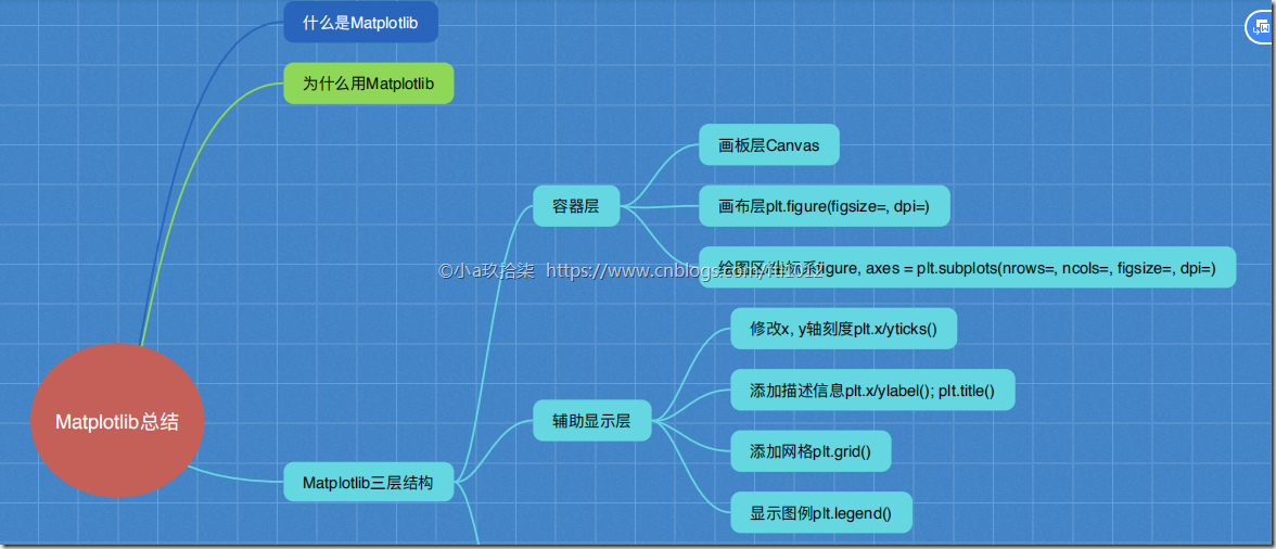
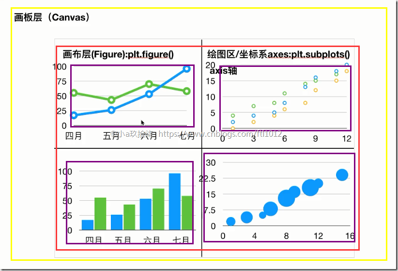
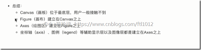
MatPlotlib的三层结构
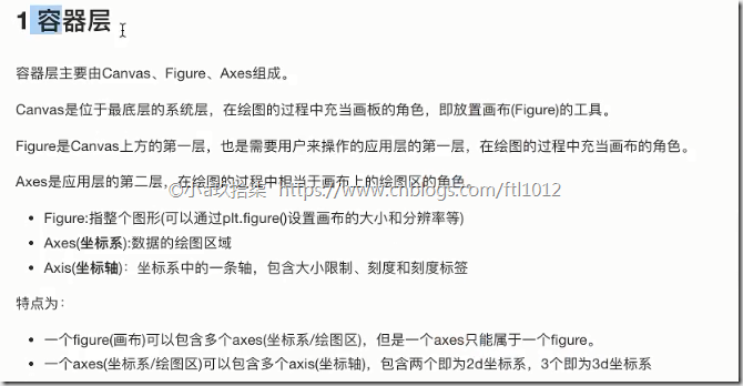
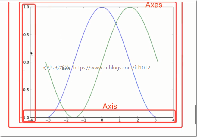
1)容器层(画板层+画布层+绘图区)
画板层Canvas --》 外出写生必须带一个画板
画布层Figure --》 画板上铺一层画布 --》 plt.figure()
绘图区/坐标系 --》 在画布上创建绘图区(可有多个,默认一个)
x、y轴张成的区域
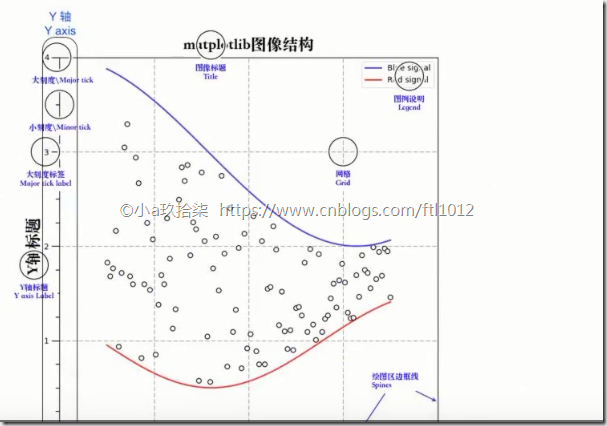
2)辅助显示层:可以设置图例,刻度,显示网格等
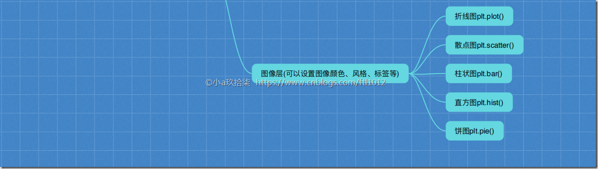
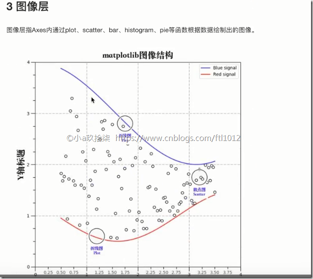
3)图像层:各种各样的图标,例如散点图、柱状图、折线图(还可以调整散点图的颜色,标题等)关系:容器层 –》 辅助显示层 –》 图像层
1、容器层
2、 辅助显示层

3、 图像层
总结:
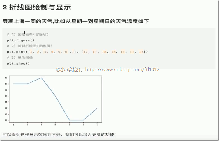
折线图(plot)与基础绘图功能
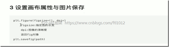
- 折线图绘制与保存图片
import matplotlib.pyplot as plt

def matplotlib_demo():

    """

    简单演示matplotlib

    :return: None

    """

    plt.figure(figsize=(20, 8), dpi=100)   # 创建了一个画布,figsize设置了长款,dpi=dot per inch设置了清晰度

    plt.plot([1, 2, 3], [4, 5, 6])  # 指定了横坐标、纵坐标参数

    plt.savefig('.tmp/hhh.png')       # 必须写在show()前,因为show()会释放整个画布的资源,即图像在显示,先显示再保存的文件是个空白图
    plt.show()  # 点连线进行呈现

    # plt.savefig('.tmp/hhh.png')     # 如果写在了show()后面,保存的文件是个空白图

    return None

 matplotlib_demo()
完善原始折线图(辅助显示层)—>某城市的温度显示(面向过程)
- 修改X,Y刻度

- 添加网格显示
- 添加描述信息

- 修改matplotlib的中文问题
DEMO
import matplotlib.pyplot as plt
import random '''
# 需求:再添加一个城市的温度变化
# 收集到北京当天温度变化情况,温度在15度到18度。
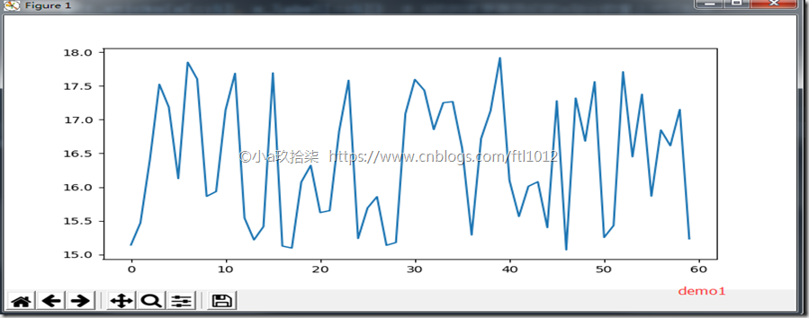
# 显示每一分钟的变化 ''' def matplotlib_demo1():
"""
完善原始折线图(辅助显示层) --> 最开始最简陋的图
:return: None
"""
# 1、准备数据 x y
x = range(60)
y = [
random.uniform(15, 18) for i in x # uniform是均匀分布的意思
]
# 2、创建画布
plt.figure(figsize=(10, 8), dpi=100) # 3、绘制图像
plt.plot(x, y) # 4、显示图像
plt.show()
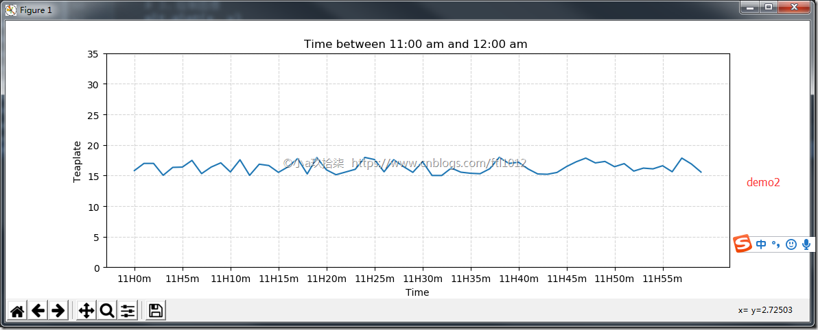
return None def matplotlib_demo2():
"""
完善原始折线图(辅助显示层) --> 添加了自定义的x,y刻度
:return: None
"""
# 1、准备数据 x y
x = range(60)
y = [
random.uniform(15, 18) for i in x # uniform是均匀分布的意思
]
# 2、创建画布
plt.figure(figsize=(10, 8), dpi=100) # 3、绘制图像
plt.plot(x, y) # 修改刻度值
x_label = [
"11H{}m".format(i) for i in x # 中文不显示问题
]
plt.xticks(x[::5], x_label[::5]) # X的刻度要跟我们的x划分数量上对应起来
plt.yticks(range(0, 40, 5)) # 添加描述信息
plt.xlabel("Time")
plt.ylabel("Teaplate")
plt.title("Time between 11:00 am and 12:00 am ") # 添加网格显示
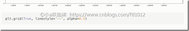
plt.grid(linestyle="--", alpha=0.5) # 4、显示图像
plt.show()
return None if __name__ == '__main__':
# 最开始最简陋的图
matplotlib_demo1() # 添加了自定义的x,y刻度
matplotlib_demo2()
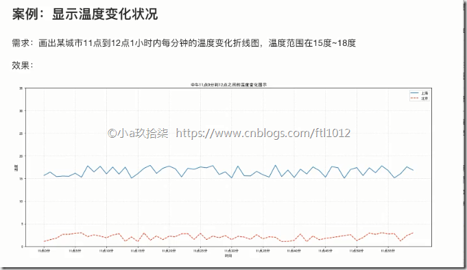
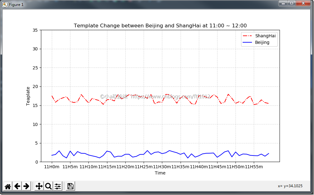
再添加一个城市的温度变化(面向过程)

demo:
import matplotlib.pyplot as plt
import random def matplotlib_demo2():
"""
完善原始折线图2(辅助显示层) --> 多个城市的温度显示
:return: None
"""
# 需求:再添加一个城市的温度变化
# 收集到北京当天温度变化情况,温度在1度到3度。 # 1、准备数据 x y
x = range(60)
y_shanghai = [random.uniform(15, 18) for i in x]
y_beijing = [random.uniform(1, 3) for i in x] # 2、准备画板
plt.figure(figsize=(10, 8), dpi=100) # 3、绘制图片
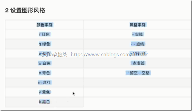
plt.plot(x, y_shanghai, color="r", linestyle="-.", label="ShangHai")
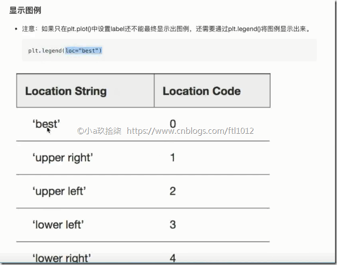
plt.plot(x, y_beijing, color="b", label="Beijing") # 显示图例
plt.legend() # 修改x、y刻度
# 准备x的刻度说明
x_label = ["11H{}m".format(i) for i in x]
plt.xticks(x[::5], x_label[::5])
plt.yticks(range(0, 40, 5)) # 添加网格显示
plt.grid(linestyle="--", alpha=0.5) # 添加描述信息
plt.xlabel("Time")
plt.ylabel("Teaplate")
plt.title("Template Change between Beijing and ShangHai at 11:00 ~ 12:00") # 4、画板显示
plt.show() if __name__ == '__main__':
# 多个城市的温度显示
matplotlib_demo2()
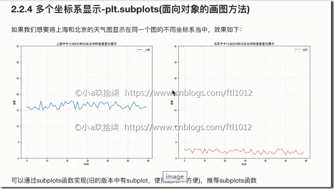
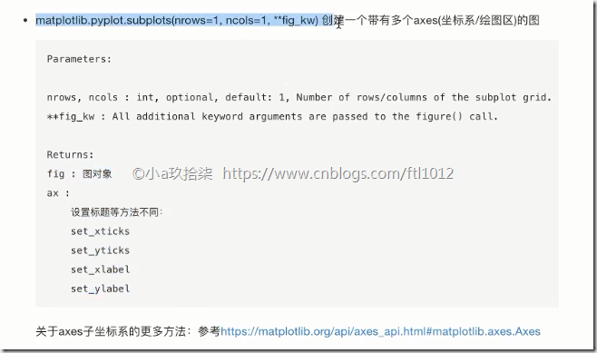
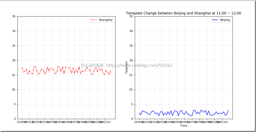
多个坐标系显示-plt.subplots(面向对象的画图)
import matplotlib.pyplot as plt

import random

def matplotlib_demo2():

    """

    多坐标显示  -->面向对象
    :return: None

    """

    # 1、准备数据 x y

    x = range(60)

    y_shanghai = [random.uniform(15, 18) for i in x]

    y_beijing = [random.uniform(1, 3) for i in x]

    # 2、准备画板

    # plt.figure(figsize=(10, 8), dpi=100)

    figure, axes = plt.subplots(nrows=1, ncols=2, figsize=(12, 8), dpi=80)  # 创建一行2列的

    # 3、绘制图片

    # plt.plot(x, y_shanghai, color="r", linestyle="-.", label="ShangHai")

    axes[0].plot(x, y_shanghai, color="r", linestyle="-.", label="ShangHai")

    axes[1].plot(x, y_beijing, color="b", label="Beijing")

    # 显示图例

    # plt.legend()

    axes[0].legend()

    axes[1].legend()

    # 修改x、y刻度

    # 准备x的刻度说明

    x_label = ["11H{}m".format(i) for i in x]

    # plt.xticks(x[::5], x_label[::5])

    axes[0].set_xticks(x[::5])

    axes[0].set_xticklabels(x_label)

    axes[0].set_yticks(range(0, 40, 5))

    axes[1].set_xticks(x[::5])

    axes[1].set_xticklabels(x_label)

    axes[1].set_yticks(range(0, 40, 5))

    # 添加网格显示

    # plt.grid(linestyle="--", alpha=0.5)

    axes[0].grid(linestyle="--", alpha=0.5)

    axes[1].grid(linestyle="--", alpha=0.5)

    # 添加描述信息

    plt.xlabel("Time")

    plt.ylabel("Teaplate")

    plt.title("Template Change between Beijing and ShangHai at 11:00 ~ 12:00")

    # 4、画板显示

    plt.show()

if __name__ == '__main__':

    # 多个坐标系显示

    matplotlib_demo2()
【更多API】https://matplotlib.org/api/axes_api.html
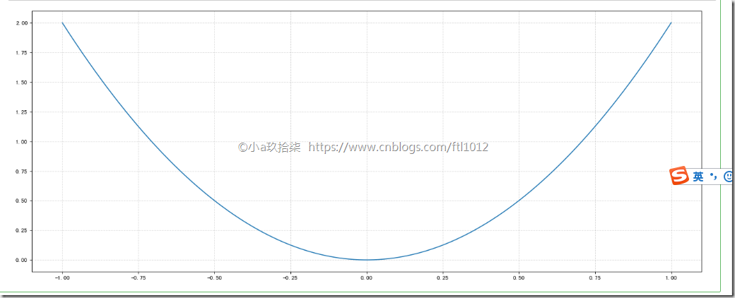
折线图的应用场景---> 绘制数学函数(点密集起来就是线段)
import numpy as np

# 1、准备x,y数据

x = np.linspace(-1, 1, 1000)  # 生成-1到1之间等距离的数字1000个

y = 2 * x * x

# 2、创建画布

plt.figure(figsize=(20, 8), dpi=80)

# 3、绘制图像

plt.plot(x, y)

# 添加网格显示

plt.grid(linestyle="--", alpha=0.5)

# 4、显示图像

plt.show()
常见的图形种类
分类:
折线图 plot --> 显示事物随着时间的变化关系
散点图 scatter --> 变量之间的关系/规律,判断变量直接是否存在数量关联
柱状图 bar --> 统计某个类别的数量大小或者整体情况,一目了然
直方图 histogram --> 分布状况,例如170-175之间有5个人
饼图 pie π --> 占比直方图与柱状图的对比
1. 直方图展示数据的分布,柱状图比较数据的大小。
2. 直方图X轴为定量数据,柱状图X轴为分类数据。
3. 直方图柱子无间隔,柱状图柱子有间隔
4. 直方图柱子宽度可不一,柱状图柱子宽度须一致
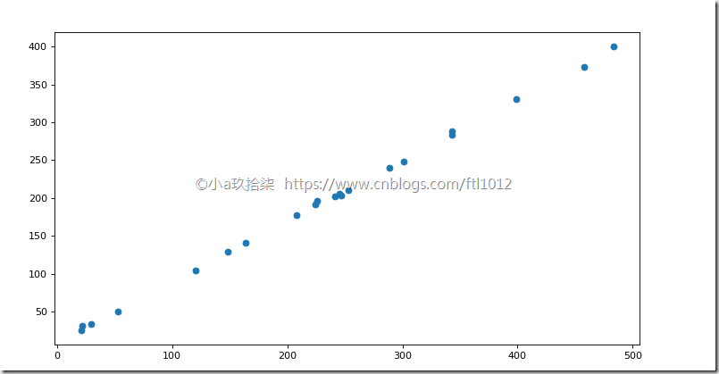
- 散点图
import matplotlib.pyplot as plt def scatter_demo():
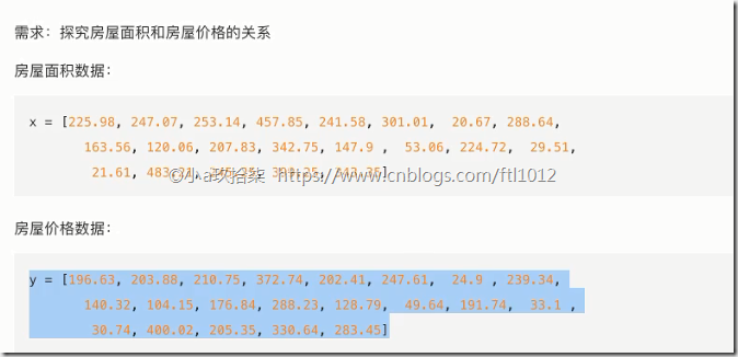
# 需求:探究房屋面积和房屋价格的关系 # 1、准备数据
x = [225.98, 247.07, 253.14, 457.85, 241.58, 301.01, 20.67, 288.64,
163.56, 120.06, 207.83, 342.75, 147.9, 53.06, 224.72, 29.51,
21.61, 483.21, 245.25, 399.25, 343.35] y = [196.63, 203.88, 210.75, 372.74, 202.41, 247.61, 24.9, 239.34,
140.32, 104.15, 176.84, 288.23, 128.79, 49.64, 191.74, 33.1,
30.74, 400.02, 205.35, 330.64, 283.45]
# 2、创建画布
plt.figure(figsize=(20, 8), dpi=80) # 3、绘制图像
plt.scatter(x, y) # 4、显示图像
plt.show() return None if __name__ == "__main__":
# 代码2:简单演示读取数据
scatter_demo()
- 柱状图
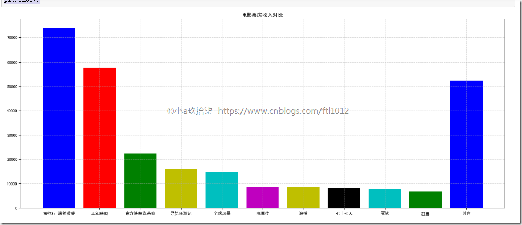
案例一:对比电影票房收入
import matplotlib.pyplot as plt

def bar_demo():

    # 1、准备数据

    movie_names = ['雷神3:诸神黄昏', '正义联盟', '东方快车谋杀案', '寻梦环游记', '全球风暴', '降魔传', '追捕', '七十七天', '密战', '狂兽', '其它']

    tickets = [73853, 57767, 22354, 15969, 14839, 8725, 8716, 8318, 7916, 6764, 52222]

    # 2、创建画布

    plt.figure(figsize=(20, 8), dpi=80)

    # 3、绘制柱状图

    x_ticks = range(len(movie_names)) # x代表电影类型

    plt.bar(x_ticks, tickets, color=['b', 'r', 'g', 'y', 'c', 'm', 'y', 'k', 'c', 'g', 'b'])

    # 修改x刻度

    plt.xticks(x_ticks, movie_names)

    # 添加标题

    plt.title("电影票房收入对比")

    # 添加网格显示

    plt.grid(linestyle="--", alpha=0.5)

    # 4、显示图像

    plt.show()

if __name__ == "__main__":

    bar_demo()
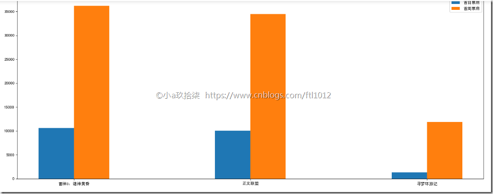
案例二:比较同一天上映电影的票房
import matplotlib.pyplot as plt

def bar_demo2():

    # 1、准备数据

    movie_name = ['雷神3:诸神黄昏', '正义联盟', '寻梦环游记']

    first_day = [10587.6, 10062.5, 1275.7]

    first_weekend = [36224.9, 34479.6, 11830]

    # 2、创建画布

    plt.figure(figsize=(20, 8), dpi=80)

    # 3、绘制柱状图

    plt.bar(range(3), first_day, width=0.2, label="首日票房") # range(3) 显示的x=0,x=1,x=2的值

    plt.bar([0.2, 1.2, 2.2], first_weekend, width=0.2, label="首周票房") # 0.2, 1.2, 2.2表示刻度平移0.2

    # 显示图例

    plt.legend()

    # 修改刻度

    plt.xticks([0.1, 1.1, 2.1], movie_name)

    # 4、显示图像

    plt.show()

if __name__ == "__main__":

    bar_demo2()
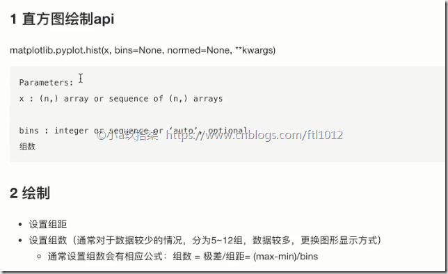
- 直方图
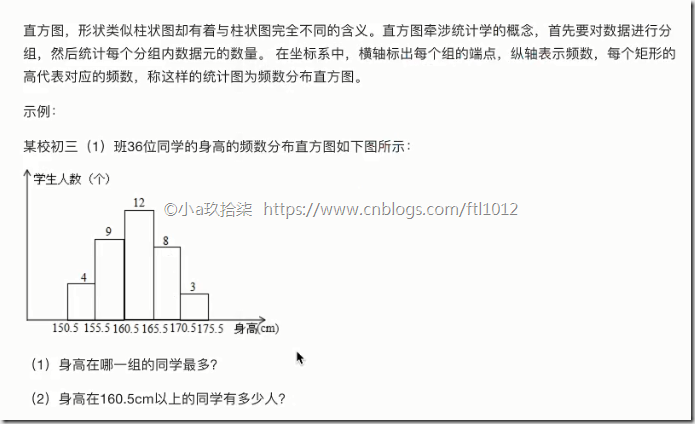
组数:在统计数据时,我们把数据按照不同的范围分成几个组,分成的组的个数称为组数
组距:每一组两个端点的差
已知 最高175.5 最矮150.5 组距5
求 组数:(175.5 - 150.5) / 5 = 5
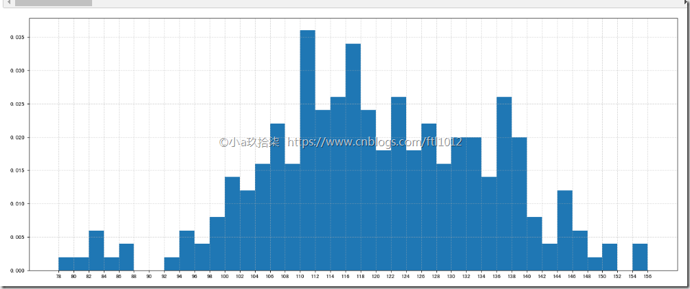
案例一:电影时长分布状况
# 需求:电影时长分布状况

# 1、准备数据

time = [131,  98, 125, 131, 124, 139, 131, 117, 128, 108, 135, 138, 131, 102, 107, 114, 119, 128, 121, 142, 127, 130, 124, 101, 110, 116, 117, 110, 128, 128, 115,  99, 136, 126, 134,  95, 138, 117, 111,78, 132, 124, 113, 150, 110, 117,  86,  95, 144, 105, 126, 130,126, 130, 126, 116, 123, 106, 112, 138, 123,  86, 101,  99, 136,123, 117, 119, 105, 137, 123, 128, 125, 104, 109, 134, 125, 127,105, 120, 107, 129, 116, 108, 132, 103, 136, 118, 102, 120, 114,105, 115, 132, 145, 119, 121, 112, 139, 125, 138, 109, 132, 134,156, 106, 117, 127, 144, 139, 139, 119, 140,  83, 110, 102,123,107, 143, 115, 136, 118, 139, 123, 112, 118, 125, 109, 119, 133,112, 114, 122, 109, 106, 123, 116, 131, 127, 115, 118, 112, 135,115, 146, 137, 116, 103, 144,  83, 123, 111, 110, 111, 100, 154,136, 100, 118, 119, 133, 134, 106, 129, 126, 110, 111, 109, 141,120, 117, 106, 149, 122, 122, 110, 118, 127, 121, 114, 125, 126,114, 140, 103, 130, 141, 117, 106, 114, 121, 114, 133, 137,  92,121, 112, 146,  97, 137, 105,  98, 117, 112,  81,  97, 139, 113,134, 106, 144, 110, 137, 137, 111, 104, 117, 100, 111, 101, 110,105, 129, 137, 112, 120, 113, 133, 112,  83,  94, 146, 133, 101,131, 116, 111,  84, 137, 115, 122, 106, 144, 109, 123, 116, 111,111, 133, 150]

# 2、创建画布

plt.figure(figsize=(20, 8), dpi=80)

# 3、绘制直方图

distance = 2   # 组距

group_num = int((max(time) - min(time)) / distance) # 组数

plt.hist(time, bins=group_num, density=True)  # time=要显示是数据 bins=组数, density=True表示显示频数,默认显示频率

# 修改x轴刻度

plt.xticks(range(min(time), max(time) + 2, distance))  # 显示的是从最小值道最大值,步长=组距, max+2是为了最后一组数据的正常显示

# 添加网格

plt.grid(linestyle="--", alpha=0.5)
plt.xlabel("电影市场”)
plt.ylabel(“电影名称”)
# 4、显示图像

plt.show()
注意点:


适用场景:
- 饼状图
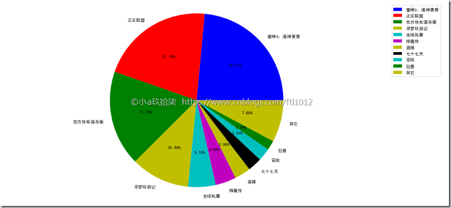
显示不同电影的票房占比:
# 1、准备数据
movie_name = ['雷神3:诸神黄昏','正义联盟','东方快车谋杀案','寻梦环游记','全球风暴','降魔传','追捕','七十七天','密战','狂兽','其它'] place_count = [60605,54546,45819,28243,13270,9945,7679,6799,6101,4621,20105] # 2、创建画布
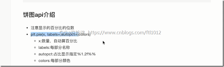
plt.figure(figsize=(20, 8), dpi=80) # 3、绘制饼图 autopct="%1.2f%%" 最后2个%%表示一个%,也就是饼图上显示的占比
plt.pie(place_count, labels=movie_name, colors=['b','r','g','y','c','m','y','k','c','g','y'], autopct="%1.2f%%") # 显示图例
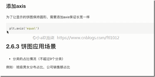
plt.legend() plt.axis('equal') # 保证横轴和纵轴的宽度一直,即比例一致,默认出来是个扁图
# 4、显示图像

plt.show()
最新文章
- GitHub实战系列~2.把本地项目提交到github中 2015-12-10
- 一些关于angularJS的自己学习和开发过程中遇到的问题及解决办法
- TSQL Merge On子句和When not matched 语义理解
- MYSQL管理之主从同步管理
- Twitter Snowflake 的Java实现
- Servlet------(声明式)异常处理
- 定时导出Oracle数据表到文本文件的方法
- 浅淡Webservice、WSDL三种服务访问的方式(附案例)
- Unable to find the ncurses libraries or the required header files解决
- Max retries exceeded with ur
- [国嵌笔记][029][ARM处理器启动流程分析v2]
- 『集群』007 如何测试Slithice源代码
- 如何给pdf文件中的一页添加水印
- c++第三次实验
- http-request详解
- C# List<string>和ArrayList用指定的分隔符分隔成字符串
- Python学习笔记010——匿名函数lambda
- mysql中什么是物理备份?
- 学习JVM
- SpringMVC 细节学习
热门文章
- 基于线程开发一个FTP服务器
- 高可用集群之keepalived+lvs实战-技术流ken
- Webapi--Webapi 跨域链接
- C#委托。
- git 创建本地分支与远程分支
- js发送邮件确定email地址
- Java五种基本的Annotation,提高程序的可读性
- 异常: The server time zone value 'Öйú±ê׼ʱ¼ä' is unrecognized or represents more than one time zone. You must configure either the server or JDBC driver (via the serverTimezone configurat
- js求渐升数的第100位
- python3 os模块