Bootstrap文本排版基础--Bootsrap
2024-08-25 12:07:25
1、排版前的基础
(1)移动设备优先
<meta name="viewport" content="width=device-width, initial-scale=1">
(2)响应式图片
CSS:img-responsive
demo.html:
<!DOCTYPE html>
<html lang="en">
<head>
<meta charset="UTF-8">
<title>Title</title>
<link href="css/bootstrap.min.css" type="text/css" rel="stylesheet">
<meta name="viewport" content="width=device-width, initial-scale=1">
</head>
<body>
<div class="container">
<div class="row">
<div class="col-sm-12">
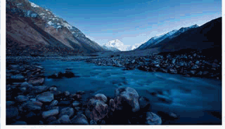
<img class="img-responsive" src="data:images/river.jpg" height="768" width="1366"/>
</div>
</div>
</div>
</body>
</html>
Effect Picture:
2、标题
CSS:class="h1"、"h2"、"h3"、"h4"、"h5"、"h6"
h1 36px margin-top:20px margin-bottom:10px;
h2 30px margin-top:20px margin-bottom:10px;
h3 24px margin-top:20px margin-bottom:10px;
h4 18px margin-top:10px margin-bottom:10px;
h5 14px margin-top:10px margin-bottom:10px;
h6 12px margin-top:10px margin-bottom:10px;
demo.html:
<!DOCTYPE html>
<html lang="en">
<head>
<meta charset="UTF-8">
<title>Title</title>
<link href="css/bootstrap.min.css" type="text/css" rel="stylesheet">
<meta name="viewport" content="width=device-width, initial-scale=1">
</head>
<body>
<div class="container">
<div class="row">
<div class="col-sm-4">
<img class="img-responsive" src="data:images/river.jpg" height="768" width="1366"/>
</div>
<div class="col-sm-8">
<h1>第一个标题样式<small>小字体</small></h1><!--h标签里可以使用small标签,small标签文字大小在h1~3占h标签的65%,4~6占h75%-->
<h2>第一个标题样式<small>小字体</small></h2>
<h3>第一个标题样式<small>小字体</small></h3>
<h4>第一个标题样式<small>小字体</small></h4>
<h5>第一个标题样式<small>小字体</small></h5>
<h6>第一个标题样式<small>小字体</small></h6>
<p class="h1">第一个标题样<small>小字体</small>式<small>小字体</small></p>
<p class="h2">第一个标题样式<small>小字体</small></p>
<p class="h3">第一个标题样式<small>小字体</small></p>
<p class="h4">第一个标题样式<small>小字体</small></p>
<p class="h5">第一个标题样式<small>小字体</small></p>
<p class="h6">第一个标题样式<small>小字体</small></p>
</div>
</div>
</div>
</body>
</html>
Effect Picture:

3、页面主题
body全局样式:Background-color:white;font-size:14px margin:0; 行间距:20px
p全局样式:font-size:14px
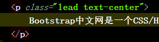
强调<p>标签里的内容,可以给p标签里加类选择器class="lead"
Before:

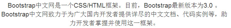
After:

对齐方式:class="text-center"
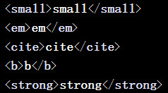
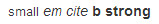
4、强调文本
small、em、cite(引用网址)、b、strong相关
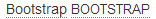
5、缩略语abbr
<abbr title="Bootstrap">Bootstrap</abbr>
<abbr title="Bootstrap" class="initialism">Bootstrap</abbr>
initialism类选择器定义的字母是原来的90%,并且会使小写字母转换为大写字母
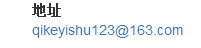
6、地址元素address
.address {
margin-bottom: 20px;
font-style: normal;
line-height: 1.42857143;
}
<address>
<strong>地址:</strong><br/>
<a href="mailto:#">qikeyishu123@163.com</a>
</address>
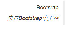
(7)引用 blockquote,引用里面最好设有p标签
<blockquote>
<p>Bootsrap</p>
<cite>来自<em>Bootstrap中文网</em></cite>
</blockquote>
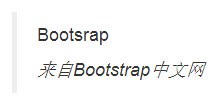
<blockquote class="pull-right">
<p>Bootsrap</p>
<cite>来自<em>Bootstrap中文网</em></cite>
</blockquote>
扩展:Botstrap使用第三方库Normalize.css,Normalize是一个专门用于将不同浏览器的默认css效果特征统一的css库
最新文章
- windbg 基础命令实战 - 简单程序破解
- ACm-ICPC Live Archive 7464---Robots
- c# Winform 开发分屏显示应用程序
- shell之数值运算
- iOS杂谈-图片拉伸的实现
- 关于javaScript注册事件传递参数的浅析
- delphi 转换sql server 中的 bit类型
- 【Python】python读取文件操作mysql
- depcomp: line 571: exec: g++: not found
- 框架应用 : Spring MVC - 开发详述
- 最大堆(Java数组实现)
- 8 ServletContext
- linux cp 拷贝文件或目录
- UC登录功能:商户需要创建的表
- 高并发秒杀系统--mybatis整合技巧
- vi/vim键盘对应图
- linux使用代理进行apt安装 以 nord 为例
- if (HttpContext.Current.User.Identity.IsAuthenticated) 权限验证总是true
- 最大m段子段和
- Java的工厂模式(二)