CSS3_伸缩盒模型_弹性布局_等分布局_flex 布局
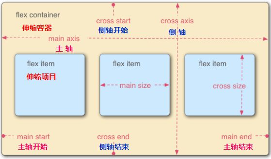
伸缩盒模型
CSS3 引入的布局模式 Flexbox 布局
主要思想: 让容器有能力让其子项目能够改变其宽度,高度,以最佳方式填充可用空间。
特点:
display: flex; 只能控制其子元素
浮动无法影响伸缩容器,但是如果内联伸缩容器 设置了浮动,元素将会以块级伸缩容器显示。
伸缩容器的 margin 与其内容的 margin 不会重叠
项目构建,会将新版语法构建成老板语法
主轴在水平方向时,元素要换行,但是子元素没有 width,此时,使用换轴(父元素加 flex-direction: column;)
- 面试题: 用 CSS3 属性实现元素 水平垂直居中,除了 trnasform: translate(-50%, -50%);
/**** 新版语法 ****/

#wrap {

    display: flex;

    justify-content: center;

    align-items: center;

}

/**** 老版语法 ****/

#wrap {

    display: -webkit-flex;

    -webkit-box-pack: center;

    -webkit-box-align: center;

}
以上代码适用于 任何类型子元素 的水平垂直居中(块元素,行内元素,行内块元素)。
- 概论:
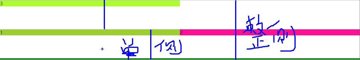
- 主轴:Flex 容器的主轴主要用来配置 Flex 项目。他不一定是水平的,这主要取决于 flex-direction 属性。
- 主轴起点,主轴终点:Flex 项目 的配置从容器的主轴起点边开始,往主轴终点边结束。
- 主轴长度:Flex 项目 在主轴方向的宽度或高度就是项目的主轴长度,Flex 项目 的主轴长度属性是 width 或 height 属性,由哪一个对着主轴方向决定。
- 侧轴:与主轴垂直的轴称作侧轴,是侧轴方向的延伸。
- 侧轴起点,侧轴终点:伸缩行的配置从容器的侧轴起点边开始,往侧轴终点边结束。
- 侧轴长度:Flex 项目 在侧轴方向的宽度或高度就是项目的侧轴长度,Flex 项目 的侧轴长度属性是 widht 或 height 属性,由哪一个对着主轴方向决定。
- Flex 布局 局限性: 因为语法规范版本众多,浏览器支持不一致,致使 Flexbox 布局使用不多。
- Flexbox 布局 语法规范 主要分成三种:
- 旧版本,2009 年版本,是最早的伸缩布局,各大主流浏览器对其支持性略有不同,可惜的是,对 Flexbox 布局的各属性支持也不完全,在使用时还需添加各浏览器的前缀。
- 混合版本,2011 年版本,只有 IE10 支持。
- 最新版本,2012 年版本,除了 Safari 浏览器不支持外,其他最新浏览器都支持这个版本。
1. 伸缩容器属性(父元素属性)
- 使用伸缩盒模型 的前提:
- 应用于 父元素 子元素
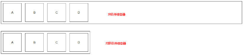
display: flex;
设置为块级伸缩容器。
/**** 新老版本兼容写法 ****/

#wrap {

    display: -webkit-box;

    display: -webkit-flex;

    display: flex;

}- 块级伸缩容器独占一行
- 有些设计用来控制块布局的属性在伸缩布局中不适用
display: inline-flex; 设置为内联级伸缩容器。
- 如果内联伸缩容器设置了浮动,元素将会以块级伸缩容器显示。
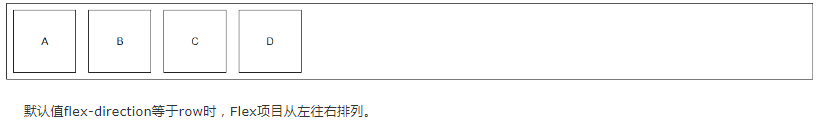
- flex-direction: row | row-reverse | column | column-reverse;
定义 Flex 项目 在 Flex 容器 中放置的方向。
- 侧轴拉伸:子元素 px 与父元素 等 px
- 主轴: 子元素 px 由内容撑开
- row: 默认值,
- 如果书写方式是 ltr,那么 Flex 项目从左向右排列;
- 如果书写方式是 rtl,那么 Flex 项目从右向左排列。
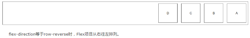
- row-reverse:
- 如果书写方式是 ltr,那么 Flex 项目从右向左排列;
- 如果书写方式是 rtl,那么 Flex 项目从左向右排列。
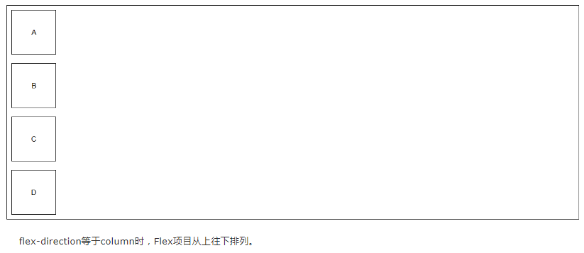
- column:
- 和 row 类似,方向从上到下排列。
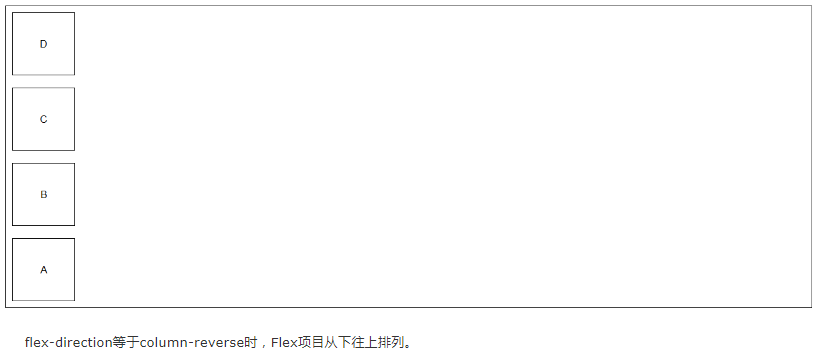
- column-reverse:
- 和row-reverse类似,方向从下到上排列。
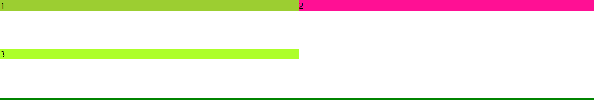
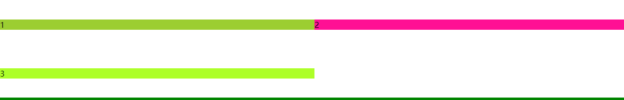
- justify-content: flex-start | flex-end | center | space-between | space-around;
设置 伸缩项目 在主轴上的对齐方式。
指定如何在 伸缩项目 之间分布伸缩容器富裕空间
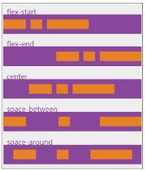
- flex-start
- 默认值,伸缩项目向一行的起始位置靠齐。
- 伸缩容器沿着布局轴方向的所有额外空间都被置于布局轴的末尾。
- flex-end
- 伸缩项目向一行的结束位置靠齐。
- 伸缩容器沿着布局轴方向的所有额外空间都被置于布局轴的开始。
- center
- 伸缩项目向一行的中间位置靠齐。
- 伸缩容器的所有额外空间平均分布在第一伸缩项目前面和最后一个伸缩项目的后面。
- space-between
- 伸缩项目会平均分布在行里。
- 伸缩容器的所有额外空间平均分布在所有伸缩项目之间,
- 但是在第一个伸缩项目之前和最后一个伸缩项目之后不分配空间,
- 也就是说,第一个伸缩项目靠齐开始位置,最后一个伸缩项目靠齐结束位置。
- space-around
- 伸缩项目会品均分布在行里。
- 伸缩容器的所有额外空间品均分布在所有伸缩项目之间
- 但是第一个伸缩项目之前与最后一个伸缩项目之后只分配其他位置得到额外空间的一半。
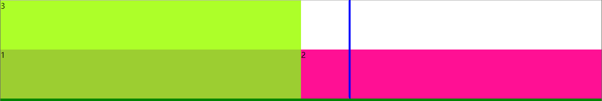
- align-items: flex-start | flex-end | center | baseline | stretch;
设置 伸缩项目 在主轴上的对齐方式。
align-items 控制的是每一行的富裕空间
align-items 是用来管理伸缩容器侧轴方向的额外空间

- flex-start
- 伸缩项目在侧轴起点边的外边距紧靠住该行在侧轴起始的边。
- flex-end
- 伸缩项目在侧轴终点边的外边距靠住该行在侧轴终点的边。
- center
- 伸缩项目的外边距盒在该行的侧轴上居中放置。
- stretch
- 如果侧轴 长度属性 的值为 auto,则此值会使项目的外边距盒的尺寸在遵照 min/max-width/height 属性的限制下尽可能接近所在行的尺寸
- baseline
- 如果伸缩项目的行内轴与侧轴为同一条,则该值和 flex-start 等效。
- 其它情况下,该值将参与基线对齐。
- 所有参与该对齐方式的伸缩项目将按下列方式排列
- 首先将这些伸缩项目的基线进行对齐,
- 随后其中基线至侧轴起点边的外边距距离最长的那个项目将紧靠住该行在侧轴起点的边。
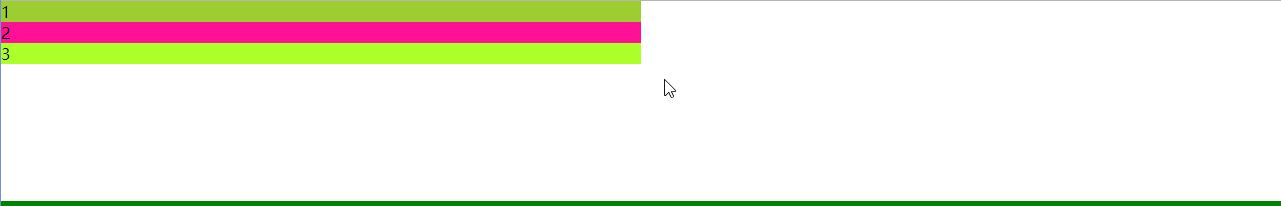
- flex-wrap: nowrap | wrap | wrap-reverse;
flex 项目 实现换行
新版本 flex 容器 特有属性
换行以后:
- 有多个侧轴(wrap-reverse 会替换所有侧轴的 start 和 end)
- 整体侧轴(align-content 控制整体侧轴的富裕空间)
- 单行侧轴(align-items 控制的是每一行的富裕空间)
- 几行就有几个单行侧轴
- 整体侧轴与单行侧轴 一样时,整体侧轴生效(有打包效果)
- nowrap
- 默认值,父元素宽度不够,子元素的自身宽度会进行压缩
- 默认元素始终在一行,无论设置多少 width,height

- wrap
- 父元素宽度不够,子元素自动进行换行
- 由于侧轴默认拉伸 stretch,所以侧轴距离被子元素均分
- wrap-reverse
- 子元素换行的同时,侧轴的 start 与 end 发生对调
- align-content: stretch | flex-start | flex-end | center | space-between | space-around;
生效条件:
- 伸缩容器 必须有 flex-wrap: wrap;
- 伸缩容器 height 设置足够的高(因为需要整体打包才能看见效果)
- stretch
- flex-start
- flex-end
- center
- 只要元素捆到一块儿,在中间,就是侧轴 flex 项目 center

- space-between
- space-around
- flex-flow: wrap-reverse colum;
是 flex-wrap 和 flex-direction 的缩写
等同于 flex-wrap: wrap-reverse; flex-direction: colum;
- 最终元素换行,取决于主轴的位置
- 主轴 在水平方向上,子元素须设置足够的 width 实现换行
- 主轴 在垂直方向上,子元素须设置足够的 height 实现换行
waiting
2. 伸缩项目属性(子元素属性)
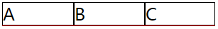
- flex-grow: | | ... ...;
设置 Flex 项目 的扩大比例,或者说,空间分配比例
flex-grow 处理的是 伸缩容器内部 剩下的额外空间
默认值为 0,不能取负值,没有单位


- 1, 2, 3____分别占 1/5, 2/5, 3/5
          <style>

            .box{

                width:100%;

                border-bottom: 1px solid red;

                display:flex;

            }

            .box div{

                width:100px;

                border:1px solid;

            }

            .box div:nth-child(1){

                flex-grow:1;

            }

            .box div:nth-child(2){

                flex-grow:2;

            }

            .box div:nth-child(3){

                flex-grow:3;

            }

        </style>

    </head>

    <body>

        <div class="box">

            <div>A</div>

            <div>B</div>

            <div>C</div>

        </div>

    </body>
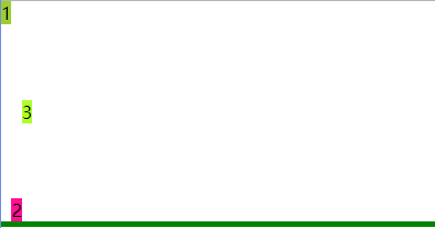
- flex-shrink: | | ... ...;
收缩率 flex-shrink 处理的是 由于伸缩容器太小, 溢出的额外空间。处理是,按比例分配,不写比例,默认1份
默认值 1,即如果溢出,每个子元素均分容器主轴空间
- 计算过程:
默认 将溢出部分分成 n 份,每个 伸缩项目 缩放 1/n
- 父盒子300px,刚刚好不溢出,
- 父盒子100px,溢出,则元素缩放,按比例分配

- A 压缩溢出部分的 1/4
- B 压缩溢出部分的 2/4
- C 压缩溢出部分的 1/4
        <style>

            .box{

                width:100px;

                border-bottom: 1px solid red;

                display:flex;

            }

            .box div{

                width:100px;

                border:1px solid;

            }

            .box div:nth-child(1){

                flex-shrink:1;

            }

            .box div:nth-child(2){

                flex-shrink:2;

            }

            .box div:nth-child(3){

                flex-shrink:1;

            }

        </style>

    </head>

    <body>

        <div class="box">

            <div>A</div>

            <div>B</div>

            <div>C</div>

        </div>

    </body>
- order: | | ... ...;
flex 项目 的排列顺序,沿着主轴方向进行排序
未排序元素正常排列再前,将 排序元素 单独拿出来,再在后面排序
- align-self: stretch | flex-start | flex-end | center;
flex 项目自身的侧轴富裕空间
- flex-basis: ;
flex 项目 的基准值
- 实现 等分布局 的两种方法:
- 第一种方法
/**** 新版语法(面试题) ****/
#inner_box {
    flex-basis: 0;    /**** 让 伸缩项目 的 主轴空间(width/height) 始终等于 0 ****/
    flex-grow: 1;
}

/**** 老版语法(面试题) ****/
#inner_box {
    width: 0;
    -webkit-box-flex: 1;    /**** 等同于新版的 flex-grow ****/
}- 主轴方向上,伸缩项目 永远等分 伸缩容器,不会被 内容 打破布局
- 第二种方法
/**** 新版本 特有实现 等分布局 ****/

#inner_box {

    flex:;    /**** ----等同于 flex-basis: 0;    flex-grow: 1;    flex-shrink: 1; ****/

}- flex 是 flex-grow,flex-shrink,flex-basis 的简写属性
- 默认值
- flex-grow: 0;
- flex-shrink: 1;
- flex-basis: auto;
- flex: none; ----等同于 flex: 0, 0, auto; ----等同于 display: flex;
- flex: 1; ----等同于 flex: 1, 1, 0%;
- 默认值
- flex 是 flex-grow,flex-shrink,flex-basis 的简写属性
- 典例:

- 给 ul 设置 display: flex; 使 li 元素在一行
- 给 li 设置 flex-basis: 0; flex-grow: 1; 等分布局
- 给 li 设置 display: flex; justify-content: center; 使文字水平居中
- 使用 ::before 来设置图片,发现文字不居中了(<a> 元素居中了,但是由于图片的加入,文字就不居中了)
- 给 a 设置 display: flex; flex-direction: column; align-items: center; 实现文本再水平居中
<!DOCTYPE html>

<html>

    <head>

        <meta charset="UTF-8">

        <title></title>

        <style type="text/css">

            * {

                margin: 0;

                padding: 0;

            }

            /**** Double Line Goods ****/

            a {

                text-decoration: none;

            }

            #top_line,

            #bottom_line {

                display: flex;

                list-style: none;

            }

            #top_line li,

            #bottom_line li {

                /**** 等分布局 ****/

                flex-flow: 0;

                flex-grow: 1;

                display: flex;

                justify-content: center;    /**** li 中 子元素 水平居中 ****/

            }

            #top_line li a,

            #bottom_line li a {

                display: flex;

                flex-direction: column;    /**** a 中 子元素 在一列 ****/

                align-items: center;    /**** a 中 文字水平居中 ****/

            }

            #top_line li a::before,

            #bottom_line li a::before {

                content:"";

                display: block;

                width: 86px;

                height: 86px;

            }

            #top_line li:nth-child(1) a::before {

                background-image: url(./img/01.png);

            }

            #top_line li:nth-child(2) a::before {

                background-image: url(./img/02.png);

            }

            #top_line li:nth-child(3) a::before {

                background-image: url(./img/03.png);

            }

            #top_line li:nth-child(4) a::before {

                background-image: url(./img/04.png);

            }

            #top_line li:nth-child(5) a::before {

                background-image: url(./img/05.png);

            }

            #bottom_line li:nth-child(1) a::before {

                background-image: url(./img/06.png);

            }

            #bottom_line li:nth-child(2) a::before {

                background-image: url(./img/07.png);

            }

            #bottom_line li:nth-child(3) a::before {

                background-image: url(./img/08.png);

            }

            #bottom_line li:nth-child(4) a::before {

                background-image: url(./img/09.png);

            }

            #bottom_line li:nth-child(5) a::before {

                background-image: url(./img/10.png);

            }

        </style>

    </head>

    <body>

        <ul id="top_line">

            <li><a href="javascript:;">天猫</a></li>

            <li><a href="javascript:;">天猫</a></li>

            <li><a href="javascript:;">天猫</a></li>

            <li><a href="javascript:;">天猫</a></li>

            <li><a href="javascript:;">天猫</a></li>

        </ul>

        <ul id="bottom_line">

            <li><a href="javascript:;">天猫</a></li>

            <li><a href="javascript:;">天猫</a></li>

            <li><a href="javascript:;">天猫</a></li>

            <li><a href="javascript:;">天猫</a></li>

            <li><a href="javascript:;">天猫</a></li>

        </ul>

    </body>

</html>
- 骰子
- display: flex;
- align-self: center; // 可以实现自身水平居中
- justify-content: space-around;
- box-sizing: border-box; padding: 4px;
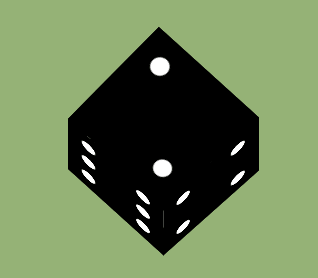
<!DOCTYPE html>

<html>

    <head>

        <meta charset="UTF-8" />

        <title>Dice</title>

        <style type="text/css">

            *{

                padding: 0;

                margin: 0;

            }

            body {

                width: 100%;

                padding-top: 300px;

                color: #000;

                background: #96b377;

                font: 14px Helvetica, Arial, sans-serif;

                display: flex;

                justify-content: center;

                align-items: center;

            }

            /**** flex 实现 Dice ****/

            /* 白点 */

            .dice_point {

                width: 20px;

                height: 20px;

                border-radius: 100%;

                background-color: #fff;

            }

            /* 黑底 */

            .diy_dice {

                width: 140px;

                height: 140px;

                background-color: #000;

            }

            #dice_1 {

                display: flex;

                justify-content: center;

                align-items: center;

            }

            #dice_2 {

                display: flex;

                justify-content: space-between;

                padding: 20px 20px;

                box-sizing: border-box;

            }

            #dice_2>div:nth-child(2){

                align-self: flex-end;

            }

            #dice_3 {

                display: flex;

                justify-content: space-between;

                padding: 20px 20px;

                box-sizing: border-box;

            }

            #dice_3>div:nth-child(2){

                align-self: center;

            }

            #dice_3>div:nth-child(3){

                align-self: flex-end;

            }

            #dice_4,

            #dice_5,

            #dice_6 {

                display: flex;

                justify-content: space-between;

                padding: 20px 20px;

                box-sizing: border-box;

            }

            #dice_4>div:nth-child(1),

            #dice_4>div:nth-child(2),

            #dice_5>div:nth-child(1),

            #dice_5>div:nth-child(3),

            #dice_6>div:nth-child(1),

            #dice_6>div:nth-child(2) {

                display: flex;

                flex-direction: column;

                justify-content: space-between;

            }

            #dice_5>div:nth-child(2){

                align-self: center;

            }

            /**** 3D 盒子 + 旋转****/

            #dice_box {

                position: relative;

                width: 140px;

                height: 140px;

                perspective: 2800px;

                transform-style: preserve-3d;

                transform-origin: 50% 50% -70px;

                transform: rotateX(-20deg) rotateY(20deg);

                animation: turnaround 5s infinite alternate;

            }

            @keyframes turnaround {

                from{

                    transform: rotateX(0deg) rotateY(0deg);

                }

                to{

                    transform: rotateX(-360deg) rotateY(360deg);

                }

            }

            .diy_dice {

                position: absolute;

            }

            #dice_2 {

                top: -100%;

                transform-origin: bottom;

                transform: rotateX(90deg);

            }

            #dice_3 {

                left: 100%;

                transform-origin: left;

                transform: rotateY(90deg);

            }

            #dice_4 {

                left: -100%;

                transform-origin: right;

                transform: rotateY(-90deg);

            }

            #dice_5 {

                top: 100%;

                transform-origin: top;

                transform: rotateX(-90deg);

            }

            #dice_6 {

                transform: rotateY(180deg) translateZ(140px) ;

            }

        </style>

    </head>

    <body>

        <div id="dice_box">

            <div id="dice_1" class="diy_dice">

                <div class="dice_point"></div>

            </div>

            <div id="dice_2" class="diy_dice">

                <div class="dice_point"></div>

                <div class="dice_point"></div>

            </div>

            <div id="dice_3" class="diy_dice">

                <div class="dice_point"></div>

                <div class="dice_point"></div>

                <div class="dice_point"></div>

            </div>

            <div id="dice_4" class="diy_dice">

                <div>

                    <div class="dice_point"></div>

                    <div class="dice_point"></div>

                </div>

                <div>

                    <div class="dice_point"></div>

                    <div class="dice_point"></div>

                </div>

            </div>

            <div id="dice_5" class="diy_dice">

                <div>

                    <div class="dice_point"></div>

                    <div class="dice_point"></div>

                </div>

                <div class="dice_point"></div>

                <div>

                    <div class="dice_point"></div>

                    <div class="dice_point"></div>

                </div>

            </div>

            <div id="dice_6" class="diy_dice">

                <div>

                    <div class="dice_point"></div>

                    <div class="dice_point"></div>

                    <div class="dice_point"></div>

                </div>

                <div>

                    <div class="dice_point"></div>

                    <div class="dice_point"></div>

                    <div class="dice_point"></div>

                </div>

            </div>

        </div>

    </body>

</html>
最新文章
- JavaScript(二)——语法
- DropDownList如何添加一个空白的选项
- AIDL
- hashlib加密操作模块
- groovy
- JVM的相关知识整理和学习--(转载)
- python学习笔记16(错误、异常)
- 如何在Windows系统上用抓包软件Wireshark截获iPhone等网络通讯数据
- windows下启动/关闭Sybase数据库服务器
- IntentService的使用
- 一个ShellExecute的超全说明(www.phidels.com这个网站很多内容)
- C++ Primer 学习笔记_29_STL实践与分析(3) --操作步骤集装箱(下一个)
- 华为6.0系统设备最完美激活Xposed框架的经验
- [Swift]LeetCode309. 最佳买卖股票时机含冷冻期 | Best Time to Buy and Sell Stock with Cooldown
- Cannot retrieve metalink for repository: epel/x86_64. Please verify its path and try again 问题分析
- HDU 3613 Best Reward(拓展KMP算法求解)
- 20155321 《网络攻防》 Exp3 免杀原理与实践
- SQL 将非标准日期格式转换成标准格式,进行条件判断
- 用正则表达式修改html字符串的所有div的style样式
- 软工之404 Note Found团队