EasyUI笔记(二)Layout布局
2024-09-06 08:44:42
本系列只列出一些常用的属性、事件或方法,具体完整知识请查看API文档
Panel(面板)

1. 通过标签创建面板
<div id="p" class="easyui-panel" title="My Panel"style="width:500px;height:150px;padding:10px;background:#fafafa;"data-options="iconCls:'icon-save',closable:true,collapsible:true,minimizable:true,maximizable:true"><p>panel content.</p><p>panel content.</p></div>
2. 创建面板程序
<div id="p" style="padding:10px;"><p>panel content.</p><p>panel content.</p></div>$('#p').panel({width:500,height:150,title: 'My Panel',tools: [{iconCls:'icon-add',handler:function(){alert('new')}},{iconCls:'icon-save',handler:function(){alert('save')}}]});
属性
| 属性名 | 属性值类型 | 描述 | 默认值 |
|---|---|---|---|
| id | string | 面板的ID属性。 | null |
| title | string | 在面板头部显示的标题文本。 | null |
| iconCls | string | 设置一个16x16图标的CSS类ID显示在面板左上角。 | null |
| width | number | 设置面板宽度。 | auto |
| height | number | 设置面板高度。 | auto |
| left | number | 设置面板距离左边的位置(即X轴位置)。 | null |
| top | number | 设置面板距离顶部的位置(即Y轴位置)。 | null |
| cls | string | 添加一个CSS类ID到面板。 | null |
| headerCls | string | 添加一个CSS类ID到面板头部。 | null |
| bodyCls | string | 添加一个CSS类ID到面板正文部分。 | null |
| style | object | 添加一个当前指定样式到面板。
如下代码示例更改面板边框宽度: <div class="easyui-panel" style="width:200px;height:100px" |
{} |
| fit | boolean | 当设置为true的时候面板大小将自适应父容器。下面的例子显示了一个面板,可以自动在父容器的最大范围内调整大小。
<div style="width:200px;height:100px;padding:5px"> |
false |
| border | boolean | 定义是否显示面板边框。 | true |
| doSize | boolean | 如果设置为true,在面板被创建的时候将重置大小和重新布局。 | true |
| noheader | boolean | 如果设置为true,那么将不会创建面板标题。 | false |
| content | string | 面板主体内容。 | null |
| collapsible | boolean | 定义是否显示可折叠按钮。 | false |
| minimizable | boolean | 定义是否显示最小化按钮。 | false |
| maximizable | boolean | 定义是否显示最大化按钮。 | false |
| closable | boolean | 定义是否显示关闭按钮。 | false |
| tools | array,selector | 自定义工具菜单,可用值: 1) 数组,每个元素都包含'iconCls'和'handler'属性。 2) 指向工具菜单的选择器。 面板工具菜单可以声明在已经存在的<div>标签上: <div class="easyui-panel" style="width:300px;height:200px" 面板工具菜单也可以通过数组定义: <div class="easyui-panel" style="width:300px;height:200px" |
[] |
| collapsed | boolean | 定义是否在初始化的时候折叠面板。 | false |
| minimized | boolean | 定义是否在初始化的时候最小化面板。 | false |
| maximized | boolean | 定义是否在初始化的时候最大化面板。 | false |
| closed | boolean | 定义是否在初始化的时候关闭面板。 | false |
| href | string | 从URL读取远程数据并且显示到面板。注意:内容将不会被载入,直到面板打开或扩大,在创建延迟加载面板时是非常有用的:
<div id="pp" class="easyui-panel" style="width:300px;height:200px" |
null |
| cache | boolean | 如果为true,在超链接载入时缓存面板内容。 | true |
| loadingMessage | string | 在加载远程数据的时候在面板内显示一条消息。 | Loading… |
| extractor | function | 定义如何从ajax应答数据中提取内容,返回提取数据。
extractor: function(data){
|
Tabs(选项卡)

1. 通过标签创建选项卡
通过标签可以更容易的创建选项卡,我们不需要写任何Javascript代码。只需要给<div/>标签添加一个类ID'easyui-tabs'。每个选项卡面板都通过子<div/>标签进行创建,用法和panel(面板)相同。
<div id="tt" class="easyui-tabs" style="width:500px;height:250px;"><div title="Tab1" style="padding:20px;display:none;">tab1</div><div title="Tab2" data-options="closable:true" style="overflow:auto;padding:20px;display:none;">tab2</div><div title="Tab3" data-options="iconCls:'icon-reload',closable:true" style="padding:20px;display:none;">tab3</div></div>
2. 通过Javascript创建选项卡
$("#tabs-tt2").tabs({width:600,height:300,//plain:true,//fit:true,//border:false,//tabWidth:300,scrollncrement:200,scrollDuration:2000,tools:[{iconCls:'icon-add',handler:function(){alert('添加')}},{iconCls:'icon-cut',handler:function(){alert('裁剪')}}],toolPosition:'right',//tabPosition:'left',//headerWidth:200,//selected:2,onSelect:function(title,index){//alert('title:'+title+';index:'+index);},onContextMenu:function(e,title,index){alert(e.type);}});
属性
| 属性名 | 属性值类型 | 描述 | 默认值 |
|---|---|---|---|
| width | number | 选项卡容器宽度。 | auto |
| height | number | 选项卡容器高度。 | auto |
| plain | boolean | 设置为true时,将不显示控制面板背景。 | false |
| fit | boolean | 设置为true时,选项卡的大小将铺满它所在的容器。 | false |
| border | boolean | 设置为true时,显示选项卡容器边框。 | true |
| scrollIncrement | number | 选项卡滚动条每次滚动的像素值。 | 100 |
| scrollDuration | number | 每次滚动动画持续的时间,单位:毫秒。 | 400 |
| tools | array,selector | 工具栏添加在选项卡面板头的左侧或右侧。可用的值有: 1. 一个工具菜单数组,每个工具选项都和linkbutton相同。 2. 一个指向<div/>容器工具菜单的选择器。 代码示例: 通过数组定义工具菜单。 $('#tt').tabs({
通过存在的DOM容器定义工具菜单。 $('#tt').tabs({
|
null |
| toolPosition | string | 工具栏位置。可用值:'left','right'。(该属性自1.3.2版开始可用) | right |
| tabPosition | string | 选项卡位置。可用值:'top','bottom','left','right'。(该属性自1.3.2版开始可用) | top |
| headerWidth | number | 选项卡标题宽度,在tabPosition属性设置为'left'或'right'的时候才有效。(该属性自1.3.2版开始可用) | 150 |
| tabWidth | number | 标签条的宽度。(该属性自1.3.4版开始可用) | auto |
| tabHeight | number | 标签条的高度。(该属性自1.3.4版开始可用) | 27 |
| selected | number | 初始化选中一个tab页。(该属性自1.3.5版开始可用) | 0 |
| showHeader | boolean | 设置为true时,显示tab页标题。(该属性自1.3.5版开始可用) | true |
选项卡面板
选项卡面板属性与panel组件属性的定义类似,下面是2个组件的一些公共属性。
| 属性名 | 属性值类型 | 描述 | 默认值 |
|---|---|---|---|
| id | string | 选项卡面板的ID属性。 | null |
| title | string | 选项卡面板的标题文本。 | |
| content | string | 选项卡面板的内容。 | |
| href | string | 从URL加载远程数据内容填充到选项卡面板。 | null |
| cache | boolean | 如果为true,在'href'属性设置了有效值的时候缓存选项卡面板。 | true |
| iconCls | string | 定义了一个图标的CSS类ID显示到选项卡面板标题。 | null |
| width | number | 选项卡面板宽度。 | auto |
| height | number | 选项卡面板高度。 | auto |
| collapsible | boolean | 如果为true,则允许选项卡摺叠。 | false |
下面的是选项卡面板新增且独有的属性。
| 属性名 | 属性值类型 | 描述 | 默认值 |
|---|---|---|---|
| closable | boolean | 在设置为true的时候,选项卡面板将显示一个关闭按钮,在点击的时候会关闭选项卡面板。 | false |
| selected | boolean | 在设置为true的时候,选项卡面板会被选中。 | false |
添加新面板
$("#tabs-tt2").tabs('add',{id:'ddd',title:'新的面板',href:'test.php',iconCls:'icon-add',closable:true,});
Accordion(分类)
分类空间允许用户使用多面板,但在同一时间只会显示一个。每个面板都内建支持展开和折叠功能。点击一个面板的标题将会展开或折叠面板主体。面板内容可以通过指定的'href'属性使用ajax方式读取面板内容。用户可以定义一个被默认选中的面板,如果未指定,那么第一个面板就是默认的。

通过标签创建分类,给<div/>标签添加一个名为'easyui-accordion'的类ID。
<div id="aa" class="easyui-accordion" style="width:300px;height:200px;"><div title="Title1" data-options="iconCls:'icon-save'" style="overflow:auto;padding:10px;"><h3 style="color:#0099FF;">Accordion for jQuery</h3><p>Accordion is a part of easyui framework for jQuery.It lets you define your accordion component on web page more easily.</p></div><div title="Title2" data-options="iconCls:'icon-reload',selected:true" style="padding:10px;">content2</div><div title="Title3">content3</div></div>
容器属性
| 属性名 | 属性值类型 | 描述 | 默认值 |
|---|---|---|---|
| width | number | 分类容器的宽度。 | auto |
| height | number | 分类容器的高度。 | auto |
| fit | boolean | 如果设置为true,分类容器大小将自适应父容器。 | false |
| border | boolean | 定义是否显示边框。 | true |
| animate | boolean | 定义在展开和折叠的时候是否显示动画效果。 | true |
| multiple | boolean | 如果为true时,同时展开多个面板。(该属性自1.3.5版开始可用) | false |
| selected | number | 设置初始化时默认选中的面板索引号。(该属性自1.3.5版开始可用) | 0 |
面板属性
分类面板属性继承自panel(面板),分类面板新增的属性如下:
| 属性名 | 属性值类型 | 描述 | 默认值 |
|---|---|---|---|
| selected | boolean | 如果设置为true将展开面板。 | false |
| collapsible | boolean | 如果设置为true将显示折叠按钮。 | true |
Layout(布局)
布局容器有5个区域:北、南、东、西和中间。中间区域面板是必须的,边缘的面板都是可选的。每个边缘区域面板都可以通过拖拽其边框改变大小,也可以点击折叠按钮将面板折叠起来。布局可以进行嵌套,用户可以通过组合布局构建复杂的布局结构。
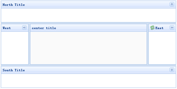
1. 通过标签创建布局,为<div/>标签增加名为'easyui-layout'的类ID。
<div id="cc" class="easyui-layout" style="width:600px;height:400px;"><div data-options="region:'north',title:'North Title',split:true" style="height:100px;"></div><div data-options="region:'south',title:'South Title',split:true" style="height:100px;"></div><div data-options="region:'east',iconCls:'icon-reload',title:'East',split:true" style="width:100px;"></div><div data-options="region:'west',title:'West',split:true" style="width:100px;"></div><div data-options="region:'center',title:'center title'" style="padding:5px;background:#eee;"></div></div>
2. 使用完整页面创建布局
<body class="easyui-layout"><div data-options="region:'north',title:'North Title',split:true" style="height:100px;"></div><div data-options="region:'south',title:'South Title',split:true" style="height:100px;"></div><div data-options="region:'east',iconCls:'icon-reload',title:'East',split:true" style="width:100px;"></div><div data-options="region:'west',title:'West',split:true" style="width:100px;"></div><div data-options="region:'center',title:'center title'" style="padding:5px;background:#eee;"></div></body>
3. 创建嵌套布局
<body class="easyui-layout"><div data-options="region:'north'" style="height:100px"></div><div data-options="region:'center'"><div class="easyui-layout" data-options="fit:true"><div data-options="region:'west',collapsed:true" style="width:180px"></div><div data-options="region:'center'"></div></div></div></body>
4. 通过ajax读取内容
<body class="easyui-layout"><div data-options="region:'west',href:'west_content.php'" style="width:180px" ></div><div data-options="region:'center',href:'center_content.php'" ></div></body>
布局属性
| 属性名 | 属性值类型 | 描述 | 默认值 |
|---|---|---|---|
| fit | boolean | 如果设置为true,布局组件将自适应父容器。当使用'body'标签创建布局的时候,整个页面会自动最大。 | false |
区域面板属性
区域面板属性定义与panel组件类似,下面的是公共的和新增的属性:
| 属性名 | 属性值类型 | 描述 | 默认值 |
|---|---|---|---|
| title | string | 布局面板标题文本。 | null |
| region | string | 定义布局面板位置,可用的值有:north, south, east, west, center。 | |
| border | boolean | 为true时显示布局面板边框。 | true |
| split | boolean | 为true时用户可以通过分割栏改变面板大小。 | false |
| iconCls | string | 一个包含图标的CSS类ID,该图标将会显示到面板标题上。 | null |
| href | string | 用于读取远程站点数据的URL链接 | null |
| collapsible | boolean | 定义是否显示折叠按钮。(该属性自1.3.3版开始可用) | true |
| minWidth | number | 最小面板宽度。(该属性自1.3.3版开始可用) | 10 |
| minHeight | number | 最小面板高度。(该属性自1.3.3版开始可用) | 10 |
| maxWidth | number | 最大面板宽度。(该属性自1.3.3版开始可用) | 10000 |
| maxHeight | number | 最大面板高度。(该属性自1.3.3版开始可用) | 10000 |
最新文章
- 山东省选 郁闷的小J
- 循序渐进做项目系列(2):最简单的C/S程序——消息异步调用与消息同步调用
- 100197C
- JQuery Placeholder - Input提示信息
- Jquery鼠标滚动到页面底部自动加载更多内容,使用分页
- 【MySQL】insert批量插入优化方案
- 今天开始应该使用 5 个JavaScript调试技巧
- 2014多校第十场1002 || HDU 4972 A simple dynamic programming problem
- UDP通信 Java
- phantomjs API
- 图数据库 Titan 高速入门
- 【css技能提升】完美的 Sticky Footer 布局
- 同步IO、异步IO、阻塞IO、非阻塞IO之间的联系与区别
- python open()函数的模式选择
- overflow标签
- How can i use iptables on centos 7?
- virtualbox虚拟机Linux系统与本地windows系统共享文件方法
- 01_MySQL DQL_基础查询
- WPF应用的一些小总结(模板、样式,上下文)
- Linux命令--hostname和uname