使用python对工作簿每个sheet表进行数据可视化展示(本案例是从第2个sheet开始循环读取也就是索引为1的表)
2024-08-23 08:26:04
# 导入相关模块
from pyecharts.charts import Bar
from pyecharts import options as opts
from pyecharts.charts import Line
import os
# excel处理模块 读:xlrd(read),写:xlrd(write)
import xlrd
# 读取excel文件
data = xlrd.open_workbook(r'D:\xlsx\db\xxx统计分析.xlsx')
# 通过索引读取sheet表
# table = data.sheets()[1]
sheet_list = data.sheet_names()
# print(sheet_list)
for x in range(1,len(sheet_list)):
table = data.sheets()[x]
# 通过表名读取
# table = data.sheet_by_name('华中-xxx有限公司')
# 打印表的行数,列数
# print(table.nrows,table.ncols)
# 存放时间,超速,振动,负载,点检,离位列表
time_list = []
cs_list = []
zd_list = []
fz_list = []
dj_list = []
lw_list = []
# 将需要展示的数据行和列加入列表
for i in range(1,table.nrows):
# x轴坐标数据
time_list.append(table.row_values(i)[0])
# y轴坐标数据
cs_list.append(table.row_values(i)[3])
zd_list.append(table.row_values(i)[4])
fz_list.append(table.row_values(i)[5])
dj_list.append(table.row_values(i)[6])
lw_list.append(table.row_values(i)[7])
# 折线图
line = Line()
line.add_xaxis(time_list)
line.add_yaxis('超速',cs_list)
line.add_yaxis('振动',zd_list)
line.add_yaxis('负载',fz_list)
line.add_yaxis('点检',dj_list)
line.add_yaxis('离位',lw_list)
# line.set_colors(['red','green','blue','black','fuscia'])
# 设置图表标题及子标题
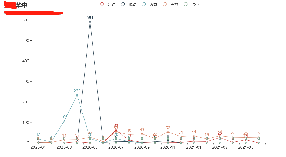
line.set_global_opts(opts.TitleOpts(title="华中", subtitle=sheet_list[x]))
if sheet_list[x]:
line.render(sheet_list[x])
os.replace(sheet_list[x],sheet_list[x] + '.html')
# 展示效果
最新文章
- 由objC运行时所想到的。。。
- 利用IIS应用请求转发ARR实现IIS和tomcat整合共用80端口
- 64位ubuntu下重新编译hadoop2.2流水账
- PCA理论与实践
- Angular系列----AngularJS入门教程02:静态模板(转载)
- “耐撕”团队2016.04.19站立会议
- 学习c的第6天2
- 用JDBC访问ORACLE数据库 关于commit 增快效率 大数据 等的整理
- 关于unsigned int和int的加法
- BZOJ 3357: [Usaco2004]等差数列( dp )
- 向EXECL文件中导入数据的同时插入图片
- 一步一步创建ASP.NET MVC5程序[Repository+Autofac+Automapper+SqlSugar](八)
- Eclipse安装hibernate插件
- cocos creator 碰撞检测
- java java.net.URLConnection 实现http get,post
- 工控随笔_19_西门子_WinCC的VBS脚本_08_常量和流程控制_01
- 深入C#的String类
- 【java】注释
- 尚硅谷springboot学习9-配置文件值注入
- 第四章-shceme和数据类型优化