前端笔记--css样式笔记
一、浮动 定位布局
1、浮动布局
left 元素向左浮动
right 元素向右浮动
例如:设置2个按钮,要使得按钮在同一行位置摆放,可以使用浮动,令按钮浮动到右边。注意,先设置float的按钮,例如:a先设置float:right,b也设置float:right,那么a在b的右边,先设置float的位置在float的方向。
both:清除浮动
2、定位布局
position:fixed;”是结合top、bottom、left和right这4个属性一起使用的,其中“position:fixed;”使得元素成为固定定位元素,接着使用top、bottom、left和right这4个属性来设置元素相对浏览器的位置。
position:relative;”是结合top、bottom、left和right这4个属性一起使用的,其中“position:relative;”使得元素成为相对定位元素,接着使用top、bottom、left和right这4个属性来设置元素相对原始位置
position:absolute;”是结合top、bottom、left和right这4个属性一起使用的,其中“position:absolute;”使得元素成为绝对定位元素,接着使用top、bottom、left和right这4个属性来设置元素相对浏览器的位置。
3、常见的设置文本水平垂直居中
通常可通过设置line-height 和height 相同,然后设置text-aline:center实现。但如果居中在高度变化的时候也要跟着居中,则可以使用:box-pack和box-alin来设置。
box-pack属性可以在水平方向上对盒子的富余空间进行管理。
box-align属性可以在垂直方向上对盒子的富余空间进行管理。
例如:
div

        {

            width:200px;

            height:160px;

            display:-webkit-box;

            -webkit-box-align:center;

            -webkit-box-pack:center;

            background-color:pink;

        }
二、UI元素伪类选择器 结构伪类选择器
结构伪类选择器:

常用:E:not(selector) 选择某个元素之外的所有元素
举例:
*{padding:;margin:;}

        ul

        {

            display:inline-block;

            width:200px;

            list-style-type:none;

        }

        ul li

        {

            height:20px;

        }

        ul li:first-child{background-color:red;}

        ul li:nth-child(2){background-color:orange;}

        ul li:nth-child(3){background-color:yellow;}

        ul li:nth-child(4){background-color:green;}

        ul li:last-child{background-color:blue;}
UI元素伪类选择器:
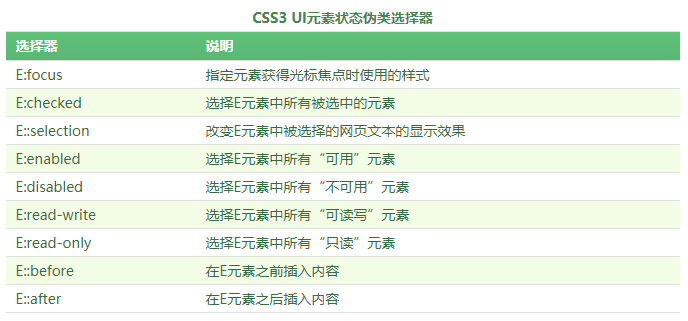
举例:
<head>

    <title>CSS3 :focus选择器</title>

    <style type="text/css">

        input:focus

        {

            outline:1px solid red;

        }

    </style>

</head>

<body>

    <p><label for="name">姓名:</label><input type="text" name="name"/></p>

    <p><label for="email">邮箱:</label><input type="text" name="email"/></p>

</body>

</html>
::selection选择器”来改变被选择的网页文本的显示效果
<style type="text/css">

        div::selection

        {

            background-color:red;

            color:white;

        }

        p::selection

        {

            background-color:orange;

            color:white;

        }

    </style>
使用::before和::after这两个选择器在元素前面或后面添加内容
<style type="text/css">

        div::before

        {

            content:"学习学习";

        }

    </style>
三、文字和颜色渐变、边框
文字:
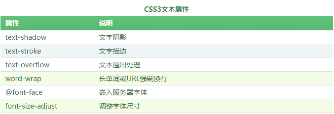
其中常见的是text-shadow文字阴影。
text-shadow:x-offset y-offset blur color; x-offset是x轴阴影,blur是模糊距离。
可以指定多个阴影:
 div

    {

            display:inline-block;

            padding:20px;

            font-size:40px;

            font-family:Verdana;

            font-weight:bold;

            background-color:#CCC;

            color:#ddd;

            text-shadow:-1px 0 #333, /*向左阴影*/

                         0 -1px #333,/*向上阴影*/

                         1px 0 #333, /*向右阴影*/

                         0 1px #333 ;/*向下阴影*/

     }
color:transparent; /*设置文字颜色为透明*/
颜色:
opacity:透明度
<head>

    <title>CSS3 opacity属性</title>

    <style type="text/css">

        a

        {

            display:inline-block;

            padding:5px 10px;

            font-family:微软雅黑;

            color:white;

            background-color:#45B823;

            border-radius:4px;

            cursor:pointer;

        }

        a:hover

        {

            opacity:0.8;

        }

    </style>

</head>

<body>

    <a>调试代码</a>

</body>
rgba(R,G,B,A):A指的是透明度。
对于设置元素的透明度,RGBA比透明度opacity属性更好,因为RGBA不会影响元素中的内容以及子元素的不透明度
线性渐变 linear-gradient和径向渐t变radial-gradient
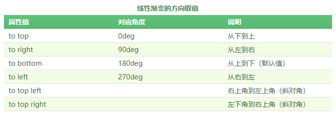
线性渐变
举例:
 <title>CSS3线性渐变</title>

    <style type="text/css">

        div

        {

            width:200px;

            height:150px;

            background:linear-gradient(to right,blue,yellow);

        }

    </style>
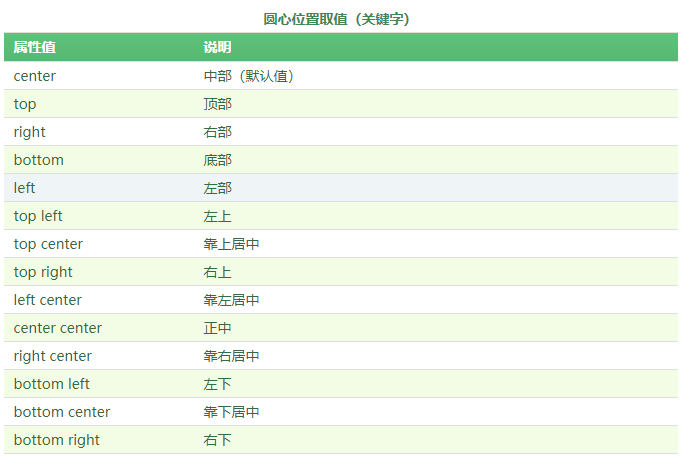
径向渐变:
举例:
#div1

        {

            margin-bottom:10px;

            background:-webkit-radial-gradient(orange,blue);

        }

        #div2

        {

            background:-webkit-radial-gradient(top,orange,blue);

        }
边框:最常见的border-radius
举例:
如果宽高都是100px的div,那么可以通过border-radius设置使得我们可以得到半圆或者正圆。其中规律:上右下左,设置2个值时,上下、左右
得到上半圆。
#div1

    {

        width:200px;

        height:100px;

        border:1px solid red;

        border-radius:100px 100px 0 0;

        background-color:#FCE9B8;

    }
四、背景大小、变形(transform) 过渡(transition)动画(animation)
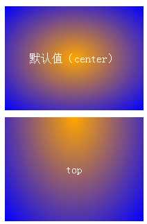
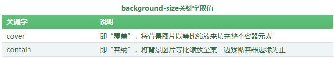
背景大小:background-size取值共有2种,一种是使用长度值(如px、百分比);另外一种是使用关键字。
举例:
<head>

    <title>CSS3 background-size属性</title>

    <style type="text/css">

        div

        {

           width:160px;

           height:100px;

           border:1px solid red;

           margin-bottom:10px;

           background-image:url("../App_images/lesson/run_css3/css3.png");

           background-repeat:no-repeat;

        }

        #div2{background-size:160px 100px;}

   #div3{background-size:cover}

        #div4{background-size:contain}

    </style>

</head>

<body>

    <div id="div1"></div>

    <div id="div2"></div>

</body>
CSS动画效果共3部分:
其中变形注重结果,过渡注重过程,动画则和过渡类似也是以过程为主
变形:
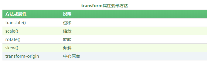
使用举例:transform:translate()、transform:translateX(20px)、transform:scale(30deg)、
<head>

    <title>CSS3旋转rotate()方法</title>

    <style type="text/css">

        /*设置原始元素样式*/

        #origin

        {

            margin:100px auto;/*水平居中*/

            width:200px;

            height:100px;

            border:1px dashed gray;

        }

        /*设置当前元素样式*/

        #current

        {

            width:200px;

            height:100px;

            line-height:100px;

            color:white;

            background-color: #007BEE;

            text-align:center;

            transform:rotate(30deg);

            -webkit-transform:rotate(30deg);  /*兼容-webkit-引擎浏览器*/

            -moz-transform:rotate(30deg);     /*兼容-moz-引擎浏览器*/

        }

    </style>

</head>

<body>

    <div id="origin">

        <div id="current">顺时针旋转30度</div>

    </div>

</body>
过渡:
使用举例:
<head>

    <title>CSS3 transition-property属性</title>

    <style type="text/css">

        div

        {

            display:inline-block;

            width:100px;

            height:50px;

            background-color:#14C7F3;

            transition-property:height;

            transition-duration:0.5s ;

            transition-timing-function:linear;

            transition-delay:;

        }

        div:hover

        {

            height:100px;

        }

    </style>

</head>

<body>

    <div></div>

</body>
其中:transition-property,指定要设置的属性名字,transition-duration,指定过渡的时间,transition-timiing-fuction,指定过渡的效果的方法,有linear,ease,等,transition-delay,指定延迟时间
动画:animation
使用动画有2个步骤:
- (1)定义动画;
- (2)调用动画;
定义动画:需使用@keyframes,其中百分比是定义过程,一般可以分为:0% 30% 60% 100%
@keyframes 动画名

{

    0%

    {

        ……

    }

    ……

    100%

    {

    }

}
举例使用:
<!DOCTYPE html>

<html xmlns="http://www.w3.org/1999/xhtml">

<head>

    <title>CSS3 animation-name属性</title>

    <style type="text/css">

        @-webkit-keyframes mycolor

        {

            0%{background-color:red;}

            30%{background-color:blue;}

            60%{background-color:yellow;}

            100%{background-color:green;}

        }

        @-webkit-keyframes mytransform

        {

            0%{border-radius:;}

            50%{border-radius:50px; -webkit-transform:translateX(0);}

            100%{border-radius:50px; -webkit-transform:translateX(50px);}

        }

        div

        {

            width:100px;

            height:100px;

            background-color:red;

        }

        div:hover

        {

            -webkit-animation-name:mytransform;

            -webkit-animation-duration:5s;

            -webkit-animation-timing-function:linear;

        }

    </style>

</head>

<body>

    <div></div>

</body>

</html>
上面定义了2个动画,实际只调用了一个动画mytransform,当0-50%时,border-radius从0到50px,当50%-100%时,border-radius保持50不变,然后translateX,水平向右移动50px。
代码举例:
#div1

        {

            width:40px;

            height:40px;

            border-radius:20px;

            background-color:red;

            -webkit-animation-name:mytranslate;

            -webkit-animation-timing-function:linear;

            -webkit-animation-duration:2s;

            -webkit-animation-iteration-count:infinite;

        }
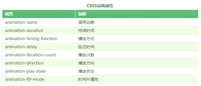
animation-name:调用的动画名,animation-timing-fuction:动画的方法,即改动画的效果是什么,方法有linear和ease等,animation-duration,动画从持续时间,animation-iteration-count,动画的执行次数,infinite表示无数次
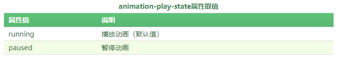
animation-delay:动画延迟时间,animation-direation:动画执行放向,animation-play-state:动画执行状态,可以让动画停止和继续,animation-fill-mode:时间外属性,即动画执行完,停止在哪个位置。
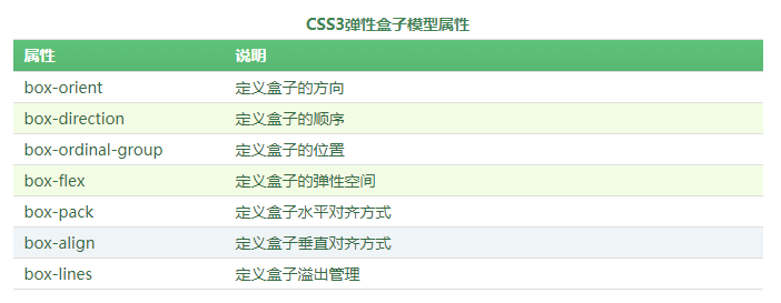
五、多列布局和弹性盒子模型
弹性盒子模型:指的是设置某个属性后,使得div或者其他标签具备弹性盒子的效果
举例:
<head>

    <title>CSS3 box-orient属性</title>

    <style type="text/css">

        body

        {

            display:-webkit-box;    /*定义元素为盒子显示,注意书写*/

            -webkit-box-orient:horizontal;   /*定义盒子元素内的元素从左到右流动显示*/

        }

        div{height:100px;}

        #box1{background:red;}

        #box2{background:blue;}

        #box3{background:yellow;}

    </style>

</head>

<body>

    <div id="box1">盒子1</div>

    <div id="box2">盒子2</div>

    <div id="box3">盒子3</div>

</body>
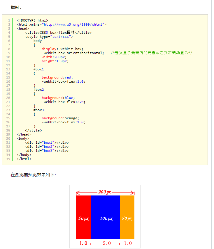
上面定义了放向为横向,盒子1、2、3、分别从左到右排列。
box-direction属性取值:normal和reverse,正向显示,和反向显示
box-flex:取值为正数,如果总数是4,取值是1,那么div占盒子的四分之一
最新文章
- 如何修复VUM在客户端启用之后报数据库连接失败的问题
- Windows Azure Storage (22) Azure Storage如何支持多级目录
- Compute Resource Consolidation Pattern 计算资源整合模式
- dsp 28377在线升级 实例总结
- Get&Post简单说明
- 解决Eclipse里Maven工程报 An error occurred while filtering resources错误
- PHP基础示例:商品信息管理系统v1.1[转]
- 初识Groovy
- presto访问 Azure blob storage
- 云计算平台(检索篇)-Elasticsearch
- jquery基础篇
- Javascript执行环境、作用域链
- hdu 1247 Hat’s Words(字典树)
- Android图片异步加载之Android-Universal-Image-Loader
- Python 学习之urllib模块---用于发送网络请求,获取数据(2)
- 基于Cordova5.0开发自己定义插件(android)
- C#调用Java代码
- Android-2
- XML的序列化(Serializer)
- ajax post json格式返回