react实战系列 —— 我的仪表盘(bizcharts、antd、moment)
其他章节请看:
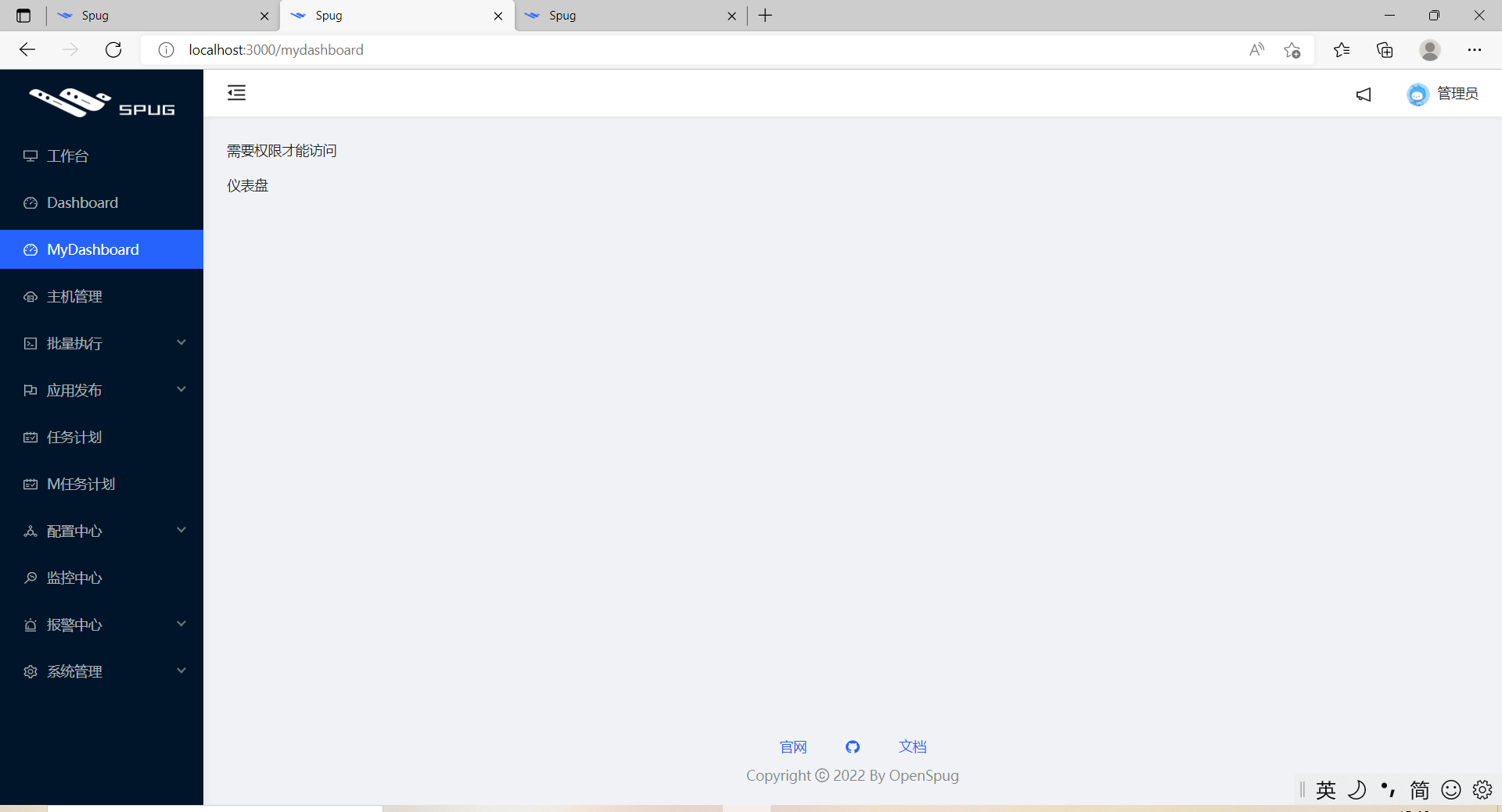
My Dashboard
上一篇我们在 spug 项目中模仿”任务计划“模块实现一个类似的一级导航页面(”My任务计划“),本篇,我们将模仿“Dashboard”来实现一个仪表盘“My Dashboard”。
主要涉及 antd 的 Grid、Card、Descriptions等组件、bizcharts 的使用、moment 日期库和页面适配。
注:实现的代码在上一篇的基础上展开。
Dashboard
界面如下:
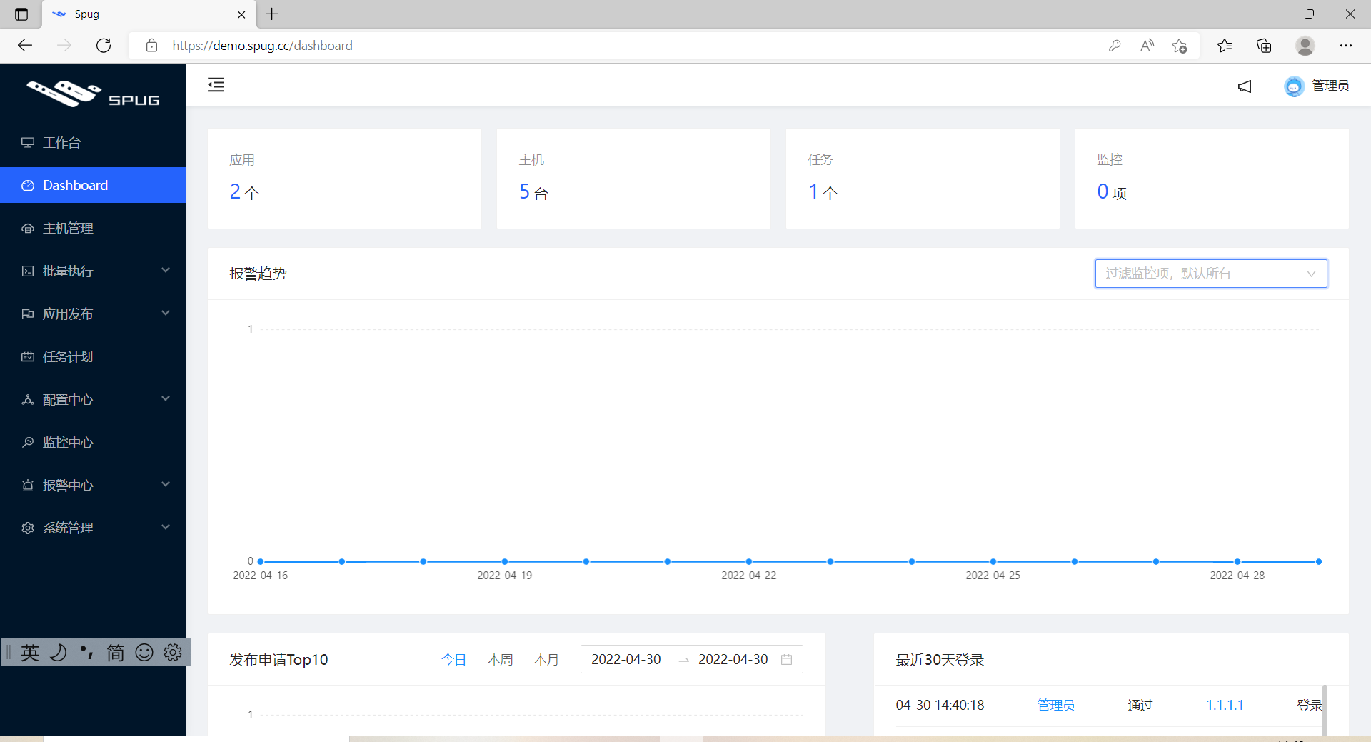
里面用到了:
- antd 的
Grid、Card、Descriptions描述列表 (文字长度不同,有时会感觉没对齐) bizcharts中的折线图、柱状图moment(日期相关的库),比如按天、按月、最近 30 天都很方便
My Dashboard
最终效果
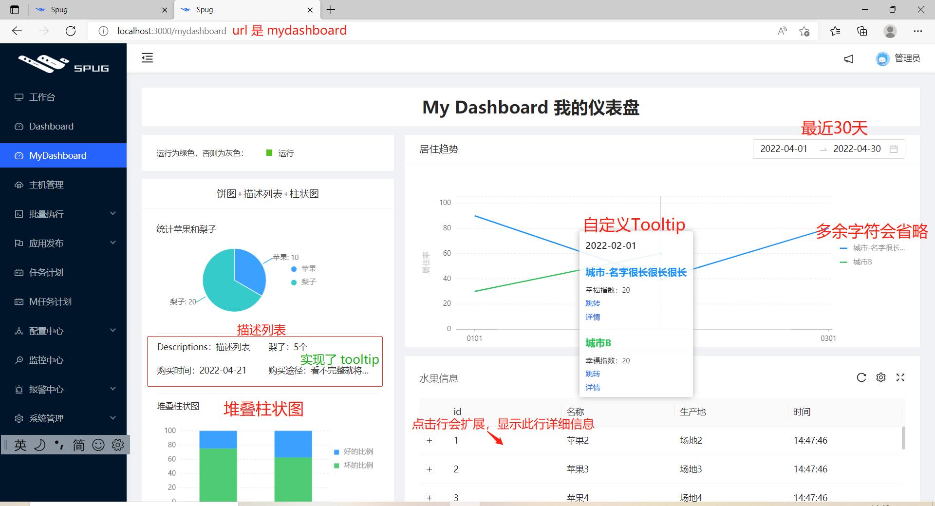
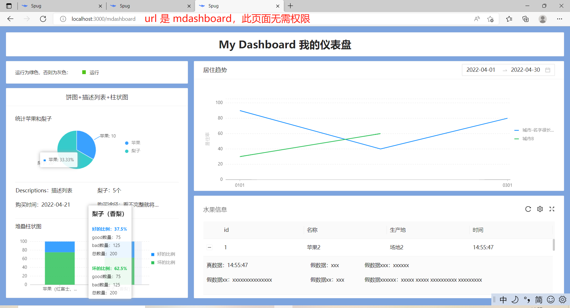
无需权限即可访问:
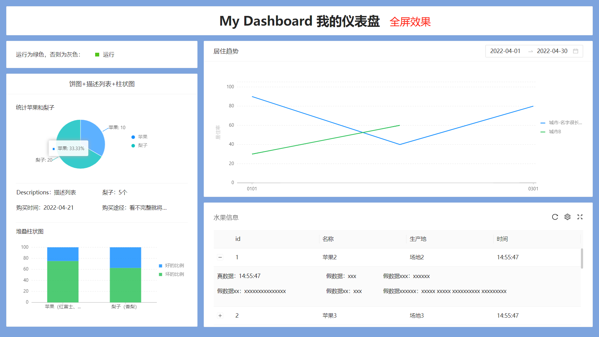
全屏效果:
实现的代码
安装两个依赖包:
@antv/data-set,柱状图和饼状图需要使用bx-tooltip,自定义 bizcharts 中的 tooltip。折线图和柱状图的 tooltip 都使用了。
spug-study> npm i @antv/data-set

added 31 packages, and audited 1820 packages in 26s

107 packages are looking for funding

  run `npm fund` for details

33 vulnerabilities (1 low, 16 moderate, 15 high, 1 critical)

To address issues that do not require attention, run:

  npm audit fix

To address all issues (including breaking changes), run:

  npm audit fix --force

Run `npm audit` for details.
spug-study> npm i -D bx-tooltip

added 1 package, and audited 1821 packages in 9s

107 packages are looking for funding

  run `npm fund` for details

33 vulnerabilities (1 low, 16 moderate, 15 high, 1 critical)

To address issues that do not require attention, run:

  npm audit fix

To address all issues (including breaking changes), run:

  npm audit fix --force

Run `npm audit` for details.
package.json 变动如下:
"dependencies": {

  "@antv/data-set": "^0.11.8",

}

"devDependencies": {

  "bx-tooltip": "^0.1.6",

}
增强表格组件
spug 中封装的表格组件,不支持 style和 size。替换一行,以及增加一行:
// src/components/TableCard.js

- <div ref={rootRef} className={styles.tableCard}>

+ <div ref={rootRef} className={styles.tableCard} style={{...props.customStyles}}>

<Table

+ size={props.size}
准备 mock 数据
将 mydashboard 模块的的 mock 专门放入一个文件,并在 mock/index.js 中引入。
// src\mock\index.js

+ import './mydashboard'
// src\mock\mydashboard.js

import Mock from 'mockjs'

// 开发环境引入 mock

if (process.env.NODE_ENV === 'development') {

Mock.mock('/api/mdashboard/occupancy_rate/', 'get', () => (

    {"data": [ {

        month: "2022-01-01",

        city: "城市-名字很长很长很长",

        happiness: 10,

        per: 90,

        msg1: '信息xxx'

    },

    {

        month: "2022-01-01",

        city: "城市B",

        per: 30,

        happiness: 50,

        msg1: '信息xxx'

    },

    {

        month: "2022-02-01",

        city: "城市-名字很长很长很长",

        happiness: 20,

        per: 40,

        msg1: '信息xxx'

    },

    {

        month: "2022-02-01",

        city: "城市B",

        happiness: 20,

        per: 60,

        msg1: '信息xxx'

    },

    {

        month: "2022-03-01",

        city: "城市-名字很长很长很长",

        happiness: 30,

        per: 80,

        msg1: '信息xxx'

    },], "error": ""}

))

let mIdSeed = 1;

Mock.mock('/api/mdashboard/table', 'get', () => ({

    "data": [{ "id": mIdSeed++, "name": "苹果" + mIdSeed, address: '场地' +mIdSeed, time: new Date().toLocaleTimeString() },

    { "id": mIdSeed++, "name": "苹果" + mIdSeed, address: '场地' +mIdSeed, time: new Date().toLocaleTimeString() },

    { "id": mIdSeed++, "name": "苹果" + mIdSeed, address: '场地' +mIdSeed, time: new Date().toLocaleTimeString() },

    { "id": mIdSeed++, "name": "苹果" + mIdSeed, address: '场地' +mIdSeed, time: new Date().toLocaleTimeString() },

    { "id": mIdSeed++, "name": "苹果" + mIdSeed, address: '场地' +mIdSeed, time: new Date().toLocaleTimeString() },

    { "id": mIdSeed++, "name": "苹果" + mIdSeed, address: '场地' +mIdSeed, time: new Date().toLocaleTimeString() },

    { "id": mIdSeed++, "name": "苹果" + mIdSeed, address: '场地' +mIdSeed, time: new Date().toLocaleTimeString() },

    { "id": mIdSeed++, "name": "苹果" + mIdSeed, address: '场地' +mIdSeed, time: new Date().toLocaleTimeString() },

    { "id": mIdSeed++, "name": "苹果" + mIdSeed, address: '场地' +mIdSeed, time: new Date().toLocaleTimeString() },

    { "id": mIdSeed++, "name": "苹果" + mIdSeed, address: '场地' +mIdSeed, time: new Date().toLocaleTimeString() },

    { "id": mIdSeed++, "name": "苹果" + mIdSeed, address: '场地' +mIdSeed, time: new Date().toLocaleTimeString() },

    { "id": mIdSeed++, "name": "苹果" + mIdSeed, address: '场地' +mIdSeed, time: new Date().toLocaleTimeString() },

    { "id": mIdSeed++, "name": "苹果" + mIdSeed, address: '场地' +mIdSeed, time: new Date().toLocaleTimeString() },

    { "id": mIdSeed++, "name": "苹果" + mIdSeed, address: '场地' +mIdSeed, time: new Date().toLocaleTimeString() },

]

}))

}
路由配置
配置 /mdashboard 和 /mydashboard 两个路由:
// src\App.js

+ import MDashboard from './pages/mdashboard/tIndex';

class App extends Component {

  render() {

    return (

      <Switch>

      //  无需权限

      + <Route path="/mdashboard" exact component={MDashboard} />

        <Route path="/" exact component={Login} />

        <Route path="/ssh" exact component={WebSSH} />

        <Route component={Layout} />

      </Switch>

    );

  }

}
// src\routes.js

+ import MyDashboardIndex from './pages/mdashboard';

export default [

  {icon: <DesktopOutlined/>, title: '工作台', path: '/home', component: HomeIndex},

  {

    icon: <DashboardOutlined/>,

    title: 'Dashboard',

    auth: 'dashboard.dashboard.view',

    path: '/dashboard',

    component: DashboardIndex

  },

+ // 我的仪表盘

+ {

+   icon: <DashboardOutlined />,

+   title: 'MyDashboard',

+   auth: 'mydashboard.mydashboard.view',

+   path: '/mydashboard',

+   component: MyDashboardIndex

+ },
新建仪表盘组件。一个需要权限访问,另一个无需权限即可访问,故将仪表盘提取成一个单独的文件:
// src\pages\mdashboard\Dashboard.js

import React from 'react';

export default function () {

  return (

    <div>仪表盘</div>

  )

}
// src\pages\mdashboard\index.js

import React from 'react';

import { AuthDiv } from 'components';

import Dashboard from './Dashboard';

export default function () {

  return (

    <section>

      //  AuthDiv 是 spug 封装的与权限相关的组件

      <AuthDiv auth="testdashboard.testdashboard.view">

        <p>需要权限才能访问</p>

        <Dashboard />

      </AuthDiv>

    </section>

  )

}
// src\pages\mdashboard\tIndex.js
import React from 'react';
import Dashboard from './Dashboard';
export default function () {
return (
<section>
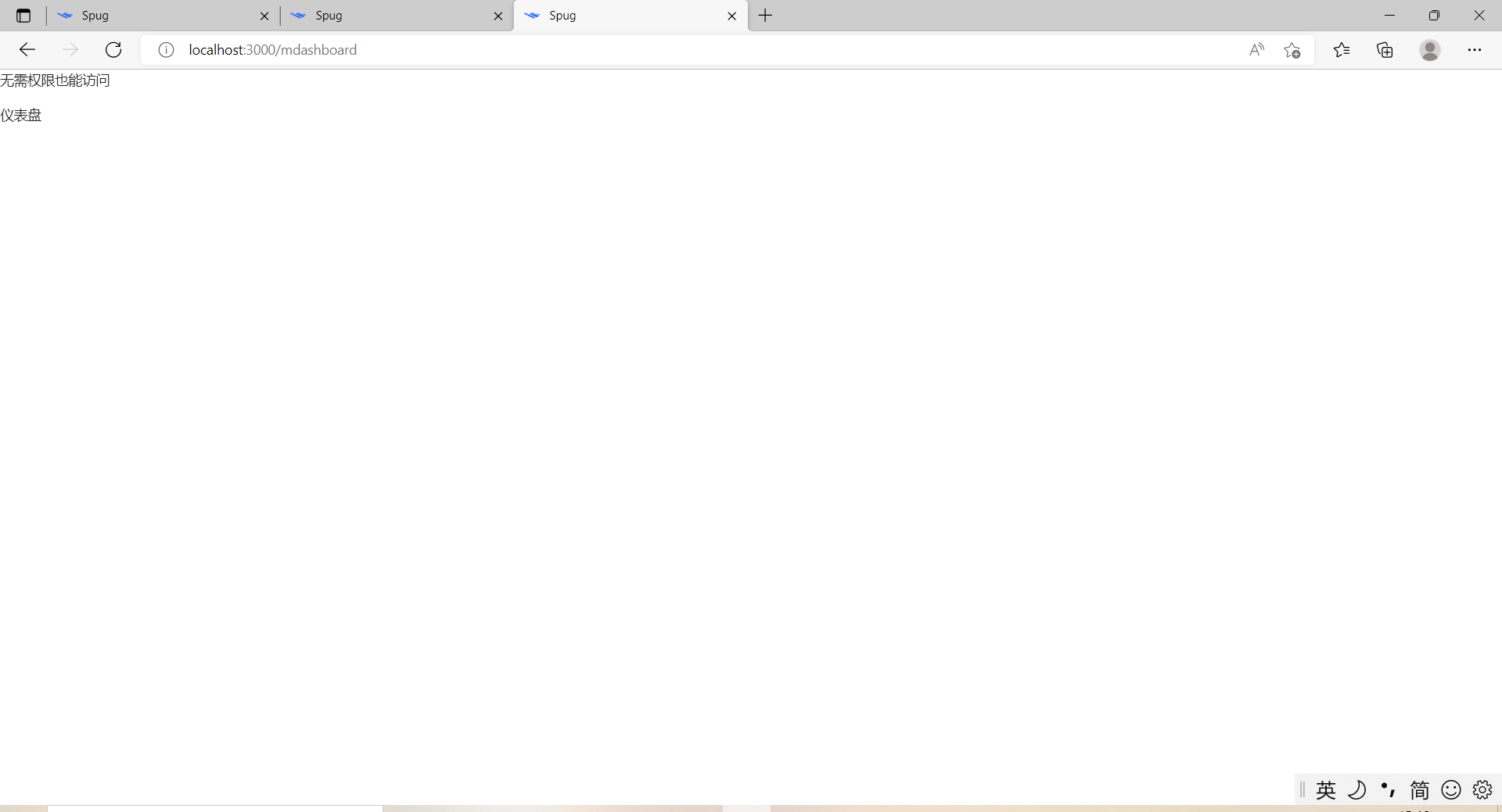
<p>无需权限也能访问</p>
<Dashboard />
</section>
)
}
重启服务,倘若能访问,说明一切就绪,只差仪表盘核心代码。
访问 /mydashboard:
访问 /mdashboard:
仪表盘的核心代码
样式
// src\pages\mdashboard\index.module.less

.tdashboardBox {

    .react{

        width: 10px;

        height: 10px;

        display: inline-block;

        background: #52c41a; /* #00000040 */

        margin-left: 30px;

        margin-right: 10px;

    }

    // 参考:src\components\index.module.less 中 global

    :global(.trendBox .ant-card-head-wrapper) {

        width: 100%;

    }

}
表格(水果信息)
// src\pages\mdashboard\Table.js

import React from 'react';

import { observer } from 'mobx-react';

import { Descriptions } from 'antd';

import { TableCard } from 'components';

import store from './store';

@observer

class ComTable extends React.Component {

  // 默认值

  static defaultProps = {

    tableHeight: 353

  }

  // scrollY 以外的高度

  excludeScrollY = 120;

  componentDidMount() {

    store.fetchRecords()

  }

  columns = [{

    title: 'id',

    dataIndex: 'id',

  },{

    title: '名称',

    dataIndex: 'name',

  }, {

    title: '生产地',

    dataIndex: 'address',

  }, {

    title: '时间',

    dataIndex: 'time',

  }];

  handleExpand = record => {

    return <Descriptions>

      <Descriptions.Item label="真数据">{record.time}</Descriptions.Item>

      <Descriptions.Item label="假数据">xxx</Descriptions.Item>

      <Descriptions.Item label="假数据xxx">xxxxxx</Descriptions.Item>

      <Descriptions.Item label="假数据xx">xxxxxxxxxxxxxxx</Descriptions.Item>

      <Descriptions.Item label="假数据xx">xxx</Descriptions.Item>

      <Descriptions.Item label="假数据xxxxxx">

        xxxxx xxxxx xxxxxxxxxx xxxxxxxxx

      </Descriptions.Item>

    </Descriptions>

  }

  render() {

    console.log('this.props.tableHeight', this.props.tableHeight, 'y', this.props.tableHeight * this.scrollRadio)

    return (

      <TableCard

      customStyles={{height: this.props.tableHeight}}

        title="水果信息"

        tKey="mt"

        rowKey="id"

        loading={store.isFetching}

        dataSource={store.dataSource}

        onReload={store.fetchRecords}

        actions={[]}

        scroll={{ y: this.props.tableHeight  - this.excludeScrollY  }}

        expandable={{

          expandedRowRender: this.handleExpand,

          expandRowByClick: true

        }}

        size={'middle'}

        // 设为 false 时不展示和进行分页

        pagination={false}

        columns={this.columns} />

    )

  }

}

export default ComTable
折线图(居住趋势)
// src\pages\mdashboard\Trend.js
import React, { useState, useEffect } from 'react';
import { Card, DatePicker, Modal } from 'antd';
import { Chart, Geom, Axis, Tooltip, Legend } from 'bizcharts';
import { http } from 'libs';
import styles from './index.module.less'
// 日期相关的库,比如最近30天等
import moment from 'moment';
/*
bizcharts 官网:
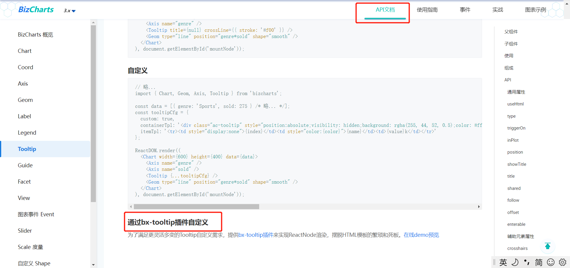
通过bx-tooltip插件自定义
为了满足更灵活多变的Tooltip自定义需求,提供bx-tooltip插件来实现ReactNode渲染,摆脱HTML模板的繁琐和死板
*/
import useCustTooltip from 'bx-tooltip';
import { Typography, Space } from 'antd';
import store from './store'
export default function (props = { cardBodyHeight: 450 }) {
// chart 高度占比
const chartHeightRatio = 0.888
const { Text, Link, Title } = Typography;
const [loading, setLoading] = useState(true);
// 本月第一天 —— 本月最后一天
// const [duration, setDuration] = useState([moment().startOf('month'), moment().endOf('month')]);
// 最近三十天
const [duration, setDuration] = useState([moment().subtract(29, 'days'), moment()]);
const [res, setRes] = useState([]);
useEffect(() => {
const strDuration = duration.map(x => x.format('YYYY-MM-DD'))
setLoading(true);
http.get('/api/mdashboard/occupancy_rate/', { duration: strDuration })
.then(res => {
setRes(res)
})
.finally(() => setLoading(false))
}, [duration])
// bx-tooltip插件的使用
const [BxChart, CustTooltip] = useCustTooltip.create(Chart, Tooltip);
return (
// headStyle、bodyStyle 在这里都是用于适配(响应式)
<Card className="trendBox" loading={loading} title="居住趋势" headStyle={store.cardTitleStyle} bodyStyle={{ height: props.cardBodyHeight }} extra={(
<div>
<DatePicker.RangePicker allowClear={false} style={{ width: 250 }} value={duration} onChange={val => setDuration(val)} />
</div>
)}>
<BxChart height={props.cardBodyHeight * chartHeightRatio} data={res} padding={[30, 120, 20, 60]}
// 坐标轴展示不完整
scale={{ month: { range: [0.05, 0.99] }, per: { alias: '居住率', range: [0, 0.95], minTickInterval: 10, max: 100, min: 0 } }}
// 强制适应(PS:只会对宽度有响应式,高度没有)
forceFit
>
<Legend position="right-center" allowAllCanceled={true} itemFormatter={val => {
const maxNum = 10
return val.length > maxNum ? val.split('').slice(0, maxNum - 3).join('') + '...' : val
}} />
{/* x 坐标格式化 */}
<Axis name="month" label={{
formatter(text, item, index) {
// 格式化:2022-01-01 -> 0101
return `${text.split('-').slice(1).join('')}`;
}
}} />
<Axis name="per" title />
{/* 自定义 tooltip */}
<CustTooltip enterable >
{(title, items) => {
return <div>
{
items.map((x, i) => {
let oData = x.point._origin
return <div>
{Object.is(i, 0) && <Title level={5}>{oData.month}</Title>}
<section style={{ marginTop: '20px' }}>
<Title style={{ color: x.color, fontWeight: 'bold' }} level={5}>{oData.city}</Title>
<Space direction="vertical" size={2}>
<Text>幸福指数:{oData.happiness}</Text>
<Link href="hello" target="_blank">
跳转
</Link>
<Link onClick={() => {
Modal.info({
title: 'title',
content: oData.msg1
});
}}>
详情
</Link>
</Space>
</section>
</div>
})
}
</div>
}}
</CustTooltip>
<Geom type="line" position="month*per"
// 两条线
size={2}
// 使线条平滑
// shape={"smooth"}
color={"city"}
/>
</BxChart>
</Card>
)
}
饼状图(统计苹果和梨子)
// src\pages\mdashboard\PieChart.js

import React from 'react';

import { Typography} from 'antd';

import {

    Chart,

    Geom,

    Axis,

    Tooltip,

    Coord,

    Label,

    Legend

} from 'bizcharts';

import DataSet from '@antv/data-set';

// chartHeight 默认高度 250px ,用于适配

export default function (props = {chartHeight: 250}) {

    const { Text } = Typography;

    const { DataView } = DataSet;

    const data = [

        {

            item: '苹果',

            count: 10,

        },

        {

            item: '梨子',

            count: 20,

        },

    ];

    const dv = new DataView();

    dv.source(data).transform({

        type: 'percent',

        field: 'count',

        dimension: 'item',

        as: 'percent',

    });

    const cols = {

        percent: {

            formatter: val => {

                val = val * 100 + '%';

                return val;

            },

        },

    };

    function getXY(c, { index: idx = 0, field = 'percent', radius = 0.5 }) {

        const d = c.get('data');

        if (idx > d.length) return;

        const scales = c.get('scales');

        let sum = 0;

        for (let i = 0; i < idx + 1; i++) {

            let val = d[i][field];

            if (i === idx) {

                val = val / 2;

            }

            sum += val;

        }

        const pt = {

            y: scales[field].scale(sum),

            x: radius,

        };

        const coord = c.get('coord');

        let xy = coord.convert(pt);

        return xy;

    }

    return (

        <section>

            <Text>统计苹果和梨子</Text>

            <Chart

                height={props.chartHeight}

                // 内容显示不完整(见 bizcharts 实战部分)

                padding={[20, 150, 20, 40]}

                data={dv}

                scale={cols}

                forceFit

                onGetG2Instance={c => {

                    const xy = getXY(c, { index: 0 });

                    c.showTooltip(xy);

                }}

            >

                <Legend position="right-center" />

                <Coord type="theta" radius={1} />

                <Axis name="percent" />

                <Tooltip

                    showTitle={false}

                    itemTpl='<li><span style="background-color:{color};" class="g2-tooltip-marker"></span>{name}: {value}</li>'

                />

                <Geom

                    type="intervalStack"

                    position="percent"

                    color="item"

                    tooltip={[

                        'item*percent',

                        (item, percent) => {

                            // 处理 33.33333333% -> 33.33

                            percent = (percent * 100).toFixed(2) + '%';

                            return {

                                name: item,

                                value: percent,

                            };

                        },

                    ]}

                    style={{

                        lineWidth: 1,

                        stroke: '#fff',

                    }}

                >

                    <Label

                        content="count"

                        formatter={(val, item) => {

                            return item.point.item + ': ' + val;

                        }}

                    />

                </Geom>

            </Chart>

        </section>

    );

}
柱状图(堆叠柱状图)
// src\pages\mdashboard\BarChart.js

import React from "react";

import { Typography, Space } from 'antd'

import {

  Chart,

  Geom,

  Axis,

  Tooltip,

  Coord,

  Legend,

} from "bizcharts";

import useCustTooltip from 'bx-tooltip';

import DataSet from "@antv/data-set";

export default function (props = {barHeight: 240}) {

  const [BxChart, CustTooltip] = useCustTooltip.create(Chart, Tooltip);

  const { Text,Title } = Typography;

  const retains = ["State", '总比例', 'bad', 'good', 'Total']

  const fields = ["好的比例", "坏的比例"]

  const data = [

    {

      State: "苹果(红富士、糖心苹果)",

      good: 50,

      bad: 150,

      Total: 200,

      好的比例: 25,

      坏的比例: 75,

      总比例: 100

    },

    {

      State: "梨子(香梨)",

      good: 75,

      bad: 125,

      Total: 200,

      好的比例: 37.5,

      坏的比例: 62.5,

      总比例: 100

    },

  ];

  const ds = new DataSet();

  const dv = ds.createView().source(data);

  dv.transform({

    type: "fold",

    fields: fields,

    key: "比例",

    value: "百分总计",

    retains: retains // 保留字段集,默认为除fields以外的所有字段

  });

  return (

    <section>

      <Text>堆叠柱状图</Text>

      <BxChart height={props.barHeight} data={dv} padding={[30, 80, 20, 40]} forceFit>

        <Legend position="right-center" />

        <Coord />

        <Axis

          name="State"

          label={{

            offset: 12,

            formatter(text, item, index) {

              // 最多显示 10 个,多余省略。详细的在 tooltip 中显示

              const maxNum = 10

              return text.length > maxNum ? text.split('').slice(0, maxNum - 3).join('') + '...' : text

            }

          }}

        />

        <CustTooltip enterable >

          {(title, items) => {

            return <div>

              {

                items.map((x, i) => {

                  // 取得原始数据

                  let oData = x.point._origin

                  return <div>

                    {Object.is(i, 0) && <Title level={5}>{oData.State}</Title>}

                    <section style={{ marginTop: '20px' }}>

                      <Space direction="vertical" size={2}>

                        <Text style={{ color: x.color, fontWeight: 'bold' }}>{oData['比例']}:{oData['百分总计']}%</Text>

                        <Text>good数量:{oData['good']}</Text>

                        <Text>bad数量:{oData['bad']}</Text>

                        <Text>总数量:{oData['Total']}</Text>

                      </Space>

                    </section>

                  </div>

                })

              }

            </div>

          }}

        </CustTooltip>

        <Geom

          type="intervalStack"

          position="State*百分总计"

          color={"比例"}

        >

        </Geom>

      </BxChart>

    </section>

  );

}
store.js
// src\pages\mdashboard\store.js

import { observable, computed } from 'mobx';

import http from 'libs/http';

const PADDING = 16

class Store {

  // 表格数据

  @observable records = [];

  // 是否正在请求数据

  @observable isFetching = false;

  // 数据源

  @computed get dataSource() {

    return this.records

  }

  fetchRecords = () => {

    this.isFetching = true;

    http.get('/api/mdashboard/table')

      // todo 接口格式或许会调整

      .then(res => this.records = res)

      .finally(() => this.isFetching = false)

  };

  /* 适配相关 */

  // 盒子高度,padding 用于给顶部和底部留点空隙。

  // 由于笔者没有设计,所以先用 px 实现,之后在在将固定高度改为响应式,937 是固定高度实现后测量出的高度。

  @observable baseBoxHeight = 937 - PADDING

  @observable padding = PADDING

  // 需要用 this 调用 padding 变量,即 `this.padding`

  @observable boxHeight = window.innerHeight - this.padding * 2

  // 饼图高度比例

  @observable pieBoxRatio = 0.20

  // 柱状图高度比例

  @observable barBoxRatio = 0.23

  // “My Dashboard 我的仪表盘”

  @computed get TitleHeight() {

    const ratio = 80 / this.baseBoxHeight

    return this.boxHeight * ratio

  }

  // 运行card高度

  @computed get todayCardHeight() {

    const ratio = 75 / this.baseBoxHeight

    return this.boxHeight * ratio

  }

  // “饼图+描述列表+柱状图” body 高度

  @computed get statisticBodyHeight() {

    const ratio = 660 / this.baseBoxHeight

    return this.boxHeight * ratio

  }

  // 居住趋势 body 的

  @computed get trendBodyBodyHeight() {

    const ratio = 385 / this.baseBoxHeight

    return this.boxHeight * ratio

  }

  // 水果信息高度

  @computed get configTableHeight() {

    const ratio = 353 / this.baseBoxHeight

    return this.boxHeight * ratio

  }

  // xys16 得用 computed 才会联动。下面这种写法不会联动

  // @observable xys16 = (16 / this.baseBoxHeight) * this.boxHeight

  @computed get xys16() {

    return (16 / this.baseBoxHeight) * this.boxHeight

  }

  @computed get xys12() {

    return (12 / this.baseBoxHeight) * this.boxHeight

  }

  @computed get xys36() {

    return (36 / this.baseBoxHeight) * this.boxHeight

  }

  @computed get xys24() {

    return (24 / this.baseBoxHeight) * this.boxHeight

  }

  @computed get xys78() {

    return (78 / this.baseBoxHeight) * this.boxHeight

  }

  @computed get pieBoxHeight() {

    return this.pieBoxRatio * this.boxHeight

  }

  @computed get barBoxHeight() {

    return this.barBoxRatio * this.boxHeight

  }

  // card 的 header

  @computed get cardTitleStyle() {

    const cardTitleRatio = 57 / this.baseBoxHeight

    return { display: 'flex', height: this.boxHeight * cardTitleRatio, alignItems: 'center', justifyContent: 'center' }

  }

  /* /适配相关 */

}

export default new Store()
Dashboard.js
// src\pages\mdashboard\Dashboard.js

import React, {useEffect, Fragment} from 'react';

import { Row, Col, Card, Descriptions, Typography, Divider } from 'antd';

import AlarmTrend from './Trend';

import Piechart from './PieChart'

import CusTable from './Table';

import CusBarChart from './BarChart';

import Styles from './index.module.less'

import { observer } from 'mobx-react';

import store from './store'

export default observer(function () {

  // Typography排版

  const { Text } = Typography;

  useEffect(() => {

    // 响应式

    window.addEventListener("resize", function(){

      // padding,用于留点间距出来

      store.boxHeight = window.innerHeight - store.padding * 2

    }, false);

  }, [])

  return (

    // Fragment 用于包裹多个元素,却不会被渲染到 dom

    <Fragment>

      {/* 使用单一的一组 Row 和 Col 栅格组件,就可以创建一个基本的栅格系统,所有列(Col)必须放在 Row 内。 */}

      <Row style={{ marginBottom: store.xys16 }}>

        <Col span={24}>

          {/* 可以省略 px */}

          {/* 如果将字体和padding 改为响应式,height 设置或不设置还是有差别的,设置 height 会更准确 */}

          <Card bodyStyle={{display: 'flex', height: store.TitleHeight, justifyContent: 'center', padding: store.xys12, fontSize: store.xys36, fontWeight: 700,  }}>

            <Text>My Dashboard 我的仪表盘</Text>

          </Card>

        </Col>

      </Row>

      <Row gutter={16}>

        <Col span={8}>

          {/* gutter:水平垂直间距都是 响应式 16  */}

          <Row gutter={[store.xys16, store.xys16]}>

            {/* 24 栅格系统。 */}

            <Col span={24}>

              {/* 垂直居中 */}

              <Card bodyStyle={{ display: 'flex', height: store.todayCardHeight, alignItems: 'center'}}>

                {/* 文字大小 */}

                <span>

                <Text style={{ fontSize: store.xys16}}>

                  运行为绿色,否则为灰色:

                  <span className={Styles.react}></span>

                  <span>运行</span>

                </Text>

                </span>

              </Card>

            </Col>

            <Col span={24}>

              <Card title="饼图+描述列表+柱状图" headStyle={store.cardTitleStyle} bodyStyle={{height: store.statisticBodyHeight}}>

                <Piechart chartHeight={store.pieBoxHeight}/>

                <Divider style={{margin: `${store.xys12}px 0`}}/>

                {/* Descriptions描述列表,常见于详情页的信息展示。这里总是显示两列。 */}

                {/* spug 中“Dashboard”的“最近30天登录”是用的就是Descriptions,缺点是不像 table 对齐。当文字长度不同,会看起来错乱。 */}

                {/* 样式,用于适配,即垂直居中 */}

                <Descriptions column={2} style={{display: 'flex', alignItems: 'center', minHeight: store.xys78}}>

                  <Descriptions.Item label="Descriptions">描述列表</Descriptions.Item>

                  <Descriptions.Item label="梨子">5个</Descriptions.Item>

                  <Descriptions.Item label="购买时间">2022-04-21</Descriptions.Item>

                  <Descriptions.Item label="购买途径">

                    <Text

                      style={{ width: 100 }}

                      ellipsis={{ tooltip: '看不完整就将鼠标移上来' }}>

                      看不完整就将鼠标移上来

                      {/* 超A、超B、超C、超D, */}

                    </Text>

                  </Descriptions.Item>

                </Descriptions>

                <Divider style={{margin: `${store.xys12}px 0`}}/>

                <CusBarChart barHeight={store.barBoxHeight}/>

              </Card>

            </Col>

          </Row>

        </Col>

        <Col span={16} >

          <Row gutter={[store.xys16, store.xys16]}>

            <Col span={24}>

              <AlarmTrend cardBodyHeight={store.trendBodyBodyHeight}/>

            </Col>

            <Col span={24}>

              <CusTable tableHeight={store.configTableHeight}/>

            </Col>

          </Row>

        </Col>

      </Row>

    </Fragment>

  )

})
index.js
// src\pages\mdashboard\index.js

import React from 'react';

import { AuthDiv } from 'components';

import Dashboard from './Dashboard';

import styles from './index.module.less'

export default function () {

  return (

    <section className={styles.tdashboardBox}>

      <AuthDiv auth="testdashboard.testdashboard.view">

        <Dashboard />

      </AuthDiv>

    </section>

  )

}
tIndex.js
// src\pages\mdashboard\tIndex.js

// 无需权限即可访问

import React from 'react';

import Dashboard from './Dashboard';

import store from './store';

import styles from './index.module.less'

export default function () {

  return (

    <section className={styles.tdashboardBox} style={{padding: `${store.padding}px 16px`, backgroundColor: 'rgb(125 164 222)', height: '100vh'}}>

      <Dashboard/>

    </section>

  )

}
重启服务,效果如下:
bizcharts
bizcharts 是阿里的一个图表组件库。
注:spug 项目中使用的版本是 3.x。参考文档时不要搞错。
API文档
上面我们安装的其中一个依赖包 bx-tooltip 就来自这里。
实战
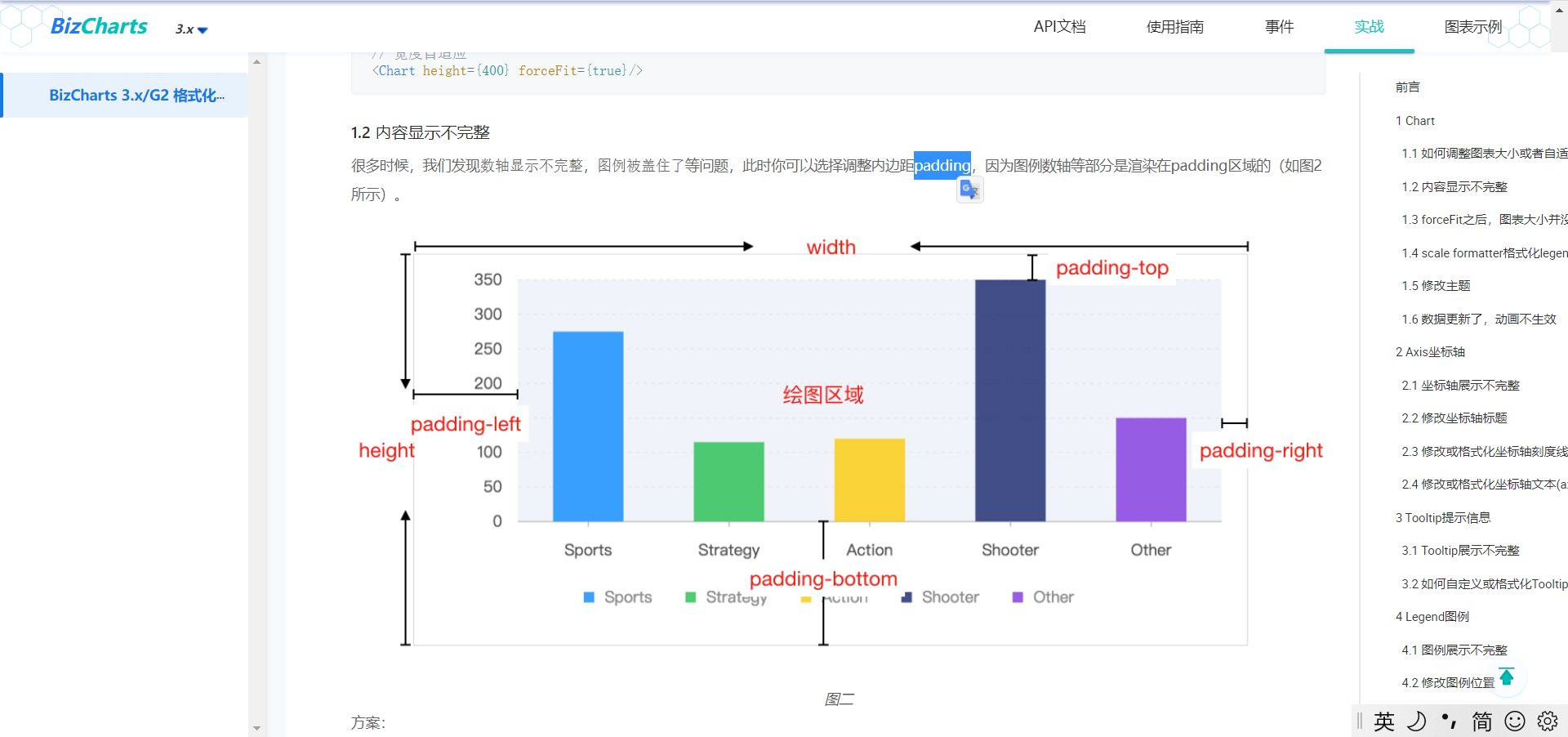
实战其实就是一些 bizcharts 使用上的一些答疑。例如“内容显示不完整”,有可能就是因为 padding 的原因。
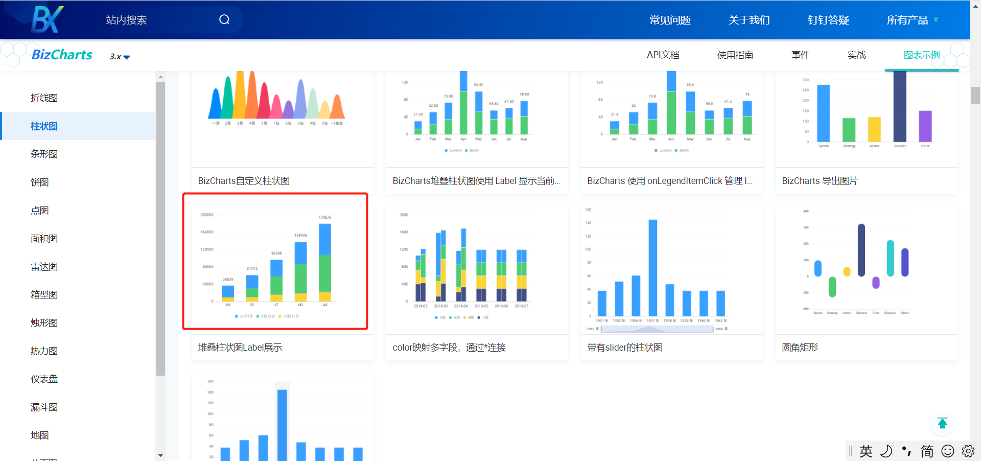
图表示例
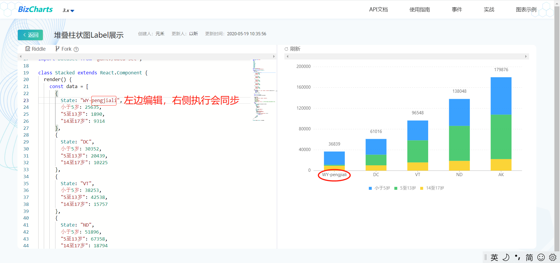
例如我们使用的堆叠柱状图的用法示例就参考这里:
点击进入示例,修改左边源码,右侧显示也会同步,非常方便我们在线研究和学习:
高度自适应
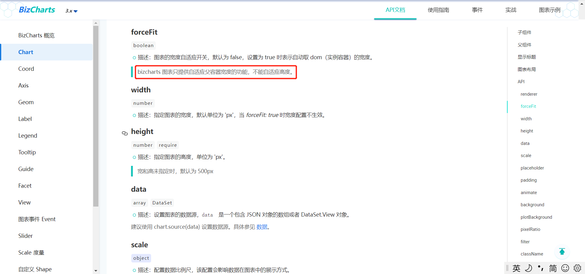
bizcharts 有宽度自适应,但没有实现高度的自适应。
笔者高度自适应的做法:将高度全部改为百分比。
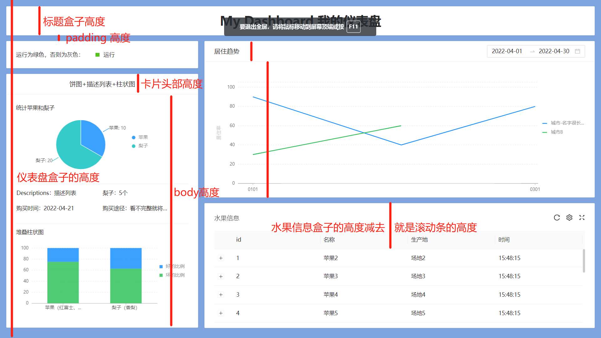
具体做法如下:
- 由于没有设计,故先用固定像素实现界面
- 取得浏览器的窗口高度 window.innerHeight,笔者这里是 937
- 将“标签盒子”、“卡片头部高度”、卡片 body 部分等全部改为百分比
核心代码如下:
// src\pages\mdashboard\store.js

const PADDING = 16

class Store {

  @observable baseBoxHeight = 937 - PADDING

  @observable padding = PADDING

  // 仪表盘盒子高度

  @observable boxHeight = window.innerHeight - this.padding * 2

  // 饼图高度比例。根据之前的效果算出来的

  @observable pieBoxRatio = 0.20

  // 柱状图高度比例

  @observable barBoxRatio = 0.23

  // “My Dashboard 我的仪表盘” 高度

  @computed get TitleHeight() {

    const ratio = 80 / this.baseBoxHeight

    return this.boxHeight * ratio

  }

  // 运行card高度

  @computed get todayCardHeight() {

    const ratio = 75 / this.baseBoxHeight

    return this.boxHeight * ratio

  }

  // “饼图+描述列表+柱状图” body 高度

  @computed get statisticBodyHeight() {

    const ratio = 660 / this.baseBoxHeight

    return this.boxHeight * ratio

  }

  // 居住趋势 body 的高度

  @computed get trendBodyBodyHeight() {

    const ratio = 385 / this.baseBoxHeight

    return this.boxHeight * ratio

  }

  // xys16 得用 computed 才会联动。下面这种写法不会联动

  @computed get xys16() {

    return (16 / this.baseBoxHeight) * this.boxHeight

  }

  // 饼状图盒子高度

  @computed get pieBoxHeight() {

    return this.pieBoxRatio * this.boxHeight

  }

  // card 的 header 比例

  @computed get cardTitleStyle() {

    const cardTitleRatio = 57 / this.baseBoxHeight

    return { display: 'flex', height: this.boxHeight * cardTitleRatio, alignItems: 'center', justifyContent: 'center' }

  }

}
问题
实现过程中出现如下两个问题:一个是折线图的 Y 轴乱序,一个是堆叠柱状图有一节空白。
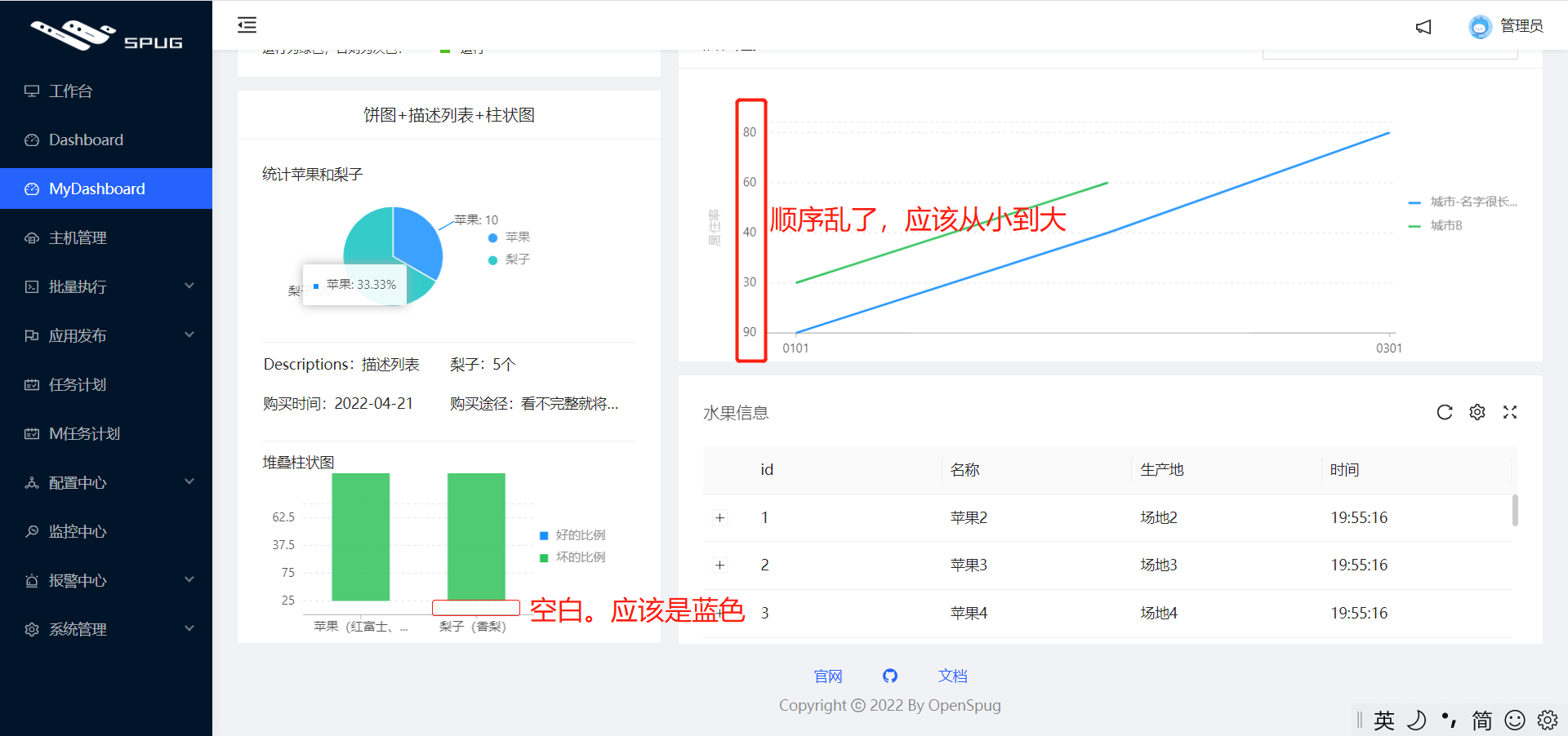
原因是值不小心弄成了字符串,改为数字类型即可。
其他章节请看:
最新文章
- [C#] 将 List 转 DataTable
- php面试题及答案收藏(转)
- sql联合查询
- hibernateValidate
- servlet的转发与重定向
- linux 好玩的命令
- [SRH.Docker] HBase Java 第一天学习记录
- Java核心 --- 枚举
- Sqlyog增加试用期
- Android 自定义Gallery浏览图片
- YII框架开发一个项目的通用目录结构
- MTU 最大传输单位
- java实现http请求
- 扫黑除恶Team second
- C#获取当前日期时间
- vscode中配置php的xdebug
- 分类器评估方法:ROC曲线
- Java 开发中的对象拷贝
- Hibernate session FlushMode的五种设置
- Eclipse配色方案插件