Cys_Control(五) MMenu
2024-09-05 13:38:13
一、查看Menu原样式
1、通过Blend查看Menu原有样式
Menu的原有样式结构较为简单,由边框Border及集合控件 ItemsPresenter 组成,原有样式如下


<Style x:Key="MenuStyle1" TargetType="{x:Type Menu}">

    <Setter Property="Background" Value="{StaticResource Menu.Static.Background}"/>

    <Setter Property="FontFamily" Value="{DynamicResource {x:Static SystemFonts.MenuFontFamilyKey}}"/>

    <Setter Property="FontSize" Value="{DynamicResource {x:Static SystemFonts.MenuFontSizeKey}}"/>

    <Setter Property="FontStyle" Value="{DynamicResource {x:Static SystemFonts.MenuFontStyleKey}}"/>

    <Setter Property="FontWeight" Value="{DynamicResource {x:Static SystemFonts.MenuFontWeightKey}}"/>

    <Setter Property="Foreground" Value="{DynamicResource {x:Static SystemColors.MenuTextBrushKey}}"/>

    <Setter Property="VerticalContentAlignment" Value="Center"/>

    <Setter Property="Template">

        <Setter.Value>

            <ControlTemplate TargetType="{x:Type Menu}">

                <Border Background="{TemplateBinding Background}"

                                BorderThickness="{TemplateBinding BorderThickness}"

                                BorderBrush="{TemplateBinding BorderBrush}"

                                Padding="{TemplateBinding Padding}"

                                SnapsToDevicePixels="true">

                    <ItemsPresenter SnapsToDevicePixels="{TemplateBinding SnapsToDevicePixels}"/>

                </Border>

            </ControlTemplate>

        </Setter.Value>

    </Setter>

</Style>
2、MenuItem主体部分
Menu 的主要样式 集中在MenuItem上,MenuItem比较复杂,这里为了方便浏览我们分批查看,首先查看MenuItem的主体部分
<Style x:Key="MenuItemStyle1" TargetType="{x:Type MenuItem}">

    <Setter Property="HorizontalContentAlignment" Value="{Binding HorizontalContentAlignment, RelativeSource={RelativeSource AncestorType={x:Type ItemsControl}}}"/>

    <Setter Property="VerticalContentAlignment" Value="{Binding VerticalContentAlignment, RelativeSource={RelativeSource AncestorType={x:Type ItemsControl}}}"/>

    <Setter Property="Background" Value="Transparent"/>

    <Setter Property="BorderBrush" Value="Transparent"/>

    <Setter Property="BorderThickness" Value="1"/>

    <Setter Property="ScrollViewer.PanningMode" Value="Both"/>

    <Setter Property="Stylus.IsFlicksEnabled" Value="False"/>

    <Setter Property="Template" Value="{DynamicResource {ComponentResourceKey ResourceId=SubmenuItemTemplateKey, TypeInTargetAssembly={x:Type MenuItem}}}"/>

    <Style.Triggers>

        <Trigger Property="Role" Value="TopLevelHeader">

            <Setter Property="Background" Value="Transparent"/>

            <Setter Property="BorderBrush" Value="Transparent"/>

            <Setter Property="Foreground" Value="{StaticResource Menu.Static.Foreground}"/>

            <Setter Property="Template" Value="{DynamicResource {ComponentResourceKey ResourceId=TopLevelHeaderTemplateKey, TypeInTargetAssembly={x:Type MenuItem}}}"/>

            <Setter Property="Padding" Value="6,0"/>

        </Trigger>

        <Trigger Property="Role" Value="TopLevelItem">

            <Setter Property="Background" Value="{StaticResource Menu.Static.Background}"/>

            <Setter Property="BorderBrush" Value="{StaticResource Menu.Static.Border}"/>

            <Setter Property="Foreground" Value="{StaticResource Menu.Static.Foreground}"/>

            <Setter Property="Template" Value="{DynamicResource {ComponentResourceKey ResourceId=TopLevelItemTemplateKey, TypeInTargetAssembly={x:Type MenuItem}}}"/>

            <Setter Property="Padding" Value="6,0"/>

        </Trigger>

        <Trigger Property="Role" Value="SubmenuHeader">

            <Setter Property="Template" Value="{DynamicResource {ComponentResourceKey ResourceId=SubmenuHeaderTemplateKey, TypeInTargetAssembly={x:Type MenuItem}}}"/>

        </Trigger>

    </Style.Triggers>

</Style>
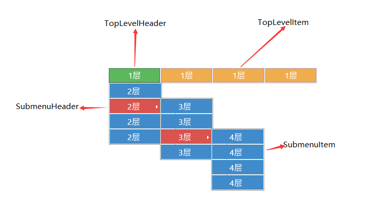
MenuItem有个Role属性, 如下图,定义了四种角色(TopLevelHeader(绿色)、TopLevelItem(橘黄色)、SubmenuHeader(红色)、SubmenuItem(蓝色)),每种角色分别对应一个模板
分别看一下各部分的原有样式
3、TopLevelHeader模板
<ControlTemplate x:Key="{ComponentResourceKey ResourceId=TopLevelHeaderTemplateKey, TypeInTargetAssembly={x:Type MenuItem}}" TargetType="{x:Type MenuItem}">

    <Border x:Name="templateRoot" Background="{TemplateBinding Background}" BorderThickness="{TemplateBinding BorderThickness}" BorderBrush="{TemplateBinding BorderBrush}" SnapsToDevicePixels="true">

        <Grid VerticalAlignment="Center">

            <Grid.ColumnDefinitions>

                <ColumnDefinition Width="Auto"/>

                <ColumnDefinition Width="Auto"/>

            </Grid.ColumnDefinitions>

            <ContentPresenter x:Name="Icon" ContentSource="Icon" HorizontalAlignment="Center" Height="16" Margin="3" SnapsToDevicePixels="{TemplateBinding SnapsToDevicePixels}" VerticalAlignment="Center" Width="16"/>

            <Path x:Name="GlyphPanel" Data="{StaticResource Checkmark}" FlowDirection="LeftToRight" Fill="{TemplateBinding Foreground}" Margin="3" VerticalAlignment="Center" Visibility="Collapsed"/>

            <ContentPresenter ContentSource="Header" Grid.Column="1" Margin="{TemplateBinding Padding}" RecognizesAccessKey="True" SnapsToDevicePixels="{TemplateBinding SnapsToDevicePixels}"/>

            <Popup x:Name="PART_Popup" AllowsTransparency="true" Focusable="false" IsOpen="{Binding IsSubmenuOpen, RelativeSource={RelativeSource TemplatedParent}}" Placement="Bottom" PopupAnimation="{DynamicResource {x:Static SystemParameters.MenuPopupAnimationKey}}" PlacementTarget="{Binding ElementName=templateRoot}">

                <Border x:Name="SubMenuBorder" Background="{StaticResource Menu.Static.Background}" BorderThickness="1" BorderBrush="{StaticResource Menu.Static.Border}" Padding="2">

                    <ScrollViewer x:Name="SubMenuScrollViewer" Style="{DynamicResource {ComponentResourceKey ResourceId=MenuScrollViewer, TypeInTargetAssembly={x:Type FrameworkElement}}}">

                        <Grid RenderOptions.ClearTypeHint="Enabled">

                            <Canvas HorizontalAlignment="Left" Height="0" VerticalAlignment="Top" Width="0">

                                <Rectangle x:Name="OpaqueRect" Fill="{Binding Background, ElementName=SubMenuBorder}" Height="{Binding ActualHeight, ElementName=SubMenuBorder}" Width="{Binding ActualWidth, ElementName=SubMenuBorder}"/>

                            </Canvas>

                            <Rectangle Fill="{StaticResource Menu.Static.Separator}" HorizontalAlignment="Left" Margin="29,2,0,2" Width="1"/>

                            <ItemsPresenter x:Name="ItemsPresenter" KeyboardNavigation.DirectionalNavigation="Cycle" Grid.IsSharedSizeScope="true" SnapsToDevicePixels="{TemplateBinding SnapsToDevicePixels}" KeyboardNavigation.TabNavigation="Cycle"/>

                        </Grid>

                    </ScrollViewer>

                </Border>

            </Popup>

        </Grid>

    </Border>

    <ControlTemplate.Triggers>

        <Trigger Property="IsSuspendingPopupAnimation" Value="true">

            <Setter Property="PopupAnimation" TargetName="PART_Popup" Value="None"/>

        </Trigger>

        <Trigger Property="Icon" Value="{x:Null}">

            <Setter Property="Visibility" TargetName="Icon" Value="Collapsed"/>

        </Trigger>

        <Trigger Property="IsChecked" Value="true">

            <Setter Property="Visibility" TargetName="GlyphPanel" Value="Visible"/>

            <Setter Property="Visibility" TargetName="Icon" Value="Collapsed"/>

        </Trigger>

        <Trigger Property="IsHighlighted" Value="True">

            <Setter Property="Background" TargetName="templateRoot" Value="{StaticResource MenuItem.Highlight.Background}"/>

            <Setter Property="BorderBrush" TargetName="templateRoot" Value="{StaticResource MenuItem.Highlight.Border}"/>

        </Trigger>

        <Trigger Property="IsEnabled" Value="False">

            <Setter Property="TextElement.Foreground" TargetName="templateRoot" Value="{StaticResource Menu.Disabled.Foreground}"/>

            <Setter Property="Fill" TargetName="GlyphPanel" Value="{StaticResource Menu.Disabled.Foreground}"/>

        </Trigger>

        <Trigger Property="ScrollViewer.CanContentScroll" SourceName="SubMenuScrollViewer" Value="false">

            <Setter Property="Canvas.Top" TargetName="OpaqueRect" Value="{Binding VerticalOffset, ElementName=SubMenuScrollViewer}"/>

            <Setter Property="Canvas.Left" TargetName="OpaqueRect" Value="{Binding HorizontalOffset, ElementName=SubMenuScrollViewer}"/>

        </Trigger>

    </ControlTemplate.Triggers>

</ControlTemplate>
4、TopLevelItem模板
<ControlTemplate x:Key="{ComponentResourceKey ResourceId=TopLevelItemTemplateKey, TypeInTargetAssembly={x:Type MenuItem}}" TargetType="{x:Type MenuItem}">

    <Border x:Name="templateRoot" Background="{TemplateBinding Background}" BorderThickness="{TemplateBinding BorderThickness}" BorderBrush="{TemplateBinding BorderBrush}" SnapsToDevicePixels="true">

        <Grid VerticalAlignment="Center">

            <Grid.ColumnDefinitions>

                <ColumnDefinition Width="Auto"/>

                <ColumnDefinition Width="Auto"/>

            </Grid.ColumnDefinitions>

            <ContentPresenter x:Name="Icon" ContentSource="Icon" HorizontalAlignment="Center" Height="16" Margin="3" SnapsToDevicePixels="{TemplateBinding SnapsToDevicePixels}" VerticalAlignment="Center" Width="16"/>

            <Path x:Name="GlyphPanel" Data="{StaticResource Checkmark}" FlowDirection="LeftToRight" Fill="{StaticResource Menu.Static.Foreground}" Margin="3" VerticalAlignment="Center" Visibility="Collapsed"/>

            <ContentPresenter ContentSource="Header" Grid.Column="1" Margin="{TemplateBinding Padding}" RecognizesAccessKey="True" SnapsToDevicePixels="{TemplateBinding SnapsToDevicePixels}"/>

        </Grid>

    </Border>

    <ControlTemplate.Triggers>

        <Trigger Property="Icon" Value="{x:Null}">

            <Setter Property="Visibility" TargetName="Icon" Value="Collapsed"/>

        </Trigger>

        <Trigger Property="IsChecked" Value="true">

            <Setter Property="Visibility" TargetName="GlyphPanel" Value="Visible"/>

            <Setter Property="Visibility" TargetName="Icon" Value="Collapsed"/>

        </Trigger>

        <Trigger Property="IsHighlighted" Value="True">

            <Setter Property="Background" TargetName="templateRoot" Value="{StaticResource MenuItem.Highlight.Background}"/>

            <Setter Property="BorderBrush" TargetName="templateRoot" Value="{StaticResource MenuItem.Highlight.Border}"/>

        </Trigger>

        <Trigger Property="IsEnabled" Value="False">

            <Setter Property="TextElement.Foreground" TargetName="templateRoot" Value="{StaticResource Menu.Disabled.Foreground}"/>

            <Setter Property="Fill" TargetName="GlyphPanel" Value="{StaticResource Menu.Disabled.Foreground}"/>

        </Trigger>

        <MultiTrigger>

            <MultiTrigger.Conditions>

                <Condition Property="IsHighlighted" Value="True"/>

                <Condition Property="IsEnabled" Value="False"/>

            </MultiTrigger.Conditions>

            <Setter Property="Background" TargetName="templateRoot" Value="{StaticResource MenuItem.Highlight.Disabled.Background}"/>

            <Setter Property="BorderBrush" TargetName="templateRoot" Value="{StaticResource MenuItem.Highlight.Disabled.Border}"/>

        </MultiTrigger>

    </ControlTemplate.Triggers>

</ControlTemplate>
5、SubmenuHeader模板
<ControlTemplate x:Key="{ComponentResourceKey ResourceId=SubmenuHeaderTemplateKey, TypeInTargetAssembly={x:Type MenuItem}}" TargetType="{x:Type MenuItem}">

    <Border x:Name="templateRoot" Background="{TemplateBinding Background}" BorderThickness="{TemplateBinding BorderThickness}" BorderBrush="{TemplateBinding BorderBrush}" Height="22" SnapsToDevicePixels="true">

        <Grid Margin="-1">

            <Grid.ColumnDefinitions>

                <ColumnDefinition MinWidth="22" SharedSizeGroup="MenuItemIconColumnGroup" Width="Auto"/>

                <ColumnDefinition Width="13"/>

                <ColumnDefinition Width="*"/>

                <ColumnDefinition Width="30"/>

                <ColumnDefinition SharedSizeGroup="MenuItemIGTColumnGroup" Width="Auto"/>

                <ColumnDefinition Width="20"/>

            </Grid.ColumnDefinitions>

            <ContentPresenter x:Name="Icon" ContentSource="Icon" HorizontalAlignment="Center" Height="16" Margin="3" SnapsToDevicePixels="{TemplateBinding SnapsToDevicePixels}" VerticalAlignment="Center" Width="16"/>

            <Border x:Name="GlyphPanel" Background="{StaticResource MenuItem.Highlight.Background}" BorderThickness="1" BorderBrush="{StaticResource MenuItem.Highlight.Border}" Height="22" Margin="-1,0,0,0" VerticalAlignment="Center" Visibility="Hidden" Width="22">

                <Path x:Name="Glyph" Data="{DynamicResource Checkmark}" FlowDirection="LeftToRight" Fill="{StaticResource Menu.Static.Foreground}" Height="11" Width="9"/>

            </Border>

            <ContentPresenter ContentSource="Header" Grid.Column="2" HorizontalAlignment="Left" Margin="{TemplateBinding Padding}" RecognizesAccessKey="True" SnapsToDevicePixels="{TemplateBinding SnapsToDevicePixels}" VerticalAlignment="Center"/>

            <TextBlock Grid.Column="4" Margin="{TemplateBinding Padding}" Opacity="0.7" Text="{TemplateBinding InputGestureText}" VerticalAlignment="Center"/>

            <Path x:Name="RightArrow" Grid.Column="5" Data="{StaticResource RightArrow}" Fill="{StaticResource Menu.Static.Foreground}" HorizontalAlignment="Left" Margin="10,0,0,0" VerticalAlignment="Center"/>

            <Popup x:Name="PART_Popup" AllowsTransparency="true" Focusable="false" HorizontalOffset="-2" IsOpen="{Binding IsSubmenuOpen, RelativeSource={RelativeSource TemplatedParent}}" Placement="Right" PopupAnimation="{DynamicResource {x:Static SystemParameters.MenuPopupAnimationKey}}" VerticalOffset="-3">

                <Border x:Name="SubMenuBorder" Background="{StaticResource Menu.Static.Background}" BorderThickness="1" BorderBrush="{StaticResource Menu.Static.Border}" Padding="2">

                    <ScrollViewer x:Name="SubMenuScrollViewer" Style="{DynamicResource {ComponentResourceKey ResourceId=MenuScrollViewer, TypeInTargetAssembly={x:Type FrameworkElement}}}">

                        <Grid RenderOptions.ClearTypeHint="Enabled">

                            <Canvas HorizontalAlignment="Left" Height="0" VerticalAlignment="Top" Width="0">

                                <Rectangle x:Name="OpaqueRect" Fill="{Binding Background, ElementName=SubMenuBorder}" Height="{Binding ActualHeight, ElementName=SubMenuBorder}" Width="{Binding ActualWidth, ElementName=SubMenuBorder}"/>

                            </Canvas>

                            <Rectangle Fill="{DynamicResource {x:Static SystemColors.ControlDarkBrushKey}}" HorizontalAlignment="Left" Margin="29,2,0,2" Width="1"/>

                            <ItemsPresenter x:Name="ItemsPresenter" KeyboardNavigation.DirectionalNavigation="Cycle" Grid.IsSharedSizeScope="true" SnapsToDevicePixels="{TemplateBinding SnapsToDevicePixels}" KeyboardNavigation.TabNavigation="Cycle"/>

                        </Grid>

                    </ScrollViewer>

                </Border>

            </Popup>

        </Grid>

    </Border>

    <ControlTemplate.Triggers>

        <Trigger Property="IsSuspendingPopupAnimation" Value="true">

            <Setter Property="PopupAnimation" TargetName="PART_Popup" Value="None"/>

        </Trigger>

        <Trigger Property="Icon" Value="{x:Null}">

            <Setter Property="Visibility" TargetName="Icon" Value="Collapsed"/>

        </Trigger>

        <Trigger Property="IsChecked" Value="True">

            <Setter Property="Visibility" TargetName="GlyphPanel" Value="Visible"/>

            <Setter Property="Visibility" TargetName="Icon" Value="Collapsed"/>

        </Trigger>

        <Trigger Property="IsHighlighted" Value="True">

            <Setter Property="Background" TargetName="templateRoot" Value="Transparent"/>

            <Setter Property="BorderBrush" TargetName="templateRoot" Value="{StaticResource MenuItem.Highlight.Border}"/>

        </Trigger>

        <Trigger Property="IsEnabled" Value="False">

            <Setter Property="TextElement.Foreground" TargetName="templateRoot" Value="{StaticResource Menu.Disabled.Foreground}"/>

            <Setter Property="Fill" TargetName="Glyph" Value="{StaticResource Menu.Disabled.Foreground}"/>

            <Setter Property="Fill" TargetName="RightArrow" Value="{StaticResource Menu.Disabled.Foreground}"/>

        </Trigger>

        <Trigger Property="ScrollViewer.CanContentScroll" SourceName="SubMenuScrollViewer" Value="false">

            <Setter Property="Canvas.Top" TargetName="OpaqueRect" Value="{Binding VerticalOffset, ElementName=SubMenuScrollViewer}"/>

            <Setter Property="Canvas.Left" TargetName="OpaqueRect" Value="{Binding HorizontalOffset, ElementName=SubMenuScrollViewer}"/>

        </Trigger>

    </ControlTemplate.Triggers>

</ControlTemplate>
6、SubmenuItem模板
<ControlTemplate x:Key="{ComponentResourceKey ResourceId=SubmenuItemTemplateKey, TypeInTargetAssembly={x:Type MenuItem}}" TargetType="{x:Type MenuItem}">

    <Border x:Name="templateRoot" Background="{TemplateBinding Background}" BorderThickness="{TemplateBinding BorderThickness}" BorderBrush="{TemplateBinding BorderBrush}" Height="22" SnapsToDevicePixels="true">

        <Grid Margin="-1">

            <Grid.ColumnDefinitions>

                <ColumnDefinition MinWidth="22" SharedSizeGroup="MenuItemIconColumnGroup" Width="Auto"/>

                <ColumnDefinition Width="13"/>

                <ColumnDefinition Width="*"/>

                <ColumnDefinition Width="30"/>

                <ColumnDefinition SharedSizeGroup="MenuItemIGTColumnGroup" Width="Auto"/>

                <ColumnDefinition Width="20"/>

            </Grid.ColumnDefinitions>

            <ContentPresenter x:Name="Icon" ContentSource="Icon" HorizontalAlignment="Center" Height="16" Margin="3" SnapsToDevicePixels="{TemplateBinding SnapsToDevicePixels}" VerticalAlignment="Center" Width="16"/>

            <Border x:Name="GlyphPanel" Background="{StaticResource MenuItem.Selected.Background}" BorderThickness="1" BorderBrush="{StaticResource MenuItem.Selected.Border}" ClipToBounds="False" HorizontalAlignment="Center" Height="22" Margin="-1,0,0,0" VerticalAlignment="Center" Visibility="Hidden" Width="22">

                <Path x:Name="Glyph" Data="{StaticResource Checkmark}" FlowDirection="LeftToRight" Fill="{StaticResource Menu.Static.Foreground}" Height="11" Width="10"/>

            </Border>

            <ContentPresenter x:Name="menuHeaderContainer" ContentSource="Header" Grid.Column="2" HorizontalAlignment="Left" Margin="{TemplateBinding Padding}" RecognizesAccessKey="True" SnapsToDevicePixels="{TemplateBinding SnapsToDevicePixels}" VerticalAlignment="Center"/>

            <TextBlock x:Name="menuGestureText" Grid.Column="4" Margin="{TemplateBinding Padding}" Opacity="0.7" Text="{TemplateBinding InputGestureText}" VerticalAlignment="Center"/>

        </Grid>

    </Border>

    <ControlTemplate.Triggers>

        <Trigger Property="Icon" Value="{x:Null}">

            <Setter Property="Visibility" TargetName="Icon" Value="Collapsed"/>

        </Trigger>

        <Trigger Property="IsChecked" Value="True">

            <Setter Property="Visibility" TargetName="GlyphPanel" Value="Visible"/>

            <Setter Property="Visibility" TargetName="Icon" Value="Collapsed"/>

        </Trigger>

        <Trigger Property="IsHighlighted" Value="True">

            <Setter Property="Background" TargetName="templateRoot" Value="{StaticResource MenuItem.Highlight.Background}"/>

            <Setter Property="BorderBrush" TargetName="templateRoot" Value="{StaticResource MenuItem.Highlight.Border}"/>

        </Trigger>

        <Trigger Property="IsEnabled" Value="False">

            <Setter Property="TextElement.Foreground" TargetName="templateRoot" Value="{StaticResource Menu.Disabled.Foreground}"/>

            <Setter Property="Fill" TargetName="Glyph" Value="{StaticResource Menu.Disabled.Foreground}"/>

        </Trigger>

        <MultiTrigger>

            <MultiTrigger.Conditions>

                <Condition Property="IsHighlighted" Value="True"/>

                <Condition Property="IsEnabled" Value="False"/>

            </MultiTrigger.Conditions>

            <Setter Property="Background" TargetName="templateRoot" Value="{StaticResource MenuItem.Highlight.Disabled.Background}"/>

            <Setter Property="BorderBrush" TargetName="templateRoot" Value="{StaticResource MenuItem.Highlight.Disabled.Border}"/>

        </MultiTrigger>

    </ControlTemplate.Triggers>

</ControlTemplate>
7、Template分析
由上述可知,重写样式即修改这四部分模板
3、4对比来看TopLevelHeader比TopLevelItem多了Popup部分,
5,6对比来看SubmenuHeader比SubmenuItem也是多了Popup部分,
接下来分别重写4部分模板
二、创建 CustomControl
1、新建MMenu
新建CustomControl 命名为MMenu 并添加相应的Xaml样式
<Style TargetType="{x:Type local:MMenu}">

    <Setter Property="Foreground" Value="{DynamicResource ColorBrush.FontDefaultColor}"/>

    <Setter Property="Background" Value="Transparent"/>

    <Setter Property="Width" Value="Auto"/>

    <Setter Property="Height" Value="35"/>

    <Setter Property="Template">

        <Setter.Value>

            <ControlTemplate TargetType="{x:Type local:MMenu}">

                <Border Background="{TemplateBinding Background}"

                        BorderThickness="{TemplateBinding BorderThickness}"

                        BorderBrush="{TemplateBinding BorderBrush}"

                        Padding="{TemplateBinding Padding}"

                        SnapsToDevicePixels="true">

                    <ItemsPresenter SnapsToDevicePixels="{TemplateBinding SnapsToDevicePixels}"/>

                </Border>

            </ControlTemplate>

        </Setter.Value>

    </Setter>

</Style>
这里的主要样式在MenuItem上,故Menu样式不做过多改变
2、新建MMenuItem
新建CustomControl命名为MMenuItem并添加相应Xaml样式
<Style TargetType="{x:Type local:MMenuItem}">

    <Setter Property="BorderBrush" Value="{DynamicResource ColorBrush.SuccessBorderBrushColor}"/>

    <Setter Property="Background" Value="{DynamicResource ColorBrush.SuccessBackgroundColor}"/>

    <Setter Property="Foreground" Value="{DynamicResource ColorBrush.FontPrimaryColor}"/>

    <Setter Property="FontSize" Value="14"/>

    <Setter Property="Cursor" Value="Hand"/>

    <Setter Property="Height" Value="30"/>

    <Setter Property="Width" Value="Auto"/>

    <Setter Property="MinWidth" Value="100"/>

    <Setter Property="HorizontalContentAlignment" Value="{Binding HorizontalContentAlignment, RelativeSource={RelativeSource AncestorType={x:Type ItemsControl}}}"/>

    <Setter Property="VerticalContentAlignment" Value="{Binding VerticalContentAlignment, RelativeSource={RelativeSource AncestorType={x:Type ItemsControl}}}"/>

    <Setter Property="ScrollViewer.PanningMode" Value="Both"/>

    <Setter Property="Stylus.IsFlicksEnabled" Value="False"/>

    <Setter Property="Template" Value="{StaticResource MSubmenuItemTemplate}"/>

    <Style.Triggers>

        <Trigger Property="Role" Value="TopLevelHeader">

            <Setter Property="BorderThickness" Value="0,0,1,0"/>

            <Setter Property="Template" Value="{StaticResource MTopLevelHeaderTemplate}"/>

        </Trigger>

        <Trigger Property="Role" Value="TopLevelItem">

            <Setter Property="BorderThickness" Value="0,0,1,0"/>

            <Setter Property="Template" Value="{StaticResource MTopLevelItemTemplate}"/>

        </Trigger>

        <Trigger Property="Role" Value="SubmenuHeader">

            <Setter Property="Background" Value="Transparent"/>

            <Setter Property="Foreground" Value="{DynamicResource ColorBrush.FontDefaultColor}"/>

            <Setter Property="Template" Value="{StaticResource MSubmenuHeaderTemplate}"/>

            <Setter Property="Padding" Value="3,0,0,0"/>

        </Trigger>

        <Trigger Property="Role" Value="SubmenuItem">

            <Setter Property="Foreground" Value="{DynamicResource ColorBrush.FontDefaultColor}"/>

            <Setter Property="Background" Value="Transparent"/>

            <Setter Property="Template" Value="{StaticResource MSubmenuItemTemplate}"/>

            <Setter Property="Padding" Value="3,0,0,0"/>

        </Trigger>

    </Style.Triggers>

</Style>
根据触发器中命名的4部分角色分别重写样式
3、MTopLevelHeaderTemplate
<ControlTemplate x:Key="MTopLevelHeaderTemplate" TargetType="{x:Type local:MMenuItem}">

    <Border x:Name="templateRoot" Background="{TemplateBinding Background}" BorderThickness="{TemplateBinding BorderThickness}" BorderBrush="{TemplateBinding BorderBrush}" CornerRadius="{TemplateBinding CornerRadius}" SnapsToDevicePixels="true">

        <Grid>

            <Grid VerticalAlignment="Center" HorizontalAlignment="Center" x:Name="PART_TextGrid" Opacity="0.8">

                <Grid.ColumnDefinitions>

                    <ColumnDefinition Width="Auto"/>

                    <ColumnDefinition Width="Auto"/>

                </Grid.ColumnDefinitions>

                <TextBlock x:Name="Icon" FontSize="25" HorizontalAlignment="Center" Text="{TemplateBinding Icon}" SnapsToDevicePixels="{TemplateBinding SnapsToDevicePixels}" VerticalAlignment="Center"/>

                <ContentPresenter ContentSource="Header" HorizontalAlignment="Center" Grid.Column="1" RecognizesAccessKey="True" SnapsToDevicePixels="{TemplateBinding SnapsToDevicePixels}" VerticalAlignment="Center"/>

            </Grid>

            <Popup x:Name="PART_Popup" AllowsTransparency="true" Focusable="false" IsOpen="{Binding IsSubmenuOpen, RelativeSource={RelativeSource TemplatedParent}}"

                   Placement="Bottom" PopupAnimation="{DynamicResource {x:Static SystemParameters.MenuPopupAnimationKey}}" PlacementTarget="{Binding ElementName=templateRoot}" MinWidth="120">

                <Border x:Name="SubMenuBorder" Margin="0 0 5 5" >

                    <Border.Effect>

                        <DropShadowEffect Color="{DynamicResource Color.MenuItemDropShadowBrush}" Opacity="0.3" ShadowDepth="3"/>

                    </Border.Effect>

                    <Border Background="{DynamicResource ColorBrush.MenuItemPopBackground}" BorderThickness="1" CornerRadius="5" BorderBrush="{DynamicResource ColorBrush.MenuItemPopBorderBrush}" >

                        <ScrollViewer x:Name="SubMenuScrollViewer" Style="{DynamicResource {ComponentResourceKey ResourceId=MenuScrollViewer, TypeInTargetAssembly={x:Type FrameworkElement}}}" Margin="0,5">

                            <Grid RenderOptions.ClearTypeHint="Enabled" Background="Transparent">

                                <Canvas HorizontalAlignment="Left" Height="0" VerticalAlignment="Top" Width="0">

                                    <Rectangle x:Name="OpaqueRect" Fill="{Binding Background, ElementName=SubMenuBorder}"

                                                   Height="{Binding ActualHeight, ElementName=SubMenuBorder}"

                                                   Width="{Binding ActualWidth, ElementName=SubMenuBorder}"/>

                                </Canvas>

                                <ItemsPresenter x:Name="ItemsPresenter" KeyboardNavigation.DirectionalNavigation="Cycle"

                                                    Grid.IsSharedSizeScope="true" SnapsToDevicePixels="{TemplateBinding SnapsToDevicePixels}" KeyboardNavigation.TabNavigation="Cycle"/>

                            </Grid>

                        </ScrollViewer>

                    </Border>

                </Border>

            </Popup>

        </Grid>

    </Border>

    <ControlTemplate.Triggers>

        <Trigger Property="IsSuspendingPopupAnimation" Value="true">

            <Setter Property="PopupAnimation" TargetName="PART_Popup" Value="None"/>

        </Trigger>

        <Trigger Property="Icon" Value="{x:Null}">

            <Setter Property="Visibility" TargetName="Icon" Value="Collapsed"/>

        </Trigger>

        <Trigger Property="ScrollViewer.CanContentScroll" SourceName="SubMenuScrollViewer" Value="false">

            <Setter Property="Canvas.Top" TargetName="OpaqueRect" Value="{Binding VerticalOffset, ElementName=SubMenuScrollViewer}"/>

            <Setter Property="Canvas.Left" TargetName="OpaqueRect" Value="{Binding HorizontalOffset, ElementName=SubMenuScrollViewer}"/>

        </Trigger>

        <Trigger Property="IsHighlighted" Value="True">

            <Setter TargetName="templateRoot" Property="Background"  Value="{DynamicResource ColorBrush.SuccessBackgroundOverColor}"/>

            <Setter TargetName="PART_TextGrid" Property="Opacity"  Value="1"/>

        </Trigger>

    </ControlTemplate.Triggers>

</ControlTemplate>
4、MTopLevelItemTemplate
<ControlTemplate x:Key="MTopLevelItemTemplate" TargetType="{x:Type local:MMenuItem}">

    <Border x:Name="templateRoot" Background="{TemplateBinding Background}" BorderThickness="{TemplateBinding BorderThickness}" BorderBrush="{TemplateBinding BorderBrush}" CornerRadius="{TemplateBinding CornerRadius}" SnapsToDevicePixels="true">

        <Grid VerticalAlignment="Center" HorizontalAlignment="Center" x:Name="PART_TextGrid" Opacity="0.8">

            <Grid.ColumnDefinitions>

                <ColumnDefinition Width="Auto"/>

                <ColumnDefinition Width="Auto"/>

            </Grid.ColumnDefinitions>

            <TextBlock x:Name="Icon" FontSize="25" HorizontalAlignment="Center" Text="{TemplateBinding Icon}" SnapsToDevicePixels="{TemplateBinding SnapsToDevicePixels}" VerticalAlignment="Center"/>

            <ContentPresenter ContentSource="Header" HorizontalAlignment="Center" Grid.Column="1" RecognizesAccessKey="True" SnapsToDevicePixels="{TemplateBinding SnapsToDevicePixels}" VerticalAlignment="Center"/>

        </Grid>

    </Border>

    <ControlTemplate.Triggers>

        <Trigger Property="Icon" Value="{x:Null}">

            <Setter Property="Visibility" TargetName="Icon" Value="Collapsed"/>

        </Trigger>

        <Trigger Property="IsHighlighted" Value="True">

            <Setter TargetName="templateRoot" Property="Background"  Value="{DynamicResource ColorBrush.SuccessBackgroundOverColor}"/>

            <Setter TargetName="PART_TextGrid" Property="Opacity"  Value="1"/>

        </Trigger>

    </ControlTemplate.Triggers>

</ControlTemplate>
5、MSubmenuHeaderTemplate
<ControlTemplate  x:Key="MSubmenuHeaderTemplate" TargetType="{x:Type local:MMenuItem}">

    <Border x:Name="templateRoot" Background="{TemplateBinding Background}"

                BorderThickness="{TemplateBinding BorderThickness}"

                BorderBrush="{TemplateBinding BorderBrush}" Height="30"

                SnapsToDevicePixels="true">

        <Grid >

            <Grid HorizontalAlignment="Left" VerticalAlignment="Center">

                <Grid.ColumnDefinitions>

                    <ColumnDefinition Width="Auto"/>

                    <ColumnDefinition Width="Auto"/>

                </Grid.ColumnDefinitions>

                <TextBlock Grid.Column="0" x:Name="Icon" Margin="10,0,0,0" FontSize="25" HorizontalAlignment="Center" Text="{TemplateBinding Icon}"

                               SnapsToDevicePixels="{TemplateBinding SnapsToDevicePixels}" VerticalAlignment="Center"/>

                <ContentPresenter Grid.Column="1" ContentSource="Header"  HorizontalAlignment="Center" Margin="{TemplateBinding Padding}" RecognizesAccessKey="True" SnapsToDevicePixels="{TemplateBinding SnapsToDevicePixels}" VerticalAlignment="Center"/>

            </Grid>

            <Path x:Name="RightArrow" Data="M 0,0 L 7,7 L 0,14 Z"

                      Fill="{TemplateBinding Foreground}"

                      HorizontalAlignment="Right" Margin="0,0,5,0" VerticalAlignment="Center" Opacity="0.6"/>

            <Popup x:Name="PART_Popup" AllowsTransparency="true" Focusable="false" IsOpen="{Binding IsSubmenuOpen, RelativeSource={RelativeSource TemplatedParent}}"

                   Placement="Right" PopupAnimation="{DynamicResource {x:Static SystemParameters.MenuPopupAnimationKey}}" PlacementTarget="{Binding ElementName=templateRoot}" MinWidth="120">

                <Border x:Name="SubMenuBorder" Margin="0 0 5 5" >

                    <Border.Effect>

                        <DropShadowEffect Color="{DynamicResource Color.MenuItemDropShadowBrush}" Opacity="0.3" ShadowDepth="3"/>

                    </Border.Effect>

                    <Border Background="{DynamicResource ColorBrush.MenuItemPopBackground}" BorderThickness="1" CornerRadius="5" BorderBrush="{DynamicResource ColorBrush.MenuItemPopBorderBrush}" >

                        <ScrollViewer x:Name="SubMenuScrollViewer" Style="{DynamicResource {ComponentResourceKey ResourceId=MenuScrollViewer, TypeInTargetAssembly={x:Type FrameworkElement}}}" Margin="0,5">

                            <Grid RenderOptions.ClearTypeHint="Enabled" Background="Transparent">

                                <Canvas HorizontalAlignment="Left" Height="0" VerticalAlignment="Top" Width="0">

                                    <Rectangle x:Name="OpaqueRect" Fill="{Binding Background, ElementName=SubMenuBorder}"

                                                   Height="{Binding ActualHeight, ElementName=SubMenuBorder}"

                                                   Width="{Binding ActualWidth, ElementName=SubMenuBorder}"/>

                                </Canvas>

                                <ItemsPresenter x:Name="ItemsPresenter" KeyboardNavigation.DirectionalNavigation="Cycle"

                                                    Grid.IsSharedSizeScope="true" SnapsToDevicePixels="{TemplateBinding SnapsToDevicePixels}" KeyboardNavigation.TabNavigation="Cycle"/>

                            </Grid>

                        </ScrollViewer>

                    </Border>

                </Border>

            </Popup>

        </Grid>

    </Border>

    <ControlTemplate.Triggers>

        <Trigger Property="IsSuspendingPopupAnimation" Value="true">

            <Setter Property="PopupAnimation" TargetName="PART_Popup" Value="None"/>

        </Trigger>

        <Trigger Property="Icon" Value="{x:Null}">

            <Setter Property="Visibility" TargetName="Icon" Value="Collapsed"/>

        </Trigger>

        <Trigger Property="IsChecked" Value="True">

            <Setter Property="Visibility" TargetName="Icon" Value="Collapsed"/>

        </Trigger>

        <Trigger Property="ScrollViewer.CanContentScroll" SourceName="SubMenuScrollViewer" Value="false">

            <Setter Property="Canvas.Top" TargetName="OpaqueRect" Value="{Binding VerticalOffset, ElementName=SubMenuScrollViewer}"/>

            <Setter Property="Canvas.Left" TargetName="OpaqueRect" Value="{Binding HorizontalOffset, ElementName=SubMenuScrollViewer}"/>

        </Trigger>

        <Trigger Property="IsHighlighted" Value="True">

            <Setter TargetName="templateRoot" Property="Background"  Value="{DynamicResource ColorBrush.MenuItemOverBackground}"/>

        </Trigger>

    </ControlTemplate.Triggers>

</ControlTemplate>
6、MSubmenuItemTemplate
<ControlTemplate x:Key="MSubmenuItemTemplate" TargetType="{x:Type local:MMenuItem}">

    <Border x:Name="templateRoot" Background="{TemplateBinding Background}" BorderThickness="{TemplateBinding BorderThickness}" BorderBrush="{TemplateBinding BorderBrush}" Height="30" SnapsToDevicePixels="true">

        <Grid HorizontalAlignment="Left" VerticalAlignment="Center">

            <Grid.ColumnDefinitions>

                <ColumnDefinition Width="Auto"/>

                <ColumnDefinition Width="Auto"/>

            </Grid.ColumnDefinitions>

            <TextBlock Grid.Column="0" x:Name="Icon" Margin="10,0,0,0" FontSize="25" HorizontalAlignment="Center" Text="{TemplateBinding Icon}"

                       SnapsToDevicePixels="{TemplateBinding SnapsToDevicePixels}" VerticalAlignment="Center"/>

            <ContentPresenter Grid.Column="1" x:Name="menuHeaderContainer"  HorizontalAlignment="Center" ContentSource="Header" Margin="{TemplateBinding Padding}" RecognizesAccessKey="True"

                              SnapsToDevicePixels="{TemplateBinding SnapsToDevicePixels}" VerticalAlignment="Center"/>

        </Grid>

    </Border>

    <ControlTemplate.Triggers>

        <Trigger Property="Icon" Value="{x:Null}">

            <Setter Property="Visibility" TargetName="Icon" Value="Collapsed"/>

        </Trigger>

        <Trigger Property="IsChecked" Value="True">

            <Setter Property="Visibility" TargetName="Icon" Value="Collapsed"/>

        </Trigger>

        <Trigger Property="IsHighlighted" Value="True">

            <Setter TargetName="templateRoot" Property="Background"  Value="{DynamicResource ColorBrush.MenuItemOverBackground}"/>

        </Trigger>

    </ControlTemplate.Triggers>

</ControlTemplate>
三、效果图

下拉框中内容可自行配色
四、源码地址
gitee地址:https://gitee.com/sirius_machao/Cys_Controls/tree/dev/
最新文章
- Android之Pull解析XML
- Android 6.0 权限请求
- Direct3D学习笔记 - 浅析HDR Lighting Sample
- 用普通用户通过sudo进行启动tomcat时报如下异常
- JAVA本地远程连接linux程序监控状态
- MYSQL 日期函数【转】
- confluence启动关闭
- Struts2+Hibernate4+Spring4整合
- Lua学习笔记(二):基本语法
- 关于 视频同步vsync 信号在不同一时候钟域採样问题
- Linux安装oracle报错解决
- Python使用Scrapy框架爬取数据存入CSV文件(Python爬虫实战4)
- easyUi五个常用插件
- Linux性能优化实战:系统的swap变高(09)
- Callable,Future和FutureTask详解
- 网站程序CMS识别
- Java反射,参数为数组
- PHP 函数 ignore_user_abort()详解笔记
- NAVICAT 12.0.24 连接 MYSQL8.0.12 的方法
- How Many Points? LightOJ - 1077(线段经过整点个数与gcd 证明)