前端每日实战:102# 视频演示如何用纯 CSS 创作一个小和尚
2024-08-30 21:56:35
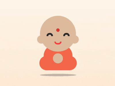
效果预览
按下右侧的“点击预览”按钮可以在当前页面预览,点击链接可以全屏预览。
https://codepen.io/comehope/pen/oMmYXp
可交互视频
此视频是可以交互的,你可以随时暂停视频,编辑视频中的代码。
请用 chrome, safari, edge 打开观看。
https://scrimba.com/p/pEgDAM/cydezCM
源代码下载
每日前端实战系列的全部源代码请从 github 下载:
https://github.com/comehope/front-end-daily-challenges
代码解读
定义 dom,容器中包含的几个元素分别代表头部、眼睛、嘴、身体和腿:
<div class="buddha">

    <div class="head"></div>

    <div class="eyes"></div>

    <span class="mouth"></span>

    <span class="body"></span>

    <span class="legs"></span>

    <span class="shadow"></span>

</div>
居中显示:
body {

    margin: 0;

    height: 100vh;

    display: flex;

    align-items: center;

    justify-content: center;

    background: linear-gradient(white, bisque);

}
定义容器尺寸、设置子元素水平居中对齐:
.buddha {

    width: 13em;

    height: 19em;

    font-size: 20px;

    border: 1px dashed black;

    display: flex;

    align-items: center;

    flex-direction: column;

    position: relative;

}
画出头部轮廓:
.head {

    width: 12.5em;

    height: 12.5em;

    color: peachpuff;

    background: currentColor;

    border-radius: 50%;

    filter: brightness(0.9);

}
用伪元素画出眼睛:
.eyes::before,

.eyes::after {

    content: '';

    position: absolute;

    width: 1em;

    height: 0.5em;

    border: 0.6em solid #333;

    border-radius: 1em 1em 0 0;

    border-bottom: none;

    top: 6em;

}

.eyes::before {

    left: 2.5em;

}

.eyes::after {

    right: 2.5em;

}
画出嘴巴:
.mouth {

    position: absolute;

    width: 1.5em;

    height: 0.5em;

    border: 0.5em solid tomato;

    border-radius: 0 0 1.5em 1.5em;

    border-top: none;

    top: 9em;

}
画出身体:
.body {

    position: absolute;

    width: 10em;

    height: 8em;

    background-color: coral;

    border-radius: 4em;

    bottom: 1em;

    z-index: -1;

}
画出腿:
.legs {

    position: absolute;

    width: inherit;

    height: 5em;

    background-color: coral;

    border-radius: 2.5em;

    bottom: 0;

    z-index: -1;

}
用阴影画出耳朵和手:
.head {

    box-shadow:

        5.8em 2em 0 -4.8em, /* ear right*/

        -5.8em 2em 0 -4.8em, /* ear left*/

        0 8.6em 0 -4.5em; /* hand */

}
用径向渐变画出眉心:
.head {

    background:

        radial-gradient(

            circle at 50% 40%,

            tomato 0.6em,

            transparent 0.6em

        ), /* circle between eyebrows */

        currentColor;

}
画出身体的阴影:
.shadow {

    position: absolute;

    width: inherit;

    height: 5em;

    background-color: rgba(0, 0, 0, 0.2);

    border-radius: 50%;

    bottom: -4em;

    transform: rotateX(100deg);

}
让小和尚上下浮动:
.buddha {

    animation: animate 3s ease-in-out infinite;

}

@keyframes animate {

    50% {

        transform: translateY(-2em);

    }

}
让阴影保持在固定位置,不随着人浮动:
.shadow {

    animation: shadow-animate 3s ease-in-out infinite;

}

@keyframes shadow-animate {

    50% {

        transform: rotateX(100deg) translateY(-10em) scale(0.7);

    }

}
大功告成!
最新文章
- SQL 删除索引错误
- [转]SQL Server字符串处理函数大全
- Mac上打开拷贝到移动硬盘里的文件提示“已经被osx使用不能打开”解决办法
- CentOS 6.4下安装Oracle 11gR2
- 配置文件后面的rc的由来
- Git教程之删除文件(8)
- OC中 block 的用法
- 用高德地图API 通过详细地址获得经纬度
- jquery $.each() 小探
- VS2008下编译boost_1_47_0
- iOS开发之UIPickerView
- jq常用操作
- CSS修改滚动条样式
- 电子商务(电销)平台中订单模块(Order)数据库设计明细(转)
- Linux Ubuntu 能PING IP但不能PING主机域名的解决方法
- BZOJ.2134.[国家集训队]单选错位(概率 递推)
- NVelocity语法常用指令
- 一个新人对HTML内JavaScript的理解
- OO学习体会与阶段总结(设计与实现)
- 何为session?