html元素height(width)是怎么确定的?
1.若height是确定的(比如height:100px),则height直接可确定(还受min-height,max-height影响,见height,min-height,max-heigth的作用机制问答)。
2.若width是不确定的(比如width: min-content 或 width:100px,min-width:fit-content),此时width受子元素影响 (height:100px,min-height:fit-content时heigth已确定就是100px,可以直接设置min-height:100px达到width:100px,min-height:fit-content的效果)
则依次确定每一个子元素的width,如果子元素的width可以由自己确定(比如子元素width写死了或者子元素width为min-content,max-content都能确定)则设置width为子元素width,如果子元素的width不能确定(比如写的width为100%,fit-content等需要确定外部元素高度的属性)则递归计算子元素的width,然后设置父元素width为最大宽度子元素的width,再用这个width去确定子元素中需要使用外部元素宽度来确定本身宽度的宽度。
看几个例子
1.父元素min-height: 100px,子元素height: 100%;
这个情况子元素最终高度为0。
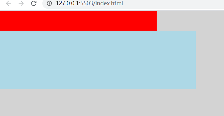
2.父元素width: 0;子元素1 width: 100%;子元素2 width: 100px.
这个情况子元素1最终宽度 100px;
3.
<!DOCTYPE html>

<html lang="en">

<head>

    <meta charset="UTF-8">

    <meta http-equiv="X-UA-Compatible" content="IE=edge">

    <meta name="viewport" content="width=device-width, initial-scale=1.0">

    <title>Document</title>

    <style>

        html, body {

            padding: 0;

            margin: 0;

            height: 100%;

            background: lightgray;

        }

        .container {

            width: 400px;

            height: 200px;

            min-width: fit-content;

        }

        .header {

            height: 50px;

            background: red;

        }

        .body {

            width: 500px;

            height: 150px;

            background: lightblue;

        }

    </style>

</head>

<body>

    <div class="container">

        <div class="header"></div>

        <div style="display: flex;height: 100%;">

            <div style="flex-grow: 1; width: 0">

                <div class="body">

                </div>

            </div>

        </div>

    </div>

</body>

</html>
这个例子中,flex-grow: 1; width: 0,这个元素已经确定了width,宽度确定就不会往他的子元素进行了,container元素再确定子元素宽度的时候会认为flex元素的宽度为0。最后的结果就是flex元素的最终宽度就是container的宽度而不会是body元素的宽度。
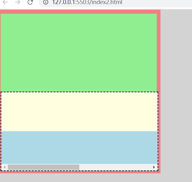
4.
<!DOCTYPE html>

<html lang="en">

<head>

    <meta charset="UTF-8">

    <meta http-equiv="X-UA-Compatible" content="IE=edge">

    <meta name="viewport" content="width=device-width, initial-scale=1.0">

    <title>Document</title>

    <style>

        html, body {

            padding: 0;

            margin: 0;

            height: 100%;

            background: lightgray;

        }

        .container {

            width: 400px;

            height: 400px;

            min-width: fit-content;

            padding: 10px;

            background: lightcoral;

        }

        .header {

            height: 200px;

            background: lightgreen;

        }

        .body {

            height: 200px;

            width: 100%;

            background: lightblue;

            overflow: auto;

        }

        .child {

            width: 800px;

            height: 100px;

            background: lightyellow;

        }

    </style>

</head>

<body>

    <div class="container">

        <div class="header"></div>

        <div class="body">

            <div class="child"></div>

        </div>

    </div>

</body>

</html>
这个例子body不会出现滚动条,因为container的width需要子元素来确定,body在第一轮计算最大宽度的时候递归到了child里面得出了结果800,就不需要开滚动条了。
要想让body在计算宽度的时候不受child影响,须在递归进入child之前确定body的宽度,办法就是例3里面的使用flex
<!DOCTYPE html>

<html lang="en">

<head>

    <meta charset="UTF-8">

    <meta http-equiv="X-UA-Compatible" content="IE=edge">

    <meta name="viewport" content="width=device-width, initial-scale=1.0">

    <title>Document</title>

    <style>

        html, body {

            padding: 0;

            margin: 0;

            height: 100%;

            background: lightgray;

        }

        .container {

            width: 400px;

            height: 400px;

            min-width: fit-content;

            padding: 10px;

            background: lightcoral;

        }

        .header {

            height: 200px;

            background: lightgreen;

        }

        .body {

            border: 2px dashed black;

            height: 200px;

            width: 100%;

            background: lightblue;

            overflow: auto;

        }

        .child {

            width: 800px;

            height: 100px;

            background: lightyellow;

        }

    </style>

</head>

<body>

    <div class="container">

        <div class="header"></div>

        <div class="flex" style="display: flex;height: 100%;">

            <div style="flex-grow: 1; width: 0">

                <div class="body">

                    <div class="child"></div>

                </div>

            </div>

        </div>

    </div>

</body>

</html>
最新文章
- Java性能调优之:idea变慢解决
- 前端scss的使用及gulp发布方式
- 【bzoj2120】 数颜色
- CentOS6.5 FTP配置
- 本博客迁移到Github,之后停止更新
- 如何通过PhpMyAdmin批量删除MYSQL数据库数据表
- [Irving]DateTime格式处理大全
- CentOS 6.5下Percona Xtrabackup的安装错误解决方案
- ThoughtWorks 面试
- Python朝花夕拾
- gradle 使用总结
- (转)Java并发编程:深入剖析ThreadLocal
- [整理]vimtutor章节小结
- Tell Me About Yourself - Best Answers and Examples
- SQL UPDATE with INNER JOIN
- sublime-text3打造markdown编辑器
- Python中DataFrame去重
- MyEclipse10.7安装Aptana后重启:An internal error has occurred. No more handles [Could not detect registered XULRunner to use]
- MyBatis代理开发(2)
- POJ 2785 4 Values whose Sum is 0(暴力枚举的优化策略)