[React] Recompose: Theme React Components Live with Context
SASS Bootstrap allows us to configure theme or branding variables that affect all components (e.g. Primary Color or Link Color). When we isolate our styles inside React components we lose the ability to theme them. To get round this we can put our theme variables on the context of our app and then read them from individual components in order to make styling decisions. Recompose allows us to create the helper functions we need to do this yielding concise, functional declarative UI components. These components will respond in real time to changes in the theme.
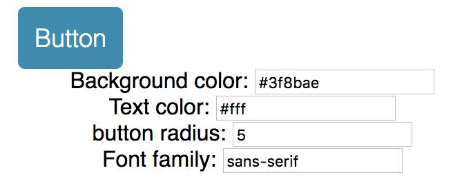
We have a default theme file:
export default {

    color: {

        keyColor: '#3f8bae',

        textLight: '#fff',

    },

    number: {

        buttonRadius: 5

    },

    string: {

        mainFontFamily: 'sans-serif'

    }

}
We want Component get defualt theme according to the file.
We will build an interface to update theme according to user input.
We can import theme file into the App.js compoent and pass down to the custom component. The problem is that, if we have hunders components, it is not ideal to passdown the props hundres times.
That's why we need context.
We can use 'recompose' to do that:
import React, { Component } from 'react';

import {compose, withState} from 'recompose';

import myDefaultTheme from './themes/default';

import Button from './components/Button';

class App extends Component {

    static childContextTypes = {

        theme: React.PropTypes.object

    };

    getChildContext() {

        return {theme: this.props.theme}

    }

    render() {

        const {theme, updateTheme} = this.props;

        return (

            <div className="App">

                <main className="container">

                    ...

                </main>

            </div>

        );

    }

}

const enhance = compose(

    withState('theme', 'updateTheme', myDefaultTheme)

);

export default enhance(App);
So for this part of code:
const enhance = compose(

    withState('theme', 'updateTheme', myDefaultTheme)

);
export default enhance(App);
We wrap our App component with 'enhance' to update component props.
widthState function: Passes two additional props to the base component: a state value, and a function to update that state value. so 'updateTheme' will take nextProps to udpate current props.
    static childContextTypes = {

        theme: React.PropTypes.object

    };

    getChildContext() {

        return {theme: this.props.theme}

    }
Those code helps us to pass 'theme' down to children components.
Also need to create a file called "hocs.js" which means high order component. This file contains reusable methods to update the custom component.
To get context from 'App.js', we need 'getContext' method form 'recompose':
export const getTheme = getContext({

                                       theme: PropTypes.shape({

                                                                  color: PropTypes.object,

                                                                  number: PropTypes.object,

                                                                  string: PropTypes.object

                                                              })

                                   });
We also need a 'themeStyle' method to update style:
export const themeStyle = mapThemeToStyle => mapProps(

    props => {

        const { theme, style } = props;

        return {

            ...props,

            style: [

                mapThemeToStyle(theme, props),

                style

            ]

        };

    }

);
It takes a updater function called 'mapThemeToStyle' which can map theme to style according to different components needs.
Now in the custom component, let compose those:
import React from 'react';

import {

    mapProps,

    compose,

    defaultProps,

    setDisplayName,

    componentFromProp

} from 'recompose';

import Radium from 'radium';

import {

    getTheme,

    themeStyle,

    addStyle

} from './hocs';

const mapThemeToStyle = ({

                            color,

                            number,

                            string

                         }) => {

    return {

        ...(color.keyColor &&

            {backgroundColor: color.keyColor} || {}

        ),

        color: color.textLight,

        borderRadius: number.buttonRadius,

        fontFamily: string.mainFontFamily

    };

};

const style = {

    backgroundColor: 'red',

    borderWidth: ,

    borderStyle: 'solid',

    boxSizing: 'border-box',

    fontFamily: 'sans-serif',

    fontSize: ,

    borderRadius: ,

    fontWeight: ,

    padding: ,

    verticalAlign: 'middle',

    whiteSpace: 'nowrap',

    color: 'white',

    alignItems: 'center',

    justifyContent: 'center',

    textDecoration: 'none',

    display: 'flex',

    flex: ,

    cursor: 'pointer',

    ':hover': {

        backgroundColor: 'purple'

    }

};

const enhance = compose(

    getTheme, // using the container's defined theme

    themeStyle(mapThemeToStyle), // apply the default theme to the component

    addStyle(style),

    setDisplayName('Button'),

    defaultProps({

        element: 'button'

                 }),

    Radium

);

export default enhance(componentFromProp('element'));
最新文章
- 学习笔记(二)——MVC扩展(渲染视图)
- appium依赖pom文件注解
- js无刷新上传文件
- WP8.1 侧边滑动Item
- JS代码判断字符串中有多少汉字【转】
- Android监听Home键
- google快捷键
- tomcat 简介
- ACM中常用的C/C++函数
- Apache 2.4.16、PHP5.6.11安装教程
- zf-关于<ww:iterator /> 标签中的<td /> 标签添加序号问题
- Zookeeper与Kafka集群搭建
- Html5 Canvas笔记(2)-Canvas绘图
- 你真的了解WebSocket吗?
- Visual Studio Code扩展:
- postgresql从timestamp(6)复制到timestamp(0),时间会变
- Puppet部署Nginx返代示例
- Python时间的简单使用
- Storm的部署
- logging日志模块,hashlib hash算法相关的库,
热门文章
- onWindowFocusChanged-屏幕焦点函数回调情况
- git 当出现 devirge 时,一个是commit的提交顺序不对
- Mine Vison base on VC++ and procilica Gige Vison SDK
- PatentTips - Use of multiple virtual machine monitors to handle privileged events
- android String 类型转换成UTF-8格式
- MySQL和Python交互
- Fiddler--功能简介
- 洛谷——P1774 最接近神的人_NOI导刊2010提高(02)
- iOS_04_学习ios开发的准备
- (嵌入式开发)移植最新uboot