CSS水平居中与垂直居中的方法
2024-10-19 09:51:41
一、水平居中
1、行内元素水平居中
在父元素里添加text-align:center即可。代码如下:
<style>

.container-1 {

        height: 50px;

        border: 2px solid grey;

        margin-bottom: 50px;

        /* 行内元素水平居中  */

        text-align: center;

    }

</style>

<div class="container-1">

        <span>this is item1</span>

</div>
效果图:

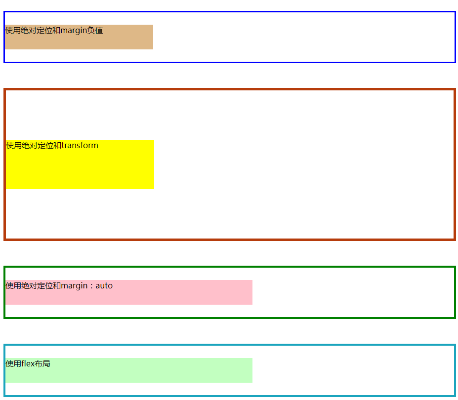
2、块级元素水平居中
(1)方法一:使用绝对定位和margin负值(缺点:若子元素宽高改变,margin值也要跟着改变)
(2)方法二:使用绝对定位和transform(缺点:存在兼容性问题)
(3)方法三:使用绝对定位和margin:auto(推荐)
(4)方法四:使用flex布局的justify-content:center(缺点:存在兼容性问题)
代码如下:


 1 <style>

 2 /* @块级元素水平居中方法: */

 3     /*  方法一:使用绝对定位和margin负值*/

 4     .container-2 {

 5         position: relative;

 6         height: 100px;

 7         border: 3px solid blue;

 8         margin-bottom: 50px;

 9     }

10

11     .item2 {

12         position: absolute;

13         height: 50px;

14         width: 300px;

15         left: 50%;

16        /* 向左平移宽度的一半 */

17         margin-left: -150px;

18         background-color: burlywood;

19     }

20

21     /* 方法二:使用绝对定位和transform */

22     .container-3 {

23         position: relative;

24         height: 200px;

25         border: 5px solid rgb(182, 60, 12);

26         margin-bottom: 50px;

27     }

28

29     .item3 {

30         position: absolute;

31         left: 50%;

32         /*水平方向向左平移自身宽度的50%*/

33         transform: translateX(-50%);

34         background-color: yellow;

35     }

36

37     /* 方法三:使用绝对定位和margin:auto*/

38     .container-4 {

39         position: relative;

40         height: 100px;

41         border: 4px solid green;

42         margin-bottom: 50px;

43     }

44

45     .item4 {

46         position: absolute;

47         left: 0%;

48         right: 0%;

49         height: 50px;

50         width: 500px;

51         background-color: pink;

52         /* 平分子元素左右的剩余空间 */

53         margin: auto;

54     }

55

56     /* 方法四:使用flex布局 */

57     .container-5 {

58         display: flex;

59         height: 100px;

60         border: 4px solid rgb(27, 164, 189);

61         margin-bottom: 50px;

62         /* 主轴方向默认为水平方向,使用justify-content实现居中对齐 */

63         justify-content: center;

64     }

65

66     .item5 {

67         height: 50px;

68         width: 500px;

69         background-color: rgb(194, 255, 192);

70     }

71 </style>

72 <div class="container-2">

73         <div class="item2">使用绝对定位和margin负值</div>

74 </div>

75 <div class="container-3">

76         <div class="item3">使用绝对定位和transform</div>

77 </div>

78 <div class="container-4">

79         <div class="item4">使用绝对定位和margin:auto</div>

80 </div>

81 <div class="container-5">

82         <div class="item5">使用flex布局</div>

83 </div>
效果图:

二、垂直居中
1、行内元素垂直居中
当line-hight等于height时,可实现行内元素垂直居中,代码如下:
 1 <style>

 2 .container-1 {

 3         height: 50px;

 4         border: 2px solid grey;

 5         margin-bottom: 50px;

 6         /* 行内元素水平垂直居中  */

 7         text-align: center;

 8         line-height: 50px;//行高与高相等可实现垂直居中

 9     }

10 </style>

11 <div class="container-1">

12         <span class="item1">this is item1</span>

13 </div>
效果图:

2、块级元素垂直居中
(1)方法一:使用绝对定位和margin负值(缺点:若子元素宽高改变,margin值也要跟着改变)
(2)方法二:使用绝对定位和transform(缺点:存在兼容性问题)
(3)方法三:使用绝对定位和margin:auto(推荐)
(4)方法四:使用flex布局,改变主轴方向为垂直方向再使用justify-content:center(缺点:存在兼容性问题)
代码如下:
<style>

 /* @块级元素垂直居中方法: */

    /*  方法一:使用绝对定位和margin负值*/

    .container-2 {

        position: relative;

        height: 100px;

        border: 3px solid blue;

        margin-bottom: 50px;

    }

    .item2 {

        position: absolute;

        height: 50px;

        width: 300px;

        top: 50%;

        /* 向上平移高度的一半 */

        margin-top: -25px;

        background-color: burlywood;

    }

    /* 方法二:使用绝对定位和transform */

    .container-3 {

        position: relative;

        height: 300px;

        border: 5px solid rgb(182, 60, 12);

        margin-bottom: 50px;

    }

    .item3 {

        position: absolute;

        height: 100px;

        width: 300px;

        top: 50%;

        /* 垂直方向向上平移自身高度的50% */

        transform: translateY(-50%);

        background-color: yellow;

    }

    /* 方法三:使用绝对定位和margin:auto*/

    .container-4 {

        position: relative;

        height: 100px;

        border: 4px solid green;

        margin-bottom: 50px;

    }

    .item4 {

        position: absolute;

        top: 0%;

        bottom: 0%;

        height: 50px;

        width: 500px;

        background-color: pink;

        /* 自动平分上下的剩余空间 */

        margin: auto;

    }

    /* 方法四:使用flex布局 */

    .container-5 {

        display: flex;

        height: 100px;

        border: 4px solid rgb(27, 164, 189);

        margin-bottom: 50px;

        /* 将主轴方向改为垂直方向 */

        flex-direction: column;

        /* 对齐方式对居中对齐 */

        justify-content: center;

    }

    .item5 {

        height: 50px;

        width: 500px;

        background-color: rgb(194, 255, 192);

    }

</style>

<div class="container-2">

        <div class="item2">使用绝对定位和margin负值</div>

</div>

<div class="container-3">

        <div class="item3">使用绝对定位和transform</div>

</div>

<div class="container-4">

        <div class="item4">使用绝对定位和margin:auto</div>

</div>

<div class="container-5">

        <div class="item5">使用flex布局</div>

</div>
效果图:
若想实现水平垂直居中,结合二者一起使用即可。
参考文档
https://www.jianshu.com/p/7bbc4860a45c
最新文章
- 【ORM】--FluentNHibernate之基本映射详解
- 使用spring提供的LocalSessionFactoryBean来得到SessionFactory
- iOS开发 Apple Pay
- MySql连接JDBC数据库------借鉴的红客联盟的
- 负margin在布局中的运用
- 小菜鸟学 MQ(三)
- Gumshoe - Microsoft Code Coverage Test Toolset
- mac端口占用查找进程并杀死
- MST(Kruskal’s Minimum Spanning Tree Algorithm)
- Android attrs.xml文件中属性类型format值的格式
- JavaScript模块化编程 - CommonJS, AMD 和 RequireJS之间的关系
- javascript Error对象详解
- TestNG并行测试
- 用Jmeter实现mysql数据库的增删查改
- 在 ASP.NET Core 中发送邮件遇到的坑_学习笔记
- wx小程序获取组件属性数据data-prop
- ZooKeeper安装,部署
- html5 web 摇一摇切换歌曲
- test命令详解
- SSD回归类物体检测