Android自定义控件 -- 带边框的TextView
使用xml实现边框
原来使用带边框的TextView时一般都是用XML定义来完成,在drawable目录中定义如下所示的xml文件:
<?xml version="1.0" encoding="utf-8"?>

<selector xmlns:android="http://schemas.android.com/apk/res/android">

    <!-- 点击状态下按钮背景样式 -->

    <item android:state_pressed="true">

        <shape android:shape="rectangle">

            <corners android:radius="2dp"/>

            <solid android:color="@android:color/transparent"/>

            <stroke android:width="1dp"

                    android:color="#ff48beab"/>

        </shape>

    </item>

    <!-- 正常点击状态下按钮背景样式 -->

    <item android:state_pressed="false">

        <shape android:shape="rectangle">

            <corners android:radius="2dp"/>

            <solid android:color="@android:color/transparent"/>

            <stroke android:width="1dp"

                    android:color="#ff48baab"/>

        </shape>

    </item>

</selector>
这样可以实现圆角边框,但颜色是固定的,如果需要在不同位置放置不同的TextView(比如多种颜色的按钮),那么就要定义多个颜色不同的XML文件。
自定义带边框的TextView
最近在做项目时遇到多种颜色的标签需求,如果还是按照上面的做法,那么需要多套XML文件配合,于是我想了一下,能不能自定义一个控件,让边框颜色在使用时指定。
在项目的设计图中主要是用于一些标签,如下图所示:

接下来我就尝试了一下,发现是可行的,于是就有了下面这个自定义,在个人项目中基本够用。
这个控件是继承自TextView的,只是在onDraw方法中画了一个边框,并设计了几个自定义属性用来更灵活地控制控件。
自定义属性如下:
<declare-styleable name="BorderTextView">

    <attr name="strokeWidth" format="dimension"/>

    <attr name="cornerRadius" format="dimension"/>

    <attr name="strokeColor" format="color"/>

    <attr name="followTextColor" format="boolean"/>

</declare-styleable>
这几个属性简要解释如下:
- strokeWidth
边框的宽度,默认为1dp - cornerRadius
圆角半径,默认为2dp - strokeColor
边框颜色,默认是没有边框即颜色为Color.TRANSPARENT - followTextColor
边框是否跟随文字颜色,默认是true
自定义控件代码(BorderTextView ):
package com.witmoon.eab.widget;

import android.content.Context;

import android.content.res.TypedArray;

import android.graphics.Canvas;

import android.graphics.Color;

import android.graphics.Paint;

import android.graphics.RectF;

import android.support.annotation.NonNull;

import android.util.AttributeSet;

import android.util.DisplayMetrics;

import android.util.TypedValue;

import android.widget.TextView;

import com.witmoon.eab.R;

/**

 * 用于作为标签显示的TextView

 * 边框默认与文字颜色一致

 * Created by chuxin on 2015/9/11.

 */

public class BorderTextView extends TextView {

    public static final float DEFAULT_STROKE_WIDTH = 1.0f;    // 默认边框宽度, 1dp

    public static final float DEFAULT_CORNER_RADIUS = 2.0f;   // 默认圆角半径, 2dp

    public static final float DEFAULT_LR_PADDING = 6f;      // 默认左右内边距

    public static final float DEFAULT_TB_PADDING = 2f;      // 默认上下内边距

    private int strokeWidth;    // 边框线宽

    private int strokeColor;    // 边框颜色

    private int cornerRadius;   // 圆角半径

    private boolean mFollowTextColor; // 边框颜色是否跟随文字颜色

    private Paint mPaint = new Paint();     // 画边框所使用画笔对象

    private RectF mRectF;                   // 画边框要使用的矩形

    public BorderTextView(Context context) {

        this(context, null);

    }

    public BorderTextView(Context context, AttributeSet attrs) {

        this(context, attrs, );

    }

    public BorderTextView(Context context, AttributeSet attrs, int defStyleAttr) {

        super(context, attrs, defStyleAttr);

        // 将DIP单位默认值转为PX

        DisplayMetrics displayMetrics = context.getResources().getDisplayMetrics();

        strokeWidth = (int) TypedValue.applyDimension(TypedValue.COMPLEX_UNIT_DIP,

                DEFAULT_STROKE_WIDTH, displayMetrics);

        cornerRadius = (int) TypedValue.applyDimension(TypedValue.COMPLEX_UNIT_DIP,

                DEFAULT_CORNER_RADIUS, displayMetrics);

        // 读取属性值

        TypedArray ta = context.obtainStyledAttributes(attrs, R.styleable.BorderTextView);

        strokeWidth = ta.getDimensionPixelSize(R.styleable.BorderTextView_strokeWidth, strokeWidth);

        cornerRadius = ta.getDimensionPixelSize(R.styleable.BorderTextView_cornerRadius, cornerRadius);

        strokeColor = ta.getColor(R.styleable.BorderTextView_strokeColor, Color.TRANSPARENT);

        mFollowTextColor = ta.getBoolean(R.styleable.BorderTextView_followTextColor, true);

        ta.recycle();

        mRectF = new RectF();

        // 边框默认颜色与文字颜色一致

//        if (strokeColor == Color.TRANSPARENT)

//            strokeColor = getCurrentTextColor();

        // 如果使用时没有设置内边距, 设置默认边距

        int paddingLeft = getPaddingLeft() ==  ? (int) TypedValue.applyDimension(

                TypedValue.COMPLEX_UNIT_DIP, DEFAULT_LR_PADDING, displayMetrics) : getPaddingLeft();

        int paddingRight = getPaddingRight() ==  ? (int) TypedValue.applyDimension(

                TypedValue.COMPLEX_UNIT_DIP, DEFAULT_LR_PADDING,

                displayMetrics) : getPaddingRight();

        int paddingTop = getPaddingTop() ==  ? (int) TypedValue.applyDimension(

                TypedValue.COMPLEX_UNIT_DIP, DEFAULT_TB_PADDING, displayMetrics) : getPaddingTop();

        int paddingBottom = getPaddingBottom() ==  ? (int) TypedValue.applyDimension(

                TypedValue.COMPLEX_UNIT_DIP, DEFAULT_TB_PADDING,

                displayMetrics) : getPaddingBottom();

        setPadding(paddingLeft, paddingTop, paddingRight, paddingBottom);

    }

    @Override

    protected void onDraw(@NonNull Canvas canvas) {

        super.onDraw(canvas);

        mPaint.setStyle(Paint.Style.STROKE);     // 空心效果

        mPaint.setAntiAlias(true);               // 设置画笔为无锯齿

        mPaint.setStrokeWidth(strokeWidth);      // 线宽

        // 设置边框线的颜色, 如果声明为边框跟随文字颜色且当前边框颜色与文字颜色不同时重新设置边框颜色

        if (mFollowTextColor && strokeColor != getCurrentTextColor())

            strokeColor = getCurrentTextColor();

        mPaint.setColor(strokeColor);

        // 画空心圆角矩形

        mRectF.left = mRectF.top = 0.5f * strokeWidth;

        mRectF.right = getMeasuredWidth() - strokeWidth;

        mRectF.bottom = getMeasuredHeight() - strokeWidth;

        canvas.drawRoundRect(mRectF, cornerRadius, cornerRadius, mPaint);

    }

}
代码中的注释也比较详细了,而且也非常简单,因此这里应该不需要赘述。唯一需要注意的是在画边框时使用的RectF尺寸,如果边框宽度较宽,由于Paint笔触是在边框中线为准,因此如果左上角指定为(0,0)话,会有一半边框宽度的线是画在不见区域的;这里指定左上角坐标为 0.5f * strokeWidth(即半个边框宽度)即可,右下角也需要作同样的考虑。
使用
自定义控件的使用就更简单了,这里我没有设置自定义属性,一切采用默认值:
<com.witmoon.eab.widget.BorderTextView

    android:layout_width="wrap_content"

    android:layout_height="wrap_content"

    android:text="身份验证"

    android:textColor="@color/tag_text_blue"/>
展示效果如下图所示:
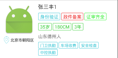
基本上满足要求。
作为按钮使用
在某些时候,我们可能会需要一些这种中间镂空的按钮,BorderTextView也可以用在这种情况下,下面是个例子。
首先在values目录中新建一个colors目录,在其中创建一个xml文件(button_text_color.xml),内容如下
<?xml version="1.0" encoding="utf-8"?>

<selector xmlns:android="http://schemas.android.com/apk/res/android">

    <item android:color="@color/secondary_text" android:state_pressed="true"/>

    <item android:color="@color/hint_text" android:state_enabled="false"/>

    <item android:color="@color/primary_text"/>

</selector>
其实是为按钮在不同状态下指定不同的颜色,以响应点击或禁用操作,增加用户体验。
<com.witmoon.eab.widget.BorderTextView

    android:id="@+id/retrieve_check_code_again"

    android:layout_width="wrap_content"

    android:layout_height="wrap_content"

    android:paddingBottom="6dp"

    android:enabled="false"

    android:textColor="@color/button_text_color"

    android:paddingTop="6dp"

    android:text="重新发送"/>
由于默认情况下边框是跟随文字颜色的,因此在被点击或者禁用时TextView会重新绘制,边框也随之改变颜色。
最新文章
- 你好,欢迎来到我的博客,我是博主royalmice
- 一些C#实用的方法汇总
- SP2013 SP1(kb28805502)补丁安装测试初体验
- hibernate中get,load,list,iterate的用法及比较
- winrt组件库(包括翻书组件)
- C# winform的WebBrowser非常规编程(强烈推荐)
- Windows Server 2008 Workstation Converter优化设置
- Android ant自动打包 crunch 报错
- c# winform 关于DataGridView的一些操作(很全,绝对够用)
- Laravel Eloquent 的条件不等于
- hdu 逆袭指数
- oracle调用array参数存储过程
- Dynamics 365 for CRM:修改ADFS的过期时间,TokenLifetime
- 博弈论中的Nim博弈
- sqlserver(查看被锁进程)
- childNodes遍历DOM节点树
- 关于游览器 cookie的操作类
- battery for stm32
- Datatables js 复杂表头 合并单元格
- asp.net错误记录