CSS常用布局整理
2024-08-24 12:03:43
固定宽度布局
1-2-1布局(浮动)
<html xmlns="http://www.w3.org/1999/xhtml">

<head>

<title>固定宽度-float</title>

<style type="text/css">

#header,#footer,#container{

    width: 760px;

    margin: 0 auto;

}

#content {

    float: left;

    width: 500px;

    background: #d5ddf3;

}

#side {

    float: left;

    width: 260px;

    background: #d2d8de;

}

#footer {

    clear: both;

    background: #d5ddf3;

}

</style>

</head>

<body>

    <h2>Page Header</h2>

</div>

<div id="container">

    <div id="content">

        <h2>Page Content 1</h2>

        <p>This is content.This is content.This is content.This is content.This is content.This is content.This is content.This is content.This is content.This is content.This is content.This is content.This is content.This is content.This is content.This is content.This is content.This is content.This is content.This is content.This is content.</p>

    </div>

    <div id="side">

        <h2>Side Bar 1</h2>

        <p>This is side.This is side.This is side.This is side.This is side.This is side.This is side.This is side.</p>

    </div>

</div>

<div id="footer">

        <h2>Page Footer</h2>

</div>

</body>

</html>
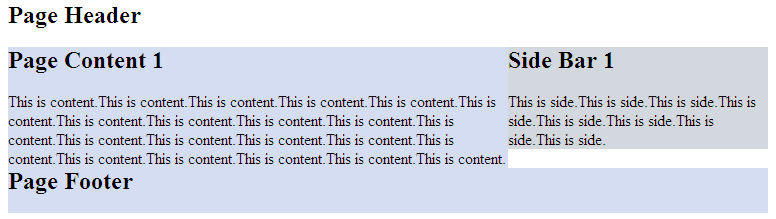
效果图:

正中间的两个div都浮动起来,且包含块的宽度是固定值。Footer清除浮动防止浮动块覆盖。
1-2-1布局(绝对定位)
<html xmlns="http://www.w3.org/1999/xhtml">

<head>

<title>固定宽度-absolute</title>

<style type="text/css">

#header,#footer,#container{

    width: 760px;

    margin: 0 auto;

}

#container{

    position:relative;

}

#content {

    width: 500px;

    margin-right:260px;

    background: #d5ddf3;

}

#side {

    position:absolute;

    top:0;

    right:0;

    width: 260px;

    background: #d2d8de;

}

#footer {

    background: #d5ddf3;

}

</style>

</head>

<body>

    <h2>Page Header</h2>

</div>

<div id="container">

    <div id="content">

        <h2>Page Content 1</h2>

        <p>This is content.This is content.This is content.This is content.This is content.This is content.This is content.This is content.This is content.This is content.This is content.This is content.This is content.This is content.This is content.This is content.This is content.This is content.This is content.This is content.This is content.</p>

    </div>

    <div id="side">

        <h2>Side Bar 1</h2>

        <p>This is side.This is side.This is side.This is side.This is side.This is side.This is side.This is side.</p>

    </div>

</div>

<div id="footer">

        <h2>Page Footer</h2>

</div>

</body>

</html>
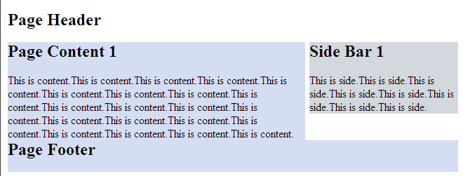
效果图:
但是有一点要注意,由于用绝对定位的块脱离的文档流,当绝对定位块高度小于旁边块高度的时候,会与其他块重叠。
流式布局
<html xmlns="http://www.w3.org/1999/xhtml">

<head>

<title>float</title>

<style type="text/css">

#header,#footer,#container{

    width: 85%;

    margin:0 auto;

}

#content {

    float:left;

    width: 66%;

    background: #d5ddf3;

}

#side {

    float:right;

    width: 33%;

    background: #d2d8de;

}

#footer {

    cleat:both;

    background: #d5ddf3;

}

</style>

</head>

<body>

<div id="header">

    <h2>Page Header</h2>

</div>

<div id="container">

    <div id="content">

        <h2>Page Content 1</h2>

        <p>This is content.This is content.This is content.This is content.This is content.This is content.This is content.This is content.This is content.This is content.This is content.This is content.This is content.This is content.This is content.This is content.This is content.This is content.This is content.This is content.This is content.</p>

    </div>

    <div id="side">

        <h2>Side Bar 1</h2>

        <p>This is side.This is side.This is side.This is side.This is side.This is side.This is side.This is side.</p>

    </div>

</div>

<div id="footer">

        <h2>Page Footer</h2>

</div>

</body>

</html>
效果图:
注意:确保不要使得某列的宽度太大。
另外,百分比布局经常会结合min-width和max-width使用。
最新文章
- LNMP虚拟机开发环境配置--vagrant+virtualbox+ubuntu14.04
- python之面向对象与构造函数
- POJ3107Godfather[树形DP 树的重心]
- live555库中的testRTSPClient实例
- 模拟赛1103d1
- 【spring bean】 spring中bean之间的引用以及内部bean
- IO中同步、异步与阻塞、非阻塞的区别
- CentOS6设置密码过期时间
- 转!mysql 查询 distinct多个字段 注意!!
- JVM-并发-线程安全与锁优化
- [已解决]EnvironmentError: mysql_config not found
- 计算几何--求凸包模板--Graham算法--poj 1113
- 李洪强iOS开发之OC语言类的深入和分类
- POJ 2488 A Knight's Journey
- nyoj 119 士兵杀敌(三)【线段树区间最大值最小值差】
- Ftp不能登陆的解决方法
- MiniSD卡是什么
- Ubuntu14.04搭建android开发环境
- ASP.NET 5- 1
- 【Zookeeper】源码之序列化