python 数据可视化 -- matplotlib02
2024-10-19 11:44:12
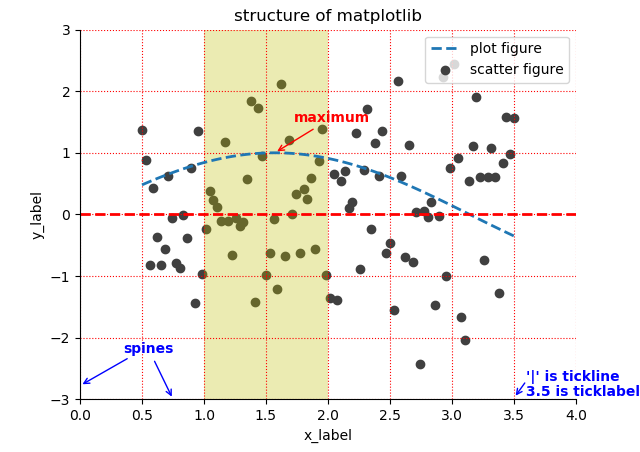
import matplotlib.pyplot as plt

import numpy as np

x = np.linspace(start=0.5, stop=3.5, num=100)

y = np.sin(x)

y1 = np.random.randn(100)

plt.scatter(x, y1, c='0.25', label='scatter figure')

plt.plot(x, y, ls='--', lw=2, label='plot figure')

for spine in plt.gca().spines.keys():

    if spine == 'top' or spine == 'right':

        plt.gca().spines[spine].set_color('none')

plt.gca().xaxis.set_ticks_position('bottom')

plt.gca().yaxis.set_ticks_position('left')

plt.xlim(left=0.0, right=4.0)

plt.ylim(bottom=-3.0, top=3.0)

plt.xlabel('x_label')

plt.ylabel('y_label')

plt.grid(True, ls=':', color='r')

plt.axhline(y=0.0, c='r', ls='--', lw=2)

plt.axvspan(xmin=1.0, xmax=2.0, facecolor='y', alpha=0.3)

plt.annotate('maximum', xy=(np.pi/2, 1.0), xytext=((np.pi/2)+0.15, 1.5), weight='bold', color='r', arrowprops=dict(arrowstyle='->', connectionstyle='arc3', color='r'))

plt.annotate('spines', xy=(0.75, -3), xytext=(0.35, -2.25), weight='bold', color='b', arrowprops=dict(arrowstyle='->', connectionstyle='arc3', color='b'))

plt.annotate('', xy=(0, -2.78), xytext=(0.4, -2.32), arrowprops=dict(arrowstyle='->', connectionstyle='arc3', color='b'))

plt.annotate('', xy=(3.5, -2.98), xytext=(3.6, -2.7), arrowprops=dict(arrowstyle='->', connectionstyle='arc3', color='b'))

plt.text(3.6, -2.7, "'|' is tickline", weight='bold', color='b')

plt.text(3.6, -2.95, '3.5 is ticklabel', weight='bold', color='b')

plt.title('structure of matplotlib')

plt.legend(loc='upper right')

plt.show()
最新文章
- Thinking in BigData 系列
- Timeline Portfolio - 时间轴作品集效果
- Project Euler 84:Monopoly odds 大富翁几率
- noip 2005 等价表达式
- c#打印记忆功能
- oracle去除字符串中间的空格
- docs/pcs/rest/file data apis list - 百度开发者中心
- jspl零散知识点
- PHPCMS v9 列表页实现文件下砸
- Jenkins的安装与系统配置
- nginx 日志分割(简单、全面)
- Core ML 机器学习
- ZooKeeper源码分析-Jute-第一部分
- JFile的导入xlsx与xls
- (五十八)NSObject实现多线程、自动释放池的补充
- Linux用过的命令集合
- Java多线程系列1 线程创建以及状态切换
- [福大2018高级软工教学]团队Alpha阶段成绩汇总
- func 的参数修饰
- java 異常抛出 throw 與 return