day27-2 pandas模块
2024-09-08 15:58:57
matplotlib
- 图形可视化,主要用来画图
- 别问,问就是看不懂
尚
折线图
# 一般使用下面的这个语句,设置字体编码

plt.rcParams['font.sans-serif'] = ['SimHei']

plt.rcParams['axes.unicode_minus'] = False
# cmd命令行用ipython也可以执行这些代码

x = [10,2,3]

y = [11,23,10]

plt.title('标题', fontsize=20, color='red')

plt.ylabel('y轴', fontsize=20, color='green')

plt.xlabel('x轴', fontsize=20)

# plt.plot(x, y, linestyle=':', marker='v')   #### 画折线图

plt.plot(x, y,'--v' )

plt.show()
柱状图
- 豆瓣电影数据为例,画出需求图
movies  = pd.read_csv('douban_movie.csv')

movies.head()
| 名字 | 投票人数 | 类型 | 产地 | 上映时间 | 时长 | 年代 | 评分 | 首映地点 | |
|---|---|---|---|---|---|---|---|---|---|
| 0 | 肖申克的救赎 | 692795.0 | 剧情/犯罪 | 美国 | 1994-09-10 00:00:00 | 142 | 1994 | 9.6 | 多伦多电影节 |
| 1 | 控方证人 | 42995.0 | 剧情/悬疑/犯罪 | 美国 | 1957-12-17 00:00:00 | 116 | 1957 | 9.5 | 美国 |
| 2 | 美丽人生 | 327855.0 | 剧情/喜剧/爱情 | 意大利 | 1997-12-20 00:00:00 | 116 | 1997 | 9.5 | 意大利 |
| 3 | 阿甘正传 | 580897.0 | 剧情/爱情 | 美国 | 1994-06-23 00:00:00 | 142 | 1994 | 9.4 | 洛杉矶首映 |
| 4 | 霸王别姬 | 478523.0 | 剧情/爱情/同性 | 中国大陆 | 1993-01-01 00:00:00 | 171 | 1993 | 9.4 | 香港 |
画出各个国家或者地区电影的数量
res = movies.groupby('产地').size().sort_values(ascending=False)	# 根据产地分组,降序显示数量

x = res.index

y = res.values

plt.figure(figsize=(20,6))	# 设置画布大小

plt.title('各个国家或者地区电影的数量', fontsize=20, color='red')	# 设置标题

plt.xlabel('产地', fontsize=20)	# x轴标题

plt.ylabel('数量', fontsize=18)	# y轴标题

plt.xticks(fontsize=15, rotation=45)	# x轴刻度,rotation代表旋转多少度

for a, b in zip(x, y):

    # text就是写值,a,b+100是代表写的做表,b是代表要写的值,horizontalalignment代表些的位置

    plt.text(a,b+100, b, fontsize=15, horizontalalignment='center')

plt.bar(x, y)	# bar代表柱状图

plt.show()

plt.savefig('a.jpg')	# 保存
饼状图
- 根据电影的长度绘制饼图
cut方法
pd.cut( np.array([0.2, 1.4, 2.5, 6.2, 9.7, 2.1]), [1,2,3] ) # 判断值是否在(1,2] (2,3]区间中
[NaN, (1.0, 2.0], (2.0, 3.0], NaN, NaN, (2.0, 3.0]]

Categories (2, interval[int64]): [(1, 2] < (2, 3]]
df = movies.head()

df
| 名字 | 投票人数 | 类型 | 产地 | 上映时间 | 时长 | 年代 | 评分 | 首映地点 | |
|---|---|---|---|---|---|---|---|---|---|
| 0 | 肖申克的救赎 | 692795.0 | 剧情/犯罪 | 美国 | 1994-09-10 00:00:00 | 142 | 1994 | 9.6 | 多伦多电影节 |
| 1 | 控方证人 | 42995.0 | 剧情/悬疑/犯罪 | 美国 | 1957-12-17 00:00:00 | 116 | 1957 | 9.5 | 美国 |
| 2 | 美丽人生 | 327855.0 | 剧情/喜剧/爱情 | 意大利 | 1997-12-20 00:00:00 | 116 | 1997 | 9.5 | 意大利 |
| 3 | 阿甘正传 | 580897.0 | 剧情/爱情 | 美国 | 1994-06-23 00:00:00 | 142 | 1994 | 9.4 | 洛杉矶首映 |
| 4 | 霸王别姬 | 478523.0 | 剧情/爱情/同性 | 中国大陆 | 1993-01-01 00:00:00 | 171 | 1993 | 9.4 | 香港 |
s = np.array(df['时长'])

'8U' in s	# 垃圾数据

np.where('8U' == s)
(array([31644], dtype=int64),)
'12J' in s

np.where('12J' ==  s)
(array([32948], dtype=int64),)
s = np.delete(s, 31644, axis=0)

s = np.delete(s, 32947, axis=0)	# 删了就会少一行

np.where('12J' == s)
(array([], dtype=int64),)
data = pd.cut(s.astype('float'), [0,60,90,110,1000]).value_counts()	# astype:强制转换

data
(0, 60]        10323

(60, 90]        7727

(90, 110]      13233

(110, 1000]     7449

dtype: int64
x = data.index

y = data.values

plt.figure(figsize=(10,6))

plt.title('电影时长分布图')

patchs, l_text, p_text = plt.pie(y, labels=x, autopct='%0.2f%%', colors='bgry')	# pie画饼图

for i in p_text:

    i.set_size(15)

    i.set_color('w')

for l in l_text:

    l.set_size(20)

    l.set_color('r')

plt.show()
NICK
条形图
import matplotlib.pyplot as plt
# 只识别英语,所以通过以下两行增加中文字体
from matplotlib.font_manager import FontProperties
# 字体路径根据电脑而定
font = FontProperties(fname='M:\STKAITI.TTF')
# jupyter 默认不显示图片,通过这一行告诉他显示
%matplotlib inline
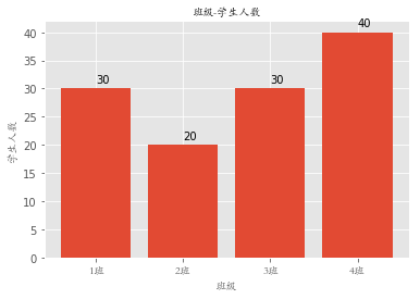
classes = ['1班', '2班', '3班', '4班'] # 相当于columns
student_amounts = [30, 20, 30, 40] # 值
classes_index = range(len(classes)) # [0, 1, 2, 3]
plt.bar(classes_index, student_amounts)
plt.xticks(classes_index, classes, FontProperties=font)
for ind,student_amount in enumerate(student_amounts):
print(ind,student_amount)
plt.text(ind,student_amount+1,student_amount)
plt.xlabel('班级', FontProperties=font)
plt.ylabel('学生人数', FontProperties=font)
plt.title('班级-学生人数', FontProperties=font)
plt.show()
0 30

1 20

2 30

3 40
直方图
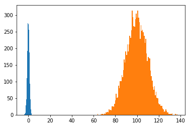
import numpy as np

import matplotlib.pyplot as plt

from matplotlib.font_manager import FontProperties

%matplotlib inline

font = FontProperties(fname='M:\STKAITI.TTF')

mu1, mu2, sigma = 50, 100, 10

x1 = mu2 + sigma * np.random.randn(10000)

print(x1)
[ 93.49947877  86.87378653  98.0194217  ... 108.33555519  90.58512015

 102.19048574]
x1 = np.random.randn(10000)

print(x1)
[ 0.85927045 -0.8061112   1.30878058 ... -0.32700199 -0.67669564

  0.25750884]
x2 = mu2 + sigma*np.random.randn(10000)

print(x2)
[101.62589858 109.86489987 117.41374105 ...  97.52364544 107.21076273

  99.56765772]
plt.hist(x1, bins=100)

plt.hist(x2, bins=100)

plt.show()
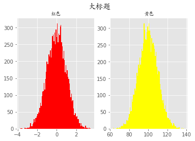
plt.style.use('ggplot')

fig = plt.figure()

# 相当于把一整块画板分成了1行2列的两个画板

ax1 = fig.add_subplot(121)

ax1.hist(x1, bins=100, color='red')

ax1.set_title('红色', fontproperties=font)

ax2 = fig.add_subplot(122)

ax2.hist(x2, bins=100, color='yellow')

ax2.set_title('黄色', fontproperties=font)

fig.suptitle('大标题', fontproperties=font, fontsize=15, weight='bold')

plt.show()
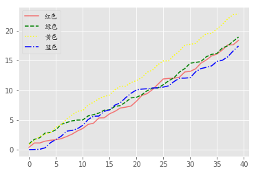
折线图
import numpy as np

import matplotlib.pyplot as plt

from matplotlib.font_manager import FontProperties

%matplotlib inline

font = FontProperties(fname='M:\STKAITI.TTF')
plt.style.use('ggplot')

np.random.seed(1)

data1 = np.random.rand(40).cumsum()

data2 = np.random.rand(40).cumsum()

data3 = np.random.rand(40).cumsum()

data4 = np.random.rand(40).cumsum()
plt.plot(data1, color='r', linestyle='-', alpha=0.5, label='红色')

plt.plot(data2, color='green', linestyle='--', label='绿色')

plt.plot(data3, color='yellow', linestyle=':', label='黄色')

plt.plot(data4, color='blue', linestyle='-.', label='蓝色')

plt.legend(prop=font)

plt.show()
arr = np.array([1, 2, 3, 4])

arr.cumsum()#   1,1+2,1+2+3,1+2+3+4
array([ 1, 3, 6, 10], dtype=int32)
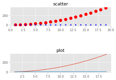
散点图
import numpy as np

import matplotlib.pyplot as plt

from matplotlib.font_manager import FontProperties

%matplotlib inline

font = FontProperties(fname='M:\STKAITI.TTF')
x = np.arange(1, 20)

x
array([ 1,  2,  3,  4,  5,  6,  7,  8,  9, 10, 11, 12, 13, 14, 15, 16, 17,

       18, 19])
y_linear = x**2

y_linear
array([  1,   4,   9,  16,  25,  36,  49,  64,  81, 100, 121, 144, 169,

       196, 225, 256, 289, 324, 361], dtype=int32)
y_log = np.log(x)

y_log
array([0.        , 0.69314718, 1.09861229, 1.38629436, 1.60943791,

       1.79175947, 1.94591015, 2.07944154, 2.19722458, 2.30258509,

       2.39789527, 2.48490665, 2.56494936, 2.63905733, 2.7080502 ,

       2.77258872, 2.83321334, 2.89037176, 2.94443898])
fig = plt.figure()

ax1 = fig.add_subplot(311)

ax1.scatter(x, y_linear, color='red', marker='o', s=100)

ax1.scatter(x, y_log, color='blue', marker='*', s=30)

ax1.set_title('scatter')

ax2 = fig.add_subplot(313)

ax2.plot(x, y_linear)

ax2.plot(x, y_log)

ax2.set_title('plot')

plt.plot

plt.show()
最新文章
- 最全面的百度地图JavaScript离线版开发
- python3 -pip
- Linux 文件操作监控inotify功能及实现原理【转】
- php 运行脚本shell
- VC++6.0MFC运行的简单流程
- python import其他文件夹下的模块
- 在ios下提示“@synthesize of ‘weak’ property is only allowed in ARC or GC mode”
- dubbo源码之三-模块依赖
- redmine后台运行命令
- Ext的正则表达式
- MacOS10.9获取Android源码不完全笔记(2014)
- [Java][20160707]Java语言介绍
- HID class request.
- 关于jQuery表单校验
- 自适应滤波:奇异值分解SVD
- 1.C和C++区别,以及const分析
- Qt QLabel 大小随内容自动变化 && 内容填充整个label空间
- Python 多线程的程序不结束多进程的程序不结束的区别
- 《梦断代码》Scott Rosenberg著(二)
- 解决python-memcache报错:“Unknown flags on get: 20”