Responsive Design in 3 Steps
Responsive web design is no doubt a big thing now. If you still not familiar with responsive design, check out the list of responsive sites that I recently posted. To newbies, responsive designmight sound a bit complicated, but it is actually simpler than you think. To help you quickly get started with responsive design, I've put together a quick tutorial. I promise you can learn about the basic logic of responsive design and media queries in 3 steps (assuming you have the basic CSS knowledge).
Step 1. Meta Tag (view demo)
Most mobile browsers scale HTML pages to a wide viewport width so it fits on the screen. You can use the viewport meta tag to reset this. The viewport tag below tells the browser to use the device width as the viewport width and disable the initial scale. Include this meta tag in the <head>.
<meta name="viewport" content="width=device-width, initial-scale=1.0">
Internet Explorer 8 or older doesn't support media query. You can use media-queries.jsor respond.js to add media query support in IE.
<!--[if lt IE 9]>

	<script src="http://css3-mediaqueries-js.googlecode.com/svn/trunk/css3-mediaqueries.js"></script>

<![endif]-->
Step 2. HTML Structure
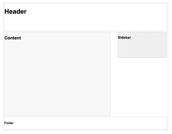
In this example, I have a basic page layout with a header, content container, sidebar, and a footer. The header has a fixed height 180px, content container is 600px wide and sidebar is 300px wide.
Step 3. Media Queries
CSS3 media query is the trick for responsive design. It is like writing if conditions to tell the browser how to render the page for specified viewport width.
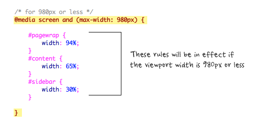
The following set of rules will be in effect if the viewport width is 980px or less. Basically, I set all the container width from pixel value to percentage value so the containers will become fluid.
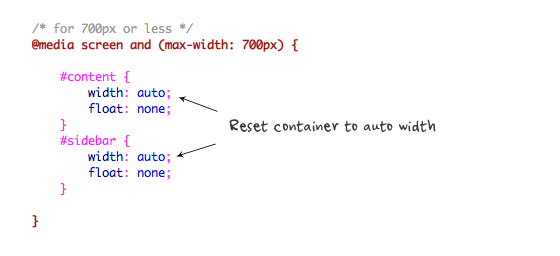
Then for viewport 700px or less, specify the #content and #sidebar to auto width and remove the float so they will display as full width.
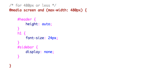
For 480px or less (mobile screen), reset the #header height to auto, change the h1 font size to 24px and hide the #sidebar.
You can write as many media query as you like. I've only shown 3 media queries in my demo. The purpose of the media queries is to apply different CSS rules to achieve different layouts for specified viewport width. The media queries can be in the same stylesheet or in a separate file.
Conclusion
This tutorial is intended to show you the basics of responsive design. If you want more in-depth tutorial, check out my previous tutorial: Responsive Design With Media Queries.
最新文章
- .NET开源项目
- chrome 插件 vimium 像操作vim一样的操作浏览器
- 在虚拟机中安装Ubuntu Server 15.04
- 定时自动启动任务crontab命令用法
- nsight 初级使用指南
- ***微信浏览器禁止app下载链接怎么办
- 为iOS 7而开发 并支持iOS 6
- HTML介绍JS
- ssl通信c实现
- Python Trick
- 【BZOJ2816】【ZJOI2012】网络(Link-Cut Tree)
- 《Java编程思想》读书笔记-赋值操作符
- java字符流操作flush()方法及其注意事项
- Cookie-parser
- GlusterFS配置及使用
- DPI 计算及速查表
- Examples of Scikit-learn Usages
- [转帖]win10 .Net Runtime Optimization Service占用大量CPU资源解决方法
- OAuth2.0网页授权 提示未关注该测试号
- 基于springboot跟poi封装的最便捷的excel导出