THE R QGRAPH PACKAGE: USING R TO VISUALIZE COMPLEX RELATIONSHIPS AMONG VARIABLES IN A LARGE DATASET, PART ONE
The R qgraph Package: Using R to Visualize Complex Relationships Among Variables in a Large Dataset, Part One
A Tutorial by D. M. Wiig, Professor of Political Science, Grand View University
In my most recent tutorials I have discussed the use of the tabplot()package to visualize multivariate mixed data types in large datasets. This type of table display is a handy way to identify possible relationships among variables, but is limited in terms of interpretation and the number of variables that can be meaningfully displayed.
Social science research projects often start out with many potential independent predictor variables for a given dependant variable. If these variables are all measured at the interval or ratio level a correlation matrix often serves as a starting point to begin analyzing relationships among variables.
In this tutorial I will use the R packages SemiPar, qgraph and Hmisc in addition to the basic packages loaded when R is started. The code is as follows:
###################################################
#data from package SemiPar; dataset milan.mort
#dataset has 3652 cases and 9 vars
##################################################
install.packages(“SemiPar”)
install.packages(“Hmisc”)
install.packages(“qgraph”)
library(SemiPar)
####################################################
One of the datasets contained in the SemiPar packages is milan.mort. This dataset contains nine variables and data from 3652 consecutive days for the city of Milan, Italy. The nine variables in the dataset are as follows:
rel.humid (relative humidity)
tot.mort (total number of deaths)
resp.mort (total number of respiratory deaths)
SO2 (measure of sulphur dioxide level in ambient air)
TSP (total suspended particles in ambient air)
day.num (number of days since 31st December, 1979)
day.of.week (1=Monday; 2=Tuesday; 3=Wednesday; 4=Thursday; 5=Friday; 6=Saturday; 7=Sunday
holiday (indicator of public holiday: 1=public holiday, 0=otherwise
mean.temp (mean daily temperature in degrees celsius)
To look at the structure of the dataset use the following
#########################################
library(SemiPar)
data(milan.mort)
str(milan.mort)
###############################################
Resulting in the output:
> str(milan.mort)
‘data.frame’: 3652 obs. of 9 variables:
$ day.num : int 1 2 3 4 5 6 7 8 9 10 …
$ day.of.week: int 2 3 4 5 6 7 1 2 3 4 …
$ holiday : int 1 0 0 0 0 0 0 0 0 0 …
$ mean.temp : num 5.6 4.1 4.6 2.9 2.2 0.7 -0.6 -0.5 0.2 1.7 …
$ rel.humid : num 30 26 29.7 32.7 71.3 80.7 82 82.7 79.3 69.3 …
$ tot.mort : num 45 32 37 33 36 45 46 38 29 39 …
$ resp.mort : int 2 5 0 1 1 6 2 4 1 4 …
$ SO2 : num 267 375 276 440 354 …
$ TSP : num 110 153 162 198 235 …
As is seen above, the dataset contains 9 variables all measured at the ratio level and 3652 cases.
In doing exploratory research a correlation matrix is often generated as a first attempt to look at inter-relationships among the variables in the dataset. In this particular case a researcher might be interested in looking at factors that are related to total mortality as well as respiratory mortality rates.
A correlation matrix can be generated using the cor function which is contained in the stats package. There are a variety of functions for various types of correlation analysis. The cor function provides a fast method to calculate Pearson’s r with a large dataset such as the one used in this example.
To generate a zero order Pearson’s correlation matrix use the following:
###############################################
#round the corr output to 2 decimal places
#put output into variable cormatround
#coerce data to matrix
#########################################
library(Hmisc)
cormatround round(cormatround, 2)
#################################################
The output is:
> cormatround > round(cormatround, 2) |
|
|
The matrix can be examined to look at intercorrelations among the nine variables, but it is very difficult to detect patterns of correlations within the matrix. Also, when using the cor() function raw Pearson’s coefficients are reported, but significance levels are not.
A correlation matrix with significance can be generated by using thercorr() function, also found in the Hmisc package. The code is:
#############################################
library(Hmisc)
rcorr(as.matrix(milan.mort, type=”pearson”))
###################################################
The output is:
> rcorr(as.matrix(milan.mort, type="pearson")) |
|
|
In a future tutorial I will discuss using significance levels and correlation strengths as methods of reducing complexity in very large correlation network structures.
The recently released package qgraph () provides a number of interesting functions that are useful in visualizing complex inter-relationships among a large number of variables. To quote from the CRAN documentation file qraph() “Can be used to visualize data networks as well as provides an interface for visualizing weighted graphical models.” (see CRAN documentation for ‘qgraph” version 1.4.2. See also http://sachaepskamp.com/qgraph).
The qgraph() function has a variety of options that can be used to produce specific types of graphical representations. In this first tutorial segment I will use the milan.mort dataset and the most basicqgraph functions to produce a visual graphic network of intercorrelations among the 9 variables in the dataset.
The code is as follows:
###################################################
library(qgraph)
#use cor function to create a correlation matrix with milan.mort dataset
#and put into cormat variable
###################################################
cormat=cor(milan.mort) #correlation matrix generated
###################################################
###################################################
#now plot a graph of the correlation matrix
###################################################
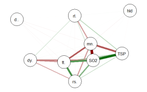
qgraph(cormat, shape=”circle”, posCol=”darkgreen”, negCol=”darkred”, layout=”groups”, vsize=10)
###################################################
This code produces the following correlation network:

The correlation network provides a very useful visual picture of the intercorrelations as well as positive and negative correlations. The relative thickness and color density of the bands indicates strength of Pearson’s r and the color of each band indicates a positive or negative correlation – red for negative and green for positive.
By changing the “layout=” option from “groups” to “spring” a slightly different perspective can be seen. The code is:
########################################################
#Code to produce alternative correlation network:
#######################################################
library(qgraph)
#use cor function to create a correlation matrix with milan.mort dataset
#and put into cormat variable
##############################################################
cormat=cor(milan.mort) #correlation matrix generated
##############################################################
###############################################################
#now plot a circle graph of the correlation matrix
##########################################################
qgraph(cormat, shape=”circle”, posCol=”darkgreen”, negCol=”darkred”, layout=”spring”, vsize=10)
###############################################################
The graph produced is below:
Once again the intercorrelations, strength of r and positive and negative correlations can be easily identified. There are many more options, types of graph and procedures for analysis that can be accomplished with the qgraph() package. In future tutorials I will discuss some of these.
转自:https://dmwiig.net/2017/03/10/the-r-qgraph-package-using-r-to-visualize-complex-relationships-among-variables-in-a-large-dataset-part-one/
最新文章
- maven热部署到tomcat
- 开发android App干坏事(二)-wifi控制
- python 时间类型和相互转换
- javascript序列化
- windows 下安装nginx
- NullPointerException异常的原因??
- kafka_2.11-0.8.2.2的搭建
- 百度编辑器ueditor前台代码高亮无法自动换行解决方法
- Android 滑动效果进阶篇(五)—— 3D旋转
- web开发没有服务器
- c++STL排序算法注意事项
- 配置SESSION超时与请求超时
- (NO.00003)iOS游戏简单的机器人投射游戏成形记(十三)
- VMware5.5-高可用性和动态资源调度(DRS)
- [leetcode]25. Reverse Nodes in k-Group每k个节点反转一下
- 大数据入门第十七天——storm上游数据源 之kafka详解(二)常用命令
- Linux(Ubuntu)下也能用搜狗输入法了!!!
- UUID含义及ubuntu配置系统默认JDK
- LINUX内核分析第四周——扒开系统调用的三层皮
- Centos7 通过yum源安装nginx