flex常用布局
2024-09-08 10:54:05
公共样式:
    <style>

        * {

            margin: 0;

            padding: 0;

        }

        .has-flex {

            display: flex;

        }

    </style>
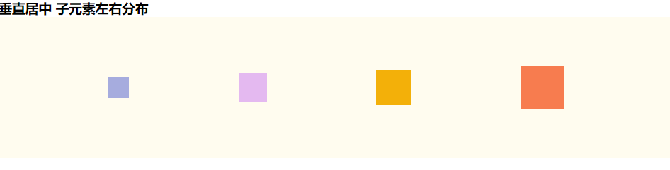
垂直居中 子元素左右分布
css
        .father-one {

            width: 100%;

            height: 200px;

            background-color: #fffcef;

            align-items: center; /*纵轴)方向上的对齐方式。*/

            justify-content: space-between; /* 均匀排列每个元素 首个元素放置于起点,末尾元素放置于终点,中间元素的中间间隔相等 */

            justify-content: space-around; /* 均匀排列每个元素 每个元素周围分配相同的空间 */

            justify-content: space-evenly; /* 均匀排列每个元素   每个元素之间的间隔相等 */

        }

        .fa-one-child1 {

            height: 30px;

            width: 30px;

            background-color: #a6acde;

        }

        .fa-one-child2 {

            height: 40px;

            width: 40px;

            background-color: #e4b9f0;

        }

        .fa-one-child3 {

            height: 50px;

            width: 50px;

            background-color: #f3b009;

        }

        .fa-one-child4 {

            height: 60px;

            width: 60px;

            background-color: #f77c4f;

        }
html
<!--垂直居中 子元素左右分布 star-->

<h3>垂直居中 子元素左右分布</h3>

<div class="father-one has-flex">

    <div class="fa-one-child1"></div>

    <div class="fa-one-child2"></div>

    <div class="fa-one-child3"></div>

    <div class="fa-one-child4"></div>

</div>

<!--垂直居中 子元素左右分布 end-->
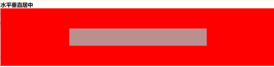
水平垂直居中
css
        .father-two {

            width: 100%;

            height: 200px;

            align-items: center; /*纵轴)方向上的对齐方式。*/

            justify-content: center; /*    横轴)方向上的对齐方式*/

            background-color: red;

        }

        .child {

            width: 50%;

            height: 60px;

            background-color: rosybrown;

        }
html
<!--水平垂直居中 star-->

<h3>水平垂直居中</h3>

<div class="father-two has-flex">

    <div class="child"></div>

</div>

<!--水平垂直居中 end-->
水平垂直居中 图标在上文字在下
css
        .father-three {

            height: 80px;

            background-color: #f77c4f;

            align-items: center;

            justify-content: center;

            flex-direction: column;

        }
html
<!--水平垂直居中 图标在上文字在下 star-->

<h3>水平垂直居中 图标在上文字在下</h3>

<div class="has-flex father-three">

    <i class="fa fa-file-text-o" aria-hidden="true"></i>

    <p>测试</p>

</div>

<!--水平垂直居中 图标在上文字在下 end-->

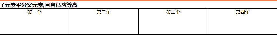
子元素平分父元素,且自适应等高
css
        .father-four {

            background-color: #ffd5eb;

        }

        .fa-four-child {

            flex: 1;

            text-align: center;

            background-color: #ffffff;

            border: 1px solid;

        }
html
<!--子元素平分父元素,且自适应等高   star-->

<h3>子元素平分父元素,且自适应等高 </h3>

<div class="has-flex father-four">

    <div class="fa-four-child">第一个</div>

    <div class="fa-four-child">第二个</div>

    <div class="fa-four-child">第三个</div>

    <div class="fa-four-child" style="height: 90px">第四个</div>

</div>

<!--子元素平分父元素,且自适应等高  end-->
子元素平分父元素,两边对齐中间自适应相同宽度间隔,且自动换行
css
        .father-five {

            height: 100px;

            background-color: #a6acde;

            justify-content: space-between;

            flex-wrap: wrap;

        }

        .fa-five-child {

            width: 21%;

            background-color: #f77c4f;

        }
html
<!--子元素平分父元素,两边对齐中间自适应相同宽度间隔,且自动换行   star-->

<h3>子元素平分父元素,两边对齐中间自适应相同宽度间隔,且自动换行 </h3>

<div class="has-flex father-five">

    <div class="fa-five-child">第一个</div>

    <div class="fa-five-child">第二个</div>

    <div class="fa-five-child">第三个</div>

    <div class="fa-five-child">第四个</div>

    <div class="fa-five-child">第五个</div>

    <div class="fa-five-child">第六个</div>

    <div class="fa-five-child">第七个</div>

    <div class="fa-five-child">第八个</div>

</div>

<!--子元素平分父元素,两边对齐中间自适应相同宽度间隔,且自动换行  end-->

三栏布局,两边固定宽中间自适应
css
        .father-six {

            height: 100px;

        }

        .one-child,

        .three-child {

            width: 300px;

            background-color: #a6acde;

        }

        .two-child {

            flex: 1;

            background-color: #eeeeee;

        }
html
<!--三栏布局,两边固定宽中间自适应   star-->

<h3>三栏布局,两边固定宽中间自适应 </h3>

<div class="has-flex father-six">

    <div class="fa-six-child one-child">第一个</div>

    <div class="fa-six-child two-child">第二个</div>

    <div class="fa-six-child three-child">第三个</div>

</div>

<!--三栏布局,两边固定宽中间自适应  end-->

对于Flex 布局更详细的讲解请移步:Flex 布局教程:语法篇
相关css面试题:两边宽度已知,如何让中间自适应
最新文章
- [转载]config文件的一个很好的实现
- Button的enabled和clickabled的区别
- SQL Server Management Studio无法记住密码
- the useful for loop
- NOI模拟赛 Day1
- Android 回到底部和返回顶部实现
- js文件的装载和执行
- Jenkins参数化构建
- DJANGO中filter_horizontal和raw_id_fields的作用
- CI框架中自定义view文件夹位置
- Android Studio 中快速提取方法
- javaWeb学习总结(10)- Filter(过滤器)学习(2)
- [JSOI 2008]最大数
- Python高效编程技巧
- vab set dim
- web开发常见bug汇总
- SCIP | 数学规划求解器SCIP超详细的使用教程
- 匿名(无账号密码)从ftp服务器下载文件
- 1143: [CTSC2008]祭祀river(最长反链)
- js 触摸事件 touch