吴裕雄--天生自然 R语言开发学习:基本图形(续三)
2024-09-05 05:06:26


#---------------------------------------------------------------#
# R in Action (2nd ed): Chapter 6 #
# Basic graphs #
# requires packages vcd, plotrix, sm, vioplot to be installed #
# install.packages(c("vcd", "plotrix", "sm", "vioplot")) #
#---------------------------------------------------------------# par(ask=TRUE)
opar <- par(no.readonly=TRUE) # save original parameter settings library(vcd)
counts <- table(Arthritis$Improved)
counts # Listing 6.1 - Simple bar plot
# vertical barplot
barplot(counts,
main="Simple Bar Plot",
xlab="Improvement", ylab="Frequency")
# horizontal bar plot
barplot(counts,
main="Horizontal Bar Plot",
xlab="Frequency", ylab="Improvement",
horiz=TRUE) # obtain 2-way frequency table
library(vcd)
counts <- table(Arthritis$Improved, Arthritis$Treatment)
counts # Listing 6.2 - Stacked and grouped bar plots
# stacked barplot
barplot(counts,
main="Stacked Bar Plot",
xlab="Treatment", ylab="Frequency",
col=c("red", "yellow","green"),
legend=rownames(counts)) # grouped barplot
barplot(counts,
main="Grouped Bar Plot",
xlab="Treatment", ylab="Frequency",
col=c("red", "yellow", "green"),
legend=rownames(counts), beside=TRUE) # Listing 6.3 - Bar plot for sorted mean values
states <- data.frame(state.region, state.x77)
means <- aggregate(states$Illiteracy, by=list(state.region), FUN=mean)
means means <- means[order(means$x),]
means barplot(means$x, names.arg=means$Group.1)
title("Mean Illiteracy Rate") # Listing 6.4 - Fitting labels in bar plots
par(las=2) # set label text perpendicular to the axis
par(mar=c(5,8,4,2)) # increase the y-axis margin
counts <- table(Arthritis$Improved) # get the data for the bars # produce the graph
barplot(counts,
main="Treatment Outcome", horiz=TRUE, cex.names=0.8,
names.arg=c("No Improvement", "Some Improvement", "Marked Improvement")
)
par(opar) # Spinograms
library(vcd)
attach(Arthritis)
counts <- table(Treatment,Improved)
spine(counts, main="Spinogram Example")
detach(Arthritis) # Listing 6.5 - Pie charts
par(mfrow=c(2,2))
slices <- c(10, 12,4, 16, 8)
lbls <- c("US", "UK", "Australia", "Germany", "France") pie(slices, labels = lbls,
main="Simple Pie Chart") pct <- round(slices/sum(slices)*100)
lbls <- paste(lbls, pct)
lbls <- paste(lbls,"%",sep="")
pie(slices,labels = lbls, col=rainbow(length(lbls)),
main="Pie Chart with Percentages") library(plotrix)
pie3D(slices, labels=lbls,explode=0.1,
main="3D Pie Chart ") mytable <- table(state.region)
lbls <- paste(names(mytable), "\n", mytable, sep="")
pie(mytable, labels = lbls,
main="Pie Chart from a dataframe\n (with sample sizes)") par(opar) # Fan plots
library(plotrix)
slices <- c(10, 12,4, 16, 8)
lbls <- c("US", "UK", "Australia", "Germany", "France")
fan.plot(slices, labels = lbls, main="Fan Plot") # Listing 6.6 - Histograms
# simple histogram 1
hist(mtcars$mpg) # colored histogram with specified number of bins
hist(mtcars$mpg,
breaks=12,
col="red",
xlab="Miles Per Gallon",
main="Colored histogram with 12 bins") # colored histogram with rug plot, frame, and specified number of bins
hist(mtcars$mpg,
freq=FALSE,
breaks=12,
col="red",
xlab="Miles Per Gallon",
main="Histogram, rug plot, density curve")
rug(jitter(mtcars$mpg))
lines(density(mtcars$mpg), col="blue", lwd=2) # histogram with superimposed normal curve (Thanks to Peter Dalgaard)
x <- mtcars$mpg
h<-hist(x,
breaks=12,
col="red",
xlab="Miles Per Gallon",
main="Histogram with normal curve and box")
xfit<-seq(min(x),max(x),length=40)
yfit<-dnorm(xfit,mean=mean(x),sd=sd(x))
yfit <- yfit*diff(h$mids[1:2])*length(x)
lines(xfit, yfit, col="blue", lwd=2)
box() # Listing 6.7 - Kernel density plot
d <- density(mtcars$mpg) # returns the density data
plot(d) # plots the results d <- density(mtcars$mpg)
plot(d, main="Kernel Density of Miles Per Gallon")
polygon(d, col="red", border="blue")
rug(mtcars$mpg, col="brown") # Listing 6.8 - Comparing kernel density plots
par(lwd=2)
library(sm)
attach(mtcars) # create value labels
cyl.f <- factor(cyl, levels= c(4, 6, 8),
labels = c("4 cylinder", "6 cylinder", "8 cylinder")) # plot densities
sm.density.compare(mpg, cyl, xlab="Miles Per Gallon")
title(main="MPG Distribution by Car Cylinders") # add legend via mouse click
colfill<-c(2:(2+length(levels(cyl.f))))
cat("Use mouse to place legend...","\n\n")
legend(locator(1), levels(cyl.f), fill=colfill)
detach(mtcars)
par(lwd=1) # parallel box plots
boxplot(mpg~cyl,data=mtcars,
main="Car Milage Data",
xlab="Number of Cylinders",
ylab="Miles Per Gallon") # notched box plots
boxplot(mpg~cyl,data=mtcars,
notch=TRUE,
varwidth=TRUE,
col="red",
main="Car Mileage Data",
xlab="Number of Cylinders",
ylab="Miles Per Gallon") # Listing 6.9 - Box plots for two crossed factors
# create a factor for number of cylinders
mtcars$cyl.f <- factor(mtcars$cyl,
levels=c(4,6,8),
labels=c("","","")) # create a factor for transmission type
mtcars$am.f <- factor(mtcars$am,
levels=c(0,1),
labels=c("auto","standard")) # generate boxplot
boxplot(mpg ~ am.f *cyl.f,
data=mtcars,
varwidth=TRUE,
col=c("gold", "darkgreen"),
main="MPG Distribution by Auto Type",
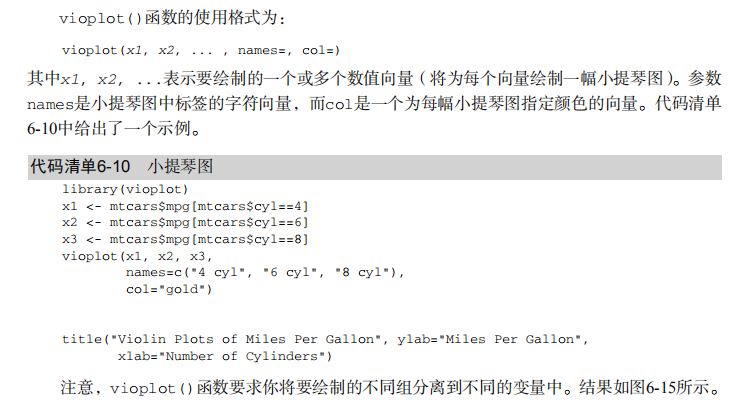
xlab="Auto Type") # Listing 6.10 - Violin plots library(vioplot)
x1 <- mtcars$mpg[mtcars$cyl==4]
x2 <- mtcars$mpg[mtcars$cyl==6]
x3 <- mtcars$mpg[mtcars$cyl==8]
vioplot(x1, x2, x3,
names=c("4 cyl", "6 cyl", "8 cyl"),
col="gold")
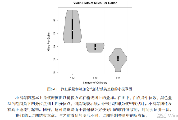
title("Violin Plots of Miles Per Gallon") # dot chart
dotchart(mtcars$mpg,labels=row.names(mtcars),cex=.7,
main="Gas Mileage for Car Models",
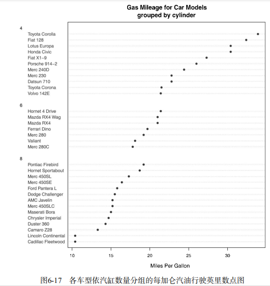
xlab="Miles Per Gallon") # Listing 6.11 - Dot plot grouped, sorted, and colored
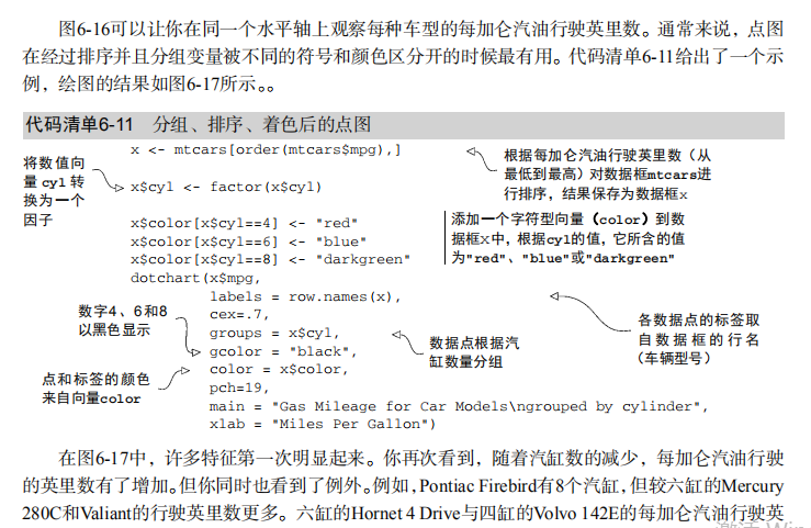
x <- mtcars[order(mtcars$mpg),]
x$cyl <- factor(x$cyl)
x$color[x$cyl==4] <- "red"
x$color[x$cyl==6] <- "blue"
x$color[x$cyl==8] <- "darkgreen"
dotchart(x$mpg,
labels = row.names(x),
cex=.7,
pch=19,
groups = x$cyl,
gcolor = "black",
color = x$color,
main = "Gas Mileage for Car Models\ngrouped by cylinder",
xlab = "Miles Per Gallon")

最新文章
- Linux 桌面美化那点事儿
- mysql数据库每日定时自动备份
- 更换win7锁屏壁纸
- 针对bootstrap内联单选框input与文字不能居中对齐的解决办法
- Objective-C关于数据处理
- DuiLib(一)——窗口及消息
- 图表引擎AChartEngine 二
- 怎样改动、扩展并重写Magento代码
- 软件工程wc项目,基于py
- spoj1026Favorite Dice
- Java基础知识——算术操作符、自增自减、关系操作符,你真的了解吗?
- windows下nginx的安装及使用(转载)
- 用原生js简单模仿angular的依赖注入
- 【转】Python模块学习 - fnmatch & glob
- 关于mysql数据库优化
- django源码解析之 BooleanField (二)
- linux中与Oracle有关的内核参数详解
- windchill10.0&11.0API_chm版百度云
- 透彻掌握Promise的使用,读这篇就够了
- javascript push 和 concat 的区别