matplotlib图表介绍
Matplotlib 是一个python 的绘图库,主要用于生成2D图表。
常用到的是matplotlib中的pyplot,导入方式import matplotlib.pyplot as plt
一、显示图表的模式
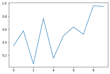
1.plt.show()
该方式每次都需要手动show()才能显示图表,由于pycharm不支持魔法函数,因此在pycharm中都需要采取这种show()的方式。
arr = np.random.rand(10)

plt.plot(arr)

plt.show()  #每次都需要手动show()
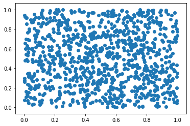
2.魔法函数%matplotlib inline
魔法函数不需要手动show(),可直接生成图表,但是魔法函数无法在pycharm中使用,下面都是在jupyter notebook中演示。
inline方式直接在代码的下方生成一个图表。
%matplotlib inline

x = np.random.rand(1000)

y = np.random.rand(1000)

plt.scatter(x,y)   #最基本散点图

# <matplotlib.collections.PathCollection at 0x54b2048>
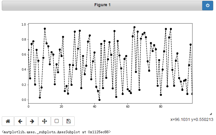
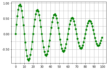
3.魔法函数%matplotlib notebook
%matplotlib notebook

s = pd.Series(np.random.rand(100))

s.plot(style = 'k--o',figsize = (10,5))
notebook方式,代码需要运行两次,会在代码下方生成一个可交互的图表,可对图表进行放大、拖动、返回原样等操作。
4.魔法函数%matplotlib qt5
%matplotlib qt5

plt.gcf().clear()

df = pd.DataFrame(np.random.rand(50,2),columns=['A','B'])

df.hist(figsize=(12,5),color='g',alpha=0.8)
qt5方式会弹出一个独立于界面上的可交互图表。
由于可交互的图表比较占内存,运行起来稍显卡,因此常采用inline方式。
二、生成图表的方式
1.Seris生成
ts = pd.Series(np.random.randn(50),index=pd.date_range('2019/1/1/',periods=50))

ts = ts.cumsum()

ts.plot()
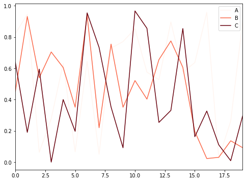
2.DataFrame生成
df = pd.DataFrame(np.random.rand(20,3),columns=['A','B','C'])

df.plot()
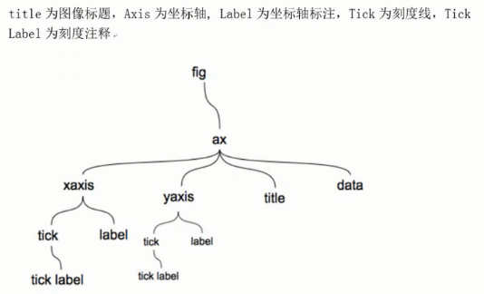
三、图表的基本元素
plot的使用方法,以下图表都在%matplotlib inline 模式下生成。
plot(kind='line',ax=None,figsize=None,use_index=True,title=None,grid=None,legend=None,\

         style=None,logx=False,logy=False,loglog=False,xticks=None,yticks=None,xlim=None,\

         ylim=None,rot=None,fontsize=None,colormpap=None,subplots=False,table=False,xerr=None,yerr=None,\

         lable=None,secondary_y=False,**kwargs)

# kind:图表类型,默认为line折线图,其他bar直方图、barh横向直方图

# ax:第几个子图

# figsize:图表大小,即长和宽,默认为None,指定形式为(m,n)

# use_index:是否以原数据的索引作为x轴的刻度标签,默认为True,如果设置为False则x轴刻度标签为从0开始的整数

# title:图表标题,默认为None

# grid:是否显示网格,默认为None,也可以直接使用plt.grid()

# legend:如果图表包含多个序列,序列的注释的位置

# style:风格字符串,包含了linestyle、color、marker,默认为None,如果单独指定了color以color的颜色为准

# color:颜色,默认为None

# xlim和ylim:x轴和y轴边界

# xticks和yticks:x轴和y轴刻度标签

# rot:x轴刻度标签的逆时针旋转角度,默认为None,例如rot = 45表示x轴刻度标签逆时针旋转45°

# fontsize:x轴和y轴刻度标签的字体大小

# colormap:如果一个图表上显示多列的数据,选择颜色族以区分不同的列

# subplots:是否分子图显示,默认为None,如果一个图标上显示多列的数据,是否将不同的列拆分到不同的子图上显示

# label:图例标签,默认为None,DataFrame格式以列名为label

# alpha:透明度
plot()使用方法
图表名称,x轴和y轴的名称、边界、刻度、标签等属性。
import numpy as np
import pandas as pd
import matplotlib.pyplot as plt
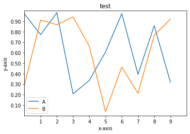
df = pd.DataFrame(np.random.rand(10,2),columns=['A','B'])
fig = df.plot(figsize=(6,4)) #figsize表示图表大小,即长和宽
plt.title('test') #图表名称
plt.xlabel('x-axis') #x轴名称
plt.ylabel('y-axis') #y轴名称
plt.legend(loc=0) #图表位置
plt.xlim([0,10]) #x轴边界
plt.ylim([0,1]) #y轴边界
plt.xticks(range(1,10)) #x轴刻度间隔
plt.yticks([0.1,0.2,0.3,0.4,0.5,0.6,0.7,0.8,0.9]) #y轴刻度间隔
fig.set_xticklabels('%d'%i for i in range(1,10)) #x轴显示标签,设置显示整数
fig.set_yticklabels('%.2f'%i for i in [0.1,0.2,0.3,0.4,0.5,0.6,0.7,0.8,0.9]) #y轴显示标签,设置显示2位小数 # legend的loc,位置
# 0:best
# 1:upper right
# 2:upper left
# 3:lower left
# 4:lower right
# 5:right
# 6:center left
# 7:center right
# 8:lower center
# 9:upper center
# 10:center
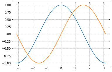
是否显示网格及网格属性、是否显示坐标轴、刻度方向等。
x = np.linspace(-np.pi,np.pi,500)

c,s = np.cos(x),np.sin(x)

plt.plot(x,c)

plt.plot(x,s)

plt.grid(linestyle = '--',color = 'gray',linewidth = '0.5',axis = 'both')  #plt.grid()表示显示网格,参数分别表示网格线型、颜色、宽度、显示轴(x,y,both表示显示x轴和y轴)

plt.tick_params(bottom='on',top='off',left='on',right='off')   #是否显示刻度,默认left和bottom显示

import matplotlib

matplotlib.rcParams['xtick.direction']='in'

matplotlib.rcParams['ytick.direction']='in'  #刻度的显示方向,默认为out,in表示向内,out表示向外,inout表示穿透坐标轴内外都有

frame = plt.gca()

# plt.axis('off')   #关闭坐标轴

# frame.axes.get_xaxis().set_visible(False)  #x轴不可见

# frame.axes.get_yaxis().set_visible(False)  #y轴不可见
linestyle:线型

            -:实线,默认

            --:虚线

            -.:一个实线一个点

            ::点
linestyle线型
marker:值在x刻度上的显示方式

    '.'       point marker

    ','       pixel marker

    'o'       circle marker

    'v'       triangle_down marker

    '^'       triangle_up marker

    '<'       triangle_left marker

    '>'       triangle_right marker

    ''       tri_down marker

    ''       tri_up marker

    ''       tri_left marker

    ''       tri_right marker

    's'       square marker

    'p'       pentagon marker

    '*'       star marker

    'h'       hexagon1 marker

    'H'       hexagon2 marker

    '+'       plus marker

    'x'       x marker

    'D'       diamond marker

    'd'       thin_diamond marker

    '|'       vline marker

    '_'       hline marker
markerx刻度上值的显示方式
color:颜色

    r:red红色

    y:yello黄色

    g:green绿色

    b:blue蓝色

    k:black黑色

alpha:透明度,0-1之间

colormap:

Accent, Accent_r, Blues, Blues_r, BrBG, BrBG_r, BuGn, BuGn_r, BuPu, BuPu_r, CMRmap, CMRmap_r, Dark2, Dark2_r, GnBu, GnBu_r, Greens, Greens_r, Greys, Greys_r, OrRd, OrRd_r, Oranges, Oranges_r, PRGn, PRGn_r, Paired, Paired_r, Pastel1, Pastel1_r, Pastel2, Pastel2_r, PiYG, PiYG_r, PuBu, PuBuGn, PuBuGn_r, PuBu_r, PuOr, PuOr_r, PuRd, PuRd_r, Purples, Purples_r, RdBu, RdBu_r, RdGy, RdGy_r, RdPu, RdPu_r, RdYlBu, RdYlBu_r, RdYlGn, RdYlGn_r, Reds, Reds_r, Set1, Set1_r, Set2, Set2_r, Set3, Set3_r, Spectral, Spectral_r, Wistia, Wistia_r, YlGn, YlGnBu, YlGnBu_r, YlGn_r, YlOrBr, YlOrBr_r, YlOrRd, YlOrRd_r, afmhot, afmhot_r, autumn, autumn_r, binary, binary_r, bone, bone_r, brg, brg_r, bwr, bwr_r, cividis, cividis_r, cool, cool_r, coolwarm, coolwarm_r, copper, copper_r, cubehelix, cubehelix_r, flag, flag_r, gist_earth, gist_earth_r, gist_gray, gist_gray_r, gist_heat, gist_heat_r, gist_ncar, gist_ncar_r, gist_rainbow, gist_rainbow_r, gist_stern, gist_stern_r, gist_yarg, gist_yarg_r, gnuplot, gnuplot2, gnuplot2_r, gnuplot_r, gray, gray_r, hot, hot_r, hsv, hsv_r, inferno, inferno_r, jet, jet_r, magma, magma_r, nipy_spectral, nipy_spectral_r, ocean, ocean_r, pink, pink_r, plasma, plasma_r, prism, prism_r, rainbow, rainbow_r, seismic, seismic_r, spring, spring_r, summer, summer_r, tab10, tab10_r, tab20, tab20_r, tab20b, tab20b_r, tab20c, tab20c_r, terrain, terrain_r, twilight, twilight_r, twilight_shifted, twilight_shifted_r, viridis, viridis_r, winter, winter_r
color颜色
也可在创建图表时通过style='线型颜色显示方式'
例如style = '-ro'表示设置线条为实现、颜色为红色,marker为实心圆
使用python内置的风格样式style,需导入另外一个模块import matplotlib.style as psl
import matplotlib.style as psl

print(psl.available)

psl.use('seaborn')

plt.plot(pd.DataFrame(np.random.rand(20,2),columns=['one','two']))
设置主刻度、此刻度、刻度标签显示格式等
from matplotlib.ticker import MultipleLocator,FormatStrFormatter

t = np.arange(0,100)

s = np.sin(0.1*np.pi*t)*np.exp(-0.01*t)

ax = plt.subplot()  #不直接在plot中设置刻度

plt.plot(t,s,'-go')

plt.grid(linestyle='--',color='gray',axis='both')

xmajorLocator = MultipleLocator(10)  #将x主刻度标签设置为10的倍数

xmajorFormatter = FormatStrFormatter('%d')  #x主刻度的标签显示为整数

xminorLocator = MultipleLocator(5) #将x次刻度标签设置为5的倍数

ax.xaxis.set_major_locator(xmajorLocator) #设置x轴主刻度

ax.xaxis.set_major_formatter(xmajorFormatter)  #设置x轴主刻度标签的显示格式

ax.xaxis.set_minor_locator(xminorLocator)  #设置x轴次刻度

ax.xaxis.grid(which='minor')  #设置x轴网格使用次刻度

ymajorLocator = MultipleLocator(0.5)

ymajorFormatter = FormatStrFormatter('%.2f')

yminorLocator = MultipleLocator(0.25)

ax.yaxis.set_major_locator(ymajorLocator)

ax.yaxis.set_major_formatter(ymajorFormatter)

ax.yaxis.set_minor_locator(yminorLocator)

ax.yaxis.grid(which='minor')

# ax.xaxis.set_major_locator(plt.NullLocator)  #删除x轴的主刻度

# ax.xaxis.set_major_formatter(plt.NullFormatter)   #删除x轴的标签格式

# ax.yaxis.set_major_locator(plt.NullLocator)

# ax.yaxis.set_major_formatter(plt.NullFormatter)
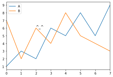
注释和图表保存
注释:plt.text(x轴值,y轴值,'注释内容')
水平线:plt.axhline(x值)
数值线:plt.axvline(y值)
刻度调整:plt.axis('equal')设置x轴和y轴每个单位表示的刻度相等
子图位置调整:plt.subplots_adjust(left=None, bottom=None, right=None, top=None,wspace=None, hspace=None),子图距离画板上下左右的距离,子图之间的宽度和高度
保存:plt.savefig(保存路径及文件名称,dpi=n,bbox_inches='tight',facecolor='red',edgecolor='yellow')
dpi表示分辨率,值越大图片越清晰;bbox_inches为tight表示尝试剪去图表周围空白部分,facecolor为图表背景色,默认为白色,edgecolor为边框颜色,默认为白色。
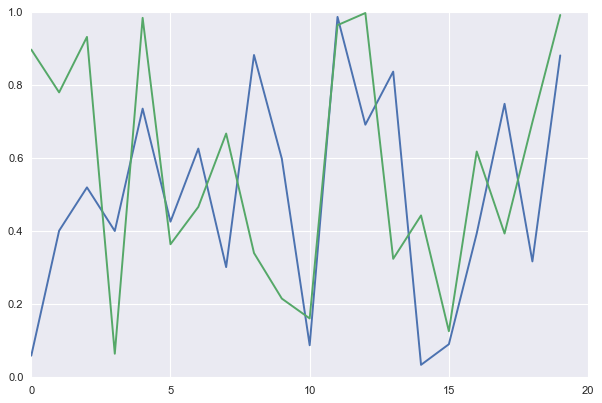
df = pd.DataFrame({'A':[1,3,2,6,5,8,5,9],'B':[7,2,6,4,8,5,4,3]})

df.plot()

plt.text(2,6,'^_^',fontsize='')

plt.savefig(r'C:\Users\penghuanhuan\Desktop\haha.png',dpi=400,bbox_inches='tight',facecolor='red',edgecolor='yellow')

print('finished')
四、图表各对象
figure相当于一块画板,ax是画板中的图表,一个figure画板中可以有多个图表。
创建figure对象:
plt.figure(num=None, figsize=None, dpi=None, facecolor=None, edgecolor=None, frameon=True, FigureClass=Figure, clear=False, **kwargs )
如果不设置figure对象,在调用plot时会自动生成一个并且生成其中的一个子图,且所有plot生成的图表都显示在一个图表上面。
num:指定为画板中的第几个图表,在同一段代码中,相同figure对象的不同num,各自生成一个图表,相同figure对象的相同num和不同figure对象的相同num,均生成在一个图标上。
figsize:图表的大小,即长和宽,元组形式(m,n)
dpi:分辨率
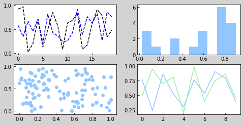
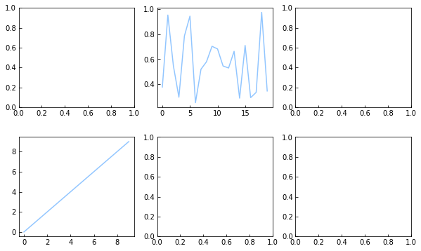
1.创建子图方法1
①通过plt生成figure对象
②通过figure对象的add_subplot(m,n,p)创建子图,表示生成m*n个子图,并选择第p个子图,子图的顺序由左到右由上到下
③在子图上绘制图表
#子图

fig = plt.figure(figsize = (8,4),facecolor = 'lightgray')  #创建figure对象

ax1 = fig.add_subplot(2,2,1)  #创建一个2*2即4个子图,并选择第1个子图,参数也可以直接写成221

 # ax1 =plt.subplot(2,2,1) 也可以使用这种方式添加子图

plt.plot(np.random.rand(20),'k--')  #在子图上1绘制图表

plt.plot(np.random.rand(20),'b--')  #在子图上1绘制图表

# ax1.plot(np.random.rand(20),'b--')

ax2 = fig.add_subplot(2,2,3)  #选择第3个子图

ax2.scatter(np.random.rand(100),np.random.rand(100))  #在子图上3绘制图表

ax3 = fig.add_subplot(2,2,2)   #选择第2个子图

ax3.hist(np.random.rand(20))

ax4 = fig.add_subplot(2,2,4)  #选择第4个子图

ax4.plot(pd.DataFrame(np.random.rand(10,2),columns = ['A','B']))
通过figure对象添加子图
2.创建子图方法2
①通过plt的subplots(m,n)方法生成一个figure对象和一个表示figure对象m*n个子图的二维数组
②通过二维数组选择子图并在子图上绘制图表
fig,axes = plt.subplots(2,3,figsize = (10,6))  #生成一个figure对象,和一个2*3的二维数组,数组元素为子图对象

#subplots方法还有参数sharex和sharey,表示是否共享x轴和y轴,默认为False

print(fig,type(fig)) #figure对象

print(axes,type(axes))

ax1 = axes[0][1]  #表示选择第1行第2个子图

ax1.plot(np.random.rand(20))

ax2 = axes[1,0]  #表示选择第2行第1个子图

ax2.plot(np.arange(10))

plt.subplots_adjust(wspace=0.2,hspace=0.3) #调整子图之间的间隔宽、间隔高占比
通过subplots添加子图
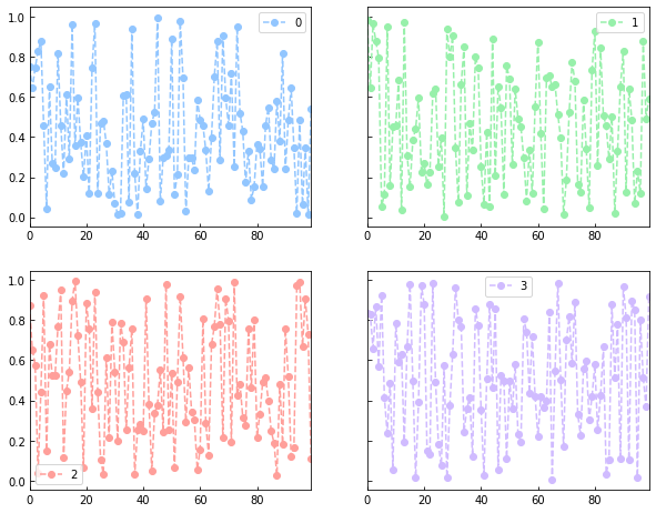
3.子图的创建方法3
在创建plot的时候添加参数subplot=True即可
df.plot(style='--ro',subplots=True,figsize=(10,8),layout=(2,2),sharex=False,sharey=True)
subplots:默认为False,在一张图表上显示,True则会拆分为子图
layout:子图的排列方式,即几行几列
sharex:默认为True
sharey:默认为False
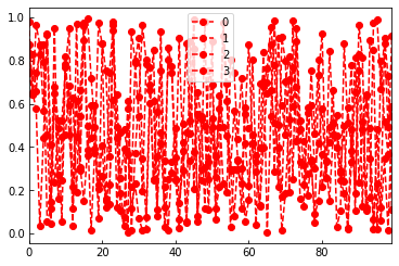
df = pd.DataFrame(np.random.rand(100,4))

df.plot(style='--ro')

df.plot(style='--ro',subplots=True,figsize=(10,8),layout=(2,2),sharex=False,sharey=True)
显示汉字问题请参考https://www.cnblogs.com/kuxingseng95/p/10021788.html
最新文章
- ASP.NET MVC传递参数(model)
- iOS开发--Swift RAC响应式编程初探
- Trace1:Default Trace
- funsioncharts的图表操作heatmap
- 编写shell脚本遇到的问题
- Tabular Model下的ADOMD.NET
- iOS NSDate计算时间间隔
- Java——多线程安全问题
- linux下zip文件解压后乱码解决方案
- 6、WPF中的特殊字符与空白
- Android学习总结——去除标题栏
- Java消息队列--ActiveMq 初体验
- 检索COM类工厂中CLSID为{10020100-E260-11CF-AE68-00AA004A34D5}的组件时失败,原因是出现以下错误:80040154
- MySQL Binlog--binlog_format参数
- idea @Override is not allowed when implementing interface method
- git merge branch to master
- Vue 动态组件、动画、插件
- thinkphp3.2 实现二级导航和高亮显示
- L1-020 帅到没朋友
- 监控SQLServer 数据库表每天的空间变化情况